Software
Houzz Logo Print
numbersjunkie

Paint Color Help Needed

10 years ago

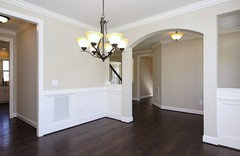
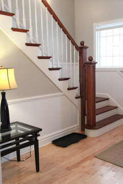
I need help choosing a paint color for our living areas. We have a chair rail, so we could do two toned walls. The floor will be a light oak look LVP - Opus Niveus from Karndean.

The living areas are open to the kitchen - separated by a peninsula. We're doing IKEA Bodbyn Gray cabinets in the kitchen and probably white counters and backsplash. There will be very little wall space in the kitchen so that space could be another color (maybe just white is best). The paint match for the IKEA cabinets is BM Cinder.

I want something neutral. If possible, I would like to do a tan/beige/greige that would be not read grey but would blend with the kitchen and the floor.

I know there are some smart people here who understand undertones much better than I do! Please give me some suggestions! TIA.

Comments (7)

  • 10 years ago

    Thanks nococcermom! I looked at the BM website, but with my monitor it was hard to really see the color options. I do plan to to the kitchen walls in white. Bit I wanted something not so stark for the walls in the living/dining/hallway.

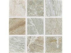
    I realized last night that our hall bathroom actually contains all of the colors I want to incorporate. It has a stone quartzite mosaic floor (the rough textured kind), and the colors vary all over the place but its basically gray/white with highlights in blue-green/tan-gold-orange hues. Here is a picture of the floor tile -

    Our vanity is IPE which is a deep mahogany color. and everything goes together! We have a dark brick fireplace in the living area which we do not intend to paint, which is close enough to the color of the IPE vanity to serve as the dark contrast color. I don't have a BM color wheel, but I do have one from SW. After looking at those colors against the tile use used on the bathroom floor, it looks like Requiste Gray would work as the darker tone wall color and Alpaca as the lighter color. They both read as warm colors to me. Actually, anything in the 7021-7036 range could work. 7036/7037 is Accessible Beige/Balanced beige.

    If anyone has experience with SW colors in this range, please share your thoughts!

  • 10 years ago

    I'm a huge Accessible Beige fan, and have it throughout my home. It's very neutral with just the lightest touch of warm greige. It has a nice depth to it that changes as light moves around the room during various times of the day. I love it so much that I haven't considered changing a single room - and that's sort of a big deal for me, considering I used to live inside a Crayola box. ;-) I think it would be lovely with the various hues in your floor tile.

    numbersjunkie thanked User
  • 10 years ago
    last modified: 10 years ago

    The BM web site is useless (at least on my monitor). Everything that's a lighter color looks yellow/beige. SO you really need to look at the chips in person for starters.

    I second Accessible Beige and also one of my favorite colors, SW Agreeable Gray (it's very similar to BM Edgecomb Grey but less greenish.) I love it. It's slightly greyer than Accessible Beige and changes depending on light from grey to beige to slightly blue to slightly green.

    numbersjunkie thanked nosoccermom
  • 10 years ago

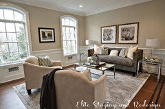
    I agree about BM web site. Everything I pulled up in a room view looked yellow! Right now, we were thinking we'd do two toned walls with the Accessible Beige and Aesthetic White. I want the White under the chair rail and the Accessible Beige on top by DH thinks that's weird. I have to pull up some of my saved pics to show him.

    So if we do that, we still need a ceiling color and a trim color. I was planning to use the Cottage White from Behr since we used that in the bedrooms and bathrooms on the ceilings and trim. But IDK if the trim looks all that great with the Accessible Beige - it looks a tad yellow which I don't want. Pure White from SW looks "pure" and not overly harsh, so I wonder if anyone can offer any advice or suggestions on the trim and/or ceiling. I know I always do the ceiling in Aesthetic White if we use that on part of the walls, and then the more white/white crown would pop.

  • 10 years ago
    last modified: 10 years ago


    Accessible Beige on top. (In the old days, the darker color was on the bottom; is that what DH thinks?)

    numbersjunkie thanked nosoccermom
  • 10 years ago
    last modified: 10 years ago

    I really like the pics of accessible beige and how the color looks with my cabinets and floor. But I saw a Utube video review where they said it was not very light reflective and not recommended for rooms with low light. I read other posts where they said it looked muddy in low light too. Since my house is definitely low light, I think I need to consider other options. Darn. Any other ideas?