Software
Houzz Logo Print
maketime4fun

Palladian blue in kitchen?

9 years ago
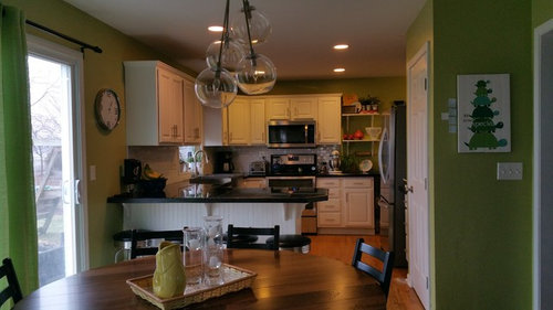
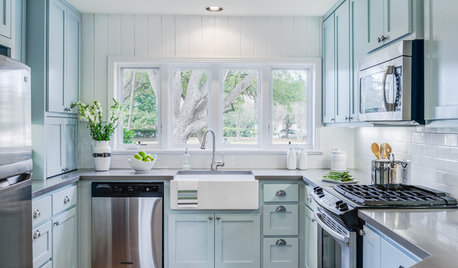
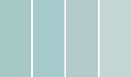
would palladian blue look good in my kitchen with southern and western exposure? Lots of light. Thinking of painting the adjacent hall/family room edgecomb gray -would they pair well? I love blue/blue-green accents in family room.

Comments (15)

  • PRO
    9 years ago

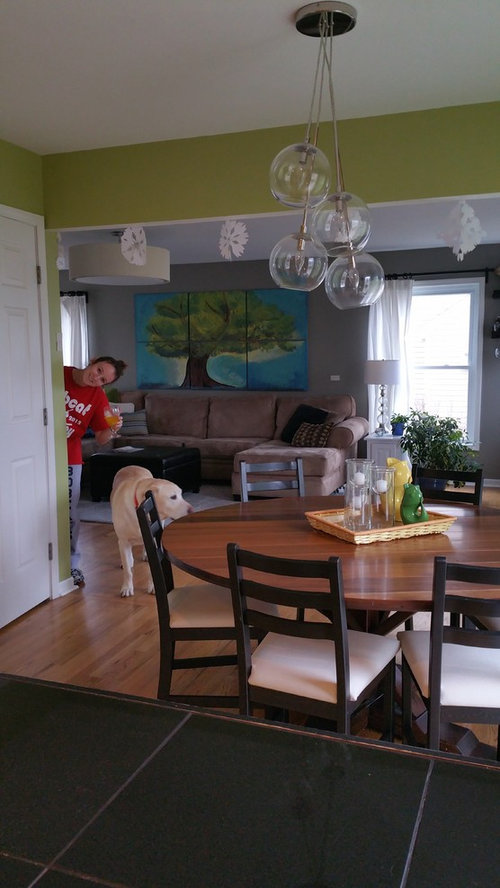
    I would second everything Flo said. And add that I love your dog.

    You might also consider Glacier Lake, Sterling, or Turquoise Mist

  • 9 years ago

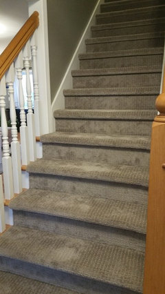
    Thank you so much for your help. I have BM River Gorge Gray in the family room now. My cabinets/trim are BM White Dove. My giant sectional is a huge deciding factor in the family room wall color. I tried Gray Owl for the family room but it didn't work. Also - I just had greige (I thought) carpet installed on my steps (first thing you see walking in the front door) that has a slight pink undertone. (Which was super difficult to see with my 4x5 sample piece). I wanted something blue-grayish that would work well with the Edgecomb gray. I've enjoyed my BM Dill Pickle green in the kitchen for the last 5 years, but I'm ready for a change to something a bit more subtle. I don't want it to look "blue". I also have samples of BM Woodlawn Bue, Harbor Haze, and Ocean Air - thoughts on those? I don't have the samples you suggested to check right now, but I really appreciate your help. Thanks! I love my dog too - he is a sweet boy :-)

  • PRO
    9 years ago

    If you don't want blue, you are going to have to sample very carefully. It is going to be very hard to get the right color with the other elements in the space. Maybe you need to find a more sage green, but I am afraid that would fight with the family room color. I have to think about this one! Real challenge for sure. Be back later.

  • 9 years ago

    My green has been fun- and I enjoyed the bright happiness of it (It looks much better in person than it photographs). I think I am looking for something a bit more sophisticated - but not cold. I have 4 kids and that crazy dog :-) Do you think the Edgecomb gray is a safe choice for the family room/entry? I am planning to change to that.

  • PRO
    9 years ago

    River Gorge Gray has a ton of olive green undertones. That is probably influencing your carpet big time. If you like that color, I would try a sample up that color strip in the same tones or you will go crazy trying to be in the right ballpark unless you really change up to a turquoise type color. Try Rodeo 1537. That is lighter than what you have in the kitchen now, but would be in the same "family" of color in the family room. Or -- I love your art piece and I would be tempted to bring the turquoise into the kitchen! Bright and fun. Would work great with your white cabinets and black countertops. So fun. Something like BM Baltimore Sky 760. You would have to check it out with your painting colors because monitors are not color perfect here by any means. So, those are some ideas.

  • PRO
    9 years ago

    Edgecomb Gray has a beige undertone. I would really look to the art as your inspiration for color. Your sofa looks beigey pink? I'll look around for color combo.

  • 9 years ago
    Don't paint the dog - i think the existing khaki is a good color for him/her. :-)
  • 9 years ago

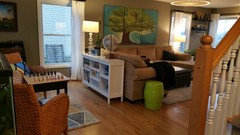
    lol -I would like the carpet to look less pink - is there a color I could consider that would make it appear less pink? I like the idea of considering the art piece. Our whole little family painted it together so it's a special thing for us. The lighter parts of the art look very close to the Palladian Blue when I hold the swatch to it. It definitely has teal in it - also navy and lime green. In general - I want the house to be lighter and brighter. I really liked Rodeo - but my husband said it looked too similar to what we have now (and doesn't see any point in re-painting it - sigh - My artsy daughter says there is a greenish undertone in the sectional. It's a yucky cloudy gray day here - so it's hard to tell. It's normally pretty sunny - and we have a 6 big windows in the family room that let in a lot of light.

  • 9 years ago
    Here are some pics from the front door coming in. family room is on the left.
  • 9 years ago

    I just chose paint colors and Palladian Blue was one of my choose from selections. It is similar to Rainwashed from SW. Both are beautiful at 100%, 75% and 50%.

    I ended up using Rainwashed at 50%, because I was going for a softer look. You look like you would be a 100% color gal.

    Too bad I can't hand the foam boards I painted to you through the internet.

    Palladian blue is a beautiful color, but you need to get chips first of it and everything around it and bring it to your house and put it next to your other colors.

    I recommend, don't get samples until after you do the chip test.

    I also recommend trying every chip within a color palette. The chips are free, the samples cost money.

  • PRO
    9 years ago
    You can do the chip thing but ultimately you need good size sample boards to ensure you can see affects of your lighting. I looked for a good color from your art, but I realize you have to figure that out. I didn't find a good combo in BM. Later I will check Behr. Sometimes they have choices no one else does. Later.
  • 9 years ago
    Thank you all so much!!
  • PRO
    9 years ago

    Take a look at Behr's 530 series colors Winsome Hue, to Grand Rapids. You could do Grand Rapids for the family room, which would frame your art piece beautifully and then go to 5300D-5 Riverside Blue for the kitchen. Strong colors and I think that level of darker blue in the family room might help tone down the pink in the carpet, although on my screen I don't see the pink. So your light is influencing greatly. Check some chips along that line out with your painting. Very hard to do colors over the Internet, but perhaps this can give you a little direction. This is a Green/Blue set of colors in the "tropical" vein.

  • 9 years ago
    Again -Thank you so much! I really appreciate your help.