Software
Houzz Logo Print
kathyvasquez

Juperana Persa Disaster!

9 years ago
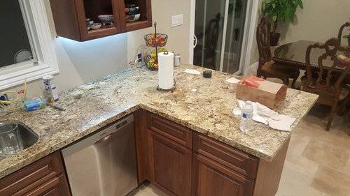
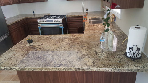
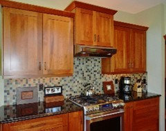
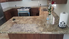
Hello everyone! I need some advice as quickly as possible, before I loose my mind. I just got my counters installed last week...and Im hating them. After, several several trips to the stores.... I made final selection with Juperana Persa...liking the variations of colors... but for some reason the color seems very off...i was hoping to see more beige than yellow... whats worst yellow turning into hints of green!!! Does anyone know if this is normal with Juperana Persa??? Is there anything I can do to hint away the yellow/greenish tone? I havent decided on a backsplash...Im soo lost still having nightmares with the granite color. Can anyone please suggest any backsplash options???

Comments (26)

  • 9 years ago
    The granite looks sickly beneath the under cabinet lights. Were you able to bring home samples to see in your own space?
  • 9 years ago

    No....you are not able to...they are large slabs

  • 9 years ago

    I like it, I don't see green...

    kathyvasquez thanked hbfn
  • 9 years ago
    last modified: 9 years ago

    I think they look gorgeous! I'd look for a plain tile to match the color you want to bring out in the granite. You can get plenty of samples of those. Or show the showroom your photos. They would have cool suggestions.

    kathyvasquez thanked jansgirl
  • 9 years ago

    I think they look great as well.

    kathyvasquez thanked lmckuin
  • 9 years ago

    Lighting and paint make a huge difference - play around with both, and don't stress on the granite. It looks pretty good to me.

    kathyvasquez thanked jmm1837
  • 9 years ago
    I think your undercounter lighting and current painted backsplash color might be what is throwing you off. While I think your countertops are lovely, having a big change from whatever your previous countertops were can be a bit mindboggling at first.

    Perhaps a honed crema marfil subway tile for your backsplash would be the ticket - it would let your granite be the "star" and quietly pull the cream/white color you desire from the granite. I have Netuno Bordeaux granite and used the crema marfil to achieve that effect in my new construction.

    Good Luck....whatever you choose will be beautiful.
    kathyvasquez thanked stelmoqn
  • 9 years ago
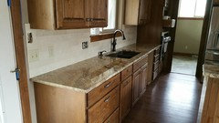
    Here is another shot of my crema marfil subway tile.
    kathyvasquez thanked stelmoqn
  • PRO
    9 years ago
    last modified: 9 years ago

    It's most likely too cool a paint color, and the too cool led under cabinet lighting. Take a daytime picture. If you chose a full slab and saw that slab in person, it's the same slab you selected. Nothing happens to the tones between the fabricator and your home. If you chose from a small sample, know that all granite can vary, thus not the recommended method for selection unless that selection is "absolute black".

    I'd consider a soft white paint job on the cabinetry, same trim, and a warmer paint color on walls, with a simple creamy subway tile splash. Some lovely hardware, and it will be just fine. Change the under cabinet lights to a warmer tone as well. All will simultaneously enhance the wood of the breakfast area .

    kathyvasquez thanked JAN MOYER
  • PRO
    9 years ago

    i'm in agreement about lighting. also, natural stone MUST be chosen by slab. if you only saw samples, you didn't know what you were getting. lighting is key also; LED bulbs come in many different colors. my recommendation is to choose an LED that is closest to natural light; buy them from a professional lighting company that will let you take them home to try out. & just relax & enjoy the wonderful part of nature you are living with.

    kathyvasquez thanked Ferris Zoe Design
  • 9 years ago
    To clarify, the slab looks sickly beneath the under cabinet lighting, but looks nice elsewhere. Under cabinet lighting is probably too cool.
    kathyvasquez thanked simstress
  • 9 years ago

    Nobody looks good under the blue-white light. That includes your granite.

    Your choice for counters was great--not just saying that to be nice.

    kathyvasquez thanked leelee
  • 9 years ago

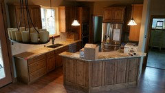
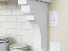
    Be very careful how you install the backsplash. Personally, I think it looks best if the b/s stops where the cabinets end with some sort of border or pencil tile to cap it off.

    Like these


  • 9 years ago
    last modified: 9 years ago

    Don't bring the backsplash forward to meet the front of the counters. Keep the b/s on the back walls. Don't turn the corner.

  • 9 years ago
    last modified: 9 years ago

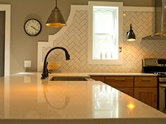
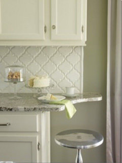
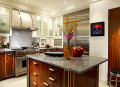
    Sorry, I don't know the name of this tile but it would look really good with your granite.

    kathyvasquez thanked leelee
  • 9 years ago

    Thats a pretty kitchen leelee! What color do u think is the tile?

  • 9 years ago

    Thank you everyone! Im surprise no one see's a hint or tint of green. I told my husband, wow its more yellow than I expected! His response, "yellow, yellow turning green...to me!" I was afraid to mention the green...and yet he could see it. I will go shopping for different light bulbs.... I really do hope it helps...at least to a comfortable look.... its the worst feeling to not feel happy with your kitcken after a big expensive..

  • PRO
    9 years ago
    last modified: 9 years ago

    I would recommend halogen light. Led's are not full spectrum only incandescent or halogen are. What that means to your design is your colors are not reading true.

    Look up 100 CRI CRI stands for color rendering index Halogen lighting is 100 CRI Led's are in the 80 range. It really makes a massive difference. This Kitchen was lit with Halogen ceiling lights, in cabinet lights, and under cabinet pucks

    Tribeca Reno Kitchen · More Info

  • PRO
    9 years ago

    I would keep it very simple perhaps a glass tile or sheets that pick up the granite once you fix your lighting

  • 9 years ago

    The paint is Dove White but the tile looks ever so slightly off white with a tinge of gray? At least on my screen.

    People get so hung up on counter color by getting too close and seeing colors that aren't even noticeable from 3 or 4 feet away. The overall color is what should drive the backsplash color not the tiny flecks.

  • PRO
    9 years ago
    last modified: 9 years ago

    Controversy abounds when talking about lighting & comparing incandescent with Halogen with LED (Light Emitting Diode), which is why i recommended a lighting professional. My personal experience started in the early part of this century. I knew everything I thought prepared me for the future of lighting. I owned a shop to showcase my Interior Design business. One day I became involved with lighting for one of my clients, and I started the research. It was pretty easy then. I took on a line of Halogen track lighting and had an epiphany. I became the go-to "expert". Lo and behold, 10 years later the lighting technology shifted to LED's, which were horrible. Hardly any efficient light came out of those first "bulbs." I was so against them until one fine day I met a real expert, an electrical engineer who gave me a quick tour of his lighting showroom pointing out the advantages of LED's and how they have blossomed since that first awful "bulb." It took a few projects using LED's to see the light, literally and figuratively. Now I'm a believer. Regarding the CRI numbers, just as my engineer pro told me, there is no direct comparison between the two, actually three technologies, LED, Halogen & Incandescent. Particularly the LED's. They go by a completely different scale. It was so much simpler for me to explain to my new lighting company what I was looking for in lighting, application, & aesthetics that I no longer try to it know it all. Here's some backup if you want to do your own research. And if you live anywhere near San Luis Obispo, go to see the folks at Acropolis Lighting. They'll fix you up. ferriszoedesign.com

    https://en.wikipedia.org/wiki/High_CRI_LED_lighting

    http://www.premierltg.com/tm30-vs-cri/

    https://www.soraa.com/blog_entries/47-understanding-tm-30-color-metrics

    "All this brings us to TM-30. Why is it better than the CRI? There are two reasons. For one thing, it uses state-of-the art color science and an optimized test of ninety-nine color samples, to preclude the predictions error found in the CRI."

  • PRO
    9 years ago
    last modified: 9 years ago

    Bringing granite samples if not available is hard because slabs cannot be cut for samples, but bringing a door to the granite place is something my customers do and also helps us help them finding and giving the best advise possible. You can also bring pieces of fabric of decoration and tile. The lighting of each home is also different, especially from a granite warehouse. Natural light also plays a part when the colors are reflecting. Lets remember this is natural.

    I think your countertops look amazing. It just depends of your taste. However, you have 2 options, you can either calm his down or bring up the color you like from the stone. With both I would suggest maybe a subway tile or glass listello for your backsplash. You dont want more busy, since your cabinets have texture and your tops have movement.

  • 9 years ago
    Accuracy of color is one things, the warmth or coolness of a light source is another. This is something known to photographers, and lighting designers, as "color temperature" and it varies enormously. Different color temperatures actually have different physiological effects, e.g., the blue light emitted by many bulbs, color TVs and computer screens impact the body's production of melatonin and alter sleep/wake cycles. So if you hang out in your kitchen before bed, forget bluish lights.

    Each bulb's color temperature is listed. Get a chart so you can interpret, and then pick what you think solves the problem. The bulb technology is irrelevant.
  • 9 years ago
    last modified: 9 years ago

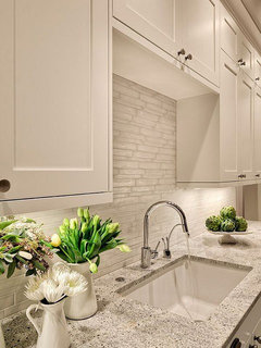
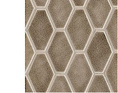
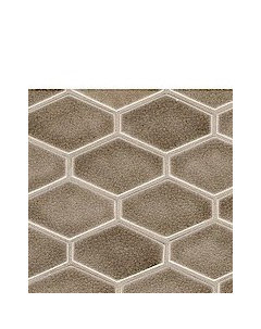
    This is Walker Zanger tile laid vertically. It would look even better laid horizontally. You can order samples from this company and they'll send several for free. Too much of taupe?


  • 9 years ago


0