

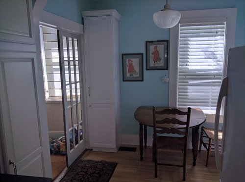
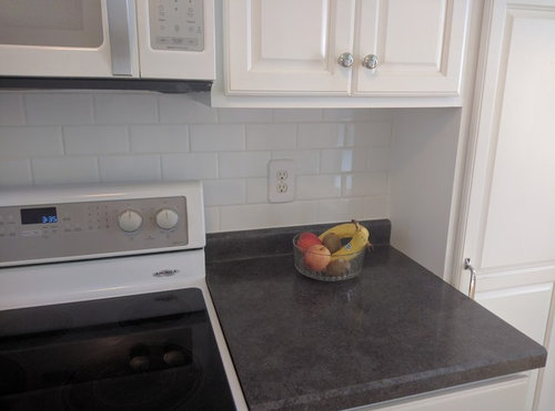
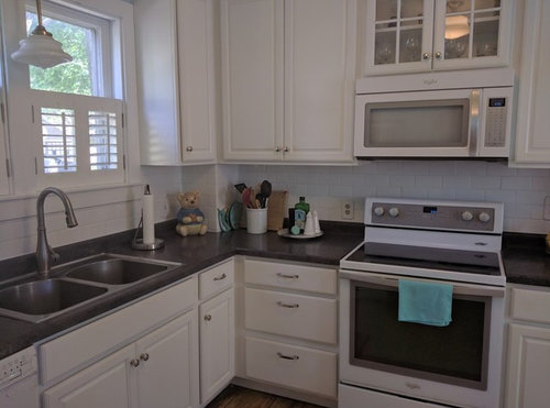
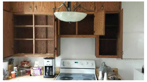
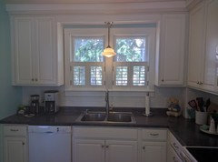
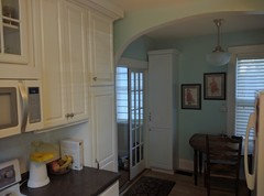
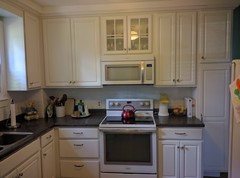
2017 update on modest kitchen reveal that started in2013
9 years ago

Featured Answer
Sort by:Oldest
Comments (19)
 9 years ago
Related Professionals
Southaven Kitchen & Bathroom Designers · Beaumont Kitchen & Bathroom Designers · San Marcos Kitchen & Bathroom Designers · Muncie Kitchen & Bathroom Designers · Lima Kitchen & Bathroom Designers · Salinas Kitchen & Bathroom Designers · Parkersburg Kitchen Remodelers · Bozeman Kitchen Remodelers · Savannah Custom Countertops · Charlotte Custom Countertops · Myrtle Beach Custom Countertops · Hartford Custom Countertops · Bloomington Custom Countertops · Lansing Custom Countertops · Queens Custom Countertops- 9 years ago
- 9 years ago
- 9 years ago
- 9 years ago




Related Stories
INSIDE HOUZZA New Houzz Survey Reveals What You Really Want in Your Kitchen
Discover what Houzzers are planning for their new kitchens and which features are falling off the design radar
Full Story
KITCHEN DESIGNStylish New Kitchen, Shoestring Budget: See the Process Start to Finish
For less than $13,000 total — and in 34 days — a hardworking family builds a kitchen to be proud of
Full Story
MY HOUZZMy Houzz: Surprise Revealed in a 1900s Duplex in Columbus
First-time homeowners tackle a major DIY hands-on remodel and uncover a key feature that changes their design plan
Full Story
HOUZZ TOURSHouzz Tour: Just Being Modest on Lake Superior
You don’t have to go all-out to have a retreat that’s all good, this Wisconsin vacation home shows
Full Story
HOMES AROUND THE WORLDMy Houzz: Modest Row House Gets a Bright, Cheery Redesign
A colorful renovation brings light and life into a simple family home in Australia
Full Story
REMODELING GUIDESHouzz Survey: Renovations Are Up in 2013
Home improvement projects are on the rise, with kitchens and baths still topping the popularity chart
Full Story
REMODELING GUIDESHouzz Tour: An Old Oregon Library Starts a New Chapter
With an addition and some renovation love, a neglected Craftsman building becomes a comfortable home and studio
Full Story
DECORATING GUIDESDecorating 101: How to Start a Decorating Project
Before you grab that first paint chip, figure out your needs, your decorating style and what to get rid of
Full Story
DECORATING GUIDES28 Design Ideas Coming to Homes Near You in 2017
Set to go big: Satin brass, voice assistants, vanity conversions, spring green and more
Full Story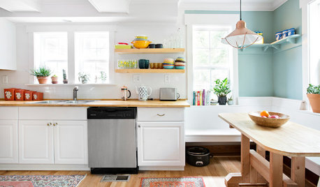
KITCHEN DESIGN11 Simple Ways to Update Your Kitchen
Check out these ideas to refresh your cooking space without going for a complete remodel
Full Story
Rita / Bring Back Sophie 4 Real