Software
Houzz Logo Print
danielle_lyn105

Something is missing here...

9 years ago
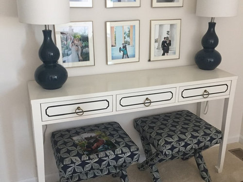
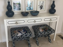
I bought this console table and stands but I feel like soemthing is missing. I've tried a tray in the middle, I've tried just books in the middle. I'm thinking about trying maybe a coral object. I've tried stuff based on looking at other photos on houzz but nothing seems right. Anyone have suggustions?


Comments (39)

  • PRO
    9 years ago
    last modified: 9 years ago

    Move the pictures up about nine inches, both rows, and hang in BOTH horizontal and vertical directions, no more than an inch apart. This will make them read as a great unit.

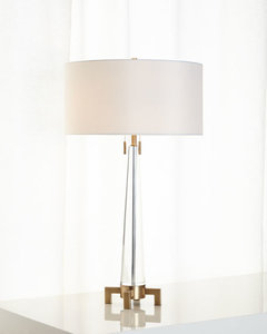
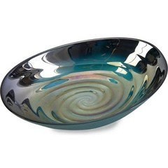
    Trade the very dark lamps for something a bit narrower, and much, much lighter in color, or even clear glass and simple. Add a great bowl in the middle.....something with some color, shape and scale......and possible lighten up the x bench with a softer color. They feel heavy for the console, but do the rest first.

  • 9 years ago

    I would agree with Jan. I would also, if in the budget, reframe with larger frames and mats. Really lovely table, and I like the lamps (plum?).

  • 9 years ago

    Thanks for the input but the lamps and stools are staying. I like the frames as I like how the brass goes with the table knobs. Also, I'm trying to use what I have.

    I can defiantly move the photos around but I'm not sure what you mean about moving them both vertical and horizontal?

    i do have a blue bowl...do I put something in it? Or leave it empty?

  • PRO
    9 years ago

    It is a nice concept you are working with but the scale is off. The items do not fit the space. Either a longer table to accommodate all picture art or use only 4. Also raise the height of the art. Best wishes!

  • 9 years ago

    I think maybe your saying just space them out more?

  • 9 years ago

    I do have the pottery bowls... I can move the photos up higher off the table. I see what your saying only and inch apart...now they're are at least three..

  • 9 years ago

    I think you can use them all as framed and would not space them further apart from each other. I would just move them up as a group so you have space below them to decorate the tabletop (short stack of books, vase, clock, etc.) without them being covered up too much. A decorative object that has some texture could nicely contrast all of the hard surfaces. Ideally, I think the fabric on the stools should be lighter in color if they will be kept there.

  • 9 years ago

    Yeah, eventually I want this space to have a thinner cabinet and a high wingback chair in the corner...but for now, i need to use what i have in the space. I can buy stuff to put on the table, not a problem but a bench or longer table is a no go. I appreciate the feedback but this is the last "project redo" for the house so I need to just spruce up what i have.

  • 9 years ago

    Thanks for the input but the lamps and stools are staying. I like the
    frames as I like how the brass goes with the table knobs.
    Unfortunately, it's missing balance among the elements, in scale, color and pattern, so something has to give. Your visual weights are awkward and there's nothing you can plop on the table that is going to help.

    • The console is lightly scaled and white.

    • The pictures are pale, with white matting and skinny frames, spaced far apart in an airy composition.

    • The lamp shades are white.

    • The wall is pale tan solid.

    • The floor is pale tan solid.

    In that pale, airy looking spot (which is rather nice on its own) you have the footstools, which are very dark and with a strong geometric pattern. Nothing else is.

    The lamps are dark, rounded and shiny. Nothing else is.

    You might be able to tie it together better by moving the pictures closer together so they have the visual weight of a single larger picture. Black frames would give you a geometric grid to counteract the stools geometric fabric.

    Putting a geometric fabric runner (picked to blend with the stools) might help.

  • 9 years ago
    last modified: 9 years ago

    Hard to suggest if you want to keep the stools, lamps and frames as is, but here goes. I don't think changing the middle accessories will make it feel any different or diminish the feeling of "something missing". Look at things with a fresh eye and you may notice the feeling of being overdone and heavy, due to the design on the drawer front, two stools, and two lamps and items being visually busy - each item is demanding attention, vs everything flowing as a cohesive vignette. Sometimes less is more. You could try removing everything, then add slowly...one lamp, one stool (or none - if you put your fingers over the stools in your photo, see what you think) and add various heights/weights in your accessory choices and as per lots of other suggestions, adjust the pictures for a more updated and balanced look.

  • PRO
    9 years ago
    last modified: 9 years ago

    I repeat........

    Move both horizontal rows of pictures up six inches to nine inches and when you do that, leave no more gap between the two rows than an inch and a half, and then move them a matching inch and a half...closer together ! They are too lightweight to be spaced and hung as you have them. and the lamps ARE too dark for your composition, sorry, but ask and you shall receive : )

  • 9 years ago

    Move the pictures very close together, add a flat bowl or tray with some color, not too much color to overpower, but enough that the space isn't bottom heavy with the dark blue. First move the pictures, see how you like it.

  • 9 years ago

    ...and tape the lamp cords to the legs.

  • 9 years ago

    I agree with most everyone else what is "off" is the scale of the things you've chosen to put together.

  • 9 years ago

    Based on your mention that everything is staying, that just leaves the option of adding and I think the only way to add to the tabletop is to move the photos up. Good luck!

  • 9 years ago

    I agree wholeheartedly with Jan and others. First, what is the purpose of those stools placed there? Could they be put somewhere else? At least try taking them out and see what you think. They are just too heavy and dark under the pretty console and are ruining what you are trying to accomplish design-wise

    Secondly the pictures have to go up and much closer together if you are going to use all 6. The pictures (either 4 or 6) belong in the middle of the console, not stretched so wide and low. Then one pretty bowl in the middle of the console with the lamps. That's all, less is more.

  • 9 years ago

    I also agree about the stools. They don't go with the arrangement and therefore have no purpose. You wouldn't pull them out and sit on them at the console, would you?

    They look like they're shoved under the table, just while you vacuum the rug or something.

  • 9 years ago

    Seems like the lamps and stands go together, no need to replace. I do agree the art could be grouped closer together and shifted up.

    OP: what do you DO at this table? That could guide your direction for what it might need.

  • 9 years ago
    last modified: 9 years ago

    I think you have a great start. I agree with hanging the pics higher (the whole grouping) and also bringing them a bit closer together so there is less space between them. You may be able to leave the top row where it is and just move the bottom one up, then all the pics moved closer together, left and right.

    The suggestion for black frames is good, but I understand what you're saying about wanting the brass. Would you consider buying just one black frame (that you could try and then return) to see how that looks? If you think it will improve the grouping, then consider painting the brass ones black and you could easily paint the pulls black to match. I think that would bring the stools and lamps together nicely. Then think about whether you need something on the tabletop in the middle or not and try some different things there.

    Be sure and post pics! Oh, and try using templates taped to the wall to get the best placement for your pics before you start nailing holes. If you post pics of the process, we can help tweak it with you.

    eta: I was looking again at your arrangement and wondering if you'd consider painting the table? You said you want to eventually replace it, so maybe that would work? If it were a color pulled from your stools, they might be more cohesive looking together. Not as dark as your lamps, but maybe a med gray?

  • 9 years ago

    Do you have room to put the stools on either side of the table?

  • 9 years ago

    I would suggest, as others have, moving the pictures higher and closer together. I think this whole arrangement is a little too "matchy-matchy" and symmetrical. Try it with just one lamp on the right side, and two other shorter elements on the right side of the console table. These would need to be fairly heavy visually to balance the visual weight of the lamp.

  • 9 years ago
    last modified: 9 years ago

    I would get rid of the stools. Far too heavy looking for the delicate table. I would also remove the lamp on the left keeping just the one on the right. Odd number of items are more interesting.

  • 9 years ago

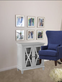
    So ive decided to just do my original plan for the space earlier.... I want a wingback chair and some sort of cabinet next to it.
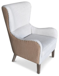
    Something close to this:

    Elle Decor Mid-Century Wingback Accent Chair in Beige · More Info


    And no idea about a table yet but something slimmer

  • 9 years ago

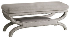
    Or just a bench below the photos? Something like this:


    Coaster Furniture Arcatia Bedroom Bench - 500004 · More Info

  • 9 years ago
  • 9 years ago

  • PRO
    9 years ago
    last modified: 9 years ago

    You have been given the best options ! Simply trade the x benches for inexpensive cubes! , move the art......tighten it up and raise it up. Find another purpose for those dark lamps/benches and select something lighter. There's nothing wrong with the table. It's a great place to tuck pull up seating, and provide warm light

    Two and two, and just for example of relating a softer colored vignette. I can see above.....no. The pictures still need to move. And before you buy anything..... you need to know the function of that space. Seating, light, ? etc.

  • PRO
    9 years ago

    You really need to move these pictures far closer together and move the entire group up higher. Yes, I agree that black frames would look better but understand your desire to leave them as they are. I am NOT bothered by the pair of stools under the table! I assume they are pulled out and used when extra seating is required - that they are not purely decorative. Get this right and then think about the wing chair. You may not need it.

  • 9 years ago

    Decided to go another direction, so no need to comment more. Thanks all.

  • 9 years ago

    It might also help to know which room in the house this area is in (living room, den, entry hall/foyer), as well as what/how the room and the area in the room are used for.

    Will this area actually be used or are you just trying to fill up a space you consider empty? And in either case, are you able to "shop" your home first before buying anything new?

  • PRO
    9 years ago

    Uh......... I believe the op didn't like any answers..... she has left the building! All further shall fall on deaf ears as mom used to say : )

  • 9 years ago

    Although I'm not a big fan of two tone furniture, I love the shape of the first wingback chair you posted. Good luck with that area.

  • 9 years ago

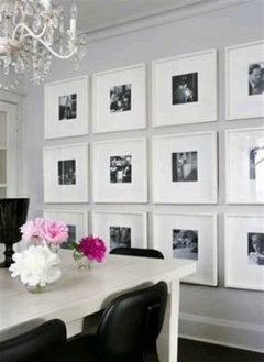
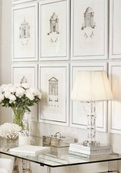
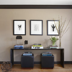
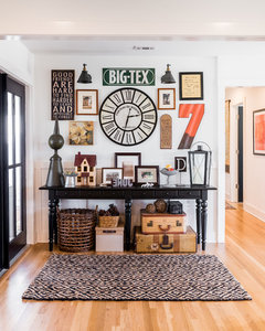
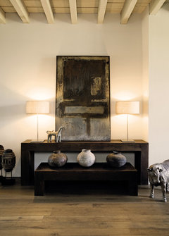
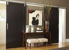
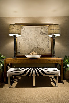
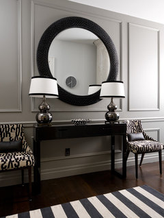
    Check out these examples below. You either go all in on the wall hangings as in #2 or go for simple and larger scale as in other pictures.


    Living Room · More Info


    Old Town Remodel · More Info


    The Inspired Home - book · More Info


    Mill Valley, CA · More Info

    Architectural and Interior Photography · More Info

    King West Bachelor Suite · More Info

  • 9 years ago

    it looks like the OP has left the thread. She commented above:

    "Decided to go another direction, so no need to comment more. Thanks all"

  • 9 years ago
    last modified: 9 years ago

    Why are two of the pictures the same? The top row has the girl (smelling flowers maybe?) twice.

    I remember right out of high school visiting friends who just had their kids pictures done at Sears. They had the same photo displayed in various sizes all over the room. It reminds me of this.

  • 9 years ago
    last modified: 9 years ago

    Dee, the op has left the thread. My guess is the pics are the ones that came with the frames and she was just getting the placement right before putting all her own pics in the frames. (you can see more unframed pics on the stools).

  • 9 years ago

    That makes sense, Olychick. I thought those were OP's wedding pictures! Ha!

  • 9 years ago

    Well thanks to everyone's input anyways cause I enjoy reading the suggestions and learning from examples (great input above!)