Software
Houzz Logo Print
ang183

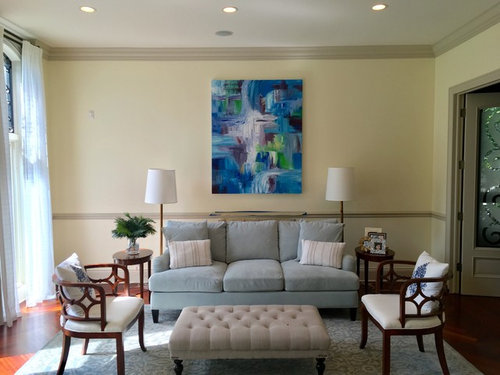
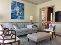
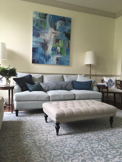
Help make this room cohesive

8 years ago
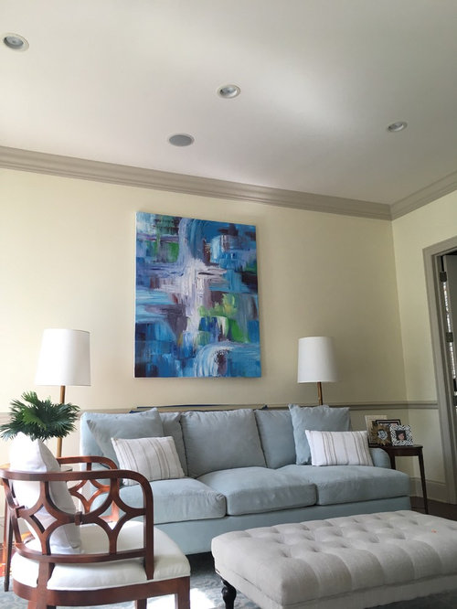
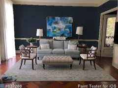
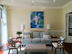
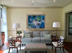
So how do we make this room work? Change wall color, toss the painting, adjust the painting? Our ottoman is temporary and necessary given the age/safety of our children/guests.

Comments (64)

  • PRO
    8 years ago
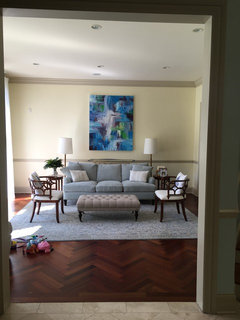
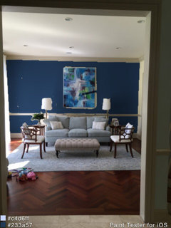
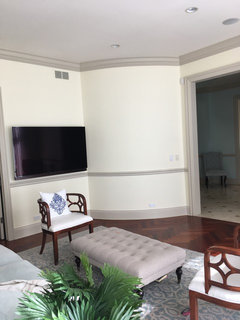
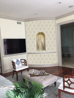
    Here's a wider shot of the room (pardon the toys)
  • PRO
    8 years ago
    The rug cannot go bigger bc there is a curved wall on the right (which you can't see) and it cuts into the room, so cannot accommodate larger rug size without making the rug less wide (therefore about as wide as the sofa).
  • 8 years ago

    Quick comment that darkish floor matters [only a photo].... but wishing sofa was wider, and a bit vibrant [with art]....?

  • 8 years ago

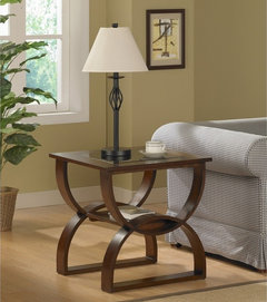
    Change wall color, add larger end tables and more substantial lamps.:))

    24 Inch End Tables - Foter · More Info


  • 8 years ago


    Shamelessly picking up on some of the suggestions above. I agree that the side tables should be bigger and I think they should be small cabinets to add weight and help anchor that wall. No, it doesn't matter at all that they will extend beyond the rug, in fact I think that would be good in that it looks less regimented. Add some touches of colour -- in particular, I think new lampshades could help a lot -- and loosen the look a bit by placing the throw pillows more casually. I like the little splash of yellow with the blue/green/gray.

  • PRO
    8 years ago
    Thank you, Rina! I will def reconsider the end tables with that thought.

    To Rina & the group...
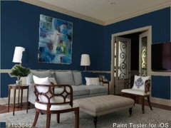
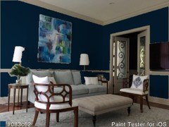
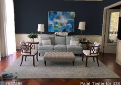
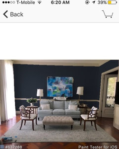
    What if we tried a deeper wall color?
  • PRO
    8 years ago
    End table question. I remembered why we got smaller end tables...didn't want to encumber the walkway towards the office. Do we still entertain larger end tables?
  • 8 years ago

    Yes!

  • 8 years ago

    That was for the dark walls -- but I also think yes would also be my answer for the bigger end tables. Round? Barrel shape, perhaps?

  • PRO
    8 years ago
    End tables could def could use more weight. I'm still unsure about width, but your sample pics look great.
    And maybe we go deeper navy walls?
  • 8 years ago

    WOW! Love that wall color!

    Agree with everybody that the side tables should be changed. Don't let hubs touch/move out the chairs, lol, they are one of the more interesting pieces in the room (the shape is great with the sofa and the wood backs add pattern and texture). Overall the room feels flat so you need pattern and texture if not dabs of stronger color (even black and white is color).

    You could replace the rug but definitely replace the sofa pillows first and that's cheaper.

    Re: choosing colors for pillows, lamp shades, rug, etc.: It sounds like until you decide on the painting you may be chasing in circles as far as colors go. I like to start a room with an idea of a palette—at least two main colors (with varying hues of them) and a pop of contrasting color (for small details threaded throughout). Black and white or charcoal and white qualify as colors, too. For ideas regarding palettes I look at a piece of art (on Houzz maybe) or fabric (fabric with some pattern/different colors). Even if I don't use the art or the fabric in the room, fabric designers and artists are great at putting together colors that look well together so that is a jumping off point for the room. Go to textile/fabric websites like Duralee or Robert Allen for swatches of fabrics.

    I'm saying all this because to start, you said you want a *cohesive* room which means to me that you want the room to look polished and pulled together. You have the big anchor pieces already that are not changing—sofa, chairs and coffee table thing. You'll polish and pull together the room with the finishes—the colors, textures, repeating patterns and shapes, also the actual art, lighting, smaller furniture, rug, and the wall color (should be last).

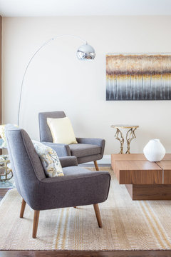
    For example, look at the picture from everdebs: The gray room looks polished and cohesive because the color scheme is not too busy with two dominant colors (gray and tan) and a few contrasting colors (black/brown wood and a reddish color in the painting) woven throughout the space. The circles in the painting (pattern) are repeated in the circular pillows on the sofa and in the lamp base, The rectangular shape of the large painting is mirrored in the small rectangular prints on the other wall and in the shape of the loveseat and ottomans (the eye moves around with these shapes and back again). The black of the lampshade is from dashes of black in the painting and black is again in the furniture. A bit of texture is seen in the metal lamp base and metal bases on the ottomans. More texture could be added imo to avoid flatness. With a subtle, subdued color palette, texture and pattern become even more important.

    HTH : ). You have a GREAT start—this room could be FAB!

  • 8 years ago
    Turn the painting horizontally and paint walls (including chairs rails and trim) a very pale grey with blue tone. Put a tray with decorative things on the ottoman for a pop of color and texture. Change pillows.You're done.
  • 8 years ago

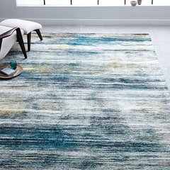
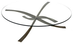
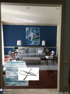
    Love the darker walls! I think the rug you have now goes well with the furnishings, there's nothing to tie the art into the room. I agree with turning the art. I think you need more navy in the rug, and maybe a round coffee table, then throw pillows to pull it together.

    Verve Rug | west elm · More Info


    The Josef Coffee Table - Contemporary Traditional Transitional Mid-Century / Mod · More Info

    .............. - Polyvore · More Info

  • PRO
    8 years ago
    Awesome! Thanks Kurln. I flipped the pic, def looks better. Just need to get it on the wall.
  • PRO
    8 years ago
    Photo flipped.
    It needs to go a little higher, but I just propped it up for reference. Elevated right lamp to see if that looked any better.
  • 8 years ago
    The lamps are rather insubstantial. Get rid of the chair rail. Look for a wall colour that is more complimentary to the soft colour of the sofa.
  • 8 years ago
    A larger horizontal art piece would probably look better.
  • 8 years ago

    Oddly enough, I prefer the painting hung vertically -- horizontally it seems to press down too much, and the vertical position is visually unexpected and gives the room a more individual character. But that is just by way of a personal reaction. I'm fascinated by the fact that in either position, it suggests waterfalls. So cool.

  • 8 years ago

    I do too [with Rina] - vertically -

    paint probably not navy and a little more whitened.... the chairs! yes to them. They strike me in organic way, because of your art..

  • PRO
    8 years ago
    last modified: 8 years ago

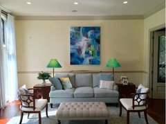
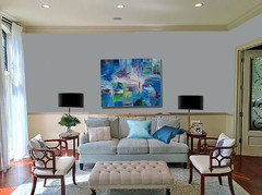
    Your lamps are too close to sofa. I painted wall in light blue/gray , got a new bigger lamp drum shades and added pillows.

  • PRO
    8 years ago
    last modified: 8 years ago

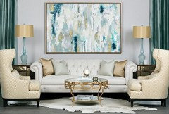
    A little bit glam :-))

  • 8 years ago

    Oh, that's pretty, Celerygirl.

  • 8 years ago

    I think everything's fine except I'd paint all the woodwork white:


  • 8 years ago
    The painting is abstract turn it horizontal. Use colours from painting for cushions and rug. It's ok if back legs of end tables off rug. Do the same with sofa. These are some ideas. I often turn abstract painting around to beat suit the place.
  • 8 years ago

    Do you have a console table behind the sofa for some reason? If you remove it, I think you'd have space for larger end table by the office door.

    Love the navy walls!

  • PRO
    8 years ago
    Thanks, jansgirl! We don't have anything behind sofa (I just pulled it in bc recently finished painting, and have painters tape on chair rail). In other pic where painting is horizontal I placed the painting on a bookcase just to get a visual reference. Sofa can def go back more.
  • 8 years ago
    last modified: 8 years ago

    Bigger lamp shades ..moved away from the sofa.

    Picture re-orientated - framed would be nice...something simple like weathered wood.

    Pillows pulling colors from the image.

    A good weight nonsymmetrical item such as a vase or old phonograph or small bench with a few books under the window.

  • 8 years ago
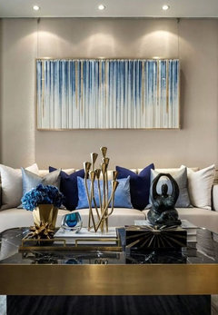
    Maybe I'm the only one that doesn't agree but I don't love the painting in this room. Your room is decorated so delicately and dainty and I think the painting is too harsh. I think you need a painting there but I think more muted than what you have..I attached some photos. Also lighten the walls and paint the chair rail same light color as walls. I don't think you should go darker with the walls. You can also widen the room a little by spreading out the lamps and angling the chairs towards the direction your taking the photo in...and not closing it off so much.
  • 8 years ago
    last modified: 8 years ago

    I agree that a painting with more washed tones would look better in this room...but this is what the poster has and our challenge is to make it work not have her invest a fortune.

    Art is so subjective 1 million images would work in this room - Calla Lily on Grey, 1928 - Georgia O'Keeffe comes to mind.


  • 8 years ago

    I have to disagree. I like the painting. It has energy without going overboard, and so creates a strong focus point for the room. I wouldn't change it.

  • 8 years ago
    last modified: 8 years ago

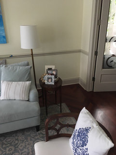
    Posts about trim - you said expensive: in person, it is very muted creamy-putty colored -- it might not be ideal with the bright blues.... grover said paint them...?

  • 8 years ago
    Hi, nice room. Try hanging painting lengthwise...have someone hold it, then take a look...you need something oblong above couch, and bigger side tables with lamps. The floor lamps are not to scale. Maybe pull a color from painting with new lamps, accent pillows, and painted tray on ottoman. Good Luck!
  • PRO
    8 years ago
    Thank you to all for your amazing and helpful comments.

    So the painting is really the trouble-maker here. I will try to make a wider, softer painting. If hubs still prefers the original, I think I will soften the original (to someone's point the bright blue clashes with taupe). See in photos below, i muted the darker purples and blues a bit, just quickly on a cheap app for visual reference.
    In person it doesn't look that bad.

    Per your suggestions, will get larger lamp shades, pillows to tie colors in, and visually heavier end tables. I still prefer the picture vertical so will hang it a tad lower. horizontal just looks stale and too department store for me.

    The wall colors are tricky bc I either have to go darker or stick to warm tones (the trim which I cannot change bc it connects to all trim in the house) has a green tint to it (anything cool colored makes the trim look dirty and dingy). It's the most impossible trim color to work with, and I curse the builders all the time for it. It's called "greenbriar beige", so note to all, don't paint your house with it
  • 8 years ago

    Ang I love what you did muting the colors in the painting....it makes such a huge difference!! I think you should definitely look into that...I think it was the dark purples that were really throwing it off for me at least....again, its such a beautiful room!!!!

  • 8 years ago

    Does the trim have to be the same throughout the house?


  • PRO
    8 years ago
    I don't know where there would be a good place to start the new trim color bc it connects to all the rooms, with doors up to the second floor through main level and into the basement.
  • 8 years ago

    I love quilted wallpaper.


  • 8 years ago

    It is an interesting curve.

  • PRO
    8 years ago

    Have you tried turning the artwork horizontally at all? It looks like that might help a bit.

    Leeward Renovation · More Info


    Luxury Lorne Park Reno · More Info

  • 8 years ago
    I would repaint the room and hang the painting the other way ( horizontally). Paint either light grey or darker as you suggested but both paints are really hard to find the right colour it's worth couple hundred dollars to get colour consultant and get it right.
  • 8 years ago
    Maybe Im crazy, but to me that painting is of a water feature in a formal garden, with the water flowing down over a series of small pools. I don't see how it can be turned sideways and still make sense.
  • PRO
    8 years ago
    Thank you, Nicola and oskuee.
    The orientation idea was explored in the course of this thread. Here's a picture for reference.

    "Photo flipped.
    It needs to go a little higher, but I just propped it up for reference. Elevated right lamp to see if that looked any better."
  • 8 years ago
    I personally like the painting and your sofa style/colour, but at the moment the scale of everything seems a bit off, with everything sized for a smaller area and a lot of empty space in the upper portion of the room. I agree that a horizontal painting might assist, but have you considered flanking both sides of the room with built-in bookshelves? This would create balance and reduce the blank space around your painting. Your furnishings are cooler in tone so I would go with a cooler paint colour. I don't think the chair rail contributes to the room but that's a person taste issue. If you like the chair rail, then keep it. If you don't like it but removing it would create other issues, try painting it the same colour as your wall so it disappears into the space.
  • PRO
    8 years ago
    Thank you, sdh, these are helpful comments and ideas. The room flows into a library (with built in bookshelves), so not sure we should repeat? But that sounds like a great idea. I can't go cooler tones on the wall, or it makes the trim look dirty, unfortunately. I need to either go with dark, warm pastel or dead, darker ashy colors. Would def consider painting the chair rail.
  • 8 years ago
    I have 11 foot ceilings so I know the lamp problem. But I think yours don't work - something about the size and shape of the shades in that location.

    Things to consider are wall sconces, wall lamps or - and I know this is odd - putting your lamps onto a table or shelf to raise their height. I have done that with minimalist, modern floor lamps and the height is perfect. Perhaps I'll install wall lamps the next time I paint, but my lamps are expensive, so maybe not.
  • 8 years ago
    A frame makes a painting look "finished". I'd start there. The furniture and placement looks very good. Paint the chair rail so it doesn't divide the wall into upper and lower areas. You may want to change the wall color to coordinate with your furnishings better, even if the new color is a white.
  • 8 years ago
    I think your room is just this close to being terrific. I agree with previous posters that the end tables need more heft. After that though, I would only change the paint color to a deep blue if himself would go for it, or a warm toasty color if he won't, and add some smashing pillows. Done!
  • 8 years ago

    We had this one huge wall at one time and I agonized over how to "fill it up". Once we painted it a noticeable color....I no longer felt like it looked empty.

  • 8 years ago

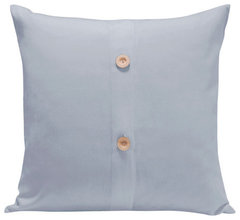
    Live Good's organic blue solid pillow would accent the blue you have in the room already.


    Organic Solid Decorative Cotton Pillow, Stone Blue · More Info

  • PRO
    8 years ago
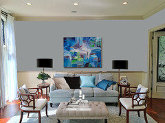
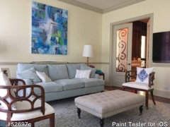
    Found some pillows, this helps, I think. Thanks for all your tips! Work in progress.
Sponsored
Wannemacher Interiors
Average rating: 5 out of 5 stars26 Reviews
Customized Award-Winning Interior Design Solutions in Franklin Cnty OH