Software
Houzz Logo Print
gramanv

Very Urgent : Kitchen Backsplash

8 years ago
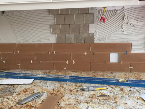
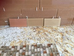
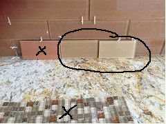
Hi all, greatly appreciate your opinion on the backsplash choice in the attached. Tile guy is putting it but now not sure if its too dark. Have him on hold.

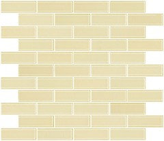
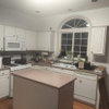
The one above is another choice. Or we cancel the whole thing and explore more options.


Comments (26)

  • 8 years ago

    In my opinion the lower is going up too dark, and I don't think the top works,either. I think you are looking in the right direction with some color rather than white, but these are too intense, in my opinion.

  • 8 years ago
    last modified: 8 years ago

    I agree with palimpest. Neither look good with that beautiful stone. I think cream subway. That stone is fabulous.

  • 8 years ago

    I takes away from your stone. I agree on cream subways.

  • PRO
    8 years ago

    Neither options are great. You need a more subtle color so that the stone is the star.

  • 8 years ago

    The upper tiles are closer to what you are looking for but not quite. This will take some time. Tell tile installer to come back after you have found the one.

    The granite is the star. Back splash is in a supporting role. A light gold that matches a light color in the granite (which is lovely by the way).

    https://www.susanjablon.com/1x3-inch-medium-gold-metallic-glass-subway-tile.html


  • 8 years ago

    Thank you all for your responses. I started with cream but then the whole kitchen and the open great room is all mostly cream (even with the granite) so wanted to get some contrast with the backsplash. If I have to go the contrast route without completely ruining it, what would you suggest. here are few more options at the bottom row. The first one is a lot of color but its that peel and stick metal type so gets a lot of shine which does not show in the picture.

  • 8 years ago
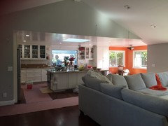
    Can you post pictures of the entire space so we know what else is happening?
  • 8 years ago

    Here is one with the whole great room. Sorry its messy as the work is going on. The great room wall is a very light gray and the sofa is cream/gray. both appearing too gray in the picture than it actually is. hopefully you can see the theme I'm trying to get - cream/orange.

  • PRO
    8 years ago

    Your granite is beautiful and has a lot of "movement". Keep your orange accents in the adjoining spaces and just add dashes of accents in the kitchen. A porcelain orange tea kettle for example. Take those tile down and go neutral on the backsplash. Try a bone/beveled subway tile. It will provide some "reflective" quality but not introduce another color and confuse the eye.

  • 8 years ago

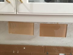
    Can we see the two lighter tiles with the counter and the cabinets? Maybe tape them against the lower cabs under the counter to get a better idea how they will look with both.

    Please no mosaic.

  • PRO
    8 years ago

    Once your kitchen gets finished, then restyle all the cabinets with glass fronts, and here is another opportunity to add some color, without too much visual impact. Everything behind glass needs to be organized, set up in attractive "views" to make the glass cabinets make the statement they should.

  • 8 years ago

    No to both choices. Loud counter does not mix with either of them. Go soft - ivory or white. NO to little tiles - that is a complete clash.

  • PRO
    8 years ago

    None of those choices is going to enhance your kitchen. You really must go neutral with your granite. A color is going to be way too much and in a week you will not like it. Think of it as "jewelry" with a printed dress. You have to keep the jewelry simple to not distract from a lovely printed dress. If you had a beige dress, then you could do amber jewelry with gold accents, etc. Can you see what I mean.

  • 8 years ago
    last modified: 8 years ago

    I like it ok - but merely from a photo - I'll tell you why: I like the peanut butter color, which with white, grey walls, wood flooring is ok.

    But - IF that color is in the counter - is it?

  • 8 years ago

    Rawket Grl , here is a picture with the lighter subways with the cabinet. the closeup makes it a bit darker - the original picture I posted of them is truer to how it is in person.

  • 8 years ago
    Go way lighter. Cream subway tile.
  • 8 years ago

    I am not feeling the 2 new ones but it is hard to tell from here, and without being able to see the tile at the same time as the granite and the cabinets without the other tiles muddying up the works.

  • 8 years ago
    Subway tile, or one with similar proportions, in a simple layout (stacked, running bond, 1/3 offset, not herringbone for instance)
    Cool cream, or slightly warm, light grey would work best
  • 8 years ago
    last modified: 8 years ago

    .. to tell the truth, maybe that hue, but the lighter ones ...

  • 8 years ago

    Agree with going lighter and neutral. Not liking those flesh colors.

  • 8 years ago
    I agree that you need white or cream. I don't know what your floors look like but between the granite and the orange walls in the other room there's a lot going on. I love the jewelry example someone else have. Also, remember that accents are simply accents - they are not the primary colors in the space. The point of an accent color is to brighten up the space / add some interest. You don't need to hit them over the head to get the point across, just add the orange in small doses and you'll get the pop you are looking for. It's going to be great in the end! (I love the bright orange walls, they look so happy but if you do orange everywhere it will no longer be the accent color, it will be the main color and I don't think that's what you want)
  • 8 years ago

    I'd try a pale silver glass subway the same size as the lower ones in your first picture.

  • PRO
    8 years ago

    I just hope the tile guy gets paid for the indecision that's not his fault.

  • 8 years ago

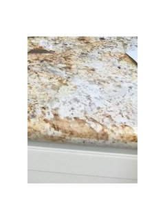
    Can you take a close up of the granite?

  • PRO
    8 years ago

    None of the choices they have too much orange. Go with a beige or cream.