Software
Houzz Logo Print
parker_murphy65

I need help with my kitchen!!

8 years ago
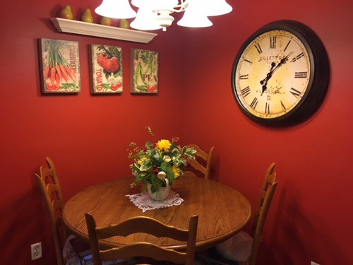
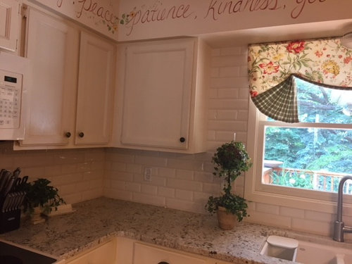
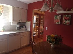
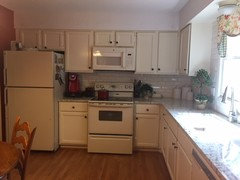
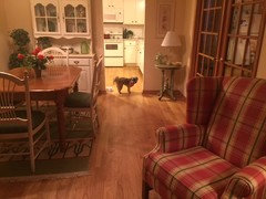
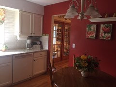
I just got new granite- snowfall- and white subway tile. Now I am wondering what color to paint walls. The kitchen is visible from the living room area. I am also wondering what to put on walls. And new light fixture? New window treatment? Ideas welcome!! Thank you.


Comments (50)

  • 8 years ago

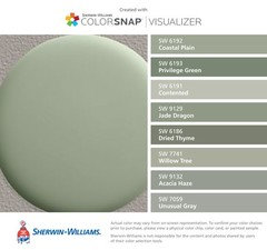
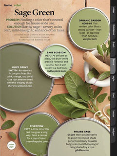
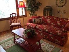
    You might bring the sage greens from the LR into the kitchen. The window treatment is dated, so you might consider a shutter. I'm not a fan of words, but that may be to your taste. They are a bit 80's looking to me.

    PARKER MURPHY thanked decoenthusiaste
  • 8 years ago
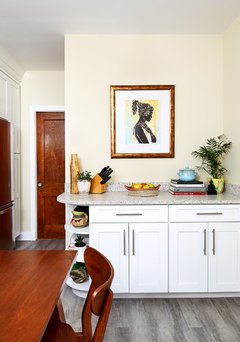
    I agree that light sage green could work well for the kitchen walls.

    PARKER MURPHY thanked Elle
  • 8 years ago
    very nice looking kitchen,, since it's really not visible, you can have a diff color. anyway you could snap a pic in the doorway to show the entire kitchen?

    i have to agree about the words painted on the soffit and the valance. did you plan on keeping those?

    if you want to replace the red wall, someone mentioned sage. that would work w/your chair and rug. (and the kitchen as well)

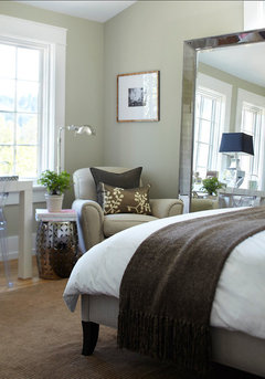
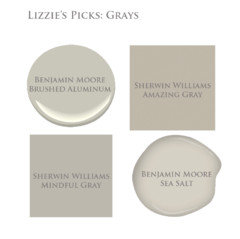
    if you want to try silvery sage tones:

    November Rain

    or

    PARKER MURPHY thanked Beth H. :
  • 8 years ago
    last modified: 8 years ago
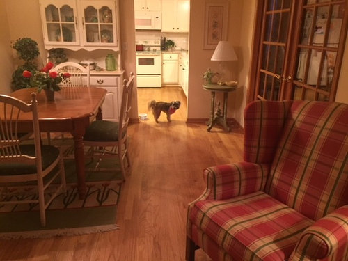
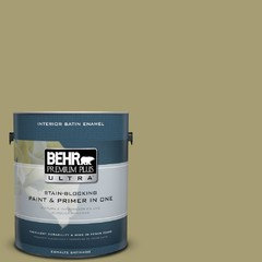
    I am getting rid of words. :( I love them but know it is outdated! Also I have been told to get rid of my curtains. I loved them too! I need to change that's why I need help. I was leaning towards green. I found one by Behr called Fresh olive. Here are a couple more pictures of the kitchen. Thanks for you help.

  • 8 years ago
    last modified: 8 years ago
    Gracie,,she's the one that asked for help. obviously some things have to go if she's asking for updates. If she was happy with everything, she wouldn't write in asking for help ;)

    Parker,,that Fresh Olive may be a bit too yellow/tan green?

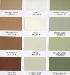
    what do you think of something more sage looking? Maybe Spanish Moss or Fennel?

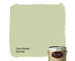
    Olive Martini?

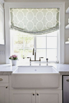
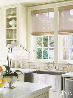
    do you really need a curtain there for privacy? what do you think about roman blind or woven wood shade?

    PARKER MURPHY thanked Beth H. :
  • 8 years ago
    last modified: 8 years ago
    You are right Beth. I asked for help and know I need to change. Friends told me the exact same things Houzz friends told me. Ditch the words and the curtains. They also said my light fixtures. Now I just need to figure out what to do. The one thing I noticed about paint chips is that they don't look the same in person as they do on the computer. I don't like Fresh Olive either when I see it on the computer but I like my paint chip. The only reason I hesitate on the green is I am worried I might have too much green? Both my rugs in the living and dining room are green. I like the possibility of woven shades?

  • 8 years ago

    Shoot, I like your cottage-y curtains and think they suit the whole vibe of your house perfectly. How much change are you planning to make? If the furniture and rugs are staying, keep the curtains too is my opinion. But I freely admit that I love chintz, gingham, plaid in any combo.

    A note on paint: every monitor and screen is different, and the paint in the can might vary from the chip. Sampling on foam core board is a must for accuracy. I think you should be looking more to the lighter, fresher greens suggested by Beth H. If you go with the deeper olive there won't be much change in your space.
    PARKER MURPHY thanked miss lindsey (She/Her)
  • 8 years ago
    you have more red than green. I'd do a very light sage.almost a creamy sage,,nothing too gray or cold looking,,if that makes sense.

    the other advice,,,all that red furniture. what do you think about painting your chair and coffee table a cream color? a little lighter cream than your dining chairs. You just have so much red, I'm afraid if you w/green it's going to look like Xmas. maybe you could bring in a warm wood coffee table or a cream ottoman? new lampshades or lamps would work too.

    otherwise, just confine this sage color to the kitchen first to see how it looks to you.


    PARKER MURPHY thanked Beth H. :
  • 8 years ago

    Oh, and I can never have too much green, personally. Pretty much I would happily move into your house as-is lol.

    But I do look forward to seeing how you update it to *your* liking :)

    PARKER MURPHY thanked miss lindsey (She/Her)
  • 8 years ago

    Parker, Your new counters and backsplash look so light and airy. I would concentrate on finding paint for the accent walls that continue the light airy feeling. I'm never a fan of accent walls and think it would look great to paint your kitchen all one color if you are ready to part with the painted words.

    I agree that a silvery sage blue would be lovely. It would look pretty from the other rooms but not be so matchy-matchy. I'm a fan of SW sea salt. I agree that you should steer away from olives and greens with a yellow base. I also really love the brightness of your kitchen as contrasted to your living room/ dining area and would consider painting the kitchen in all cream. Some think that is boring, but I love cream.

    So as not to overwhelm yourself and to keep this kitchen really the way you want it to be, if you are going to paint only two accent walls, I would do this in stages:

    1. Paint the accent walls first. Once you do that, you may be in love with the fresh new look of your kitchen and feel that the painted words and curtain look great with the new color.

    2. If you still want more change, paint over the words and/or take down the curtain. (I love the curtain fabric. I wonder if people have a problem with it being a dated style of valance? I don't. You could probably turn the fabric into a more contemporary looking valence if you want.)

    3. The table corner looks very heavy to me. After the walls are painted consider whether that wall art is right for the space.

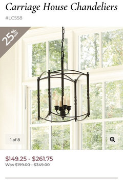
    4. I'd replace the chandelier with something a little less heavy - not as many arms, more clear glass.

    Go slowly and make sure what you come up with is really you and what you love!

    PARKER MURPHY thanked Kendrah
  • 8 years ago

    Thank you Lindsey for your compliments. I agree- you can never have too much chintz, gingham and plaid. My house has always made me happy so I have hesitated to change but am willing to make some.

    Thank you Beth for your insights. I could maybe like Spanish Moss? I am not a light light green person but I agree that maybe I shouldn't be so saturated like I was with the red. I will bring up a brown table tomorrow and see what that looks like. I understand what you mean about the red table. I do you look darn good at Christmas!

  • 8 years ago

    I would prime you red walls before you do any paint sampling. The red cast in the room is going to make everything look off. Once it is primed, paint 14 x 14 inch squares of the different color samples on both accent walls, making sure that one set of squares is painted within a site line from the living room. Live with those samples for a few days so you can view them from near and far away in the living room. Also view them a many different times of day so you can see how they change color.

    Yep, samples look different on monitors and chips. But they also look really different on chips vs 14x14 patches.

    PARKER MURPHY thanked Kendrah
  • 8 years ago

    Do you like yellow? A cream verging on yellow would also be pretty.

    PARKER MURPHY thanked miss lindsey (She/Her)
  • 8 years ago

    I thought about yellow- but quickly because I didn't know what I would do with those two big walls . I would need something really cool to make a statement.

  • 8 years ago

    Artwork, an open shelf with pretty pottery, a chalkboard for your honey-do list.

    PARKER MURPHY thanked miss lindsey (She/Her)
  • 8 years ago

    You can also check out all-over wall stencils. It would suit you I think.

    PARKER MURPHY thanked miss lindsey (She/Her)
  • 8 years ago

    Yes to cream verging on yellow.

    Parker, do you have an aversion to empty space? Those walls are not all that huge. You don't need a lot of optics there. Your tiles and countertops are really the show stopper in the room and you needn't go overboard. Pull the table out from the wall a bit, hang a more eye catching chandelier, and I have not doubt it won't take you too long to find something to put on those walls. The clock might still look great. I think the shelf lowered with some interesting glass bottles would be nice too.

    PARKER MURPHY thanked Kendrah
  • 8 years ago

    I love the look you have achieved thru out the downstairs. It is all different, but combines very nicely.

    Frankly, I like the window treatment in the kitchen. I think it is true to the rest of the decor downstairs.

    I think I would lean more towards Beth's first choices and I think the SW Sea Salt may be a nice light but green tone paint that would look nice.

    I would also think about a nice light butter cream yellow. Your cabinets appear to have a creamy tone to them in the pictures you are showing. It may be the lighting. Hard to tell, but a very light cream, might look nice.

    Beth is much better at this!!

    Also, look at your dining area. You have a very nice green accent table with a lamp on it. Your chair cushions are green. Maybe a very light green on the walls will keep the kitchen light and airy and still pull colors from the dining area.

    PARKER MURPHY thanked Kathi Steele
  • 8 years ago

    Pretty kitchen! Check out Smith and Noble for window treatments-- they have some roman shades that would look gorgeous in your kitchen (you can use their website for ideas, at least). I would go with a WARM NEUTRAL on the walls because your living room and wood furniture have warm tones. For a light fixture, consider something "open" with no glass globes and the bulbs facing upward. Sharing Sherwin Williams colors and Ballard Design light fixture

    PARKER MURPHY thanked mom2hsm
  • 8 years ago

    Thank you Kendrah for all your ideas. I really do like my valance. Maybe I can keep it depending what happens. My husband already primed over the words so that is a done deal. I am going to really have to think about creamy yellow. I will check out SW Sea Salt. I wasn't going to keep the wall art in the corner. I am open to anything. I had thought about white/cream chairs to lighten the kitchen but if I am going to have light walls maybe not. Off to bed for me..............


  • 8 years ago
    last modified: 8 years ago

    Still thinking of creamy yellow vs sage/green . The reason I originally leaned towards green was it does "more" for the granite. I was going to maybe accent with some orange/tangerine tones. Woven shades would look good with that?The yellow seems like it would do nothing for the warm tones of the granite. I am going to go pick up paint samples today and see how they look.

  • 8 years ago

    Take a look at gray mirage, it's clean, light and pretty. I think I'd thin out accessories and take away all fake greenery. You'd still have a cottage feel but maybe introduce some cleaner lines in your lighting.

    PARKER MURPHY thanked tfitz1006
  • 8 years ago
    I also think your house is super cute and flows well. I like your dated valance and words, so if you like them, keep them! I’m a big proponent of if you like it and it works, then don’t worry about the trends.

    If you’re looking at color, I do think the sage in the kitchen would be best overall, because it still matches a lot of your decor. Prime the wall and get samples from the store, put them up and live with them for a couple of weeks and decide what you like then.
    PARKER MURPHY thanked Laurie Hutch
  • 8 years ago

    Thank you lhutch13. I am leaning to the green and keeping the curtains. Today I go shopping for paint. Pictures to come.


  • 8 years ago

    I had roses stenciled on my soffit for many years and had to paint over them because the kitchen needed painting - and I had decided it was time for them to go - but I wanted something pretty up on the soffit. At the same time I walked into an antique store that had lots of old china - very inexpensive, so I bought some and tried the china plates. It is not an "updated" look, but I was trying for vintage anyway. However, there are many types of plates - Anthropologie, southwestern, modern - whatever you like.

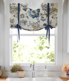
    Your valance looks a a bit like a tie up shade and I still see those frequently. I recently made a faux roman shade for my kitchen - but used a floral fabric. I like color and a cottage vibe. I do not want my kitchen to look like a generic kitchen so I appreciate your going with your own style.

    This is my kitchen. My older valance was the same fabric, but gathered - still not sure I like this better:

    https://www.houzz.com/photos/my-pics-work-in-progress-phvw-vp~110720042

    This is a tie-up shade - I still see these, and yours is very close. I am not sure it is as "dated" as some have said. It suits the style of your kitchen. Add a matching green tie and your valance becomes a tie up shade:


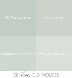
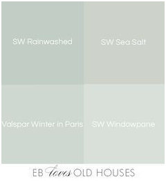
    If I had a white kitchen, I would consider this green - it is either Rainwashed or Sea Salt - the original pic listed both:


    PARKER MURPHY thanked jhmarie
  • 8 years ago

    The chintz and gingham shade is quite pretty and could be your source of color cues. Take it to the paint store and find some light green color chips that go with the green leaves. Enjoy what you love.

    PARKER MURPHY thanked apple_pie_order
  • 8 years ago

    A very popular kitchen renovation from this week was done in Convivial Yellow SW. I wonder how that might look in your space. I think it is very pretty.


    Kitchen Remodel - NW Washington DC · More Info

    I do love the rainwashed / sea salt picture posted just above my comment. So pretty.

    PARKER MURPHY thanked Kendrah
  • 8 years ago

    I like your fabrics in your kitchen jhmarie. Your chairs were cute. I think I will still keep some cute floral type curtains - it goes with my cottage feel. Maybe my old ones won't work but I will do something similar but different. :) It just depends which paint is selected.

  • 8 years ago

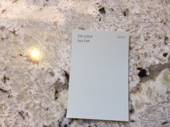
    I really liked that picture you posted jhmarie. The plates were nice on the wall too. I picked up a chip of Sea Salt today- so many people have suggested it but I am afraid I don't! I took a picture on my granite and it doesn't do anything for it.

  • 8 years ago

    I would consider picking up the color of your cabinets for the wall. It would tie the cabinets in with the soffits as well.

    PARKER MURPHY thanked karielen
  • 8 years ago
    last modified: 8 years ago

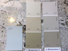
    those tan tones lean on the yellow end of the spectrum. those grays, on the taupe side,,, You aren't trying to match your granite,,you want to compliment it.

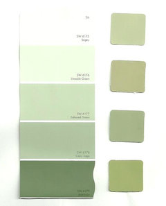
    look at this range

    keep in mind that looking at chips w/your indoor lighting will also affect the look. do you have warmer bulbs in your home? your lighting will add more of a yellow tone to the paint color. try using a neutral white bulb in the kitchen. you will have to get actual samples and paint them on the wall for an accurate pick.

    PARKER MURPHY thanked Beth H. :
  • 8 years ago

    I like your kitchen curtain and don't find it "dated" at all. It complements the vibe of your very updated kitchen. I agree that a pale or medium greyed-green would work well on your wall.

    PARKER MURPHY thanked jay06
  • 8 years ago

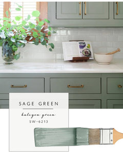
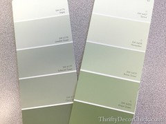
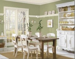
    I am soooo confused Beth! I don't want a blue green paint because I have reds yellows and greens throughout. I shouldn't have a blue tinge should I? I would lean more towards Great Green 6430 that you posted. I think I want a little depth. Or could I go off the color on my curtains- that's a sage green? This picture isn't that green- I found it under sage kitchens. Would something like this work. Maybe more like Great Green? Thanks!

  • 8 years ago

    I love your kitchen and your curtain. Soft new paint color is all you need.

    PARKER MURPHY thanked athomeeileen
  • 8 years ago

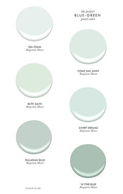
    parker, yes,,,that green above. sorry about the bluegreen,,,i don't know how those got in there!

    that soft sage w/the whites/creams would look very nice with your reds and decor.

    PARKER MURPHY thanked Beth H. :
  • 8 years ago

    Thanks Beth. Do you like the picture above. Should it be a bit sagier? I like it but who knows what it really looks like in my kitchen. I will get a chip. I went and looked for a cream coffee table but didn't have any luck. I will keep looking. Thanks for the suggestion.


  • 8 years ago

    yes, I do like it. its a nice shade and tone of the sage green.

    PARKER MURPHY thanked Beth H. :
  • 8 years ago
    last modified: 8 years ago

    I think it would be great to have your kitchen compliment the living and dining room area, but it does not have to match. Your kitchen feels like it has a tremendous possibility for being light and airy and these saturated darker sages feel so weighted to me.

    I loved Beth's original idea of a more silvery sage. What if you found a sage that were a much lighter tone and painted the entire room with it instead of just doing the two walls? Or are you thinking of using these darker sages on your whole kitchen including above your cabinets?

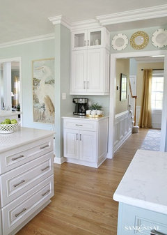
    In this picture the walls are November Rain. They have such a pretty light cast that blends well with cream cabinets. I think it would read a bit darker anyway in your kitchen because you have less natural light, but still would be understated, pretty with your counters, and compliment other parts of your house. My mantra for you is silver sage.

    kitchen and breakfast room · More Info

    PARKER MURPHY thanked Kendrah
  • 8 years ago

    I too thought you were going for lighter and brighter. That sage that you posted is very pretty, but it will not be light and airy.

    The green that Kendrah posted matches but is lighter.

    PARKER MURPHY thanked Kathi Steele
  • 8 years ago
    SW Sagey
    PARKER MURPHY thanked Jeanne Cardwell
  • 8 years ago

    Thanks Kathi. I still like the other one too. :( People seem to think the lighter shades are better. Same with a paint store I went to today. I have always been about color. I am trying to listen. :)

  • 8 years ago

    Honestly, if you like the darker color, then go for it! There is nothing wrong with staying with what you like!!

    On the other hand, it is just paint. You could paint the lighter color, live with it for 2 weeks and then paint it darker if it is not you!!

    I like this color, but the flooring is white, the cabinets are white, etc. Everything is white but the walls.

    In Kendrah's picture, there is much more going on with wood floors, darker cabinets, etc.

    So, in the end, you need to do what YOU like! Can you live with the lighter? Does the darker make your heart sing?

    Because, it truly is all about you!!

    PARKER MURPHY thanked Kathi Steele
  • 8 years ago

    I am not fond of the grays myself - waiting out the current trend. I saw the Sea Salt in a Parade home and it looked green, but I have heard it is a very changeable color, looking gray, green or blue depending on the situation.

    It looks gray here - the Rainwashed looks green - but it might be too gray for you:


    My walls are cream with a touch of beige, but in the rooms with white cabinets (laundry and powder room) I have white beadboard with light blue above the beadboard. I love how you like color:)

    If it hasn't been said yet - get some large pieces of foam board and a few sample jars of paint. Paint the foam board and move it from place to place, observing it in different light and at different times of the day. I agree to consider taking a cue from your window treatment - maybe a lighter tone of the green or yellow, though yellows can be hard. I do like the Convivial Yellow kendrah posted.

    Take your time. So many colors work with white cabinets.

    PARKER MURPHY thanked jhmarie
  • 8 years ago

    Thank you jhmarie. I like your foam board idea. I am going to try couple paints this week-end.And I am glad you don't care for grays. I never have gone with the trends- I want to feel happy when I come home and see the warmth of colors. Gray doesn't do it for me.

  • 8 years ago

    Forget pleasing people who you don't even know online. You and your family have to love your house and if you like darker, richer warm colors that is indeed what you should get.

    PARKER MURPHY thanked Kendrah
  • 8 years ago

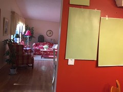
    Here are a couple paint samples I found. What do you think? I had a couple lighter ones but ruled them out. I think I like the one on the left- less limey. The one on the left is called Dill Weed by BM. The other one is Grasslands by BM. Thanks for your opinions.

  • 8 years ago

    Based on my monitor, the one on the right appears too yellow BUT it would be better to see them in between the cabinets with a white background behind.

    PARKER MURPHY thanked Kathi Steele
  • 8 years ago
    last modified: 8 years ago

    I like the dill weed from what I can see, and I agree with Kathi that seeing it without the influence of the red is really important.

    PARKER MURPHY thanked miss lindsey (She/Her)
  • 8 years ago

    You are right. I will take another picture tomorrow. Its too dark right now.

Sponsored
Haus Studio
Average rating: 4.8 out of 5 stars28 Reviews
Franklin County's Preferred Custom Cabinetry & Design Studio