Software
Houzz Logo Print
ana_zucchino

hello. what wallpaper should I put ?

8 years ago
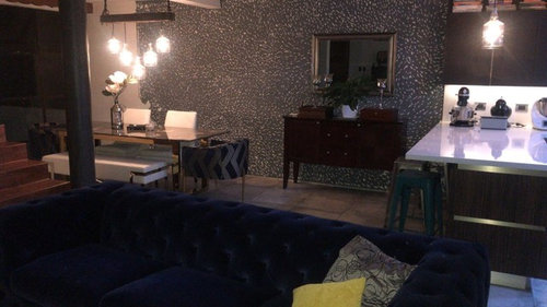
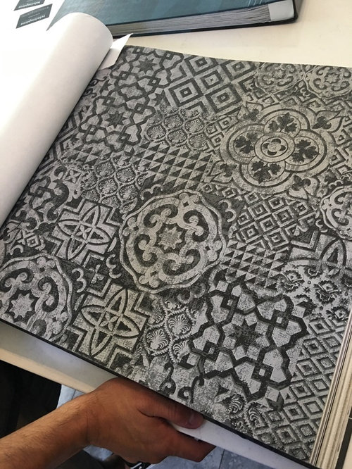
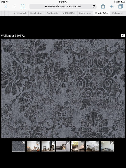
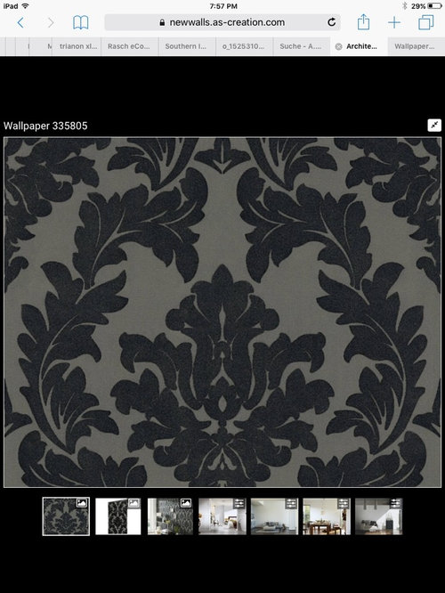
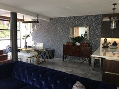
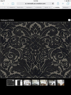
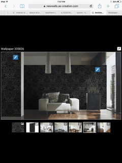
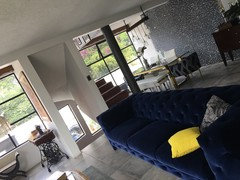
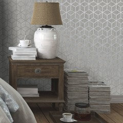
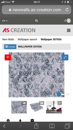
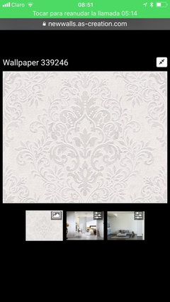
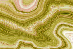
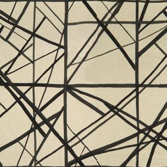
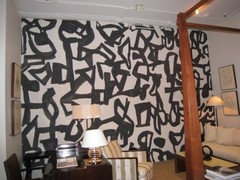
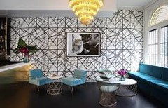
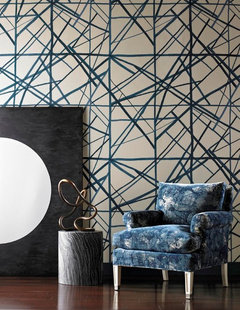
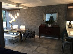
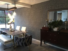
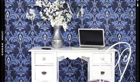
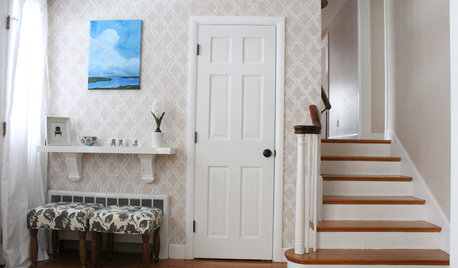
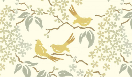
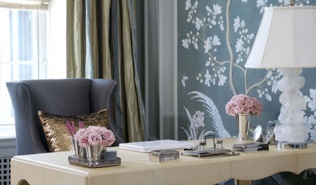
This is my dinning room wall to put a wallpaper. I chose 4 options. Please help me decide. Thank you.

Comments (50)

  • PRO
    8 years ago
    last modified: 8 years ago

    Post a picture of your dining room please. I'm assuming the first picture is of someone else's dining room.

  • 8 years ago
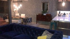
    This is my dinning room
  • PRO
    8 years ago

    All of those feel too dark. Even the current one on the wall is too dark. The gray is also clashing with what appears to be beige tile flooring.

  • 8 years ago
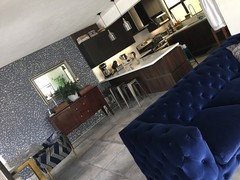
    This is more clear.
  • 8 years ago

    Only 3 options are showing. Is there a 4th?

  • 8 years ago
    The floor is gray concrete.
  • 8 years ago

    Are you replacing the existing wallpaper? They all look alike. And too dark for my tastes.

  • 8 years ago
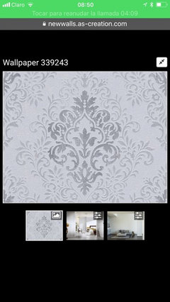
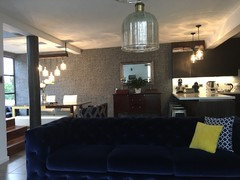
    You are right. Sorry. This is the 4th. With an example
  • 8 years ago
    Right now is just paint. The white dots are little holes I made for the clay to glue better. I am preparing the wall to put a wallpaper because it was not smooth.
  • 8 years ago

    Since you like sleek, modern I would recommend the second wallpaper.

  • 8 years ago
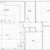
    Thank you all!! This is all my second floor space for you to have a big picture of what I have.
  • 8 years ago
    last modified: 8 years ago

    What about a silvery metallic wallpaper with a tone on tone pattern? I don't think your current wallpaper choices say sleek and modern.


  • PRO
    8 years ago

    If you want an accent wall, the wall behind that shorter sofa seems more appropriate. That dining room wall gets cut in half by the kitchen so there are competing elements.

    (Also, get some rugs to warm up the space!)

  • 8 years ago
    last modified: 8 years ago

    Ana, if you are just wallpapering to cover up the imperfections on the wall why don't you do a light texture treatment on the wall or put up a plain textured wallpaper?

    You have so many nice things in your space. I think it would be counter productive to add a large pattern that would draw the eye away from your other great choices. More pattern is not really needed.

  • 8 years ago

    No wallpaper on that wall, it doesn’t start and end well because of the kitchen. It will look great in a textured wall in a simple colour. The wallpaper will overwhelm your room. Maybe add it on another wall?

  • 8 years ago
    Thank you all! You made me realize that the colors where too dark and also maybe I should look for a less pattern wallpaper. My idea was to have contrast with the white chairs of my dinning.
  • 8 years ago

    What about something simple and lighter with some blue to tie the dining and living room area together?

  • 8 years ago
    Any of these?
  • 8 years ago

    The white chairs already contrast nicely with the floor and the patterned chairs.

    You need to keep in mind that you have an open space and the dining area wall is a big part of it. Whatever you do to the wall needs to work with the whole space.

  • 8 years ago

    Take photos that are level ... the angled photos are hard to look at. I got dizzy!

  • 8 years ago

    I think this is so cool:


    DD11146

  • 8 years ago

    I really love your space and your furnishings -- very cool home.

  • PRO
    8 years ago

    I prefer what you currently have on the walls to any of the selections you are considering. I have turned the mirror over your sideboard vertical.

    If I were looking for something for this room I would not go traditional, but select a wallpaper that is more dynamic.


  • 8 years ago

    Your home has quite a lot of juxposition between the traditional/antique and sleek modernism. If you want a big change from the current paper(is it Farrow and Ball?) a dulled light silver geometric or even a fine woven silvery grasscloth with a lot of sheen could work. The papers you've chosen all seem too traditional,even when over-scaled,to read "modern" in the space. If you want the wall to stand alone more like an art installation,I'd test Harlequin Clouds (umm,the one that is rather like Fornasetti's spectacular Nuvolette) in a silvery colorourway. Knowing what it is about the current paper that you don't like,could get you better and more specific suggestions.

  • 8 years ago

    Ana Zucchino
    Right now is just paint. The white dots are little holes I made for the clay to glue better. I am preparing the wall to put a wallpaper because it was not smooth.


    Holly, there is no wallpaper currently on the wall.

    I think there may be bit of a language issue.

  • 8 years ago

    What is that gray leafed pattern already on the wall - is that not wallpaper??


    I would paint. No wallpaper. Way too dark and busy in there.

  • 8 years ago

    I think she has said that there is NOT wallpaper on that wall yet. The white dots are actually holes in the wall.

  • PRO
    8 years ago

    I vote for the 3 paper - the faded stylized print.

  • 8 years ago

    Not sure i get the purpose of making holes in the wall.

  • 8 years ago

    ^^Gotta love it when the "pros" don't take the time to read the posts.^^

  • 8 years ago

    oh - and I love wallpaper # 2. Looks a lot like what I am considering for my bedroom.

  • 8 years ago
    last modified: 8 years ago

    Ana, I love the way you mixed modern and traditional pieces in your house. It is fresh and classic at the same time. I like the first two wallpapers you presented. I am not put off by more pattern in the room, but my current design reading is the latest book about Renzo Mongiardino. I think the design supports it (I am no pro of course.)

    The markings you have made on the wall remind me of a paisley pattern and make me wonder if paisley with a small touch of a bright color in a neutral background would not be a nice accent.

  • 8 years ago

    OMG...I love, love, love wallpaper contrary to what others think. I really like your #2 option as it isn't as likely over the years to look dated. Your #4 option is also very nice. I don't think you can go wrong with either of them. The paper will give you a lovely back drop or accent wall. Down to only 4 choices. I am proud of you. That's difficult. Good luck.

  • 8 years ago
    last modified: 8 years ago

    powermuffin

    I think she has said that there is NOT wallpaper on that wall yet. The white dots are actually holes in the wall.


    Yes, I read that. But I couldn't make any sense of it. I enlarged the picture - I looks like they scraped large "slashes" into the wall. It just looked like wallpaper in the picture.


    Still, I would NOT do wallpaper. But I am biased...I hate the stuff.

  • 8 years ago

    The more I think about it, the more I like all the choices. You can't go wrong. My least favorite is the first wallpaper with the pattern that looks a bit tile like. I think the Damask ones are perfect. I think having something with a very organic shape makes a great deal of sense and the super traditional pattern is spot on for the balance of your decor. Bravissima!

  • 8 years ago

    PS I looked at Cole and Sons, Dedar, Pierre Frey and Osborne and Little in hopes of finding something with a little bit of color, but still along the same lines as you have, to no avail. Th best I could do was a Nina Campbell paper called Marguerite and I don't think it suits the space as well as what you found. I tried marbleized papers- like the Florentine end papers in books, but nothing again.

  • 8 years ago

    I LOVE wallpaper...that being said the ones you have suggested don't seem right for your space. I really like the idea of a grass cloth. Phillip Jeffries makes beautiful ones...in fact I have two in my current house. I recently saw one that was a silvery iridescent that would be gorgeous. The texture would be wonderful and soften up what you have going on.


  • 8 years ago
    Thank you all! It is going to be my first time to use wallpaper and it is very stressing.
    I am from Guatemala, central america. The type of construction in my country is mostly with concrete, firm block cement walls. The finishings of the walls are also mostly rustic, not smooth.
    I was told that in order to put wallpaper I have to change the finishing. That is why I have to chop the wall a little bit to apply later the smooth finishing because the material I use need to glue and that is the way to do it.
    English is my second language so I apologize to you if it is hard to get me understand.
    My husband took the final word in the decision and he bought number 2 option. I hope it suits well. Next week I will have it done and I will post the final picture of how it turned. Thank you very much and blessings to all!!
  • 8 years ago
    I really appreciate all of your comments. Thanks again
  • 8 years ago

    I think that paper will suit the space wonderfully. Your English is excellent. No need for any apologies :-)

  • 8 years ago

    following

  • 8 years ago
    Hi everyone! This is how it turned!! I am happy with the result. Thanks for all your help!
  • 8 years ago

    Looks terrific! The pattern is muted just enough to add interest without overwhelming the space. Great choice.

  • 8 years ago

    Your decor is stunning. You were very smart to choose the right one, it's perfection.

  • 8 years ago

    Thanks for sharing your room! It's nice to see some styles that are different and unique. I love the dramatic colors!

  • 8 years ago

    Really polished , quiet, modern elegance. Your husband was right about the choice :) it was my favourite too !

  • 8 years ago

    it looks great!!


  • 8 years ago

    Oh, I missed this update when you posted it. What a stunning result you have. But of course your house was perfect long before the wallpaper. Your style is incredibly elegant and modern.

  • 8 years ago

    PS You should post more often :-) You could help people with a different perspective.