Software
Houzz Logo Print
julia3142

help! painted my walls pink

8 years ago
Hi all, I made the mistake of choosing a white with a pink undertone, Sherwin Williams Arcade White. I came home today to hallways with an obvious pink cast. It’s pretty horrific. I’m considering asking the painters to redo it in Sherwin Williams Alabaster, which is a warm cream, but it’s very close to the color of my trim. Is it a big deal to have walls and trim that are close in color? My other colors are SW Silverpointe (light gray w blue cast) and SW Gossamer Veil (light greige). Also, do you think I need two coats, or would one maybe be okay since Arcade White is already white?

Thanks,
Julia

Comments (18)

  • 8 years ago
    last modified: 8 years ago

    one coat should do it,. is there any way you can grab a sample and try before you tell the painters to redo? you should always, always, do samples.

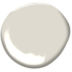
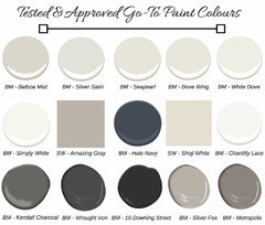
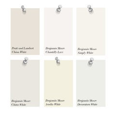
    White Dove has a bit of gray...or how about Pale Oak?

    or lacey pearl? they are very, very soft warm grays,,lacey pearl is a white/gray.


  • 8 years ago
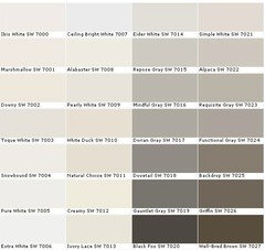
    Thanks for the helpful suggestions! My painter uses SW, and I’m wary of color matching BM. Do you happen to warm SW whites you like? SW suggests Eider White as complementary for Silverpointe and Gossamer Veil, but Eider White seems quite cool to me. One of the hallways I’m painting is dark and cold, with no natural light. I wanted a warm white to brighten it and make it more inviting.
  • 8 years ago

    ok, gotcha. go grab some samples. any of those whites are going to look different in your lighting in the hallway (as you found out w/your current one). Eider might be a good choice. samples are cheap insurance.

  • 8 years ago

    Why the third color. Actually four when you count the trim. Can’t it also be the gossamer veil?

  • PRO
    8 years ago

    What is the color of your trim. This is critical factor. Once I know that color I can do a "color scan" and come up with best options. Whites all have variations so you have to be very careful you get the right hue family for combinations. Post your trim color and we can go from there.

  • PRO
    8 years ago

    What is your flooring and ceiling as well. All impact.

  • 8 years ago
    We have the following colors currently:

    SW Gossamer Veil — all bedrooms
    SW Silverpointe — open kitchen/living main floor
    SW Alabaster — trim (approximate color)
    SW Downy — ceiling (approximate color)
    Greige carpet
    Oak floors (light gold)

    This Color Scan option sounds exciting. Thanks for your help!

    I did test out seven white paint swatches, but they were too small, and/or I stink at matching undertones.

    I’d like the hallways to differ from the main rooms, with the idea of creating visual interest and not having so much of the house all one color. But who knows, maybe fewer colors is better.
  • 8 years ago

    Julia...I'm with you. Hubby and I painted the guest bathroom a beautiful shade of white (that took us ALL DAY TO DO), and when done saw that pinkish undertone you are talking about. Wasn't fun living with that for a couple of months and re-painting it (this time with BM White Dove)! :).

    I'm not an expert by any mean (as obvious from the pink bathroom mistake), but since I've read that the lighting, surroundings, many things play a factor when you choose a 'white' paint color.

  • 8 years ago
    last modified: 8 years ago

    My husband prefers a white with a pink undertone so that is fun (I have learned he does not see colour quite the same way I do anyway though he is not colour blind or anything).

    It is not at all uncommon to put the same colour on walls as trim, you can use a different finish even, but you might find that one will now look a lot creamier than you may prefer. If you are okay with that though then it is completely fine to do. I know of designers who paint an entire house in the same white with different finishes (flat v eggshell v gloss etc) and/or using different percentages (ie cut 50% for a north facing wall) and it can look amazing!

    I love white, but I think an issue when you combine too many different whites without a very careful plan you will really notice the differences in them *as* whites - like one will look very pink next to another, or dingy, etc. I think it is far easier to combine white with darker accent walls than other whites! And of course lighting, the direction of natural light source, size of walls, time of day, furnishings will all change how it looks.

    You need to paint some large poster boards with samples instead of use small samples on the wall. Look at them through day in spaces you intend to use it. Look at them one by one, not next to each other unless you plan to use them by each other.

    I believe Eider White is a truly neutral white, not warm, not cool, it was one I was looking at (we went with Heron Plume instead) but it truly matters what it is next to even then.

  • 8 years ago

    what lightbulbs are you currently using?

  • 8 years ago
    last modified: 8 years ago

    i deliberately chose a white with a pink undertone (BM Atrium (Atria?) white. most of our vacation house is painted that color, and in winter it feels slightly less chilly. something to consider for you, too, before you repaint.

    the best location to test a color for undertones is behind a door.

  • 8 years ago
    Thanks for all the amazing, thoughtful comments! I had to tell the painters my choice first thing this morning to avoid derailing them any further. I just went with Eider White, mostly because it was suggested on the back of the other paints’ chip cards, and because the painter said Alabaster is lighter than my ceiling (true), and would make the ceiling look dingy. Result: I love it! It’s a warm, very light gray that offsets and matches the other colors at the same time. It looks very different in different parts of the house. Silvery, gray, white, even slightly mauve under some of the super warm bulbs. I guess going with SW’s suggested combos tends to be a safe choice.
  • 8 years ago

    I just painted our kitchen cabinets with SW white---forget the name. What we did was look at the color chips in the store, select the five we liked the best, took home four chips of each color and taped them up on all three sets of cabinets. We have been debating for several years, having made mistakes in the past.

    We looked at the colors almost every hour(east sun through one window) and facing the front door---which faces west. Two colors were obviously too gray, so they got removed. There are two different kinds of light bulbs in the room, one type in the kitchen lights and another in the dining room chandelier. That made a difference in one color. The flooring(tile) and the back splash are neutral tans/light browns, appliances are black or stainless steel, ceiling is ceiling white.

    We looked several different times a day, with all kinds of lighting combinations(natural and artificial) and in two weeks had finally decided on the one we wanted.

    I have since changed the kitchen lights to a new LED type which is SHOCKINGLY BRIGHT WHITE. The cabinets still look the way we want.

    Having the different chips all over the room made a huge difference---instead of putting them in one area. And looking at different times/lighting conditions made the final difference.

  • 8 years ago
    So you know if you’re considering Eider White, it has a definite purple undertone, not blue or green.
  • 8 years ago
    Now that we’ve lived with Eider White more, I actually don’t think it’s ideal with Silverpointe and Gossamer Veil. It’s just so purple, while Silverpointe is obviously blue. They look like Easter pastel colors next to each other. It could be worse, but I recommend considering a different color combo if you’re thinking of either color.
  • 7 years ago

    Did you ever repaint? I am looking at BM Pale Oak, SW Agreeable Gray, SW Gossamer Veil or PPG Silent smoke for our whole house (new build). Am so tired of worrying about undertones and what white to paint the cabinets/trim! I should have hired someone to tell me what to do, but I've invested so much time and lots of samples, I have to make the decision myself.

  • 5 years ago

    Pale Oak has a pink purplish undertone in north facing rooms. We have it in our south kitchen and it is a beautiful light greige almost white next to white dove trim but in the master bath north facing it looks like a light purple and we need to change color.