Software
Houzz Logo Print
uscroy

Powder room color help

8 years ago
last modified: 8 years ago
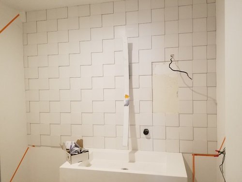
I am working on my powder room and the backsplash/accent wall just went in. Here is a photo.


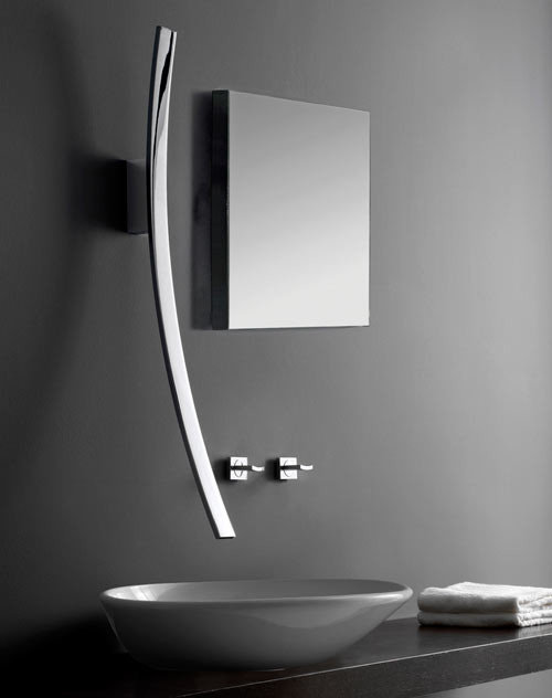
Some explanation of what you are looking at. The faucet is the Luna by Graff and to the right of the faucet will be a floating mirror with RGBW backlighting. It's hard to make out the faucet in the photo because it is polished chrome and there is no contrast. This is what this beauty looks like:


The Luna will strongly reflect whatever color is on the opposite wall so it needs to be a bold color so the faucet doesn't blend into the white tile as it does in the photo above (opposite wall currently white).


Here is the dilemma and where I need advice. The powder room isn't huge (although bigger than it appears in the photo) and I don't know that I want this bold color on all the walls because I'm afraid it will be overwhelming. So I'm wondering if it's OK to have two paint colors in addition to the white tile -- so I'd have a bold color for the opposite wall and a second more subtle color for the side walls and below the tile. Or should I have the bold color on the opposite wall and leave the other walls white like the tile? Or go bold color on all walls?


A more subtle option is to not make the opposite wall so bold. Just use something that will provide some color for the Luna and not feel overwhelming if I put it on all the walls.


Thanks in advance!

Comments (117)

  • 8 years ago

    I can't help but think the tiled wall reads differently in photos than in person. I do like the way it is now but I'm still going to consider going all the way to the floor. The only people who have seen it at this point are me and the guys who painted the walls. I'll get some more eyeballs on it this week and see what others think.

    Pal - That's a nice tile but when I decided to go with the Iron Ore paint I figured a light colored floor would be the way to go. I think that would brighten the space up. I'm still nervous about the room ending up too dark and feeling like a dungeon.

    Do you think a light colored floor would be a mistake?

  • 8 years ago

    Part of what confuses me about the partially tiled wall is usually, when you see a half tiled bathroom wall, it's the bottom half that is tiled and the top half is painted or papered.

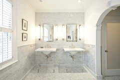
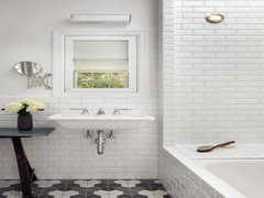
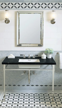
    Here are some pictures. And while these bathrooms are very traditional, the modern ones that features super cool tile, used it on the whole wall- maybe just one wall with their fanciest tile, but floor to ceiling- not ceiling to washbasin.

    And of course you can choose to march to the beat of your own drummer, which has already resulted in some pretty awesome and thoughtful designs in your kitchen. With this issue, the look is unfinished- like cpartist said, it looks like you ran out of tile.


  • 8 years ago

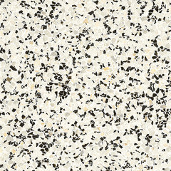
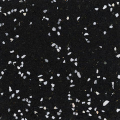
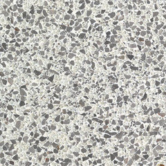
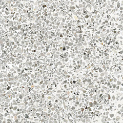
    Fritztile, lightweight flexible terrazzo tile:

    Carbon

    Contrast

    Mist

    Sheer Gray

  • 8 years ago
    The whole wall needs to be tile for the reasons posted above by a few^^^it really does cheapen the high end look you have going so far. I like the terrazzo tiles for floors however have to ask what the adjacent space has for flooring?
  • 8 years ago
    And be very careful w 5000k lighting here. May be too harsh - have dimmers for sure no matter the 3000 or whatever for mood lighting.
  • 8 years ago

    5000 lighting is going to look blue. I actually like 2700 for residential. But I like warm lighting

  • PRO
    8 years ago

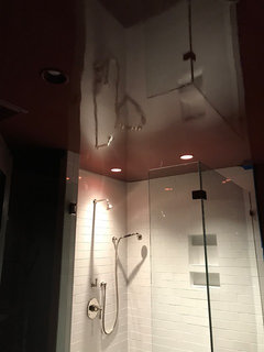
    Lacquered walls and ceiling all one color

    Glace Finish · More Info


  • 8 years ago

    I have 3000K in there now. I'm not a fan of 5000K either (is anyone?) but I just have a feeling it might work in here. Doesn't hurt to plug it in and see how it looks.

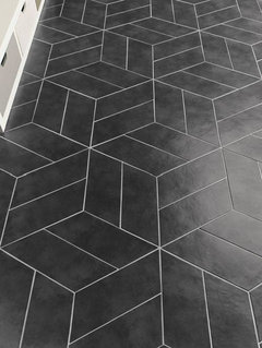
    What do you guys think about this for the floor tile? It carries the theme of 3D squares from the wall to the floor. I've always been drawn to this pattern but never thought I'd have a place for it. Might be too busy though since the wall is already kind of busy.

    This tile comes in black, white and a medium gray.

  • 8 years ago
    last modified: 8 years ago
    Please tile all the way to the floor, currently it looks very bizarre and not in a good way. I like the idea of large format, simple rectangular tile for the floor. I think a medium/dark color would work nicely, just make sure you have nice bright lighting in the room.

    uscpsycho thanked Tems
  • 8 years ago
    last modified: 8 years ago

    I never imagined I'd go with a dark theme in this room so don't have a ton of light in here. That's a big part of why I'm worried about it getting too dark. So far so good but one of the benefits of 5000K lighting is more lumens. 5000K LED downlights give more lumens than 3000K.

    Here's a photo of the unicolor door, meant to post this earlier.

  • 8 years ago
    last modified: 8 years ago

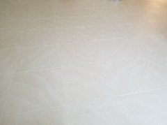
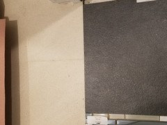
    This is the adjacent floor. It's a 24" x 24" sand/beige tile with a light swirl pattern. .

  • 8 years ago
    Hmmm, I wonder how it would look to continue the adjacent tile into the powder room?
  • 8 years ago
    I'm usually pretty open minded but you'll have a very hard time convincing me to use the same tile. Very much prefer not to.
  • 8 years ago
    You have lots of options. :)
  • 8 years ago

    I would not use something that has a specific shape, also not square, on the floor. The unusual wall tile is enough. Use something with a regular grid or no discernible grid.

  • 8 years ago
    I love love what you have done.
    Amazing. I think many of us were inspired by the faucet to comment.
    uscpsycho thanked Laura
  • 8 years ago
    last modified: 8 years ago

    Laura - Thank you! :-)

    Pal - What do you mean by something with no discernible grid? How do I do that with tile? Or are you suggesting something like linoleum? EEK! (Is that making a comeback too???)

    BTW - I made sure the 5000K light I am trying is 90+ CRI so the colors should stay true.

  • 8 years ago

    No I just mean I would grout in some color that did not draw attention. Or use another unusual shape for the floor. It can be tile but I would not want to distract from the wall tile.

  • 8 years ago

    Continue the wall tile. It’s the focus. The floor needs to be ignorable and disappear. Which is why Pal is suggesting the charcoal tile, which I like. It almost matches the walls, and that’s a good thing.

    The whole point of a design strategy like that wall as the focal point is that everything else is subordinate to that wall. Which is why painting the door and trim worked. Now that the floor needs to fall in line too.

    If Numi comes in matte black like the Inox did, that’s be perfect for that too. That Inox that raised the lid and played music when you approached was the first 10K toilet I had ever seen, many years ago. And it still makes an impression, years later. I think they’re only sold in Japan these days.

  • 8 years ago

    Some photos of a black Numi have recently surfaced but you can't buy one at the moment. However, in this bathroom I want the white one. You don't buy a Numi toilet to have it blend into its surroundings. You buy that thing to make a loud statement. I want it to be noticed. Not sure I'll be convinced otherwise on this.

    OTOH - The black photos appeared around the same time as Kohler announced the Konnect system which the Numi will be a part of. The Numi with Konnect may only be available in black, so then I'll have a decision to make. Do I want a white toilet or do I want an Alexa-enabled toilet I can talk to? Hopefully that will come in white so I don't have to pick one.

  • 8 years ago
    last modified: 8 years ago

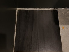
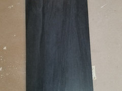
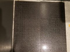
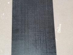
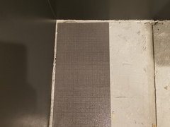
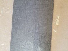
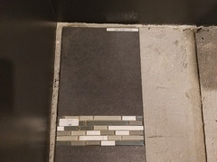
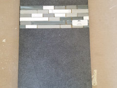
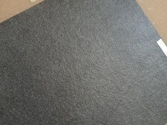
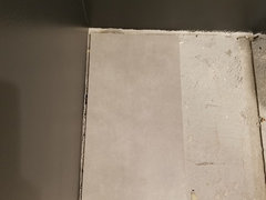
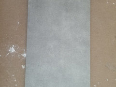
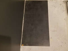
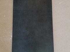
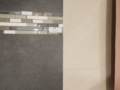
    Here are some floor tiles I picked out when I thought I was going with the 3D corian panels. The dark walls really mess with the camera exposure so I took a photo of each tile next to the painted walls and isolated.

    1) This is a really cool tile. It's like a black woodgrain floor. Very modern with a touch of nature/warmth.


    2) This one was originally my favorite but might be overkill for the direction the bathroom ended up going in. It's kind of got a reflective linen pattern to it. Photos don't do it justice. Of the people that have seen this tile in person it's either their favorite or their least favorite. The one above is usually the favorite if this isn't their favorite.

    3) Gray version of the tile above. It also comes in white, which I have samples of, but you guys don't think white is a good option so not posting photos.

    4)This is a gray rustic tile that I wouldn't particularly care for except it has a light dusting of silver specks which I also have in the adjacent beige tile that also has a rustic texture. So they kind of work together. I tried to show the silver in the third photo but it's hard to capture in a photo, you only really notice it when you move your head.

    Continued...

  • 8 years ago
    last modified: 8 years ago

    Houzz limits the number of photos per post and I ran out above.

    5) Light gray cement look tile. I know you guys will hate it ;-) It's just a lighter option.

    6) Probably my least favorite, but I have it so I'm posting it. This has kind of a hatch mark pattern on it. I don't hate it, I'm just meh about it. But maybe that is a good thing since you guys seem to think the floor should be meh so as not to draw attention away from the wall.

    I didn't do the last round of tile shopping with the current motif in mind so I'll hit the tile stores again and see if I find something new that pops out at me as a perfect fit.

    Here I go again... It never ends :-(

  • 8 years ago
    I vote for number 4 which looks good in the photo next to the dark walls. Will it be run in the same pattern as the adjacent space? How does the size of this tile compare to the tile of the adjacent space? Some thought as to how the transition works?
  • 8 years ago
    last modified: 8 years ago

    The thing I worry about with #4 is the rustic texture, it doesn't exactly scream modern.

    The adjacent tiles are 24x24 and all of the above tiles are 12x24. I'm thinking I don't want to go bigger than that in a small room. Right?

    Here is #4 side by side with the adjacent tile.


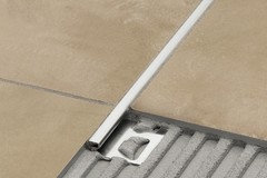
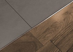
    I'll most likely use a transition strip in between, similar to these Schluters.

    Something clean and simply like this gray tile above seems like it would be a good option for me. Don't you guys think?

  • 8 years ago
    You are right to look at the tile in the space. Please don’t select a tile from a showroom without trying it at home as you do want a tone that relates to your dark color. It wouldn’t be unheard of to do a 24x24 laid out in the same pattern as the adjacent space so then you are just transitioning color and not color and size. 12x24 would be the minimum in my opinion.
    uscpsycho thanked thinkdesignlive
  • 8 years ago
    last modified: 8 years ago

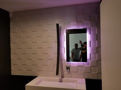
    Here's the wall with the mirror in. This is with the backlight on but no downlight.

    You guys don't seem to have strong opinions on the floor tile but here is one that was recommended by the designer at one of the tile stores. Blends into the wall nicely, which sounds like should be one of my goals.

    I'll call this one #7.


    I decided against 5000K lighting. Wondering if I should try 4000K.

    Here is 5000K vs 3000K. I like the way 5000K looks in the photo but not so much in person.


    Any other thoughts on the floor?

  • 8 years ago

    I would match the walls.

  • 8 years ago

    I still haven't settled on the floor and need to make a decision soon.

    But I took a video of the backlit mirror cycling through the colors and thought I'd share it. It's fun.

    https://www.dropbox.com/s/ndguipbdnmz5xx3/20180814_112534.mp4

    This wall panel controls the light so you can set it to any color you want or set the color changing program.

  • 8 years ago

    That's cool. Throwing my hat in for tiling to the floor-especially w/the colors behind the mirror like that.

  • 7 years ago
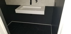
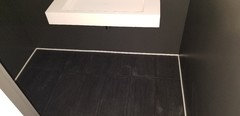
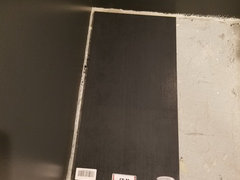
    This could probably be a new thread but hopefully some people that were following along here will chime in. For now I've decided to leave the wall tile as is, stopping above the the sink. But I finally picked a floor tile and just had it put in. It's a black tile and my original thought was to use black grout. However, seeing the tile installed makes me feel like it will be too much black in the room. So I'm thinking I should use a lighter color grout. The toilet and baseboards will be white, which will help balance things, but here are some current photos of the powder room with the floor. What do you guys think about grout?


    I was recently talking to a rep from a roofing company and told him I was having trouble finding a monotone black roof tile. He told me a story about a woman who wanted a uniform black roof and she called in a panic less than halfway through installation because the roof looked like a tire and the monochromatic color block was ugly. That is in my head right now even though this tile isn't uniform black. The photos don't do the tile justice but here a couple of closeups.


    It's hard to capture the effect but the tile has a little sheen that you see when you look straight down at it.


  • 7 years ago
    I have a difficult time visualizing things as a whole, but an alternative to black grout might be to pick a color that matches the lighter lines in the tile.

  • 7 years ago
    Keep the grout dark to match the tile. This is about creating a clean visual back ground to your tile wall and faucet. You don’t need the pattern that will jump out by using lighter grout. Don’t over think it.

    uscpsycho thanked thinkdesignlive
  • 7 years ago
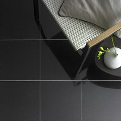
    I agree with thinkdesignlive. You will still see the grout lines as shadows. It's the difference between this...

    Nain_Large_Black_Floor_Tiles_on_a_Patio_with_Candle_Holder_1024x1024.jpg (JPEG I · More Info

    ...and this:

    stonetileco_black_granite_floor_tile_305x305mm.jpg (JPEG Image, 700 × 700 pixels · More Info


    uscpsycho thanked groveraxle
  • 7 years ago
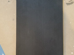
    Gorgeous tile


    uscpsycho thanked brengjerd
  • 7 years ago
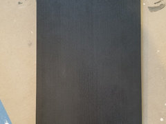
    Definitely not white. I was wondering how a dark bronze color would look if that's the lighter color in the tile. But I would trust Groveraxle's advice. He or she always has great design advice!

    uscpsycho thanked drsaj
  • 7 years ago
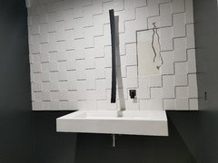
    Match the tile. Once you put the other fixtures in, it will look fine

    BTW is that your faucet?

  • 7 years ago
    last modified: 7 years ago

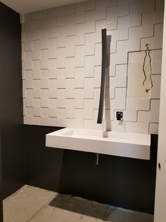
    I wasn't thinking white grout, I was thinking a shade of gray (pewter or platinum in Custom grout colors). I didn't think it would take focus off the wall but just break up the floor-to-ceiling black. The ceiling is white of course, but It's a lot of black when you're standing in there. However, everyone seems to think my original plan of using black grout is best.

    Since it's come up a couple of times, the lighter color in the tile is actually gray. And then there are some polished streaks that provide the sheen when you're looking straight down, those are black. Here's a closeup with the exposure turned up so you can see the variations better. Everything looks a little lighter here because the camera exposure is up but the tile is dark as in the previous photos.


  • 7 years ago
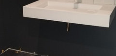
    You just answered your question. Even though the tile is ‘black’ there is enough visual interest already.

  • 7 years ago

    Yes, that is my faucet. It's the Luna by Graff. There are a bunch of photos here.

  • 7 years ago

    Is the faucet black or chrome? In the photo it looks black.

  • 7 years ago

    Oh cpa! lol

    I'll save you the hassle of reading the thread from the start but the faucet is the reason for this thread. The faucet is a highly polished chrome and before I painted the walls it was reflecting the white wall across from it and that beautiful faucet was blending into the white 3D tile. It was like the faucet was invisible. No bueno! Check the very first photo in the first post.

    So I immediately realized the wall across from the sink had to be something other than white and so this thread "Powder room color help" was born to help me figure out what to do about this. Now the faucet looks black because it is reflecting the black walls and no longer blends into the white tile.

    Then as Houzz threads tend to do, after solving the wall color we migrated to other subjects like how much of the 3D tile to use (many urged me to go all the way down to the floor) and finally what color floor to put in.

    And now you're all caught up! :-)

  • 7 years ago

    Is your mirror from Electric Mirror Co?

  • 7 years ago
    last modified: 7 years ago

    No. I knew what I wanted my mirror to look like but after searching high and low, I couldn't find what I wanted. Which is odd, because I don't consider this design to exotic and didn't expect it to be hard to find. It's been a while now so it's hard to remember but I may have found a company or two that had the design I wanted but not the right size.

    So I had to figure out how to make it and ended up building the mirror myself. It was a lot of work but a fraction of the price and mine is better than anything I could have found because I used RGBWW LEDs and all the commercially available mirrors I saw have white only.

  • 7 years ago

    I’m specifying one now through Electric Mirror that has the light surround with a keen dimmer and a touch control on the front. Thought maybe it was the same. The other thing that’s hard to find is the look you have WITH a medicine cabinet. Yours turned out great!

    uscpsycho thanked thinkdesignlive
  • 7 years ago

    Mine is not a medicine cabinet. Building a medicine cabinet is way above my skill level. Mine is "just" a floating back-lit mirror. Maybe the fact that it is floating makes it look like there is a medicine cabinet but there isn't.


    The tile is in, here's a couple photos but the tile is dirty and it's so hard to get the high contrast surfaces to look accurate with a phone. Whatcha think?


  • 7 years ago

    Thoughts on the white baseboard? I have a feeling you guys will suggest painting it black but I kind of like the way it breaks up the monotone without being distracting.

  • 7 years ago
    last modified: 7 years ago

    It may not be the modern look you want, but I think you need to have a thicker/taller baseboard to go with a contrast. Right now, it looks like a painter tape strip. Can you tile all the way down that whole wall? IMO, it looks a bit unbalanced with the floating sink off-centered and holding up the back tile (You alluded to many others suggesting this). If you tiled the whole back wall, I think the smaller white baseboard would look better because it would connect with the white tile.

    uscpsycho thanked mmilos
  • 7 years ago

    I tried a few different baseboard profiles and I liked this one best. In person it does not look like painters tape, it's fairly thick and there is no mistaking it for tape when you are in the room. It's a small room and anything larger feels like it becomes its own feature if it is painted white. If I'm going to have a white baseboard, I feel like this is the right profile.

    I know I'm in the minority here but I'm really resistant to tiling the whole wall. Perhaps it is different in person than in the photo but it just feels right to me. I've asked a number of people who have been here what they think and I don't recall anyone suggesting that I tile all the way down. I'm also afraid it will look "commercial" if I tile all the way down.

    In the corner to the left of the sink will be some sort of console/mobile for storing TP and such. No idea what that is going to look like yet.

  • 7 years ago

    This goes back awhile now and Rita said it originally and I do agree with her:


    "Part of what confuses me about the partially tiled wall is usually, when you see a half tiled bathroom wall, it's the bottom half that is tiled and the top half is painted or papered.

    Here are some pictures. And while these bathrooms are very traditional, the modern ones that features super cool tile, used it on the whole wall- maybe just one wall with their fanciest tile, but floor to ceiling- not ceiling to washbasin.

    And of course you can choose to march to the beat of your own drummer, which has already resulted in some pretty awesome and thoughtful designs in your kitchen. With this issue, the look is unfinished- like cpartist said, it looks like you ran out of tile."


    Right now the baseboard is not working at that thickness and I don't think a thick white baseboard is the answer. If it were me I'd have tiled the sink wall all the way. This way you have a pure visual backdrop to your 'features'. And yes paint the baseboard to match the wall for sure but I'd also beef it up.