Software
Houzz Logo Print
debtex

Bathroom cabinets and tile don't work together...help!

7 years ago
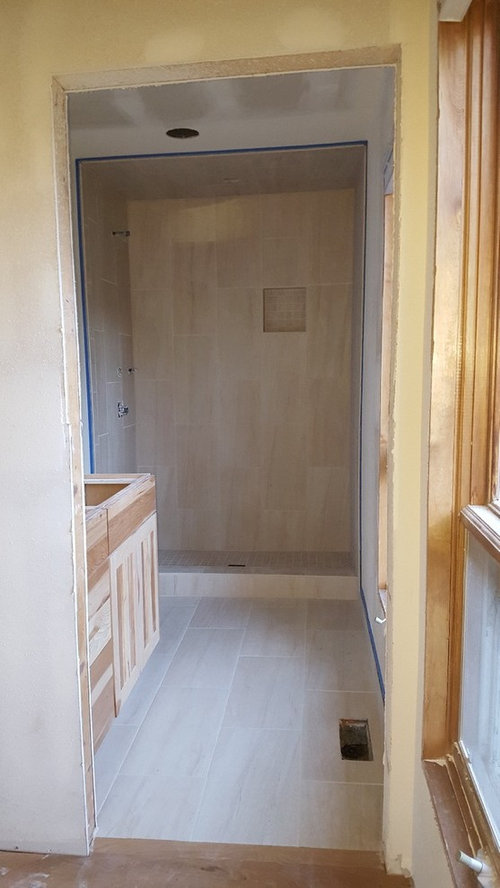
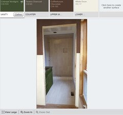
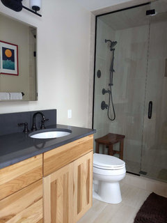
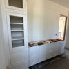
Well, this is what I get for choosing everything remotely...some things just don't work out. I picked the tile and the cabinets separately and while I love both they don't work together at all.

Should we paint the cabinet? Should we restain it darker? Am I overreacting, should we wait and see how it all looks put together?

Any advice would be welcome...

Comments (51)

  • 7 years ago
    It's a mountain house...should we find a taupe or brown? Turquoise isn't very mountain-y.
  • 7 years ago

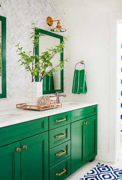
    or paint cabinet a dark green? Sage green?

  • 7 years ago
    Paint is your friend..pick a color that goes with the tile and perhaps nearby colors of furnishings, not brown though..
  • 7 years ago
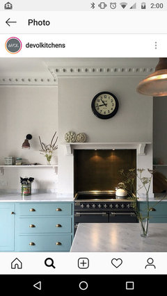
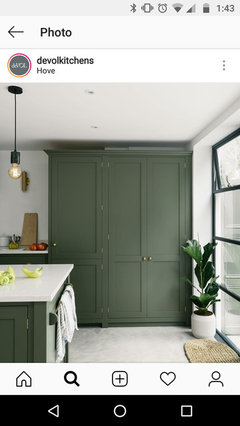
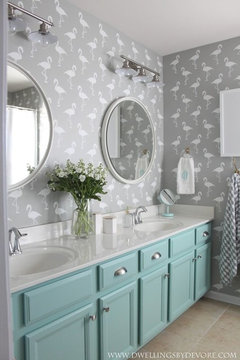
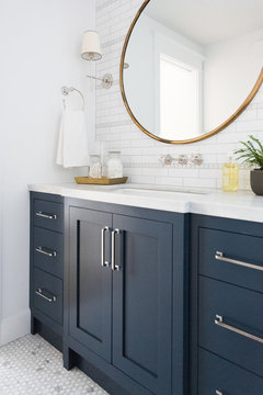
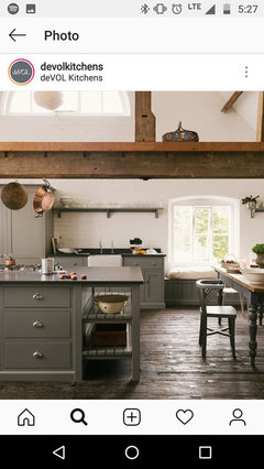
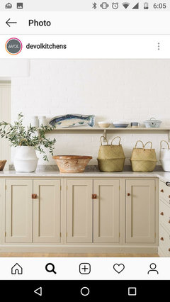
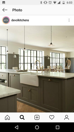
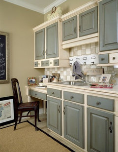
    Like these?
  • 7 years ago
    last modified: 7 years ago

    Yes exactly like those.

    But don't choose the color remotely. Get large samples and bring it to the house and look at it in the same light you'll be living in. Meaning tape it vertically on the surface to make sure it's the right color.

  • PRO
    7 years ago

    Sophie is correct - look to nature for your colors. I remember the first fall we were in Maine and were so surprised at how the leaf colors changed as the season progressed. The brilliant red maples were the first, with that incredible blue fall sky. Then the russets and browns, the sky being less blue. And for Fall's Grande Finale, the brilliant yellow leaves arrived with the gray sky of late fall, early winter. I had never realized before how wonderful bright yellow looks against gray! Something for those GW members who have a house that is ALL gray, to think about.

  • 7 years ago
    last modified: 7 years ago

    make sure you prime those cabs before painting them.

    and why can't you use turquoise or teal? look outside at the sky. is there a lake?

    Taupe or Brown paint? sigh.


  • 7 years ago

    Paint the cabinet navy blue.

  • 7 years ago

    I love all the advice. Can't wait to see what you come up with!

  • 7 years ago

    following

  • 7 years ago
    Loads of great suggestions, everyone must be taking a break on Houzz before cooking/eating dinner!

    I think the initial advice of sticking with the grays is so spot on. I think there isn't a color (including brown) that I couldn't use here so long as I keep it toned down.

    I can't do it in person. That's the risk I run. I am doing this from 2 states away...the house is our vacation house and it was totaled on a plumbing disaster and I can't get up there because of life. I have the tile sample and know the color has to be Ben Moore. The painting will be done professionally.

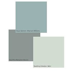
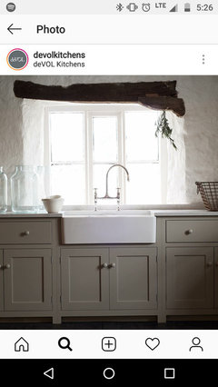
    Just for grins, a couple of taupe/putty options too. I love the true greens and blues, though so will probably choose something like that. Turquoises are tricky...before you know it you have a little girl's room or a Tiffany box.
  • 7 years ago

    Sorry but your last choices look blah and not at all exciting.

  • 7 years ago

    Agree with cpartist, those are dull, dull, dull. Just because it’s a mountain doesn’t mean it can’t be pretty and colorful. Color makes people happy. I love the idea of a teal blue that evokes the sky or a mountain lake.

    If you’re using BM paint, use samplize.com to get samples of colors you’re thinking of. They use real paint on an adhesive-backed material that allows you to mount the paint in different areas.

  • 7 years ago
    last modified: 7 years ago

    IF you paint them 2 tone, you might do the vanity, and walls in the same neutral that matches your richest hue neutral in your tile(very pretty tile) and the doors&drawers, in another color... I guess this is a blue gray below, or I think it could be beautiful in whatever color evergreen you have around you, pine green? or gray green or sage green? or the color of the sky, but really with that color in your tile, any of your favorite colors would be very nice.. Paint the walls the same color as the cabinet itself. You could do the trim in that same color neutral, or the trim/woodwork, in the color of your vanity door and drawer fronts? That could be very pretty. IF you wanted to just have the cabinet doors sealed with a polyurethane finish in their natural unstained state? And paint the vanity as said above, it would not be too busy and we all know that wood is pretty everywhere, in the mountains and the valleys. :D Keep us posted.


    http://colorinspace.com/bungalow-dwelling-palette/ This plan by BJ Moore gives a group of coloring you can go thru your entire house with that blend well in any mix. I thought the Bungalow mix with lots of wood tones since you are in the mountains, is very nice. You might find colors there you like? The cabin wheel was pretty brown, and I don't think you really need browns galore. Color, is easier to light in the evening and soothing too, in certain blends. Enjoy the research and other options that come to exist here!

  • 7 years ago
    Lord, I sometimes forget how frank people are on these boards.
  • 7 years ago

    Since you are doing this remotely, if you try to go with another neutral taupe/gray color that is very similar to the tiles, you run the risk of the same thing happening again -- the color will be a little off. It would be much safer to go with a contrasting color. I really like the navy Beth posted above or the green you posted above.

  • 7 years ago

    It's a mountain house...should we find a taupe or brown? Turquoise isn't very mountain-y.

    Ok, I'll bite. Which mountains? Where? What do you see when you look out the window(s)?

    Also, is this an en suite bathroom? If so, what will the bedroom look like?

  • PRO
    7 years ago

    Vanity would look amazing painted an almost black if that fits your home.


  • 7 years ago

    following

  • 7 years ago
    Have you actually seen the bathroom in person? I wouldn’t jump to paint that gorgeous wood if you haven’t. Maybe different, warmer lighting with the right counter would pull it together?
  • 7 years ago

    What look were you going for in the bathroom? In the house as a whole? Do you have any inspiration pictures?

  • 7 years ago
    I had the kitchen cabinets done in an almost - black color on the bases and hickory for the tall/wall cabinets and it looks fantastic. Going for kind of a rustic Scandi look, clean but not modern per se.

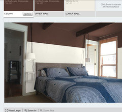
    The photo is taken from the bedroom, this is an en suite. The bedroom is dark - there are windows but it's on the ground floor in the front of the house, so the shades are always drawn. I was considering doing the bedroom in a colorblock...a chocolate color on the ceiling and 3' down the walls, and white for the bottom 5'. Hoping that would give me a nice cosy feel.

    So given that, a medium blue might look good with the chocolate in the bedroom.

    The house is in the Rockies. Think lots of barnwood, antlers and wood skis on the walls. That's the common aesthetic I see.
  • 7 years ago

    This is all really helpful, useful information that should inform any decision. I'm always mystified when this sort of stuff isn't offered up at the beginning. Because I at least find it very difficult to offer suggestions in a vacuum. Anyone can say, yup, sure paint it green lol.

  • 7 years ago

    Just looking at your pictures again ... It's a little hard to tell in the pic, but if the tile is kind of a beigy/sandy tone, which it looks like it could be, rather than grey, I think it might actually look OK. Since the cabinets and tile are both in already, maybe I'd wait and see what it looks like all put together. What are you doing for the countertop? A black leathered finish granite might look nice - seeing as it's a mountain/rustic home ...

  • 7 years ago

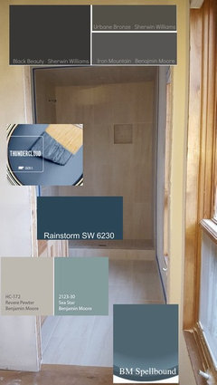
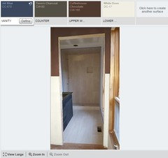
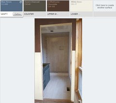
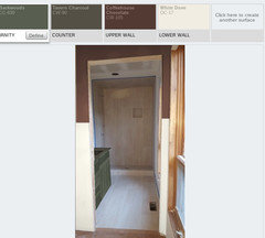
    OK, spent a little time on this today, thought this might help. Other things to note...trim will all be oiled douglas fir, as will the door, and master bed floor is clear coated white oak. Counter will be silestone marengo.

  • 7 years ago

    Following

  • 7 years ago

    I think I like the Blue Heron, seems more earthy to me. I don’t envy you having to make these decisions from a distance.

  • 7 years ago

    If those three colors, I like the Blue Huron best. Have you decided what you are doing with your bedding/decor in the adjoining bedroom yet?

  • 7 years ago
    last modified: 7 years ago

    I was considering doing the bedroom in a colorblock...a chocolate color on the ceiling and 3' down the walls, and white for the bottom 5'. Hoping that would give me a nice cosy feel.

    I have a color block feel throughout my house. However my ceilings are 9' and 10', not 8'. (And my ceiling color goes down 2' on the 10' ceiling and only 1' down on the 9' ceilings.)

    A 5' wall on the sides will feel off. It will make the ceiling feel way too low and more like you have just forgotten to paint the bottom. If you want do paint the ceiling a darker color, but do the walls a different color. The darker ceiling will give you the feeling you're after considering your walls are 8' high.

  • PRO
    7 years ago

    Another vote for Blue Heron.

  • 7 years ago

    Blue Heron : )

  • 7 years ago

    I'll be the odd one out. I like Jet Blue.

  • 7 years ago

    i'll take Jet Blue since I posted Rainstorm way back when,,,,

  • 7 years ago
    last modified: 7 years ago

    I mocked up the bedroom in the color block (down 2' instead of 3) and like it a lot, actually. (note I didn't end up re-ordering that bedding and the beams are gone now (destroyed.) All the door frames will be Douglas Fir.

    Also adding a more muted green just because I kind of like it and the other one is too bright.

  • 7 years ago

    Agree, it’s less garish.

  • 7 years ago
    Part of this is a regional thing. All these people “ugh” are not in areas where natural hickory are extremely popular. My guess is the OP lives in Maine, NH, Vermont, Minnesota, Montana or Wisconsin. Unfortunately, the tile does not go with these beautiful cabinets. And the space may be too small for the pattern of these cabinets. Too bad.
  • 7 years ago

    Admittedly I'm working off my screen, and from a very small picture on it, with a photoshopped image at that, but to my eye Blue Heron makes the tile look less pink than the Jet Blue or Colonial Verdigris do. I would definitely try all the samples IN PERSON and with a LARGE piece of cardboard painted and taped to the vanity.

  • 7 years ago
    last modified: 7 years ago

    Try just painting the ceiling and NOT the walls. 8' walls are not tall as is and by bringing the ceiling down, it might feel more like the ceiling is falling on you. Ideally ceilings should feel like they're taller than you. A 6' ceiling doesn't do that.

    Also will there be a picture rail or something else to define the two areas?

  • 7 years ago
    last modified: 7 years ago

    I did try just the ceiling dark, it looks awful.

    And no picture rail, I'm going for something more modern, that feels very victorian/cottage.

  • 7 years ago
    last modified: 7 years ago

    I don't mean something traditional looking. Maybe a thin flat piece of molding or even a metal strip? Or a contemporary bookshelf type of ledge? Just throwing ideas out because unless the painted line is perfect, it might not work.

    Or paint the whole room dark with white woodwork.

  • 7 years ago
    Cpartist, it's a good suggestion I will keep it in mind, see how it looks after it's painted. That can be added after the fact if it looks unfinished.
  • 7 years ago
    last modified: 7 years ago

    We have grey wood plank floor and the cabinets in SW Slate Tile (7624) look stunning with a nice countertop with whites and blacks in it.

  • 7 years ago
    I have to follow this as
    I’m also going to be needing lake/mountain colors....and lots of windows!
  • 7 years ago

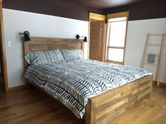
    Hi all, we are mostly finished with this and I thought I would post finished pics since many of you gave me advice. We decided not to paint the cabinets in the bathroom after all, and I think it's perfectly nice (if a bit boring.) It's better in person than in pictures for some reason. We also color blocked the walls and I think it's pretty nice although probably not everyone's taste.


  • 7 years ago

    I actually really like the look. Looks good!

  • 7 years ago

    Fabulous

  • 7 years ago

    Love the colorblocking!

  • 7 years ago

    I just finished complete remodel of Dad’s Breckenridge vacation house remotely, from here in TX. So I feel you on the difficulty in making all these decision from far away.

    I think it looks great not painted.

  • 7 years ago
    That did pull together nicely.