Software
Houzz Logo Print
vtchewbecca2001

The Grey Dilemma

7 years ago
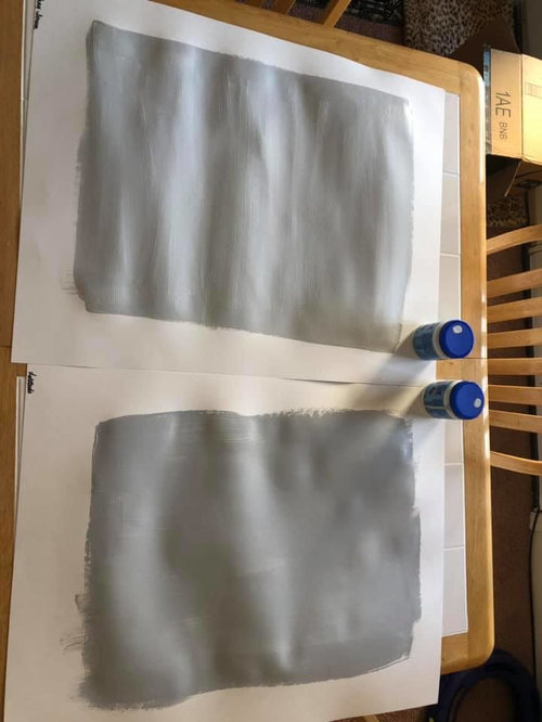
We are building a house and must (at this time) pick a color for the whole house. The house will be full of cool colors (ignore my warmly colored dining table...it's about shot and will be replaced).


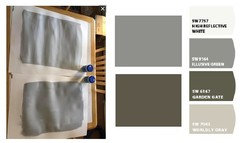
I really want a neutral grey, but I HATE warm greys. I tend to prefer cool blue-hued greys. The issue is that the main source of light (from lots and lots of windows) will be eastern light filtered through trees, which I know can make cool colors appear drab or cooler. I have so far painted two samples on poster board....Gray Screen and Latitude (too dark I think). I'd like to stay in the LRV range between 50 and 60.


I have done a TON of reading about greys and there is a lot of information. The trim will be SW Highly Reflective White.


Comments (41)

  • 7 years ago

    I would look at colours with a much higher lrv. These are both very dark and will appear even darker on the walls.

    You could also look at using various shades of the same colour for different rooms. Your house will still flow but each room will be slightly customized to appear to its greatest advantage. For example, you could use one of these darker shades in a dramatic dining room, go two or three steps lighter in the kitchen, do the shade between them in the rest of the house.

    R. C. thanked miss lindsey (She/Her)
  • 7 years ago

    We wanted more reflectance of light in our main rooms, especially during our low light winter and ended up doing light grey trim with white walls. I second Lindsey’s comment that your current choices are likely darker that you want even with lots of windows.

    R. C. thanked NHBabs z4b-5a NH
  • 7 years ago

    I have chosen a bit darker due to wanting the walls to still appear grey when the sun is on them. I hate having my walls washed out and looking white (I chose a blue in our old sunroom that really became almost white when the sun was in that room).

  • 7 years ago

    The Gray Screen has a LRV of 59. Anything higher than that comes across as almost white to me and I do not want white walls.

  • 7 years ago
    last modified: 7 years ago

    I find that because my wall are white (your trim will be white) the contrast still shows in almost any light levels. Both my rooms that have the combo of light grey with white are south facing, with one also having an east window and one a couple of west windows.

    Look at large sample and have the white trim there as well.

    R. C. thanked NHBabs z4b-5a NH
  • PRO
    7 years ago
    last modified: 7 years ago

    This is how my computer sees your paint colors that were painted on paper???


    Get some decent samples. See below

    https://samplize.com/


    R. C. thanked BeverlyFLADeziner
  • 7 years ago

    We are living in an apartment while the house is being built, so I can't paint the walls.

  • 7 years ago
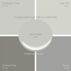
    Check out this article... https://www.kylieminteriors.ca/the-9-best-benjamin-moore-paint-colors-grays-including-undertones/

    I have BM Classic Gray in my whole downstairs and usairs hallways including a 20 foot living room. It reads a bit warmer but looks cooler in a couple of my rooms. I’m doing Stonington Gray in my next remodel starting next week, which will be my master bathroom, bedroom, and 2 guest bedrooms. I also used Samplize, highly recommend! It looks so different on the color swatch than on the wall!
    R. C. thanked K R
  • 7 years ago

    BeverlyFLADeziner - thank you for the link. I have ordered a few samples of the paint colors to try out on our apartment walls (which also face east).

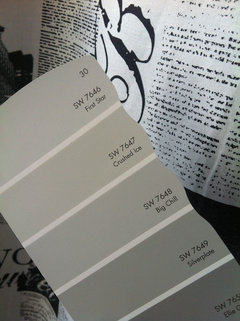
    Any thoughts as to Sherwin Williams Big Chill? It has a LRV of 62, which is a little bit more reflective than the other two. I don't want it to be too dark, but nor do I want the color to wash out or be too full of yellow, green, or purple undertones...or tend to anything resembling or hinting at beige.

    Our builder uses SW, so I'm trying to stick to their paint colors.

  • 7 years ago

    Rebecca, try some of these. BTW, I used BM Gray Cloud in my bath and master. it's a lighter blue gray. Here it is in a room with very good lighting. Marilyns Dress and Sweet Innocence are also nice choices.


    and just above Big Chill is Crushed Ice. it's a paler gray that doesn't have any obvious undertones.


    R. C. thanked Beth H. :
  • 7 years ago

    You may be able to get some Sheetrock/wallboard scraps from your builder to try paint on.

    R. C. thanked NHBabs z4b-5a NH
  • PRO
    7 years ago

    The trim will be SW Highly Reflective White.


    HRW is available in a limited number of SW products. Before you base the color palette on HRW, you should verify that it is an option in the product, grade, sheen you want to use.

    R. C. thanked Lori A. Sawaya
  • 7 years ago

    We also are fine with Extra White, which goes with the cooler greys. Thanks Lori!

    NHBabs - definitely something to check out!

  • 7 years ago

    SW Light French Gray is nice! I don't have a pic but it was looking dark in my room so I had it mixed at 50%. perfect. good luck :)

    R. C. thanked Brenda
  • PRO
    7 years ago

    Extra White is prettier.

    R. C. thanked Lori A. Sawaya
  • 7 years ago

    Highly Reflective White is a very transparent white with poor coverage despite using primer and multiple coats. My local SW store discourages the choice.

    R. C. thanked pkpk23
  • 7 years ago

    wsbiggirl - what are the undertones for the French Gray?


    Thanks for letting me know about the coverage issues with Highly Reflective White. Guess it will be Extra White then!

  • 7 years ago

    Rebecca, there are no apparent undertones to speak of. The SW rep did describe it as a true "neutral" grey. Does not pull, blue, green or purple! these color choices can drive you crazy..

  • 7 years ago
    last modified: 7 years ago

    Something we always do when considering a paint color is check how it looks in a corner. You don’t have to paint the walls to do this; either put paint on a couple of pieces of cardboard/foamcore or get two biggish paint chips of the same color. Tape them up (tape on the back so the color of the tape isn’t seen) butted against each other in a corner. This gives you an idea of how the color is going to intensify when it’s on more than one wall. Even though I’ve done this many times I’m still always surprised at how much more saturated colors are than they look on a flat chip or sample board.

    R. C. thanked SapphireStitch
  • PRO
    7 years ago

    My go-to gray is Crushed Ice by Sherwin Williams - this gives you a good overall "base" color, then you can add colored accent walls or color for specific rooms as you like. The best paint for this is Sherwin Williams SuperPaint in a Velvet finish. It's a great sheen - not too shiny (like eggshell) and not too matte. Happy Decorating! P.S. Best to put sample paint on the wall 2' x 2' minimum, two coats and let dry before deciding. If possible do this is a few locations. Then look at them during different times of the day during a 24 hr.. period - wall color constantly changes with the light.

    R. C. thanked CK Hoffman Design
  • 7 years ago

    I also prefer cool grays with blue undertone and my go to is sherwin williams uncertain gray.


    R. C. thanked Hope Guthrie
  • 7 years ago

    I can’t paint directly on the walls, as we are renting. But I do have painted poster boards I’ve been moving around. I like the corner idea. I have three samples from samplize that are on their way: gray screen, passive, and big chill. I will check out crushed ice.

  • 7 years ago

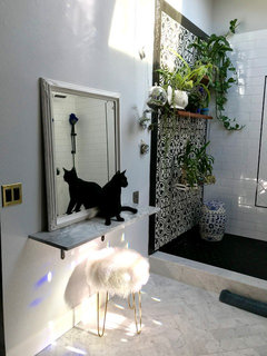
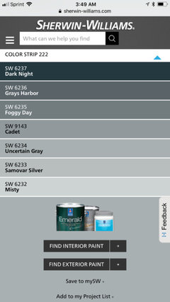
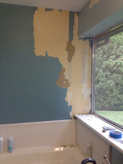
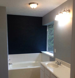
    We just sold this house but here are some before and after photos where I used uncertain gray and dark night from that color strip.


    R. C. thanked Hope Guthrie
  • PRO
    7 years ago

    Follow Lori Sawaya's advice--she's the most knowledgeable about color of anyone here on Houzz!

    R. C. thanked Diana Bier Interiors, LLC
  • 7 years ago
    last modified: 7 years ago

    I think crushed ice would go too white for her.

    R. C. thanked ishop19
  • 7 years ago

    Crushed ice is a little too light.

  • 7 years ago

    Hope - very pretty! Thanks for sharing!

  • 7 years ago

    Wow! Lori A. Sawaya..great explanation. :) I would not have known any of this. I get so confused and overwhelmed by colors and making decisions . I do know in my case, I didn't want a gray that looked too blue or green in my room.

  • PRO
    7 years ago

    I get so confused and overwhelmed by colors and making decisions


    The science of color measurement is more than 100 years old. It's only logical that the simple, straight forward color order systems that are used to make color are the same systems we use for specifying color.


    But that logic is lost on many.

  • 7 years ago
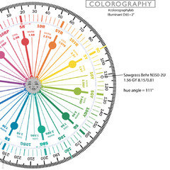
    Lori I have a color question if you wouldn’t mind. I have Behr Sawgrass in a few places in my home and I see if with subtle green/gray undertones but others don’t. Am I “misreading” this color?? I use it with navy blue and love they way it looks to me but am afraid my color eye is off. Thanks
  • PRO
    7 years ago
    last modified: 7 years ago

    Sawgrass belongs to the Green-Yellow (GY) hue family.


    If you look at the color wheel, you can see it's on the cusp of the Yellow (Y) hue family and the Green-Yellow (GY) hue family.

    This is where the greeness is coming from - it's not hidden or under anything. It's just part of its inherent attribute. If someone isn't able to discern a quantity of greeness in Sawgrass it's either a color acuity issue or it's because of the light.

    Grayness is about chroma. Chroma answers the question how gray/dirty or colorful/clean is your target color.

    In other words, a Chroma value tells you about a color's intensity, weak or strong.

    Behr's Sawgrass has a Chroma of 0.81. That technically makes it a chromatic gray near neutral. Which means it has a quantity of discernible hue but not enough to call it a colorful color.

  • 7 years ago
    Thank you so it seems I see the color the way it’s meant to be seen. I love it in my house because we have abundant sunlight and it just reflects as an easy color that goes with things well. I was just worried I saw it wrong and it was really hideous and I was last in on the joke. I’ll rest easy now. You are such a wealth of information thank you.
  • PRO
    7 years ago

    I see the color the way it’s meant to be seen. I love it in my house because we have abundant sunlight


    When we measure color to quantify its hue, value and and chroma, we use an illuminant called D65. D65 mimics indirect, noontime daylight. It's an even quality of light - even across all the wavelengths in the visible spectrum.


    What that means is a hue, value, chroma color notation tells us what a color looks like when it's well and evenly lit.


    Like in your house. So, yes, I do believe you are seeing and describing Sawgrass accurately.


    If a color looks different from what its notation says, then we know there is something about the person viewing the color, the context and/or quality of light that is making it look different than it's hue, value, chroma notation says it should.


    Then we simply use the notation as an orderly framework - a jumping off point - to work from and find better color options for that person, context and/or quality of light.

  • PRO
    7 years ago

    And, yes, therein lies the rub. How to work from and find better color options. The trickiest part of selecting colors for walls.

  • PRO
    7 years ago
    last modified: 7 years ago

    Yes. Exactly.

    The key is having a systematized framework to work from to find those better color options. Without such a system, you're just shuffling paint chips and guessing.

    To be useful, said color system must be based on how the human vision system works.

    Because if it's not based on the 3 dimensions of color (hue, value, chroma) that are at the core of the human experience and sensation of color, then what could it possibly be based on?

    Which is why the Munsell Color Order system, a constructed framework of hue, value and chroma, is THE gold standard of color systems and is used to specify, make and manage color in every industry you can name across the globe - Munsell is especially useful in architectural color design applications.

  • PRO
    7 years ago

    So, Lori, riddle me this. If a neutral color is of the yellow hue family (as so many are) but in a particular room with particular light, it skews let's say, purple. How do you compensate for that and select a color that doesn't go purple?

  • PRO
    7 years ago
    last modified: 7 years ago

    How do you compensate for that and select a color that doesn't go purple?

    Good question.

    Simple answer.

    Choose a color from a different hue family.

    Could be a matter of just a few degrees from where you're starting - clockwise or counter clockwise on the color wheel.

    Or, you may need to move in bigger steps to a new hue family neighborhood altogether.

    Either way, easy to do if you understand that color is ordered according to its hue family AND you know how to use a hue/value/chroma color notation to navigate to the attributes, like hue, that you need/want.

  • 7 years ago
    RC , SH Babs - what colors did you finally use and how do you like them.
    I am looking to change to greys in my home and have a north facing living with little light, south family and kitchen and a dining in between living and family with one east window.
    Would greatly appreciate input and help.
  • 7 years ago

    I went with SW passive. Love it! Our windows primarily face east. We have a ton of natural light, but even at night the paint is beautiful and not at all blue.


  • 2 years ago

    Do you have any pictures?? I realize this is an old post but thinking about passive for our house!