Software
Houzz Logo Print
goodman_n

Why does this kitchen work?

7 years ago
last modified: 7 years ago
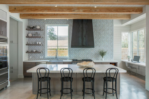
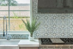
I am really drawn to this beautiful kitchen. I am trying to understand why it works. I am contemplating putting the sink and range on the same wall as seen here. I like how the window and hood are balanced here. Here are some questions for all your designers: 1) are the open shelves necessary to make this work? 2) is the bold tile also necessary? I prefer a simple clean tile, but I recognize you need some interest or the design might fall flat. Does anyone have any other photos of similar kitchens?

https://www.houzz.com/photos/bridle-path-residence-transitional-kitchen-austin-phvw-vp~83885247I 

Bridle Path Residence · More Info


Comments (34)

  • PRO
    7 years ago

    Hi! I'm not sure if it's an issues for others on here, however the link provided does not open for me and says, "page not found" :(

  • 7 years ago

    Thanks for the heads up. I hope I fixed the problem.

  • 7 years ago
    last modified: 7 years ago

    Is it this one? Bridle Path Residence - Austin

    No, goodman_n, the link doesn't work. Truncated somehow.

  • 7 years ago

    I don't feel it works. I personally would want the cooktop and hood centered on that wall between the window and the end of the blue tile there as it feels like it's crowding the window to the left. Take the potted plant out of the picture and you'll see how unbalanced it really is.

    Additionally it doesn't work functionally. There looks to be a total of 15-18" between the only sink and the cooktop. Normally when we prepare a meal, we take food out of the fridge, wash it at the sink, then prep between sink and cooktop. There's NO ROOM to prep there which means either carrying it to the right side of the stove to prep it, or carrying it across to the island and then back to the stove.

    This is a show off kitchen but it doesn't even do that particularly well.

  • 7 years ago

    a. I don't consider the tile to be bold considering both the floor and counter tops are plain. You need a little something.

    b. Wondering if this has under counter refrigeration. since none is showing.

  • 7 years ago

    The refrigerator is on the left hand side of the picture, right up on the edges of the shot. One door is made of glass.

  • 7 years ago

    I don't think it works either. I always prep to the right of the sink and the space here is tiny. My DH splashes quite a bit at the sink and he would be getting the range wet every time. That would drive me crazy!

    I would have included the space to the right for more drawers and counter space. Even if it meant raising up the windows a bit . Move the sink to that wall for a garden view, instead of a fence view.

    I would also never choose shelves or open storage.

  • 7 years ago

    It also looks like there are steps to the left, so having to go up/down a couple of steps to some of your kitchen storage is not ideal.

  • 7 years ago

    The tile is from Walker Zanger. I think it is actually made by Tabarka, but an exclusive design/color for WZ.

  • 7 years ago

    It works aesthetically (for me, anyway) but not functionally. Cpartists pretty much made my points on functionality. The counter between the sink and range is typically (and arguably should be) the hardest-working real estate in the kitchen, and that kitchen has only has a foot of counter there (maybe 15"). It's absolutely useless as a work surface.


    The kitchen has soaring ceilings, which is not an effect that you can replicate in just any kitchen. The full wall of tile (again, with those soaring ceilings) and the patterned tile (keeping everything else very plain) are necessary for the look, I think. The pattern of the tile doesn't have to be super bold (I don't actually find the inspiration tile all that "bold"), but it needs to have enough interest to be the focal point of the kitchen.

  • 7 years ago
    last modified: 7 years ago

    Just to keep up my GW bona fides, yes, I agree, the kitchen does not work for actual cooking. It's just all about that gorgeous tile and the sculptural hood set against the high ceiling for me. I have tried to be a good GW student.

  • 7 years ago
    last modified: 7 years ago

    agree w/cpartist.

    personally I think the shelves on the left should also be on the right. looks a little off balance to me.

    No the shelves aren't necessary. I would hope there is storage somewhere. imagine taking out your dishes from the DW and schlepping them ? I have my cup/glass cabinet right over my DW.

  • 7 years ago
    last modified: 7 years ago

    The kitchen doesn't work for me either, either in form or function. As far as form, I find the sink/range wall looks unbalanced and for me, even that plant doesn't do much to help. For function, I agree with Marcolo in his classic post,

    Looking for layout help? Memorize this first: Ice. Water. Stone. Fire.

    And cpartist is right, that's a very small sliver of counter ^ between the sink and range. It would make me buggy, both from a functional and a financial standpoint, paying good money for a kitchen that could be so much better.

    I think it might be easier for you to try to figure out what appeals to you about the kitchen -- the beams? the color scheme? the way the grey and aqua scheme works with the warmth of the wood? the bentwood chairs? the height? all the light from the large windows?

    For me, it's a show kitchen trying hard to be striking and Pinterest-y. And I wonder if there's a hard-working pantry somewhere out of sight.

    Edited to add: I do love the tile, esp with the beams.

  • PRO
    7 years ago

    This is the kind of kitchen where the caterers come in and clean up and go away. I do not like the assymetry of that wall and I never like open shelves in a ctual working kitchen IMo there is enough to clean without cleaning display stuff all the time.. I like thre tile and the hood is functional be needs to be moved to the right other than that I would need to see the whole kitchen

  • 7 years ago

    That off-center hood is driving me crazy. There's a lot to like about this kitchen but way more to not like. Cpartist and Rita both made excellent observations. I also don't like that the kitchen steps down into another room, has concrete floors, etc. And honestly, I don't really even like that hood design. It competes too much with the massive window. One of those should have been the star, but not both.

  • 7 years ago

    You can see the whole house at 3folddesignstudio.com. Pretty cool! I thought it was a remodel but its not.

  • 7 years ago

    Thanks for all the comments. I completely agree that their is a complete lack of workspace between the sink and cooktop. I also agree its a little off balanced. I really hate the idea of a sink in the island so I am looking for something unique.

  • 7 years ago

    Any strong opinions for or against this kitchen. It's a little plain I feel like a stained wood hood and matching open shelves would give it some pop. A more vibrant backsplash would help too. Anyone worried about the lack of landing space to the left of the range?

    Southgate Custom Home · More Info


  • 7 years ago

    For me, that last one would work much better with the range centered on the window and the main sink in the island.

  • 7 years ago

    I really hate the idea of a sink in the island so I am looking for something unique.

    Call me crazy, but I think you might be going about this the wrong way.

    Is your new kitchen a new build or a remodel? Where in the process are you? Do you have plans or measurements for the room already? If so, could you post that, and then we could help you work on a good functional layout, and then work on the finishes.

  • 7 years ago

    Very difficult to pull off this kind of minimalist kitchen layout without putting something in the island if you really cook.

  • 7 years ago

    the cook is a serious cook w 6 burners some of that space can be used to rest hot things. the storage provided on the side w fridge and the large assembly right of fridge is where a lot of things are retrieved and then pivot over to island w separate sink..again none of this activity by various people will interfere w cook behind at sink, counter, and stovetop. It is deceiving...a LOT of activity in terms of people movement and serious cooking goes on here. The people wanted an ambience that was clean and fairly modest.....the attention is focused on the activity that occurs. Maybe too plain for some people but this space functions. It may be a large household or extended family and friends are present often, or perhaps even some sort of instruction re to food/cooking or other?

  • 7 years ago

    goodman n, added to my questions above, how do you cook and how do you live? How many people in the house? How many cook? Is the cook the only person in the kitchen, or is the whole family in there? What sort of cooking do you do? Do you cook from scratch for most meals? Do you love to bake? Do you mostly heat up takeout?

  • 7 years ago

    As others have posted, the gestalt of this kitchen is quite lovely but that is because beautiful fixtures were used - tile, floors, windows, hood, counters are all lovely and complement each other.


    However, in terms of function, I am not understanding why the cooktop is so close to the stove since it seems to be easily moved to the right which would provide more functional space for both the sink and the range on either side of each as well as eliminating the visual asymmetry of the hood being so clearly off center for no reason.


    In terms of inspiration, as others have posted, the best way to use inspiration photos is to analyze what is appealing to you in terms of inspiration. I finished a remodel and provided my designer with A LOT of inspiration photos - some of which were all over the place in terms of style. I also told her what styles appealed to me and which didn't - i.e. I DID NOT want a "spa" bathroom or a white subway tile kitchen :-). My designer then was able to present me with a design board which really captured much of my aesthete and then we collaborated in terms of refining elements and picking specific stuff like fixtures. Neither my kitchen or bathrooms are slavish reproductions of any of my inspiration photos but I think she did an amazing job of capturing what I found appealing in both my inspiration photos and period favorites (i.e. Art Deco, Art Nouveau, William Morris, Prairie).

  • 7 years ago
    last modified: 7 years ago

    Aesthetically it works because it has great natural light, the elements all work in harmony together, and it is spacious.

    Functionally, I've gotta go with those who say it's low on the practical living scale.

  • 7 years ago

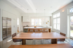
    The second photo is better but there's still not enough space between sink and stove and there's too little space between stove and wall.

    The prep space is far from the fridge and the stove so once again is not functional.

    Additionally in both kitchens there is no landing space next to the fridges. Personally I don't want to turn 180 degrees every time I need to take out or put away something in the fridge.

    Neither are functionally good designs.

  • PRO
    7 years ago

    Wow! Tough crowd! I love this kitchen. But you'll notice that the reason they are able to keep it fairly minimal and airy is because all the storage is in the hallway off to the left of this photo and along the perpendicular wall to the left of the island. Same with the fridge, wall oven, etc. So my advice is that if you have the room to have a butler's pantry of sorts that allows for most of your storage needs to be out of sight from the main part of the kitchen, have at it.


    Most of us, however, don't have the kind of square footage necessary to do what was done here. So from a sheer real estate perspective, perhaps I wouldn't have given as much prominence to the desk along the window wall and put low base cabinets there instead. Or maybe I would have given up the open shelving to put in wall cabinets instead. And then lastly, perhaps I would have put in a smaller prep sink in the island which would solve the "not enough counter space" issue between the main sink and the range.


    But overall, I think this is stunning!

  • 7 years ago

    Regarding goodman's last inspiration pic, I'm not bothered by the lack of space to the left of the range, largely because I grew up with a range with less space than that, and for the past 22 years have lived with kitchens with no counters at all on one side of the range. It's not that big a deal to work off one side of the range. Of course, maybe having space on both sides would be vastly preferable and I just don't know because I've never had that. Actually, I've lived in at least 5 other apartments in my adult life where I either don't remember the configuration, or had space on both sides and don't remember liking that any better.


    But, I still would like more space between sink and range. I'm not that wedded to the sink being centered on the window, so I would move the sink to the right in that design by at least 18 inches.

  • PRO
    7 years ago

    If you look at the photos of the entire house, you will see a huge free-standing tub in front of an enormous window that looks out from above onto the outdoor entertaining area. No curtains - nothing. Gorgeous, but totally unusable unless one is either a "naturalist" or an exhibitionist. Eye candy, not liveable.

  • 7 years ago

    Where is the storage? Are you bending all the time to fish everything out of the island? Neither of these have enough cabinets for me but I may have more kitchen items than others.

  • 7 years ago

    So, you believe this kitchen "works!" I seriously doubt that it functions; it looks to be all about form. You can steal some of the form ideas and downscale them to your residence, but it looks to be more about a look than about a cook!

  • 7 years ago
    last modified: 7 years ago

    The more I look at these "high end" kitchens, the more I love my own diy planned and built Ikea kitchen! Functional AND balanced.

    Ha!

    That said, I love the architecture/space of the first kitchen. Otherwise, as others have commented, visually, the balance is off and the hood competes with the window for attention. Functionally, it's terrible.

    The second kitchen has zero appeal to me. it looks more like a teaching kitchen, and reminds me of a classroom with islands/table in rows instead of desks... can't see myself and my family walking around a counter, a table, another counter to get to the sink...


  • 7 years ago
    last modified: 7 years ago

    Most of us, however, don't have the kind of square footage necessary to do what was done here.

    Yes, this is a large space, and that's why it has the airy, light look. The average kitchen is smaller than this.

    So from a sheer real estate perspective, perhaps I wouldn't have given as much prominence to the desk along the window wall and put low base cabinets there instead.

    Yes, and the desk is not realistic for most of us. Most of us would want shelves for office supplies, space for storing paperwork and mail, and more. This is a very idealized desk ... all I need is my laptop and the view. Yeah, right.

    The more I look at these "high end" kitchens, the more I love my own diy planned and built Ikea kitchen! Functional AND balanced.

    Lovely and functional are two separate measures. You can have one without having the other.