Software
Houzz Logo Print
mobial

Desired: opinion and suggestions on home addition, exterior materials

7 years ago
last modified: 7 years ago
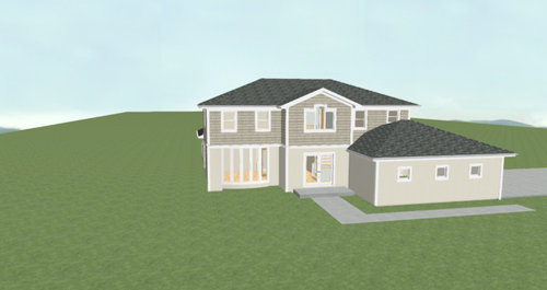
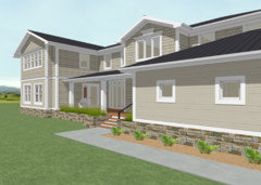
I’m adding an addition to my 20-year home, essentially 2 stories added on one side. I’ve included a "render" of it now, and 2 ideas of exterior changes. I designed and built the home, and we love it, but need to add on.

What I’m looking for: opinions on the addition form and exterior design on the front (most harmonious and “correct”), for example, sizing/configuration of windows… I could change all this, because I’m just doing the plans now. Stylistically, I consider this kind of coastalish, craftsmanish, shingleish.


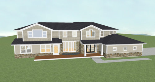
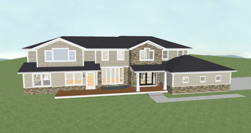
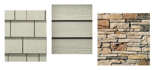
What I have in mind: stone, 7” siding, 7” shake. Replacing whole roof with black standing seam. Deck in front (vs. large cement/stone patio). Replacing dryvit on bottom, and adding a covered porch. Not a lot of extra pieces at this point.


To note:

  • The house is 700’ back from the road and has a 1/2 acre pond in front (no neighbors to hide from). So the bow window and front door have great views. Northwest Ohio.
  • First floor, the addition contains a living room (hence the additional entry door), and then a bedroom (about 50/50 of the 30' width of the addition) and windows are 20” from the floor, so when sitting you can look out easily.
  • Upstairs is a big open “project room” so I wanted that to have unobstructed views as well.

Concerns: Big window upstairs seems kind of 1950ish.

Rest of the house is 5” D5 siding in a similar tone, and the full home has a white band around the middle, with crown on top. All exterior windows, save those above the front door have 5" trim with no crown.

CURRENTLY IT LOOKS LIKE THIS:


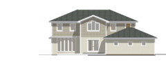
IDEA A: Less stone in front, whole top remains/is straight shake, bottom is 7" siding, stone...


IDEA B: Column of stone up front door, on 3 sides...


Materials... 7" exposure


Any comments and suggestions would be welcomed! I can supply plans and other details if anyone is interested. Thanks!

Comments (22)

  • PRO
    7 years ago
    last modified: 7 years ago
    Well...it's commonly said here of architectural designs that "less is more" meaning fewer use of shapes, motifs and materials is often a much better design result.

    In addition, architects know that interiors and exteriors are inextricably linked--a decision in one sphere has a direct effect in the other sphere. As a result, it takes study and exploration of both, together, before either can be finally resolved.

    That's why so many consumers make a fundamental mistake in their postings here by only looking at their floor plan, and not the elevations and roof plan.

    In your case your elevation would be much stronger and more appealing with changes to the floor plan.

    My suggestion would be to go back and explore your floor plan together with your elevation until both are in harmony. They are not presently.

  • 7 years ago

    Are you really not using an architect for this?

  • PRO
    7 years ago

    I have no idea how someone can say a floor plan doesn't work simply by viewing an exterior elevation.

  • 7 years ago

    I like it. An addition that doesn't look like an addition.

    I'm not a huge fan of stonework so definitely prefer the first of your two options.

    Beverly's second floor window suggestion is a huge improvement. And she is correct about your front door as well.

    Mike Osswald thanked sheepla
  • PRO
    7 years ago
    last modified: 7 years ago
    I don't believe I said that the floor plan doesn't work. I said that floor plan and elevation are linked.

    The exterior elevation is unorganized and unresolved.

    The only way to improve the exterior elevation is to revisit the organization and development of the floor plan.

    Floor plans, elevations and roof plans are inextricably linked.


    The same holds true for giamongous and disorganized roof plans: it's a clear sign that the floor plan was developed without thought of the roof plan--the roof plan is simply an afterthought of the result of a narrow focus on a floor plan.


    That's the case here--the exterior elevation as shown is simply an afterthought.

    Mike Osswald thanked Virgil Carter Fine Art
  • 7 years ago

    More isn’t more. More is worse. The plan needs to be pared back a lot more. Too many gables and bumps and materials. Way too many materials. Shingles for it all would help to unify all of the busyness. But that busyness needs addressing first. It’s just too much.

    Mike Osswald thanked User
  • PRO
    7 years ago

    Yes, there's too much going on visually. Eliminate all stone as a start. Then consider making all the siding the same material, probably shingles. I don't mind the bumped up windows, but the new window on the left side is out of scale with the existing on the right. They don't have to be the same, but they should relate to each other. And floor plans do have to be developed in concert with elevations, but nothing about your post indicates that they haven't been.


    If you haven't already, I strongly suggest that you bring an architect on board to help you with this.

    Mike Osswald thanked RappArchitecture
  • 7 years ago
    last modified: 7 years ago
    Thanks for the great input everyone, I appreciate it and we are considering and continuing to think about it. I didn't share the floor plan, because I didn't want people to feel obligated to react to too much, and I'm thankful for the comments.

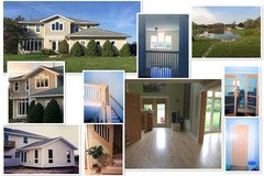
    And, sorry for the delay, but I've attached some ACTUAL photos (some from 20 years ago, some from recent, and yes the landscaping is a disaster). This will give you additional context, and a sense of the design (natural maple everywhere, and MORE casement/fixed panes around the house. But we're finally in a position and need to address this. (Also ignore piano in the doorway, photo was from getting ready to refinish floors.)

    Maybe worth noting that Sarah Susanka's The Not So Big House came out as we were planning this the first time. It's a relatively small and open plan home.

    Beverly, the windows in center are not in a room, the front of the house is open all the way up. with a winder staircase on right. Half the time looking at this addition we wish the roof wasn't a 5/12 hip, as it seems to be limiting in many ways (or at least that gable gums up the works).

    But we are still very fond of our home, and aren't in a position to redo the rest of the house's exterior materials. And the floor plan and exterior are of course linked, we have strategically placed windows everywhere and frequent double rainbows in our skies.

    I'll update soon, and yes we'll likely engage an architect in the future. Thanks again!


  • 7 years ago
    last modified: 7 years ago

    Nice home.

    Like bay windows but not a fan of fixed windows as you appear to have left of the existing front door .

    Would not want two forward facing doors on the front of the home.

    If you don't need that second front door, would at least consider an 8' deep front porch with its roof extending all the way across from the one story roof line to the left front corner of the home and maybe even wrapping around the corner if you could put a screened porch on that left end.

    If, however, your plan needs two forward facing doors on the front side of the house, consider creating a front courtyard on the left side of the house so the door opens into the courtyard and the entry to the courtyard is from the side facing right.


    Use stone or brick for front courtyard walls but use the same siding (whatever you choose) for the entire house itself -- at least the same for all the downstairs and the same for all the upstairs (except, perhaps, for around the front door) or risk making the house have a more obvious add on piecework look.

    Mike Osswald thanked suezbell
  • 7 years ago

    I would stick to at most two materials. If you are using any stone, I would do the whole house in shakes. Of your two presented options, option A makes more sense, but could be improved by lowering the stone down to cover just the foundation on the garage and addition.


    I am also bothered by the door in the addition. It is competing for attention with the front door, and cluttering up that wall. If you need access there, could you make the two pairs of double hung windows pairs of french doors instead? They could be designed to look more like the tall bay window and provide some consistency to your front elevation.


    Similarly the gable front on the front elevation is competing with the gable over the entrance. I would try reducing the size to be no wider than the entrance level or try eliminating it all together and see how that looks.

    Mike Osswald thanked A Fox
  • 7 years ago
    last modified: 7 years ago

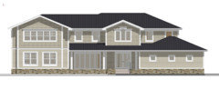
    I have returned with a new design that changed just about everything. Now there is a full porch. And a door on the side. And shake. And stone at the foundation. Gable in front is much narrower, as the addition has be reshaped and laid out differently inside.


    Bottom on the addition and garage is straight 7" (but shake under the porch).


    Any thoughts or comments are welcome... :)


    Thanks!

  • 7 years ago
    last modified: 7 years ago

    One of the best features of shingle siding is the ability to wrap or weave the corners and eliminate corner boards which IMO chop up an otherwise nice facade.

    Shingles can also be flared over the foundation or a belt line of a horizontal board and a bed molding or crown. I think these features would be a dramatic improvement on your house.


    Mike Osswald thanked User
  • 7 years ago

    You’re a good sport to post your updated design and ask for feedback. I think it looks cleaner/better (hard for me to scroll up and down on my phone to see all the changes). The shingles appear to suit it better, but for the life of me, I couldn’t explain why.

    Mike Osswald thanked Anna (6B/7A in MD)
  • 7 years ago

    The updated design looks much better.

    Why two different siding materials? Why not just pick one siding and one stone?

    Mike Osswald thanked Kristin S
  • PRO
    7 years ago

    I'd try it without the 1st floor shingles, using lap siding on the entire first floor.

    And the columns need something. Maybe double them up.

  • 7 years ago

    Why are you using pork chop returns?

    Will you have to redo the whole roof? If so, I'd change it all to gabled roof.


  • 7 years ago

    It looks better, but I think it might look even better if you skip the jogs on the front sides on the addition. Either keep that all straight ( my preference) or make it more bay like. The proportions look off to me.


  • PRO
    7 years ago


  • 7 years ago

    Hi, some thoughts out loud as I iterate a bit more. The current house aside from the front is D5 high-quality vinyl siding and 5" trim which we are not replacing at this time. And plenty of fixed and casement around the bottom. We've enjoyed the Dryvit on the front but it's in need of repair. We're not rebuilding the existing roof, except to add in the porch roof and addition connection. So the white trim and belt with crown are used elsewhere. And the bow window will be deep under the porch but we think a porch is what we've been waiting for for 20 years. Good southern exposure anyway.


    But good points by everyone so far, so thanks very much!


    So, Kristin S, regarding the mixed siding materials... Here in NW Ohio anyway, I have 25+ photos of well-built homes that break all these rules with mashup of straight, stone, shake, vertical, some with all four. (Not to mention an insane number and complexity of gables, varying levels of stone heights.) Plus white trim, siding-colored trim, black exterior window frames, and everyone is nuts for standing seam porch (but only the porch). And one house with a crazy wide eyebrow roof VENT.


    So, I recognized as well what many on Houzz say, which is using so many materials don't make any "vernacular" or I guess I mean "functional" sense. But they give a little variety here and there. And people can do what they want, so I see how it happens.


    It seems to me that what pros such as yourselves are saying when it comes to mixing materials is that stone as a foundation makes sense. And maybe that one material per floor makes sense (like layers on top of each other). But of course our home is some interpretation of Craftsman, Prairie, Coastal, and look at a bit of each, but still wanting to stay on the simpler side. But we're also trying to push it a little on this addition, give it a little more flair. I'm cringing now at the first ideas, and pleased with everyone's comments helping us iterate again.


    So lyfia, I guess as we kept looking at this and many other photos, and trying many shapes, we just want something nice to happen, while including the belt. But maybe the proportion needs work.


    cpartist, our returns are actually flush, thanks for noticing because they shouldn't be "pork chop". But since I'm not changing everything all around, PPF, while I like the closed angled eave, I guess that seems out. (My flat soffits are beadboard look).


    PPF, going to look at the columns. Will try double in the center again. Trying to not block the door, or the bow, and the bow wall span is 15'ish, while the door span is 13'ish. In any case, will probably make them robust and with a little trim accents.


    RES 3d Sketches, shake is so beautiful, I'm planning to use fiber cement shake, which can be weaved, but I have white trim so much elsewhere. I do love the flaring though, going to look at that some more.


    I'm surprised no one mentioned the stone planter boxes in front of the porch! (Just trying it on for an idea). Actually, maybe there shouldn't be stone in front of the porch deck, since a porch doesn't sit on a foundation?


    Will post again soon.

  • PRO
    7 years ago

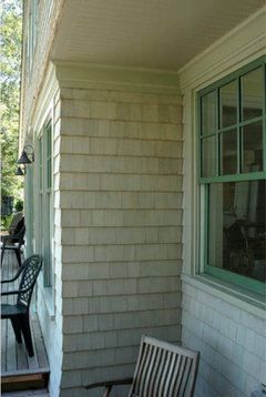
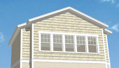
    My image above was not about the eave, but about the roof following the wall.

    Mike Osswald thanked PPF.
  • 7 years ago

    So, Kristin S, regarding the mixed siding materials... Here in NW Ohio anyway, I have 25+ photos of well-built homes that break all these rules with mashup of straight, stone, shake, vertical, some with all four. (Not to mention an insane number and complexity of gables, varying levels of stone heights.) Plus white trim, siding-colored trim, black exterior window frames, and everyone is nuts for standing seam porch (but only the porch). And one house with a crazy wide eyebrow roof VENT.


    So, I recognized as well what many on Houzz say, which is using so many materials don't make any "vernacular" or I guess I mean "functional" sense. But they give a little variety here and there. And people can do what they want, so I see how it happens.

    If all your friends jumped off the cliff...?

    Just because everyone else is doing it doesn't make it good or right.

    But of course our home is some interpretation of Craftsman, Prairie, Coastal, and look at a bit of each, but still wanting to stay on the simpler side. But we're also trying to push it a little on this addition, give it a little more flair. I'm cringing now at the first ideas, and pleased with everyone's comments helping us iterate again.

    No, there is nothing craftsman or prairie with your house. And pushing it only works well when you first know what are the different styles. Know the rules before you break them.

    The simpler the house, the more classic and the more it will stand the test of time.

    Mike Osswald thanked cpartist