

paint choices... will they work
7 years ago
Featured Answer
Sort by:Oldest
Comments (13)
 7 years ago
 7 years ago
Related Professionals
Florence Kitchen & Bathroom Designers · Concord Kitchen & Bathroom Designers · El Paso Kitchen & Bathroom Designers · Amherstburg Kitchen & Bathroom Designers · Montréal Kitchen & Bathroom Designers · Lake Charles Kitchen Remodelers · Concord Custom Countertops · Elizabeth City Custom Countertops · Winston-Salem Custom Countertops · Austin Custom Countertops · Sugar Land Custom Countertops · Des Moines Custom Countertops · Waterloo Custom Countertops · Saint Marys Custom Countertops · Lancaster Custom Countertops- 7 years ago
- 7 years ago
 7 years ago
- 7 years ago
- 7 years ago
- 7 years ago
 7 years ago
- 7 years ago
 7 years ago
- 7 years ago
Related Stories

COLORPick-a-Paint Help: How to Quit Procrastinating on Color Choice
If you're up to your ears in paint chips but no further to pinning down a hue, our new 3-part series is for you
Full Story
DECORATING GUIDESEasy Green: 5 Ecofriendly Paint Companies
Dizzy spells and headaches, begone. Be kinder to your health and the environment with these safer paint choices for your interior decorating
Full Story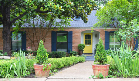
EXTERIOR COLORChoosing Color: Transform Your Exterior With 2 Cans of Paint
One charming brick house takes on 4 color combinations to show you the power of paint choice
Full Story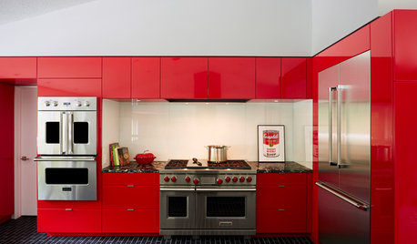
COLORFUL KITCHENSCabinet Paint Colors That Are Anything but Neutral
Craving some color for your kitchen? Consider these bright choices for your cabinetry
Full Story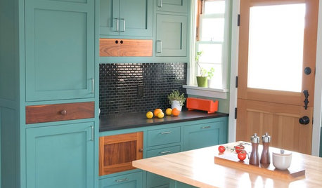
KITCHEN CABINETSKitchen Cabinet Color: Should You Paint or Stain?
Learn about durability, looks, cost and more for wooden cabinet finishes to make the right choice for your kitchen
Full Story
COLOR PALETTESWill These Soothing and Rich Paint Colors Define 2021?
Paint companies released their 2021 Color of the Year choices. See if soft teal, elegant brown or other shades suit you
Full Story
PAINTINGBulletproof Decorating: How to Pick the Right Kind of Paint
Choose a paint with some heft and a little sheen for walls and ceilings with long-lasting good looks. Here are some getting-started tips
Full Story
MOST POPULARThe Right Way to Test Paint Colors
Here are 5 key steps to take to ensure you're happy with your wall paint color
Full Story
COLOR11 Terrific Paint Color Matches for Wood Details
Pair your wood trim and cabinets with the right shade of wall paint to bring out the beauty in both
Full Story
BATHROOM DESIGN8 Bold Paint Colors for Your Powder Room
Turn your powder room into a exclamation point with a bold shot of red, raspberry, hyacinth, rich brown or stormy blue
Full Story


localeater