Software
Houzz Logo Print
trish_walter

Help with Elevation

6 years ago
last modified: 6 years ago
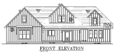
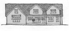
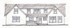
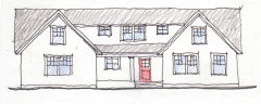
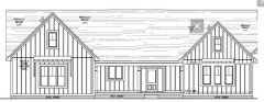
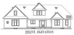
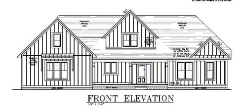
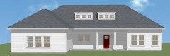
We are finalizing elevations and are stuck between these 2.

I received help on Design forum and thought I'd present it here as well. [design 1 came from suggestions].

Left side sticks forward [side load garage]; middle has entry below bedroom above; right has bedroom/office below [2 of 3 from left to right windows] with closet [last window on right] and blank area above. Back right is higher ceiling if that matters [12' instead of 9'].

Thanks for any help.

1


2


Trish

Comments (56)

  • 6 years ago
    last modified: 6 years ago
    IMO its pointless to offer design advice with only one elevation. All I can say is the ridge of the dormer should not be taller than the main roof ridge.

    What is the Design forum?

  • 6 years ago
    last modified: 6 years ago
    Many of the architects and designers on this forum can read elevation and plan drawings well enough to give you good advice but for you to be sure you like it you should get a 3D model.

    The other advice I would offer is to remove all of the siding and roofing from the elevations so you can see what is really going on with the massing of the house. The drawings are so busy I find it difficult to look at them.

    In the first elevation, why would the little dormer be lower than the big dormer? Is there a chenge in floor level?

  • 6 years ago

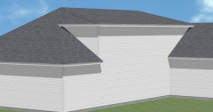
    Is the right side of this elevation cut off? or does the roof line really get squared off like that?

  • 6 years ago

    Which window spacing work best for the rooms inside?

  • 6 years ago

    Hi Trish, beautiful home either way - but I think #1 is the best looking option not knowing anything about then inside. I think it’s timeless and love the front right window being bigger. Hard to swallow all the negative comments and silly questions so just ignore them. Can’t go wrong either way- your house, your taste, your design. All that really matters is that you love it! ❤️Good luck!

  • PRO
    6 years ago
    last modified: 6 years ago
    Actually...one can easily "go wrong" with their house, taste and design.

    The fact that someone may love a house which is poorly designed doesn't change the poor design.

    How many times have we seen it here...?


    That said, I like the first elevation.

  • 6 years ago

    But if their “poor design” (your opinion) is what they love and they are living in the house and you aren’t, does it matter? Your idea of a good design could be quite different than mine. It’s finding something that works for you personally which will depend on how you live your life everyday. And unless it’s some super outlandish flow/floor plan - it won’t really hurt you if it ever came time to sell. I’ve lived in a number of homes that I really liked that weren’t perfect for me - as I didn’t build them. I would make different choices when designing my own. But even though they weren’t perfect - I still bought them and enjoyed living in them while we were there.

  • 6 years ago

    Of the 2 elevations, my eyes prefer option 1.

  • 6 years ago

    well said jenntref

  • PRO
    6 years ago

    jenntref, there are some pretty universally accepted norms for "good design". Pros are aware of what they are and their value. You may well adore you purple and chartreuse striped walls with orange shag carpet and find it quite chic, but don't expect those knowledgeable about good design to find it appealing. There is a difference between "personal taste" and "good design". Sometimes they coincide; often they do not.


    Humans are infinitely adaptable, but just because we are, it doesn't mean that we should pay no attention to designing a house that "works". There are several far from ideal things in my home of 35 years, and I have adapted to them and they don't keep me in a perpetual bad mood, but I sure wouldn't design a new house with these things the way they are. But I bought a 1948 house and while I've done multiple remodeling, it's still the same "box" it was when I bought it and its limitations.


    When building a new house, there is the opportunity to "get it right". Why on earth would anyone build in a known problem? Of course there will be cost limitations, but they should never limit one to truly bad design. If it's a tract house, consider looking for an existing one that is better.


    My role as a designer (I'm now fully retired - don't even do work for myself anymore), is to help people achieve their vision of their house. Often, what they think will do this, I know, from years or experience, will not do so and can advise them to accomplish it another way.


    We often say on GW: "You don't know what you don't know", and that pretty much sums it up.


  • 6 years ago

    lol at the good design police.

    1. following examples were all "good design" at some point

    time was (in England)when having small windows was considered good design. only low class people had tans so you hid from the sun and had small windows

    -houses didn't have an entry room - what a waste of space

    • low ceilings to save energy
    • sleeping porches
    • closed floor plans that had to be closed for the load bearing walls
    • hidden kitchens
    • living spaces towards the street
      -living spaces away from the street
    • sitting rooms
      -formal dining rooms
      -farmhouse kitchens
      -kitchens with islands
      -ridge vents
      -long hallways
      -no hallways

    it seems like good design is really flavor of the moment design.

    every design book I've ever read, said minimize hallways it's wasted space- yet I see more hallway space in architect designed plans than I see in builder or plan mill plans.

    figure that one out.

  • 6 years ago

    DE - I have to say, based on that comment, that you don't understand what "design" actually is. Hint: it's not simply a random collection of features. And it's not independent of location, orientation, building materials and construction techniques or era. There are reasons my grandmother's childhood home in England, built in 1597, didn't have huge windows or vast open concept areas, and those reasons had a lot to do with the limited availability (ie none) of plate glass, steel beams, and effective central heating at the time the house was built. You had a fireplace in the room or you froze in winter: hence, small bedrooms with low ceilings. And I won't even get into the subject of bathrooms... It did have a farmhouse kitchen, possibly because it was a farmhouse. And lots of small rooms in the attic for the servants. And yes, hallways.

    A house designed today to fulfill the same functions would look very different because we have laminate and steel beams, electricity, indoor plumbing and automobiles. And no footmen or scullery maids. Our lifestyles are very different. That doesn't mean the old Tudor was a bad design in its day, because it made good use of the materials and building practices available to provide a home suited to the lifestyle if the time. But no one would replicate it today any more than one replicates a DC3 for standard commercial air travel. Designs in and of their eras.

  • 6 years ago
    last modified: 6 years ago
    thanks all. appreciate all feedback good and bad.

    Learning a lot. Wish I had started this a year ago here. We are behind the 8 ball.

    Again I do appreciate even if it's painful.


    These elevations don't affect the interior except for windows on right lower side possibly. The 3 together make more sense probably because they'd be in bedroom and none in closet. Otherwise 1 in closet. Beyond that, we designed so as not to affect the inside.


    Do not live in Florida. Indiana.


    Right side probably cut off..hubby kind of 'winged it'.


    I think that was most of the questions I'm able to answer.


    Trish


  • 6 years ago

    PPF, you’re the “elevation whisperer”!

  • 6 years ago

    I think I’d rather have three windows in a bedroom than a window in a closet (which might be nice for light, but not for privacy or storage capacity). I also prefer the first elevation aesthetically. Good luck!

  • 6 years ago

    The house just seems timid to me. On the assumption that a 3D model would reveal weak side elevations due to the hipped roofs I used end gables and let the front dormers be big and repetitive. I would not show the board & batten siding until the shape and style of the house was acceptable.


  • 6 years ago

    I'm sorry if you answered this already but are you married to a hip roof?

    In your second rendering, it really bothers me that the right small gable is not over an offset area of the house. I think it looks odd just kinda "stuck" on there. What if you made your front porch extend all the way to the far right and then centered a gable above your front door?


    PPF's and RES's last designs are also more aesthetically pleasing to my eye than yours in the OP. I definitely prefer gable roof, too, to the hip one.

  • 6 years ago

    PPF, can you render RES's version? I think that one is the best one.

  • 6 years ago

    shead. no not at all. thanks.


    and thanks so much everyone.


    Trish

  • 6 years ago

    Trying to tack on an elevation without a floor and site plan is a pointless endeavor. As Steve Jobs observed: "People think it's this
    veneer — that the designers are handed this box and told, 'Make it look good!'
    That's not what we think design is. It's not just what it looks like and feels
    like. Design is how it works
    .”

    I suggest posting the site and floor plans to get meaningful "Hey, that works!" feedback.

    But good luck in your build. Exciting times ahead!

  • 6 years ago

    PPF pretty much nailed it with that last rendering! I definitely prefer the gable over the hip and it seems more authentic to me for the farmhouse look.

  • 6 years ago
    last modified: 6 years ago

    shead this one?


    thanks all for the help.

    Special thanks to ppf and res 3d for drawings. you rock. so grateful.


    Trish

  • 6 years ago
    last modified: 6 years ago

    Okay, I'm confused because PPF's last designs (the one you screenshotted plus the other one) are no longer appearing on this thread. Weird unless he deleted them ¯\_(ツ)_/¯

  • 6 years ago

    I doubt many on the forum realize how much time and skill is required to draw a 3D model especially when there is so little information provided. It would be inappropriate to take PPF's generosity for granted by asking him to make a 3D model of someone else's idea.

  • 6 years ago

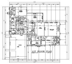
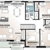
    I'm confused. Did you flip your house plan that you posted as "preliminary" because these elevations don't seem to agree with that one posted HERE?


  • 6 years ago

    shead, it's been changed a lot since then. and flipped.

  • 6 years ago

    Is there another post with the current floorplan?

  • 6 years ago
    last modified: 6 years ago

    Why is the side load garage so far out in front of the main home body? It makes for a very long and circuitous route to the front door. Are you trying to actively discourage visitors with an unwelcoming facade? Garages should be tucked back a bit, so they don’t dominate and look like the house is the secondary structure instead of the garage.

  • 6 years ago

    shead. I just updated current floorplan on the old thread...scroll to bottom. Thanks.


    https://www.houzz.com/discussions/5761144/here-s-my-preliminary-floorplan-for-your-review


    sorry live wire oak it sticks out about 1.5 garage lengths...there are trees blocking the view as you drive from that side so won't be as noticeable as seems.

  • PRO
    6 years ago


  • 6 years ago

    PPF. that's very nice. Thank you.

  • PRO
    6 years ago


  • 6 years ago

    these are great PPF. We have no bump outs on left or right in our floorplans. Does that make a difference? Are you wanting us to add them? We are trying to minimize expense so prefer not to have them. Thanks so much.

  • 6 years ago
    last modified: 6 years ago

    I like PPF's continuous shed dormer between two gable elements. Perhaps it could be simplified to fit the current plan and combine PPF's earlyier and later designs. The post could be deleted.


  • PRO
    6 years ago


    I'll try to explain what I was thinking when drawing.


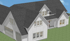
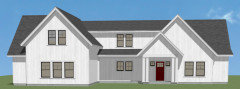
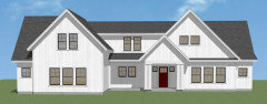
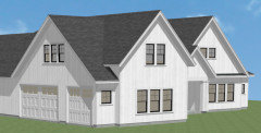
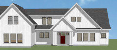
    I like gables over doors to shed moisture (snow and water) to the side. I don't like a large front facing gable over the garage because it usually dominates the front elevation. Bonus rooms should be usable and not just finished attic space -- unless that's all that is wanted.


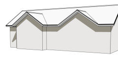
    This design raises the roof over the garage giving you more space in the bonus room, makes the front facing gable smaller, and puts a gable over the garage doors that also expands the usable space in the bonus room.


    For the right side, I experimented with how to create a gable that would be tall enough to both visually balance the one on the left, and to allow a shed dormer to run between them.


    I think gables look best when over a wall where there is a change in plane -- it projects out like the one shown here on the left, or may be recessed. It looks honest, where the one on the right does not.


    On your house, I moved the guest room front wall forward a bit creating what you called a bump out to the right.


    And remember, I'm just a guy with an opinion and the software to visualize it.

  • 6 years ago

    thanks so much.

  • PRO
    6 years ago
    last modified: 6 years ago

    I posted this on your previous thread.


    And your response was: " Unfortunately the middle has a bedroom. The right side does not. ".

    The plan and the exterior are linked and sometimes the plan needs to change, or the exterior needs to be rethought, to make them work together.

  • 6 years ago

    so weird. I thought I posted earlier today floorplans and new elevation...but didn't save...


    I'll try again...sorry.


  • 6 years ago


  • 6 years ago

    Why is the right side of the roof clipped off?

  • 6 years ago

    The house would look 1000% x better with a gable roof instead of a hipped roof

  • 6 years ago
    last modified: 6 years ago

    thanks cpartist.

    Like this?


  • PRO
    6 years ago

    Here is a different idea that would require the 2nd floor to change with both bedrooms in the rear, and eliminating the bonus room. Less expensive roof.


  • 6 years ago

    wow...that is a good idea PPF...thanks so much for taking time for this. appreciate it...

  • 6 years ago
    last modified: 6 years ago

    Trish, a house is a water balloon. You stretch it this way, and it gets skinny that way. You push it that way, and it gets fat this way. The balloon changes shape. But so does the water in the interior. You can’t concentrate on the shape of the balloon without realizing that the water inside has to match the balloon on the outside.

    You have to design the interior simultaneously with the exterior. They aren’t separate components. And that garage schnozz front needs to go away behind the plane of the house. It’s a bad design to have to make your guests do a Where’s Waldo to even find your way to the front door in the rain by doing a complete ring around the rosy around an entire two car garage. You should be able to see the general front door area, and a clear path to it, from where your guests park. Unless you’re doing a porte cochere for the chauffer’s to drop them off under cover.

  • 6 years ago

    live wire oak. There will be parking in front of the house leading to the walkway to the front door.

  • 6 years ago
    last modified: 6 years ago

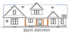
    I think maybe the issue I'm having is it's not symmetrical because of interior elements. So maybe by removing the big covered porch and just having a small one to keep people dry etc. might help?

  • 6 years ago
    last modified: 6 years ago

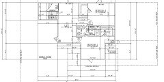
    The second floor plan is lopsided with the the habitable rooms and stair pushed to one side of the house. I would let the house be a full story and a half with a stair featured near the center of the house. I would also frame the roof with rafters and let any unneeded upper floor space be unfinished.