

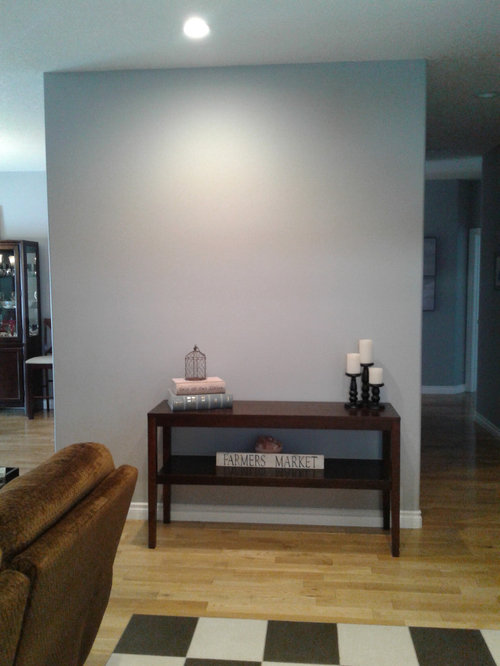
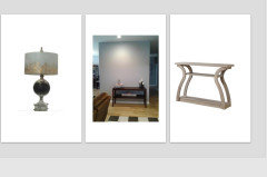
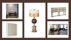
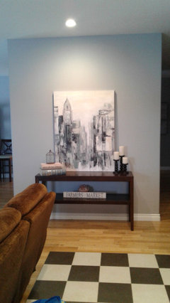
Front enterance facing wall needs work!
6 years ago
Featured Answer
Sort by:Oldest
Comments (22)
 PRO6 years ago
 6 years ago
Related Professionals
Athens Interior Designers & Decorators · Frisco Interior Designers & Decorators · South Sioux City Interior Designers & Decorators · Wausau Interior Designers & Decorators · North Platte Interior Designers & Decorators · Rapid City Interior Designers & Decorators · Albany Architects & Building Designers · Kalamazoo Architects & Building Designers · Marquette Architects & Building Designers · Huron Architects & Building Designers · Green Bay Architects & Building Designers · Show Low Architects & Building Designers · Fort Smith Kitchen & Bathroom Designers · Louisville Kitchen & Bathroom Designers · Bloomington Kitchen & Bathroom Designers 6 years ago
- PRO6 years agolast modified: 6 years ago
- PRO6 years ago
- 6 years ago
- 6 years ago
- 6 years ago
- 6 years ago
 6 years ago
- PRO6 years ago
- 6 years ago
- 6 years ago
- 6 years ago
- 6 years ago
 PRO6 years ago
- 6 years ago
 6 years ago
- 6 years ago
- 6 years ago
- PRO6 years ago

Related Stories
REMODELING GUIDES11 Reasons to Love Wall-to-Wall Carpeting Again
Is it time to kick the hard stuff? Your feet, wallet and downstairs neighbors may be nodding
Full Story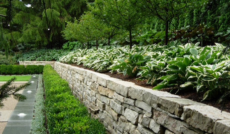
LANDSCAPE DESIGNGarden Walls: Dry-Stacked Stone Walls Keep Their Place in the Garden
See an ancient building technique that’s held stone walls together without mortar for centuries
Full Story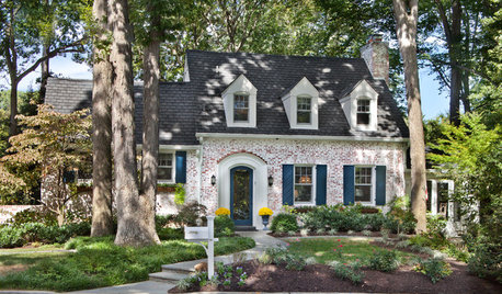
CURB APPEALThe Cure for Houzz Envy: Great Front Facade Touches to Borrow
Pull up to a better view and make visitors feel welcome by perking up your home’s face
Full Story
BATHROOM DESIGNShould You Get a Recessed or Wall-Mounted Medicine Cabinet?
Here’s what you need to know to pick the right bathroom medicine cabinet and get it installed
Full Story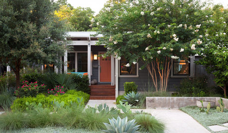
LANDSCAPE DESIGN6 Front Yards That Balance Privacy With Curb Appeal
Selective screens, layered plantings and low walls boost privacy but still keep yards welcoming to neighbors
Full Story
WALL TREATMENTS7 Ways to Decorate Your Walls When Painting Is Not an Option
These wall decor ideas let you be creative when you rent, despite any design restrictions you may face
Full Story
COLORHow to Paint Your Front Door, From Start to Finish
Learn what you need to know about this weekend project, such as the best paint to use and the right time to do it
Full Story
SMALL HOMESMy Houzz: Walls of Art and Glass in a Brooklyn Loft
Eclectic collections, vintage furniture and favorite artworks personalize this 1,000-square-foot open-plan loft
Full Story
LANDSCAPE DESIGNYard of the Week: Elegant Poolside Retreat and Front Yard Lounge
A landscape design-build firm gives a family in New Jersey an outdoor oasis for swimming, eating and relaxing
Full Story
PRODUCT PICKSGuest Picks: Make a Meaningful Display Wall
Personalize your walls to your heart's content with shelves, clips, frames and customizable art
Full StorySponsored

Columbus Design-Build, Kitchen & Bath Remodeling, Historic Renovations

BeverlyFLADeziner