Software
Houzz Logo Print
webuser_42319409

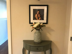
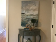
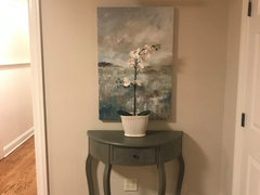
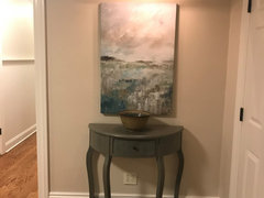
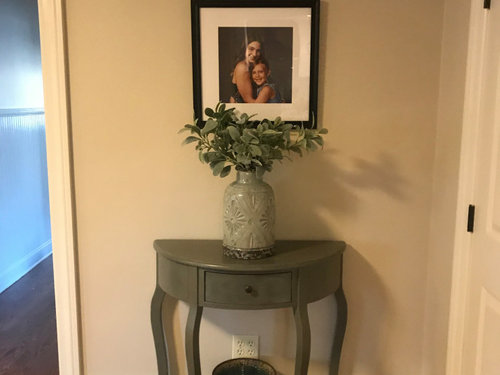
Does this picture look ok?

6 years ago


Comments (48)

  • 6 years ago

    No

  • 6 years ago

    Ok thanks. Any ideas on how to make this picture work?

  • 6 years ago

    That picture light was there when we bought the house...

  • PRO
    6 years ago

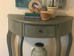
    IMO personal pictures belong in personal spaces and that vase is too big to be in front plus fake stuff in a vase is IMO never a good choice.

  • 6 years ago

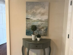
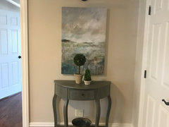
    Ok thanks. Those bushy green leaves are pretty bad. Replaced them with these in the meantime and removed small bowl but I’ll think about something different for that space. Thanks again


  • 6 years ago

    IMO the picture is too small for the space. I would suggest removing the table and replacing with a large piece of art.


    If keeping the table, I would still increase the art size and I would remove the vase.


  • PRO
    6 years ago

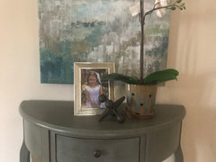
    No fake anything remove the vase lower the picture or better yet if you mst have it there a larger frame and mat. I think this looks like your son and I will tell he will not want that picture out in the open when he becomes a teenager,

  • 6 years ago

    As for the flowers, if you must keep them, I would do the bushy greens instead. I guess it is personal preference but the greens look more like dried flowers, the others look like silk flowers. IMO dried is better than silk but neither is ideal.


    I don't mind family photos, in fact, I kind of like them. It's just that this frame is too small.

  • 6 years ago

    No. The picture is too small and too personal. It feels awkward and almost uncomfortable when entering a common space to see such a personal picture.

  • 6 years ago

    @Kate

    Uncomfortable. Really? I find this so bizarre to have such a strong reaction to a family photo. Art is personal too.

  • 6 years ago

    IF her son expresses distaste one day for the photo, won't she able to handle that situation then? ;-) Apparently the photo is meaningful and worthy now of hanging; she gets to enjoy seeing it regularly in the open until the day she chooses to remove it.

  • 6 years ago

    Ok thank you everyone

  • 6 years ago

    Great picture! You are asking on a design site, so I’m going to agree that it is a bit small for the spot you chose. I can’t give alternatives without seeing the house. Or th rest of your photo collection.

    When I get a new piece of art or a new framed photo, I hold it and walk the entire house looking for the right space for it.

    Mel thanked auntthelma
  • 6 years ago

    The pic was taken by a professional photographer. 2 girls by the way lol. Also I had it framed by frame bridge. Not getting rid of it obviously but I could put it in my bedroom... I do have a different painting I could use in this space instead

  • 6 years ago

    You don’t have to hide it. There may be other spots in the living room, family room, dining room, den or kitchen.

  • 6 years ago
    last modified: 6 years ago

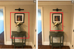
    The photo is lovely but too small for that location. Art in the sizes shown by ilikefriday...with or without the table...would work nicely.

  • 6 years ago

    Sorry, couldn’t quit make out the faces. Cute photo. Maybe put a smaller version on the credenza and the large print in a different spot that you can walk past everyday, hallway perhaps?

  • 6 years ago

    Thanks everyone. Very helpful. Will move the pic of my daughters and post when the art is up.

  • 6 years ago

    I think it looks good, but with a shorter wider vase.

    Mel thanked houssaon
  • 6 years ago

    sorry to say, but it looks like a grieving corner ....
    remove a table and make a bigger duplicate of the picture in a bigger frame.

  • 6 years ago

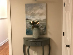
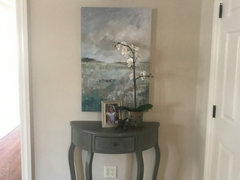
    Better?


  • 6 years ago

    Yes...better but I would remove the vase.

  • 6 years ago

    Dump the vase and stuff in it. Why would you have a vase that block about one-third of your art? also, is the light off center?

  • 6 years ago

    Looks better! I would either remove the vase or restyle the table.


  • 6 years ago

    Thanks all! No Lisa that’s just the angle

  • 6 years ago
    last modified: 6 years ago

    Try the vase on the lower shelf. The pic of the girls was cute, but this is better for the space. It looks great with your little table.

  • 6 years ago

    Thanks Olychick

  • 6 years ago

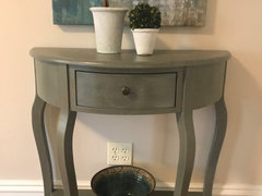
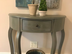
    How’s this??


    Option 1


    or this...


    option 2


  • 6 years ago

    Since it’s a round/ curved console table go for a round or oval shaped mirror.

  • 6 years ago

    Thanks momo but I already have a mirror in this room.

  • 6 years ago
    last modified: 6 years ago

    I think that looks very nice. (The last pic). How do you like it? The rest look like there's too much stuff. Try pulling the dish forward just a bit.

  • 6 years ago

    Thanks so much Olychick. Just wasn’t lovin it. I think i need to listen to everyone and get rid of the clunky vase. How’s this instead??


  • 6 years ago

    I have these topiaries as well. The tan/off white pots might blend a little better


  • 6 years ago

    I would have the art framed and I would replace the light with something more transitional.

  • 6 years ago

    Thanks felizlady. Framing is a good idea

  • 6 years ago

    What about the bowl like you had it and without the vase?

  • 6 years ago

    Thanks Olychick, yes I could do that... but what do you think of this orchid or I could get a smaller one?? I know it covers the art but I like how it adds some height but it’s still airy


  • 6 years ago

    Maybe off to the side as far as you can put it...I don't think it looks good centered in front of the art.

  • 6 years ago

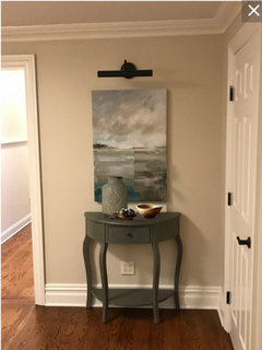
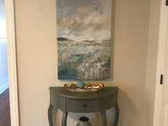
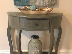
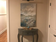
    and here’s just the bowl...


  • 6 years ago

    Thanks Olychick. Here orchid (plan to get a smaller one) off to the side with 2 other Knick knacks. The bowl was feeling too plain to me. I’m so bad at this :(. What do u think?


  • 6 years ago


  • 6 years ago

    You don't need all that stuff on that table! If you like it, then leave it, but the picture is the star and you keep trying to hide it with more stuff. The table and picture together are quiet nice. The low bowl adds some interest to top of the table, but you don't need anything tall there. The picture is the tall thing. It's quite lovely on its own.

  • 6 years ago
    last modified: 6 years ago

    Yes, the table + art are nice together with nothing else. If anything, you might put the vase on the bottom shelf with nothing in it.

  • 6 years ago
    last modified: 6 years ago

    I think you might be trying too hard to make it "work." Why not take everything off the table and just let it be? Some day something that you already love will suddenly strike you as perfect for that spot.

    I find taking time to just let decor evolve is the best and, in my opinion, the best way to create a gallery wall or vignette. In my former home, I had a wall next to the front door and I left it blank for almost two years while mentally trying out various ideas. Even when I finally settled on a gallery wall, it was more than a year before I had more than one thing up there. And it was almost three years after that before it was complete. Once done, however, I never questioned it, never changed it. It had evolved with me and for me and gave me immense satisfaction and joy whenever I looked at it (which was often considering it faced the living room).

  • 6 years ago

    Use the items in the last picture but shift the photo and jack to the left. This way the two smaller items balance the one tall item on the right. Leave breathing space in between.

  • 6 years ago

    Ok. Thank you all for talking some sense into me Lol. For now I’ll keep this one bowl that’s it! My mom gave it to me as a gift and I like the color. I think a floating frame one day soon will look nice as well.


  • 10 months ago

    all photos on Houzz seem fake. AI photos I presume. Just doesn't seem realistic. Disappointing when trying to get decorating ideas.