Software
Houzz Logo Print
eam44

Layout for puzzle lovers

6 years ago
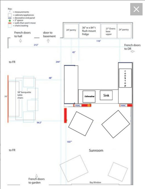
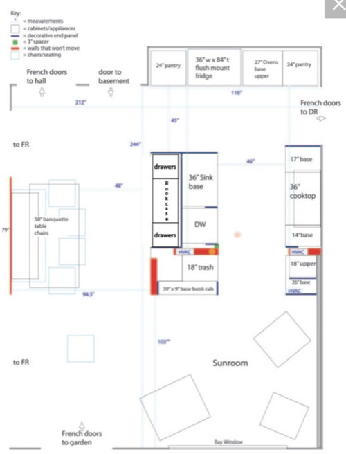
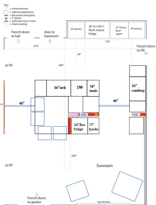
Hello neighbors. Finding my one true layout has been a bit of a puzzle because of structural, plumbing or hvac that cannot be moved without essentially re-building the house. In two previous threads I've managed to come up with the following options. It's time to improve upon them or just pick one. Nothing in red can move. Any input would be welcomed - including telling me to let go of the "pac man" layouts. If it's going to look weird, I'd rather know now. The top image is the current layout.

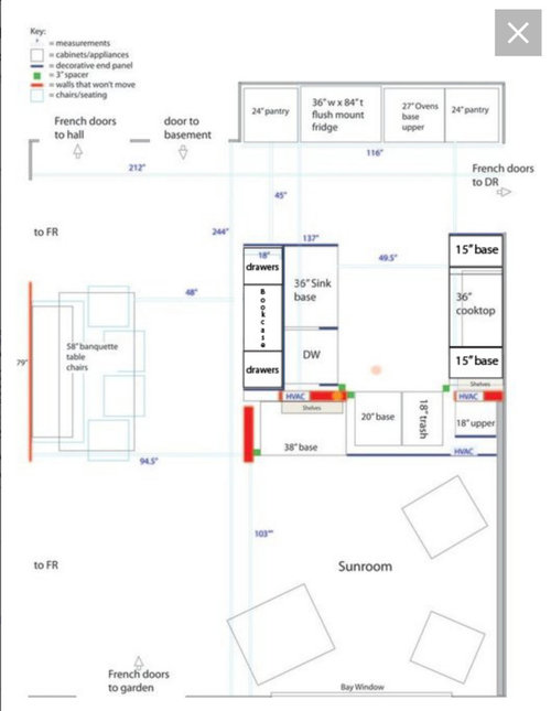
Here are the options I'm trying to improve upon, because there's just not enough counter space. Option #2 is the one I revert to when my manipulations tank.

OPTION #1, NOT REALLY AN ISLAND

OPTION #2, THE U

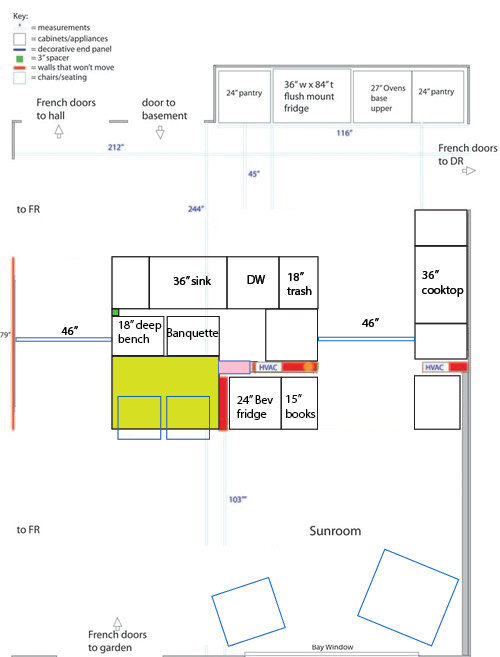
The "pac man" options follow.

OPTION #3, THE BANQUETTE

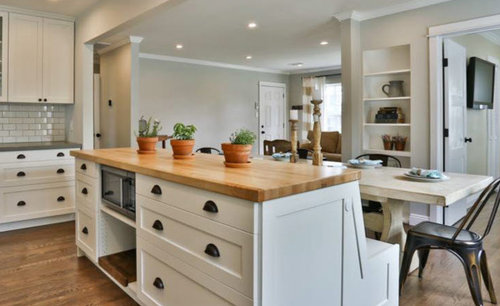
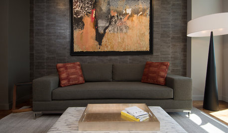
with inspiration image...


OPTION #4, THE EAT-IN ISLAND


Comments (32)

  • 6 years ago

    Anyone?

  • 6 years ago

    The proximity of the sink to the banquette in option 3 doesn't seem like a good option. Splash zone seats. I would say option 4 but with a space like this I would hire a KD.

    eam44 thanked 1901Reno
  • 6 years ago
    last modified: 6 years ago

    Thanks so much to both of you. Kristin, I’d rather sit at a table as well, and I like #3. It was the closest thing to an epiphany I’ve had in this process. I kept a 46” walkway between the table and the wall for symmetry’s sake, but it could be smaller, and the banquette a little bigger.

    1901, I have tried to work with two kds. The first one recommended I keep the current layout. The second came and measured, then didn’t return my calls. No judgements, it’s a difficult space. I can address the splash issue by moving the sink to the right, or increasing the space behind the bench of the banquette. I wasn’t sure how much space I should leave. I can also get a smaller table. That said, #4 gives me tons of counter space. I could butcher a side of beef on that surface if I needed to.

  • 6 years ago

    Option #1 seems to have the most usable space with the peninsula and adjacent counter above the dishwasher.

    eam44 thanked felizlady
  • 6 years ago

    I also prefer Option 1 - but swap the sink and DW locations so you have a drop zone closer to the refrigerator and the sink is between the trash and DW. Also, try to do a custom extra deep trash cabinet as otherwise that is wasted space. The other layouts compromise the dining and sunroom spaces too much IMO.

    eam44 thanked thinkdesignlive
  • 6 years ago

    Which option gives you the most counter space and keeps the working triangle between the sink, stove and fridge?

    eam44 thanked rbhirano
  • 6 years ago

    I’d argue that the ones that give the most counter space negatively impact the whole. It has to be a balance.

    eam44 thanked thinkdesignlive
  • 6 years ago

    #2 but move the DW to where the trash is so you can center the sink giving you more counter space on both sides.

    eam44 thanked debrak_2008
  • 6 years ago

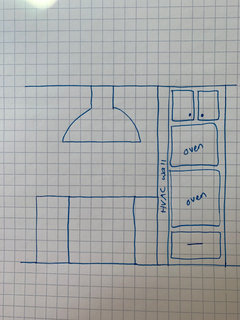
    I think you need something tall to disguise the walls that must stay. Otherwise, it’ll always be like, why are there walls coming up and dividing the countertop. I’d put the ovens on the cooktop side and make a pantry closet or alcove facing the sunroom for a pantry cabinet or beverage station.

    eam44 thanked emilyam819
  • 6 years ago
    last modified: 6 years ago

    2. More freedom of movement. Consider in 1 and 3 when you want to move from the sunroom to the kitchen. Then look at 2 and it’s clear. 4 and 5 are just trying too hard.

    Inagree swap the sink and dw. You want counter space on both sides of the sink.

    eam44 thanked auntthelma
  • 6 years ago

    It’s such a blessing to have fresh eyes on this. Thank you all. Each layout has pros and cons. I guess I just have to decide which pros matter most to me.

    @felizlady, I like the simplicity of #1, but I do worry about there not being enough work space. That said, the “not an island” would be 44+“ deep. Maybe the ability to use the other side of the peninsula makes up for that.

    @thinkdesignlive, balance is one thing the pac man designs sort of lack. Do you think #1 with the sink/dw swap offers a decent work space?

    @rbhirano, they all have a work triangle, and #4 offers the most counter space, but I lose the table and the sunroom is minimized to basically two chairs. And I’m eating at an island. The one thing I really like about #3 and #4 is that the sink run is extensive. It seems a little cramped in #1 and #2. But I pay for it when I lose the dining space.

    @debrak_2008, that is the design I have lived with the longest. I can make the dw/sink swap. #2 is the compromise option, meaning I maximize the work space while keeping the dining and sunroom space mostly intact.

    @emilyam819, I plan to pop an upper on one side or the other of that wall, depending on the design I pick. I’m having difficulty visualizing the ovens change and pantry - can you elaborate?

    @auntthelma, am I misunderstanding you? #2 has the least freedom of movement because one of the U - the pathways is closed. Is that better? Or do you mean #1? The top image is the current layout.

    THANK YOU FOR REASONING THIS THROUGH WITH ME. ♥️

  • 6 years ago

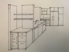
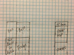
    Yes, I see that you have an upper cabinet where I’m proposing the ovens, but that won’t hide the wall. I’m thinking a tall cabinet would be able to hide the wall. I’ll attach a sketch...

    eam44 thanked emilyam819
  • 6 years ago

    I meant 1. I’m used to the label being under the picture. I read that wrong. I like the open galley type that opens to the sunroom.

    eam44 thanked auntthelma
  • 6 years ago

    I think this looks intentional, not like part of kitchen on other side of wall.

    eam44 thanked emilyam819
  • 6 years ago

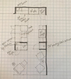
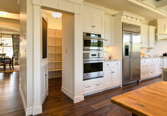
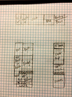
    I think I’d rather have the pantry there so close to the lounge area. Something like this:

    eam44 thanked thinkdesignlive
  • 6 years ago

    A smaller trash cabinet could get the DW on the other side of the wall closer to the sink....that would be better. You get the idea overall. What I like about this is the extra counter space by the micro/2nd oven. And the location of that extra counter in relation to the 'island' makes the kitchen feel a bit bigger. And by doing the open shelf detail with the exposed corner just embraces the quirkiness and sneaks a bit of light through there (which would be a trick to keep that sun room space as open as possible).

    eam44 thanked thinkdesignlive
  • 6 years ago

    ... anything that doesn’t force the island-side HVAC wall to be part of the kitchen.

    eam44 thanked emilyam819
  • 6 years ago

    Not to mention having that extra counter space by the fridge would be the perfect spot for a toaster, coffee, etc to keep that tight range wall as clutter free and useable as possible.

    eam44 thanked thinkdesignlive
  • 6 years ago

    Yes, I agree need counter space by fridge. Good for microwave, buffet space, extra stuff.

    eam44 thanked emilyam819
  • 6 years ago

    Yes, even if it's just small like this:

    eam44 thanked thinkdesignlive
  • 6 years ago

    You’d have to have a really good countertop company for this but could be really cool.

    eam44 thanked thinkdesignlive
  • 6 years ago

    @thinkdesignlive

    @emilyam819

    Oh my gosh, you two are drawing for me. I could absolutely cry. Let me digest a bit. I absolutely love this. Thank you so much.


  • 6 years ago

    Can I change my vote? I love the plan thinkdesignlive drew.

    eam44 thanked Kristin S
  • 6 years ago

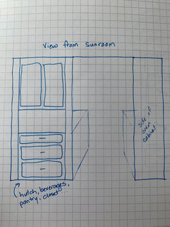
    Thanks Kristin! I actually really like the awkward walls if you leave the corner opening - has an almost Mondrian like quality. Now if your home is more traditional eam44 - then you might want to enclose that corner and do a cabinet where I'm showing shelves. But, if your home is transitional or moving toward more contemporary then the open corner would really work (so no crown molding there please :)

    eam44 thanked thinkdesignlive
  • 6 years ago

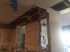
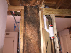
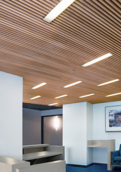
    No crown. The house has very little trim, and a few sheet rocked corners. It is a child of the ‘60’s so it should look like it fits right in. I have wanted to keep that corner open. There are beams and a plumbing tie-in so I might have to have a very small soffit there, or, I’ve been thinking of lowering the ceiling just a bit and doing a linear wood ceiling for the space. But the Mondrian space can remain even if it doesn’t go all the way to the ceiling. Here is the view from the kitchen, and below that, the view from the sun room. The wood beams will be swapped out for a smaller metal beam there.


  • 6 years ago

    Fascinating......I like the last mod looking sketch.....WOW!

    eam44 thanked Susan Davis
  • 6 years ago
    last modified: 6 years ago

    eam44, I still like the 'not really an island' plan, and even though it puts the DW in the sun room, I like thinkdesignlive's version (great sketches, btw). Maybe with the wider sink, which can be used as counter space--with the addition of an integrated cutting board. I'm excited that you're making progress!

    eam44 thanked mama goose_gw zn6OH
  • 6 years ago

    As it stands I do like #2 best, though I agree that you'd want to switch the dishwasher and the sink, both so the sink could be by the trash but also you really don't want a sink at the end of a counter. I was thinking though...What if you moved your tall stuff over next to the HVAC walls?


    Your measurements are blurry on my screen so maybe it wouldn't actually fit, but if you moved the fridge and oven over by hvac walls they would hide it, you could even put a veneer that matches your cabinets over it and another tall closet/pantry/storage on the other side, and a tall built-in hutch to the back of the fridge facing your eating area. You'd move the sink to the back wall where you fridge and pantries currently are. You could still have a tall pantry or just have a base there and upper cabinets or shelves over the sink and cabinets instead. The drawback to this is the sink would probably be visible from your dining room, but workflow wise it would make it easier for clean-up, it would be well out of the cooking/prepping zone.


    Good luck. I spent a good 2 years trying to figure out the puzzle that was my kitchen, with windows and doors everywhere there was no place to put my appliances, my back and front doors both entered right into my kitchen (with all their messes), and I needed a place for my kids to sit and work while I cooked. Just going back and forth on here and really pinpointing what was important to me and what I could live with helped. Sometimes the worst ideas contained the hint that solved the overall problem. You will figure it out!

    eam44 thanked Forever Now
  • 6 years ago

    Oh, I just finally made sense of emilyam819's first picture and I'd actually make that change to my suggested layout (move ovens to the other side of that HVAC wall) as it would give you some more landing space between cooktop and ovens! And you could have another trash by the oven. I always need a trash close at hand when I'm cooking!


  • 6 years ago

    @mama goose_gw zn6OH, and @Forever Now, thank you both for taking a look. I can absolutely tweak the layout a bit, but it feels so great to have confirmation that I’m working from the right plan. You know, I first posted that one five years ago! Thank you again so much.

  • PRO
    6 years ago

    @eam44 - I am looking at the puzzle you have here and am not sure I have anything to offer that others haven't said. I will continue to look and see if I can come up with any other thoughts. In the meantime, here is my current layout and I'm asking others for any recommended changes. https://www.houzz.com/discussions/5945612/kitchen-renovation-should-i-change-the-layout

    eam44 thanked Design Girl
Sponsored
AIS Renovations
Average rating: 4.5 out of 5 stars15 Reviews
Custom Craftsmanship & Construction Solutions in Franklin County, Ohio