Software
Houzz Logo Print
jonilynn25

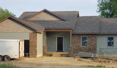
Something doesnt look right with our house.

6 years ago
last modified: 6 years ago
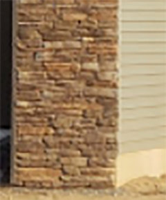
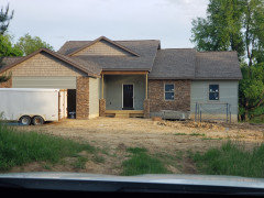
We are building a new home and the interior is fine but the exterior😔 We are missing the mark. The cedar shanks? The garage design doesnt look right. What could we change? When I look at our new house I should be excited and think it's perfect. But theres something off. Granted the posts on the front porch arent done. I wanted the steps on the front porch wider. I would greatly appreciate some feedback on anything..before our house is completely done.

Comments (40)

  • 6 years ago


  • 6 years ago

    Your front door looks lonely and insignificant. Is ceiling height higher in the interior entryway?

    Joni thanked Seabornman
  • 6 years ago
    last modified: 6 years ago
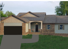
    The two shake shingled gables on the left are making the house appear unbalanced or heavier on the left side. And, the shake material isn't used anywhere on the right. I'd probably have a coordinating gable placed at the roof line furthest to the right using the shake shingles.

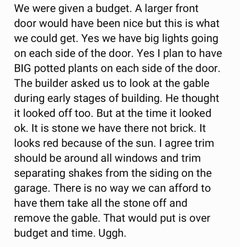
    I presume the front door will be beefed up with a light fixture on each side plus a couple pots of flowers, which should give it more prominence.

    Joni thanked jewelisfabulous
  • 6 years ago

    is it finished? it looks like it might be missing some fan lights around the door and perhaps some shutters. it looks like a lady who has very thin lashes and brows before she fills them in with mascara and pencil (I know of what I speak. im.a redhead. )

  • 6 years ago

    It looks odd to me, and it is not the shakes.

  • PRO
    6 years ago

    What could we change?

    What are you willing to change?

    What type of siding?

    Do you have an elevation you could show so we see the entire front.

    Joni thanked PPF.
  • 6 years ago

    I like it. Imagine a small tree roughly the size of the garage extension on the right, well out from the bedroom windows, say a dogwood, over a larges solid bed of dark pachysandra. Or you have idea space for a bistro table sized bump out off the front right corner of your front walk. I find ours ideal for brief chats with neighbors. I, too, would prefer the steps were wider. Do take care to choose porch lights of sufficient scale; all too often they are wimpy.

  • 6 years ago

    why do you have a gable up on the roof just sitting there? You have three different materials on the exterior (one too many). What color will the house and garage door be painted? You need something on either side of that poor skinny front door (lights/plants)

    Joni thanked new-beginning
  • 6 years ago

    Will there be something extending from the roof above your front door? It looks like the overhang was “cut back” for some reason. it is odd where it meets the garage and I don’t know why that beam isn’t covered by the overhang. that is what I would change - make the roof go straight across from where it meets the garage.


    I do think landscaping and being finished will help though.

    Joni thanked roccouple
  • PRO
    6 years ago
    last modified: 6 years ago
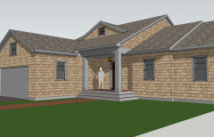
    Eliminate the shark's fin emerging out of the roof like PPF shows. And get rid of the brick.

    Joni thanked Mark Bischak, Architect
  • 6 years ago

    Thanks!

  • 6 years ago


  • 6 years ago


  • 6 years ago


  • 6 years ago
    last modified: 6 years ago
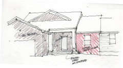
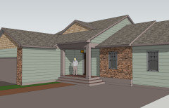
    I would try to reduce the number of cladding materials, remove the brick that doesn't turn the corner at the garage and make the porch structure much bolder and simpler.

    This is just a 2 minute sketch. A 3D model would be the best way to design it.


    A simplified version would be to replace the garage brick with clapboards and add the bolder porch structure.

    Whatever you decide to do, get rid of the posts on stone pedestals and lanterns. They are not only fussy, they're from entirely different design traditions.

    The porch needs to be simple and bold enough to pull the design together. Posts on pedestals belong on a vernacular/craftsman house with a full width front porch. Eye level lanterns next to the door belong on a colonial house and in any case would not belong under a porch roof. Put 2 recessed or surface lights at the porch ceiling or, if tall enough, on a pendant.

    Could a small window be added to one side of the door? Maybe the steps could wrap around the porch.

    The gutter and downspout at the porch eave must be large enough to not overflow.

    Joni thanked User
  • 6 years ago


    Joni thanked User
  • 6 years ago
    last modified: 6 years ago
    Houses get this way when traditional designs must be compressed to fit on a subdivision lot. That forces the garage to be brought forward with a small porch-like portico in the intersection. Instead of relieving the compressed appearance, multiple cladding materials emphasize the compression. Stopping a material at a corner, of course, adds another level of arbitrariness and artificiality. Its a difficult design problem.

    This house can be saved but it should be done carefully with a 3D drawing so it has the classic simplicity of a great house design.

    If your contractor is not willing, get a credit for the work not done and hire a carpenter to finish it later..

    Joni thanked User
  • 6 years ago

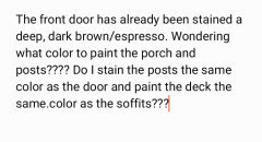
    I also think that a bolder color door might help bring your eye to the door and compensate for it's recessed "smallness". Agree with the recessed lights to light the entire space, and heavier columns and supports and a header.

    Joni thanked just_janni
  • 6 years ago

    I would listen to RES. He saved my house exterior.

    Joni thanked cpartist
  • 6 years ago

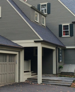
    As had been discussed above, the house looks chopped up like a series of single rooms because of the different façade materials and the different roof lilnes. Take the advice previously given and stop the madness now. The picture posted by PPF looks so much better than your current look.

  • 6 years ago


  • 6 years ago
    last modified: 6 years ago
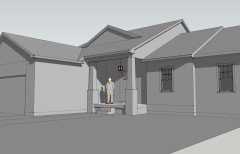
    The porch posts and beam should be large enough for the roof eaves to be extend to and die into them. The new large posts should sit on the porch deck and at the left, attach to the house walls. Just add a bit on the face of the deck framing. Masonry should only be seen below the deck framing.

    If that stone is only a couple of inches thick, after removing it you will already have the rough-in for the bottom third of the post ready for a panel of Azek. The post doesn't need to be square,

    If you're uncertain about the design, mock it up with OSB. It would be a simple thing to do with a 3D computer model but we don't have any drawings to work from.

    I think CP wants to build another house.

  • 6 years ago

    Eye level lanterns next to the door belong on a colonial house and in any case would not belong under a porch roof.

    @User: Would you please expand upon this rule? I think that understanding why a rule exists would help people push for design changes to be made (or not made) based upon the adherence (or non-adherence) to that rule. Does that make any sense at all? :/

  • 6 years ago

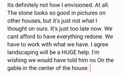
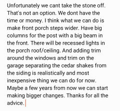
    Have you asked your builder how much it would be to remove the gable? I do realize people are on a budget but sometimes the cost isn’t prohibitive and you may be able to save on something else that would be easier to do later or skip landscaping for a while. Removing the fake gable would make such a huge difference in the look of the house that I would really put my efforts into how I could make that happen. I’m guessing that the demo would leave you only with the need to add roof sheeting and patch the roof in that area. Material wise it is not a lot and it Isn’t a complicated task. Before you rule it out check with your builder and see how you can re-work your budget to make it happen.

  • 6 years ago

    The colors seem to fight each other in my opinion. Definitely attempt to loose the "shark fin" as Mark called it and the brick at the garage. If you cannot do those tone down the different colors, use trim at all windows for starters. And plenty of landscaping to hide the front facade.

  • 6 years ago

    You aren't happy with the exterior and posted asking for help, but don't seem to be able to, or want to, make any changes.

    If you really have no budget for removing or changing materials, then at least paint the siding the same color as the cedar shingles or a beige-y color that goes with the shingles and the stone.

    Sorry to say, but the right side of the house looks like one of those fancy RVs with the telescoping sections that pop out, specially because of the scale/size and the different siding colors.

  • 6 years ago

    The random location of the blank pediment dormer on the roof is a secondary issue. All it needs is a small window. What the house urgently needs is a central element to join the two wings without adding to the randomness of the design.
    Good luck with it.

  • 6 years ago

    There is no focal point. And yes, the colors are too homogenized. A focal point and painting that middle section (to the right) another color even a darker gray (or lighter to match the gable) , will add much needed dimension. The posts with the larger landing at the front (that someone did a mock up for) would make the front door "more open" and inviting. Try painting the front door a burnt orange, give it a "pop". All inexpensive fixes. I don't have a problem with the gable over the garage, you could make it the same darker color so its cohesive. Good luck.

  • 6 years ago
    last modified: 6 years ago

    I generally hate the idea of painting brick (just a personal preference) but in your case, thethethethe
    Painting your brick would be very inexpensive and fights the chopped up look.

    (ited to say orry, can't delete the thethetheetx)

  • 6 years ago
    last modified: 6 years ago

    It appears to be adhered thin real or imitation stone.


  • 6 years ago

    Could the cedar shakes be painted same color as the siding? Can anyone photo shop to show?

  • 6 years ago

    I agree with a lot of what has been said but get the sense you don’t want to take on a big fix. I’d that’s the case wait and see what you can do with landscaping and accessories. The house will look exactly the same but you don’t seem receptive to changing the house?

  • 6 years ago

    You have a pink roof and orange faux stone. If you don’t want to remove the stone, you could paint it to coordinate with the roof color.

  • 6 years ago

    Will the home be nicer than the one you are living in now ? You will drive yourself upset overthinking the details. When the house is done, add landscaping and move in and enjoy. There is nothing so wrong about the house that you need to make changes. If you were looking at homes for sale, designed by someone else, would you not buy it for the details you are focusing on now? Overall it is a lovely home and I hope you can enjoy it for many years! If anything bothers you in the future, you can do some modifications then. You may find that in a year you no longer care about the things that bug you now. But some things you haven't noticed yet may bother you:)

  • 6 years ago

    The worst mistake I made when we built our house—— contractor said, “That will be too expensive.” I didn’t ask,” How much?” His idea of expensive and my idea were not the same. Get a dollar figure, then decide.

  • 6 years ago

    Yes, always ask for the numbers so you can make good decisions.

    Please don't build posts on stone pedestals in that awkward corner with the misaligned eaves. Worry about the cladding and colors later.

  • 6 years ago
    last modified: 6 years ago

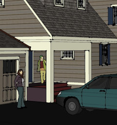
    It's a fairly quick mockup. I'm not sure what your garage door looks like so I left it dark. I think the wooden front porch "cheapens" the overall effect. I would would enlarge the stone pillars and use tapered Craftsman columns to help draw attention to the front door. A pretty hanging lantern, colorful pots and landscaping, and extending the stone would greatly enhance the overall aesthetic.


  • 6 years ago
    last modified: 6 years ago

    Its rarely possible to add order to a facade by adding distracting elements. The result is usually more disorder. What is needed is to take the design back to its essential elements and find the cause of the issue.

    The primary issue with this design is the misalignment of the eaves. It was apparently meant to be a feature but was not carefully thought out in the drawings.

    The first thing to do is design the beams and trim to create a sense of alignment and order. Then use 12 x 12 cellular PVC or composite one-piece columns with the left one engaged with the wall without a gap.

    The eave-to-rake-to-eave roof edge detail near the left column is awkward and may need an upturn rake drip edge to prevent staining of the trim. There are other solutions but they don't look much better.

    The use of several claddings is unfortunate for this size house. Some day you could make it all shingles and let t be a cottage. The trim color should be less muddy brown. You could someday add some windows.


  • 6 years ago
    last modified: 6 years ago

    This is what it would look like without additional windows and different cladding.


    Study of original design without materials

    The split columns reinforce the randomness of the uneven eave heights. A column almost touching a side wall is another random.distraction. The eave to rake to eave derail is another.

Sponsored
Hope Restoration & General Contracting
Average rating: 4.7 out of 5 stars35 Reviews
Columbus Design-Build, Kitchen & Bath Remodeling, Historic Renovations