Software
Houzz Logo Print
bujonathan

Main wall color to compliment SW Urbane Bronze

6 years ago
last modified: 6 years ago

Hello Houzz,

My husband and I recently closed on a new construction townhouse. All of the walls are builder's grade white. So now the fun starts with picking colors and painting!

We've decided on SW Urbane Bronze for an "accent" wall. But, we're undecided on which gray to go with as a "main" color for the remainder of the walls. We've narrowed it down to SW Repose Gray and SW Agreeable Gray.

Any thoughts on which gray better compliments Urbane Bronze?

Comments (22)

  • 6 years ago

    J D thanked ljangell44
  • 6 years ago

    Thanks. In that color palette, the Agreeable Gray looks very reddish/pink when put next to Urbane Bronze.

  • 6 years ago

    You are right, it is a warm gray.

  • 6 years ago

    I really like Laura Rugh design's color analysis. https://www.rughdesign.com/color-wheel/urbane-bronze/


    Maybe one of these:


    J D thanked User
  • PRO
    6 years ago
    last modified: 6 years ago

    I order to determine a color to go with an accent wall we first have to determine WHY there's an accent wall at all.

    Second, why Urbane Bronze?

    Ideally the same thing that informed the Urbane Bronze color choice would inform the near neutral gray to go with it for the "main color".

    If nothing informed the Urbane Bronze choice and you just chose it randomly out of thin air, then the problem that needs fixed here isn't what gray goes with Urbane Bronze.


    Instead, there could be an overall lack of a color plan and direction.

  • 6 years ago

    The problem here is that you want to pick a color that will work with Urban Bronze, but we don't know the color of your flooring and the colors in your furnishings.


    What do you pick first? It is a balancing act - what is going to cost the most to replace, what will last forever, what fits the budget.


    In your case, flooring, cabinetry and counter tops have probably been selected and installed. You have to work around those colors. Are you buying new furniture? Sofa's often come in limited colors. Sometimes the best deal isn't exactly what you had in mind.


    I picked a color palette for my home. I had my inspiration and knew what I wanted, but before painting I knew I had to find the right sofa. I found the one I wanted, perfect size, perfect color, good manufacturing. Then I went to the local store that sold that brand and priced the sofa. . . $16,000.00.


    The store also carries other high end brands that are not quite so high end. We looked at this that and the other. Found another brand that was still good, but was significantly closer to my price range. The same size and shape, but I would have to compromise on the color. The price was $7,000.00. I wanted something dark purple gray, they had more of a dark charcoal gray and a dark greige with more neutral green undertones. Nothing with that purple gray that I really loved. I wasn't sure I wanted to spend $7k and make this compromise.


    The sales woman asked if I would consider a completely different color. They happened to have that same sofa in the back. Someone had ordered it and then refused delivery. It was light cream. This didn't fit my vision at all, but it would fit my room and it was well made and the sale price was $2,800.00.


    I asked the sales woman to hold the sofa while I ran home and got my floor sample. When I returned we looked at the sofa with my flooring inside the store and then took a cushion outside looked at it with my flooring outside. The colors worked together.


    I also brought my original paint sample and wow - it was pink! It took me about 30 seconds to determine that the sofa would work and I can easily pick a new neutral paint color that will work with both the sofa and the flooring.


    I couldn't be happier with my decision. The sofa is comfortable and well made and I found the perfect area carpet to add the dark contrast that I was looking for.


    Had I painted first I would have ended up re-painting.


  • J D thanked Yayagal
  • 6 years ago

    We did intimate white and I think it looks good as well as shoji white

  • 6 years ago


    Shoji white, extra White and urbane Bronze .

  • 6 years ago

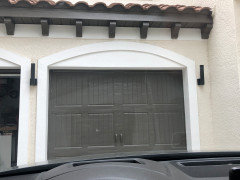
    We recently built and used Colonnade Gray on the walls and painted the interior of the front door in Urbane Bronze. It's important to note that Colonnade leans more greige/beige than gray because Urbane Bronze has a dark brown tone to it, more complemented by a beige-ier color rather than standard gray. Be sure you have enough light in your room to use Urbane on even one wall because it's extremely dark.

  • 6 years ago

    Thank you everyone for all the suggestions!


    Just an update, we ended up going with Repose Gray as our main color throughout the house and Iron Ore as the accent wall in the bedroom. Although I really like Agreeable Gray, my husband and I both agreed that it looked very warm in our house. So, that made the decision to use Repose Gray for the "main" color easy. Then once we put Repose next to Urbane Bronze, we realized that the two just did not go well together. Urbane is much warmer than Repose. So, after looking at a few other dark gray samples, we settled on SW Iron Ore.

  • 6 years ago

    Can you tell me what color you went with?

  • 6 years ago

    We went with Repose Gray as our "main" color and Iron Ore as our accent wall.

  • 6 years ago

    Pictures? Would love to see more Iron Ore pics

  • 5 years ago

    Would you mind posting a picture or three? Your question and conversation is our actual dilemma. I want Urbane Bronze on my basement theater wall. It's all new construction with extremely well lighted areas. However, I am struggling in choosing the accompanying gray that goes with it. Agreeable Gray is also, slightly too pinkish for my taste. How did the iron ore turn out? I am worried that it will look too black, rather than dark gray or charcoal.

  • 5 years ago

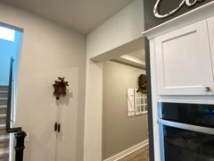
    Yes! Here’s the best shot- the foyer is 50% Fawn Brindle, the archway is builder grade pt in Alabaster- the wall with cuckoo clock is Gossamer Veil- and the accent bump out wall with ovens is UBronze. We love it!


  • 5 years ago

    Tyler- sorry! Thought you were asking about Urbane Btonze- opted for Urbane Bronze because it was warmer than Iron Ore and complemented the hues in our flooring...if you have cooler tones in your decor- iron ore is really pretty!

  • 5 years ago
    last modified: 5 years ago

    https://www.sherwin-williams.com/homeowners/color/find-and-explore-colors/paint-colors-by-family/SW7668-march-wind

    we chose March Wind with Urbane Bronze. Looks great in the bathroom with the free standing tub

  • 4 years ago

    SW Morris Room Grey!

  • 3 years ago

    SW Anew Grey, Alabaster & Urbane Bronze are beautiful together.

  • 3 years ago

    I went with Alabaster and Gossamer Veil- they work great!!!