Software
Houzz Logo Print
webuser_885870677

Whitewash gone wrong

5 years ago
Hi there!


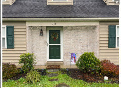
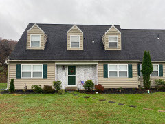
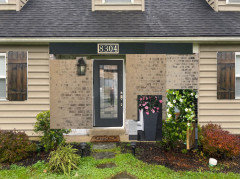
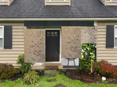
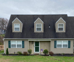
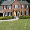
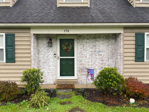
I had the grand idea of whitewashing the brick facade on the front of my house. The whitewashing technique worked perfectly HOWEVER... it doesn’t fit the rest of the color palette out front and I don’t have budget to reside the house.


I'm looking for advice on the best way to turn this situation around.


Thanks in advance!


Comments (20)

  • 5 years ago

    I would paint it charcoal, remove the screen door and paint your front door a lighter version of the beige siding. The charcoal will pick up the colour of your roof and the lighter beige will pick up the colour of your siding. You already have an accent colour on your shutters. Also, I find your house numbers look odd where they are. They tend to draw attention to your off-centre door. I would remove them and get some really big numbers to hang on the right side of your door. The numbers will provide some balance. Add some big pots with flowers on either side of your door. You made a small misstep with the whitewash, but that’s okay. We’ve all been there. Luckily your the front of your house has oodles of potential!

  • PRO
    5 years ago

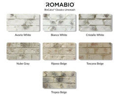
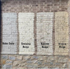
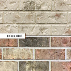
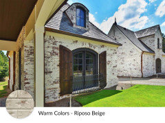
    The problem is you whitewashed in WHITE but you have no white on the house. One of the colors Romabio offers would have worked better. See samples on brick below.


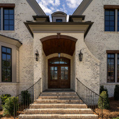
    Here is the brick in Tropea Beige simulation

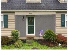
    Here is the brick painted charcoal


  • 5 years ago

    Not a fan of the dark green shutters and front door with your siding and roof colours.

    It would be helpful to have a picture of the whole house. Is there any other brick, or any other colours to take into account?

  • 5 years ago

    Once you color correct the brick, bring in some planters, change out your light fixture and numbers for a nice update.


    My Houzz: Iris Dankner · More Info


    modern house numbers - plaques · More Info


  • 5 years ago

    Here is the whole house for reference.

  • 5 years ago

    The bricks came out great! That’s not the problem. The problem is that no white or gray colored bricks are going to work with your siding yellowy-tan color siding. I hate to say it but I think you should paint your siding now :) A white or gray would instantly update your entire exterior while keeping the while house true to its traditional style. Good luck!

  • 5 years ago
    last modified: 5 years ago

    The charcoal roof looks good with your siding colour. Repeat the colour by painting the bricks the same. Use Romabio paint. Lose the shutters or if the siding behind the shutters is a different colour, keep the shutters and paint them the same gray. Add more evergreen shrubs and remove the too-tall one. Larger house numbers.

    Nice house with attractive proportions. It doesn't need much, just a little bit of sprucing up.


  • 5 years ago

    I agree with all of Brown Dog’s suggestions, but vote for the beige wash. I think the charcoal is too dark. I would also remove the shrubs from the entry and use low flowering plants. A new color on the shutters and door would be an inexpensive way to continue the update.

  • 5 years ago

    Leave it the trim color of white. Much better look overall in your rendition. Minimizing the brick is best with same shade/tone as siding so not to draw attention to it.

  • 5 years ago
    last modified: 5 years ago

    agree w/Beverly. you whitewashed w/a bright white, and the siding is a very warm yellow tone.

    Tropea Beige would have been a better choice, or this one, Riposo Beige.


    You can easily go over the white color you have w/this Romabio

    Riposo: would go w/your siding color much better


    AND, I love the idea of going w/the black shutters. I think it would look great w/the warmer tones.

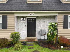
    I tried photoshopping the Riposo, dark wood shutters (but black is nice too) I painted the trim piece above the door, new address numbers, and a new door. this color is SW Iron Ore.


    for the space to the right of door, try some of these accessories:

    black door, black shutters (or a very dark charcoal) a taller plant in the corner, new address plaque


    this one is a bit more modern. taller plant, chair, larger numbers, a new light, a new door.


    I tried to photo shop the Riposo beige color on the brick, w/the black accents. I also painted the trim piece above it to match the shutters. I don't think it should be a bright white. maybe the shutter color, or the siding color


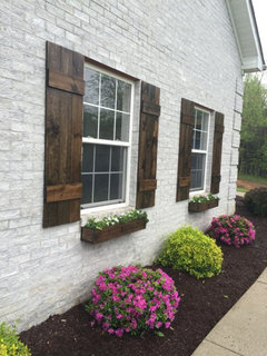
    you could also do some dark wood shutters. I think it looks good w/the Beige tones.

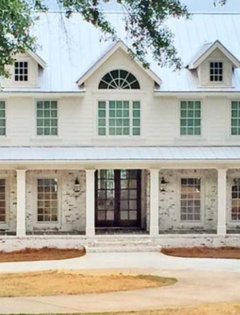
    pretty easy to make the wood shutters. try a dark walnut stain. coat w/UV varnish. Maybe try the flower boxes and do your flower beds like this


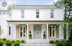
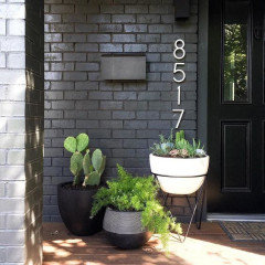
    Another option, but you'll have to do black shutters, is to do the brick in a charcoal or black. and the door too. bring a trio of black/white pots like you see here, and larger numbers.


  • 5 years ago

    Doing the beige wash will solve your problem. I have to admit I like the photos with no shutters. If you keep them, rethink that green color. Either black or wood are more neutral and a better contrast. You don’t need to repaint your whole house. It’s a hiccup, really. I would be upset if I made the same error, but there are good solutions here. (After you do that, rethink the bushes and house numbers.)

  • 5 years ago

    No matter how you choose to paint. Please post the update. We love seeing the transformation.

  • 5 years ago

    Love the pictures with dark shutters and the white strip of wood over door painted in dark color. It draws your eye to the door without screaming he here I am like the white does. A dark charcoal would be softer than black.

  • 5 years ago

    I dislike the mockups with the brick done in charcoal. I do like the Riposo Beige - sets off the door area nicely. I also like the door and shutters in Iron Ore. I agree, lose the green on the shutters. Keep the shutters or not, whichever you like, I think both ways work.

  • 5 years ago

    Drawing attention to the board over your door with a bright or accent paint color visually diminishes your entrance. If you can remove it, I would recommend that. If not, paint it to match the siding so that it disappears.

  • 5 years ago

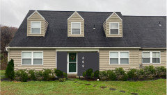
    Update: color corrected the brick — finally able to sleep at night. Thanks for all the encouragement and ideas!

  • 5 years ago

    The brick is much improved!

  • 5 years ago

    Brick looks good. A few small things. I would paint the white wood over the door the same colour as the brick and siding. Large house numbers to the right of the door would look good.

  • 5 years ago

    So much nicer. I also agree with Partim, the board at the top needs painting the same color as the siding, and take the numbers off it and put them on the wall to the right of the door.