Software
Houzz Logo Print
kisa_valenti

Accent wall color

5 years ago
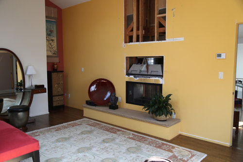
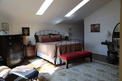
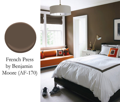
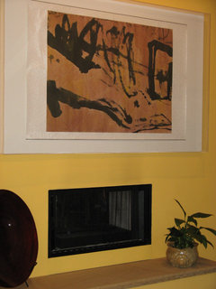
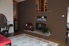
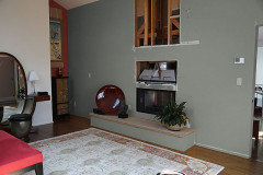
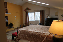
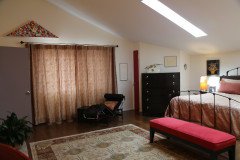
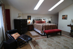
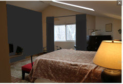
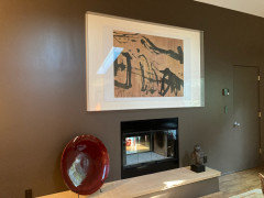
Thoughts please on a color for the accent wall behind the fireplace. We had to replace the chimney and I think a dark brown, instead of the yellow, would look good. I am posting a second picture of the room to give you a better idea of the space. I usually change up my bed linens and draperies with the seasons. My winter draperies match the bedspread in the second photo. In the summer, everything is off-white. In the photo I am posting, the bedskirt is off-white, but usually it is dark brown, like the rear pillow shams as shown on the bed. My husband was recovering from surgery and couldn't help with the lifting the mattress. So for now we have a summer bedskirt with winter bedspread, lol. I'm leaning toward Benjamin Moore French press for the accent wall. It is listed as complementing the persimmon in the alcove.


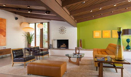
And below a stock photo of a bedroom with French Press walls.


Comments (51)

  • PRO
    5 years ago
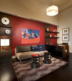

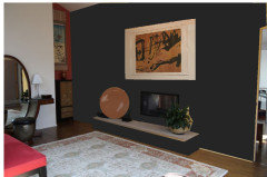
    Not quite black


    Kisa Valenti thanked BeverlyFLADeziner
  • 5 years ago
    last modified: 5 years ago
    jck910 and housegal200. No, not a t.v. the same very large art work I had before the chimney work. (a calligraphy by Bernice Bing, hung sideways, mounted on silk and framed in plexi museum box)


  • 5 years ago
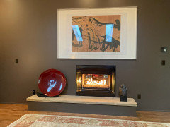
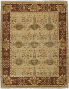
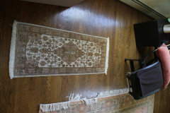
    The photo I posted doesn't really give good color representation of the rug.Here's a better one.


  • 5 years ago
    last modified: 5 years ago

    BeverlyFLEDeziner, Peppercorn is a great color, but what is your thinking in suggesting it for this room as opposed to the French press?

  • 5 years ago

    I think the brown will diminish the beauty of all the gorgeous dark furnishings...the dark color of the rug border would have the same effect while contributing a more integrated contrast...

    Kisa Valenti thanked btydrvn
  • 5 years ago

    The niche wall color may work as well...either of these colors will harmonize ...more than contrast with the art ...adding another fresh aspect for the room as well...

    Kisa Valenti thanked btydrvn
  • 5 years ago

    Your space is intriguing and eclectic..but it feels like a little fine tuning with the furniture and rug placement would make it flow better

    Kisa Valenti thanked btydrvn
  • 5 years ago

    Pics of all four walls would clarify that...

    Kisa Valenti thanked btydrvn
  • 5 years ago

    the color “weekend” by magnolia home paint

    Kisa Valenti thanked angelarose15
  • PRO
    5 years ago

    I would go with the green color in the rug for your accent wall

    Kisa Valenti thanked Lisa Caudill Designs
  • PRO
    5 years ago

    I like idea of green to picked from rug better than French Press


    Kisa Valenti thanked Celery. Visualization, Rendering images
  • 5 years ago

    btydrvn I'll take more pix tomorrow. The ones I posted today were taken in BRIGHT afternoon light. It is definitely eclectic, I don't think the rug could be placed differently.

  • PRO
    5 years ago
    last modified: 5 years ago

    Selecting brown seems a bit arbitrary and you're just adding yet another brown to the wide variety of brown wood finishes in the room.


    I selected black to reiterate the color of the bed frame. It's neutral it's a great backdrop for art.

    Kisa Valenti thanked BeverlyFLADeziner
  • 5 years ago
    last modified: 5 years ago

    Basically your room’s color scheme


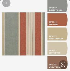
    I’d think a color similar to Red Cent (on the alcove wall as well) would complement your art, which is really important. Complements the rug and winter bedding as well, pulling the room together.


    I’d reupholster your bench


    Suggest try turning rug


    Kisa Valenti thanked Maureen
  • 5 years ago
    last modified: 5 years ago

    Grrr, I just finished a really long addendum with more photos. I pressed submit and it stalled. I hit reload and the comment disappeared. So I'm going to try submitting the photos one by one and then writing my comments. Fingers crossed.

  • 5 years ago


  • 5 years ago


  • 5 years ago


  • 5 years ago


  • 5 years ago


  • 5 years ago


  • 5 years ago


  • 5 years ago
    last modified: 5 years ago

    Firstly thank you all so very much for the time and thought you have given to advising me. Celery, your visualizations were so very helpful. Not sure if the dimensions of the room come through clearly on the blueprint I posted. The window wall measures 17'5". From the window to the wall behind the Thomasville Bogart vanity, it is 17'7" and then the niches add another 2' - 3'. I never considered it a particularly small room. The wall behind the bed is only 6' tall, the fireplace wall is 14' and in the peak of the niche it goes up to 16'. So a rather steep slope to the ceiling.

  • 5 years ago
    last modified: 5 years ago

    The Stickley arts and crafts rug is 8'X10". The two scendiletto are 47"X21". A rug large enough to place under the bed and still fill a good portion of the space in front of the bed is sadly out of my budget. I'm not even sure I could find one of the required dimensions and a custom-made one would be way out of line with my purse. Plus I bought the rug only last June.

  • 5 years ago
    last modified: 5 years ago

    This is a two bedroom house, no attic, no basement. So storage area is at a premium. I have storage boxes under the bed and that's why I have the bedskirt. The usual dark brown winter one is a simpler, tailored design.

  • 5 years ago
    last modified: 5 years ago

    I think the gents' chest would look lost on the wall where the bed is now. And, on that 6' wall, there wouldn't be much room above it for any artwork. If I didn't need the storage, I would chuck the chest altogether.

  • 5 years ago
    last modified: 5 years ago

    Because of the steep pitch of the ceiling, I don't like the idea of placing the head of the bed against that wall that the vanity is in front of now. Maybe I'm wrong about that, but I think it would look a bit odd.

  • 5 years ago
    last modified: 5 years ago

    As to removing the smaller artworks - here I am probably letting my heart get in the way and making decisions on a sentimental basis. Each one of these works is either the creation or gift of a loved one I have lost. And I really don't have room for them elsewhere in this little house.

  • 5 years ago
    last modified: 5 years ago

    One furniture item I would like to replace the black cube next to the Le Corbusier chaise. I have an Eileen Gray chrome and glass table I was thinking of moving there. Or should I look for something Asian. Any suggestions?


  • 5 years ago
    last modified: 5 years ago

    Now back to the main point of my post - color. Several of you suggested using the color from the border of the rug. It is too similar to the persimmon and I think it would detract from the background of the Bing calligraphy.

  • 5 years ago
    last modified: 5 years ago

    Others suggested green. I had considered that myself. But decided against it because I don't think it would look good with the red bench at the foot of the bed and the red door. There is also a bit of very dark red in the centers of the flowers in the rug and in the decorative dish on the hearth stone. Of course, I could paint the door and reupholster or replace the bench. But once more, I hesitate for sentimental reasons. My late husband was the one to pick that color. He was already quite ill by the time we were decorating this room and contributed very little. So I hold on to the things he did choose. I do love the Urbane Bronze heathermalia suggested though. It might be the perfect mid-point between brown and green.

  • 5 years ago

    BeverlyFLADeziner's black wall does look great. But there is really no such thing as black in the real world. There is always a touch of another color. So I am suggesting a dark, charcoal brown, rather than a black to the blue or green. The brushstrokes of the calligraphy are a brown black and the thistles in the rug are outlined in brown black. So maybe the paint should be darker than the French Press, but still to the brown. What about that idea?


  • 5 years ago

    So if I haven't exhausted you all with my ramblings, I would love to hear further thoughts.

  • PRO
    5 years ago

    for your small paintings how about grouping them and making a gallery wall of them?

    Kisa Valenti thanked Lisa Caudill Designs
  • PRO
    5 years ago

    IMO the drapery panels should be hung higher in your room.


    Kisa Valenti thanked BeverlyFLADeziner
  • 5 years ago

    I love the dark brown and the black.

    You have some very interesting and unusual pieces. What a wonderful space!

  • 5 years ago

    I have to admit I feel like I asked about the color of my nail polish with a particular dress and my well-intentioned friends told me, "Well if you really care about your looks, you'll lose 40 lbs, dye your hair and get a face lift. "


  • 5 years ago

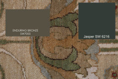
    try these too. the bronze has the underlying green tone to work w/the rug colors

    Jasper is a very dark forest green. you mentioned black having undertones, but this green will work w/the rug colors.

    Kisa Valenti thanked Beth H. :
  • 5 years ago

    The little niche is cute decorated.. but it is a treasure as a potential closet..since storage is a premium..even floor to ceiling drapes covering big shelves would work.. kept simple with curtains matching walls perhaps

    Kisa Valenti thanked btydrvn
  • 5 years ago

    This is a tough crowd. You have a beautiful, eclectic style and you are absolutely right in your color choice.


    Red and brown is a perfect combination with the art and things in your space.


    There are few examples of red and brown rooms because everyone is currently in love with gray and/or white.


    Go for it! It will be beautiful.


    fenwick residence · More Info


    Kisa Valenti thanked Jennifer Hogan
  • 5 years ago

    As for your art, remember that the art in your bedroom isn't for the world to love, it is for you to love. This is your personal space. If the smaller pieces of art speak to you and bring your joy they belong in this space. With the slope of your ceiling you need smaller pieces on the lower walls.


    I personally don't like "gallery" walls. They simply feel like clutter to me. I love my art and each piece is given it's own place of honor in my home. I think I would love entering your room and walking and just looking from place to place and learning about the wonderous person who put this together.


    Kisa Valenti thanked Jennifer Hogan
  • PRO
    5 years ago

    Kisa sorry if my comment on your art added to the harsh and unsolicited commentary. I originally only added a response to your question of color and then when you mentioned keeping the art and the sentimental value I loved that and thought maybe showcasing it would be something that you would like. if it came across any other way my apologies. can't wait to see what you decide to go with and my best wishes and intentions for your painting! Have an amazing day!

    Kisa Valenti thanked Lisa Caudill Designs
  • 5 years ago
    last modified: 5 years ago

    Lisa Caudill, sorry I didn't reply yesterday. Your comments were not harsh. You suggested a color and that is exactly what I was looking for. Green is a very good idea and actually the first I considered. But then thought it didn't really suit the background of the calligraphy piece and that it might not work well with the red touches in the room. Your suggestion of a gallery wall was a welcome one. The recessed alcove to the left of the wall with the vanity actually does have a gallery wall - but the works there are all very similar. The others are quite varied in style and framing treatment. So I can't see them working in a grouping. But your suggestion is worth considering. In short, you have absolutely no need to apologize. Thanks for your suggestions and for writing. I will post again when the chimney repairs are completed (that may be quite a while yet) and the wall repainted. I will not be redecorating the room.

  • 5 years ago

    Kisa...i really try to avoid contentious interchanges....but you might take a step back and take a look at your own comments...not so kind or diplomatic ,either...i have an affinity for your style and taste....but have been put off by this as well...

    Kisa Valenti thanked btydrvn
  • 5 years ago
    last modified: 5 years ago

    btydrvn True, but if the offensive remarks had not been deleted by the posters, you would be able to go back to see when my comments turned unkind. But thank you for writing to share your perspective. You are right that it is always wise to step back to examine one's own part in any dissension.

  • 5 years ago

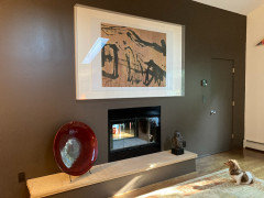
    To update - I went with the dark brown (BM French Press) and I am happy with the result. And so is my little dachshund.


  • 5 years ago

    Yes, he seems to like it and the art piece. Looks great!

    Kisa Valenti thanked houssaon
  • 5 years ago

    Looks great, looks like your little dog is wondering what looks different.

    Kisa Valenti thanked katrina_ellen
  • 5 years ago

    The fireplace itself is now fully functional - So an updated photo. My apologies for the reflection of the skylights