Software
Houzz Logo Print
michael_schaffer22

Why do these sample paints have such difference sheens?

5 years ago
last modified: 5 years ago
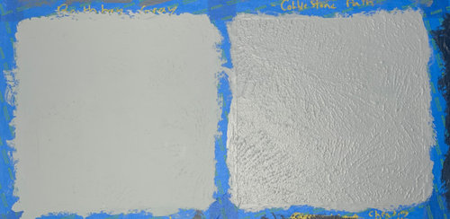
I am trying out a few Benjamin Moore paint colors on my walls. Even though all the samples are supposed to be the same sheen (eggshell), I'm noticing a massive difference in the shininess these two relatively similar colors:


Left is Boothbay Gray, Right is Cobblestone Path.

Even though the paint on the right is a darker tone, it's reflecting way more light and revealing much more texture in the wall. Part of my goal for painting these walls is to hide this texture in the wall, so I'm planning on using a matte or flat sheen. Unfortunately, samples are only available in eggshell.

Why is the one so much shinier than the other? Can one color be inherently more reflective than another, even though it is darker? Will this pattern hold with real matte or flat paint for both colors?

I prefer the color of the right, but would really like a flat sheen that hides the texture like the one on the left is doing.

I did two coats of each, and tried lighting from a few of different angles to make sure it wasn't just the light (this photo is one light source directly in front of the wall).

Comments (5)

  • PRO
    5 years ago
    last modified: 5 years ago

    Probably colorant load. Cobblestone Path is darker and likely has more colorant in the sample can. Making formulas to fit in sample sizes, ratio of colorant to paint, doesn't always translate gracefully.


    My guess is it won't happen with are bigger volume of base -- and in a matte finish.

    To be sure you can always buy a quart in the grade and sheen you intend to use and see what it looks like.

    Even though the paint on the right is a darker tone, it's reflecting way more light and revealing much more texture in the wall.

    Not really what's happening. The color isn't reflecting more light. It's more like flashes of glare. Because shiny paint film on sheetrock isn't the same as a mirror and doesn't bounce light back into the room.

    In other words, glossy paint doesn't mean a lighter and brighter room. It just means spots of glare when the light hits it at the right angle. The more texture, the more possible angles to catch the light and create shadows emphasizing every detail.

  • 5 years ago
    last modified: 5 years ago

    Lori, thanks so much for your reply. That makes a lot of sense.

    Am I understanding you correctly that the colorant used in these samples exhibit certain amount of inherent sheen that would normally be less pronounced when diluted by actual paint? And that this effect would be more pronounced with colors that use more colorant (ie, having higher base number)? I'm noticing that all the darker samples I'm trying out have more sheen, and also have higher base numbers - so that seems to track pretty well with that idea.

    I like your suggestion of buying a quart of the real stuff, it's actually not that much more expensive than the sample in the grand scheme of things. So I'll probably buy two or three and try it out.

    One more thing - once it's time to paint for real, do I wanna sand down these sample squares and go over them with the original (white) wall paint before painting the new color?

  • PRO
    5 years ago

    Yes. Darker colors can look shinier than expected because of how much colorant they require. If you Google what is colorant shiny you can get the chemistry low-down. The nitty-gritty of the chemistry of paint isn't my thing, I just know what to do with the results.


    For example, dark navy, charcoal and black are popular exterior colors right now. You never use anything less than satin exterior. Between the gloss of the paint and the sheen the colorant adds, people freak out.


    However, gloss especially exterior, tends to temper over time. So, you always want to give it a minute or 4 weeks to adjust.


    It's one of the reasons Aura matte is a popular choice. Benjamin Moore's Gennex colorants and the Aura base are a kind of magical combination because it delivers a lovely final finish, coverage and hide for darker colors.


    You should never sample directly on the wall. Always paint a Mighty Board, I sell Swatch Right decals, order from Samplize, etc.


    If paint must go on the wall, have your painter do it.


    If you must DIY, two light coats with a GOOD quality brush, feather the edges well. And, yes, it's a good idea to knock down. buff out the splotches with fine grit so there is no texture to telegraph thru to your final finish.

  • 5 years ago

    Thanks so much Lori! Super helpful.


    I already painted directly onto the wall, so I'll have to fix it this time around but I'll keep your decals in mind for future projects. Fortunately this is a relatively small wall so it shouldn't be too much work to apply a couple fresh coast of white over the whole wall.


    Super appreciate your help and insight on this.

  • 5 years ago
    last modified: 5 years ago

    Just wanted to post a follow up for anyone who might find this thread in the future.

    I got a quart of actual matte paint for a few of my favorites from the color samples and tried them out. The real paint was indeed truly matte and what I wanted in terms of sheen, and deemphasized the wall texture as I hoped, regardless of darkness.

    The color of the actual matte paint was quite a bit different than the color samples, which was a bit surprising.

    I would recommend that anyone who is very particular about color and sheen get a quart of real paint so you can see what it's really going to look like. I'm very glad I did this, it actually led me to choosing a different color than I would have otherwise.