

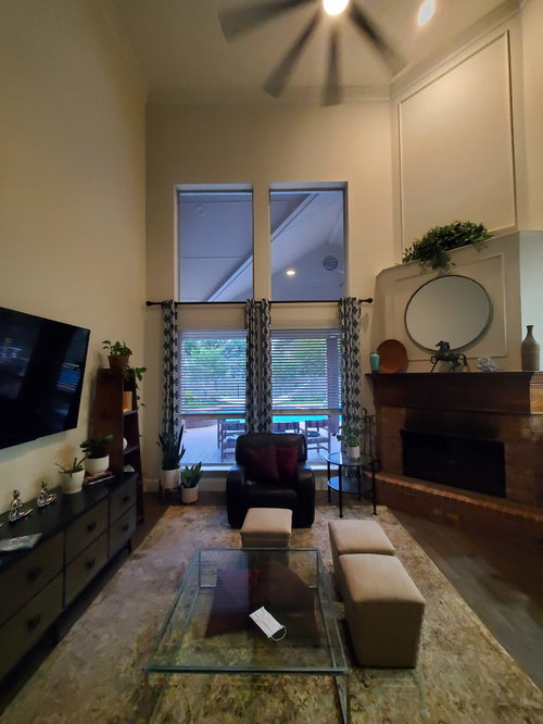
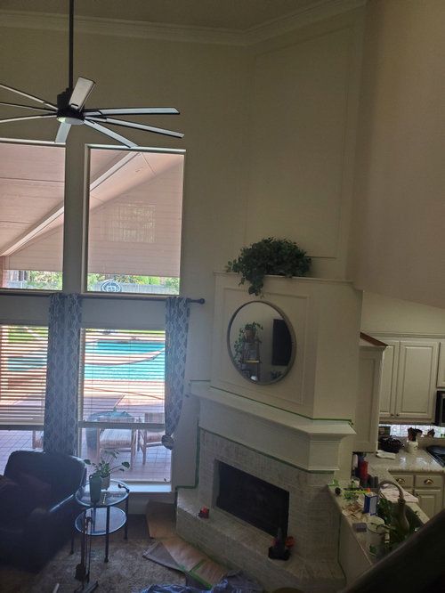
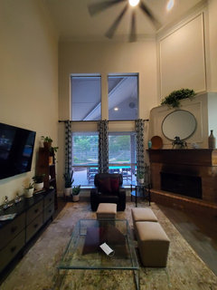
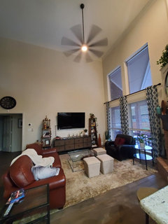
Corner fireplace design dilema
5 years ago
Featured Answer
Sort by:Oldest
Comments (25)
 5 years agolast modified: 5 years ago
- 5 years ago
Related Professionals
Hartford Interior Designers & Decorators · Edison Interior Designers & Decorators · Mansfield Interior Designers & Decorators · Cornwall Interior Designers & Decorators · Tacoma Tile and Stone Contractors · Natchitoches Interior Designers & Decorators · Williamsburg Interior Designers & Decorators · Bend Interior Designers & Decorators · Moline Interior Designers & Decorators · Hattiesburg Furniture & Accessories · Lebanon Furniture & Accessories · Riverton Flooring Contractors · Meridian Interior Designers & Decorators · Show Low Interior Designers & Decorators · Leamington Architects & Building Designers- 5 years ago
- 5 years ago
 5 years agolast modified: 5 years ago
- 5 years ago
- 5 years ago
- 5 years ago
- 5 years ago
- 5 years ago
- 5 years ago
- 5 years ago
 PRO5 years ago
 5 years ago


Related Stories

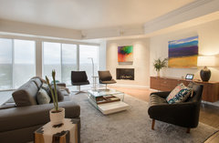
REMODELING GUIDESCorner Fireplaces Give Rooms a Design Edge
Maximizing unused space, opening a floor plan, creating a focal point ... corner fireplaces offer more advantages than just heat and light
Full Story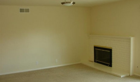
FIREPLACESDesign Dilemma: Difficult Corner Fireplace
Where to Put the TV? Help a Houzz Reader Set Up His New Living Room
Full Story
FIREPLACESConquering the Corner Fireplace
How to Decorate a Living Space When the Focal Point Is In the Corner
Full Story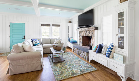
MOST POPULARDesign Debate: Is It OK to Hang the TV Over the Fireplace?
In the spirit of the upcoming political debates, we kick off a series of conversations on hotly contested design topics
Full Story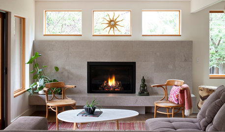
LIVING ROOMSNew This Week: 5 Living Rooms Designed Around the Fireplace
Overcome one of design’s top obstacles with tips and tricks from these living rooms uploaded recently to Houzz
Full Story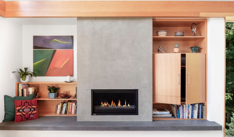
FIREPLACESNew This Week: 9 Fantastic Fireplace Design Ideas
Custom details, stylish materials and neat storage features bring function and looks to these living room focal points
Full Story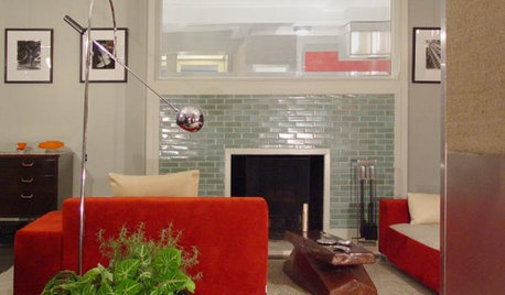
REMODELING GUIDESDesign Details: Tiled Fireplace Surrounds
Give the Hearth a Beautiful Finish With Colorful Glass, Ceramic or Classic Stone Tile
Full Story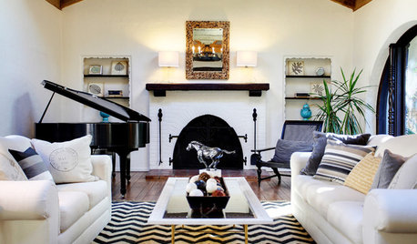
FIREPLACESStoke Your Fireplace Design With Decorative Screens and Doors
Keep wayward sparks in while setting your fireplace ablaze with style, with a screen that suits your hearth and home
Full Story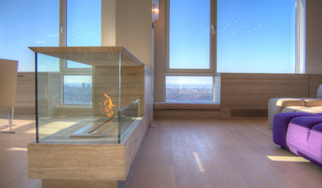
FIREPLACESDesign Workshop: Is an Ethanol Fireplace Right for You?
Learn the pros, cons, types, cost and more details about ethanol, or gel-fueled, fireplaces
Full Story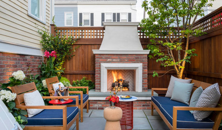
LANDSCAPE DESIGNPatio of the Week: Designer’s Cozy Retreat in a Side Yard
Tight on space, big on style, this 15-foot-wide Boston patio has an outdoor kitchen, dining area and fireplace lounge
Full Story

Ms JamOriginal Author