Software
Houzz Logo Print
nicole_lahat

BM Intense white vs Seapearl

5 years ago
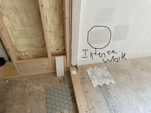
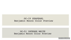
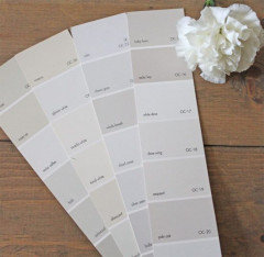
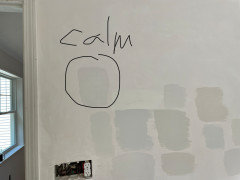
Does anyone know what is a touch lighter than Benjamin Moore Intense White? does anyone know how Seapearl compares? i’m looking for a very very pale gray that is almost off white and not cold but not warm and that will also offset white trim. heres my tile with Intense white which is in the lead unless i can find something with that tone a touch lighter. above it is white wisp (too blue as was paper white) and next to it is classic gray. My other option is just do simply white on walls and trim but my vanity is white so not loving that idea.


Comments (36)

  • 5 years ago

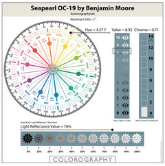
    Both BM Seapearl + BM Intense White belong to the Yellow Hue Family.


    Intense White sits further clockwise, past the middle of the Yellow-Hue Family in comparison to Seapearl. So it may read that bit cooler than Seapearl.


    Intense White is also darker + more neutral. Seapearl is more colourful.


    Both may show some moments of inherent greenness, depending upon the light.


    Intense White may be more inclined of the two to shift blue in certain imbalanced light settings.


    If it does appear this way, it is an effect of light quality & context and not a fixed and

    permanent attribute of this colour.


    Cloud Cover is from the same Hue Family neighbourhood as Intense White but is 2 points lighter & a tiny touch more neutral again.


    Nikki LA thanked Marylee H
  • 5 years ago


    Nikki LA thanked Marylee H
  • 5 years ago

    Thanks! I think i will skip Seapearl and check out cloud cover instead. i dont see any bothersome green with Intense White in my light and like the hue with my marble and other tile since it seems grayish but not too cold or too warm. i thought i was going to love paper white but did not it very much as it was a very icy blue in my space (eastern exposure double window, long narrow bathroom) which seemed too cold and even worse in the afternoon. i also thought white wisp was too blue. classic gray was too warm/purple.

  • 5 years ago

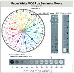
    BM Paper White is further clockwise again. it sits in prime ’can shift blue territory’.

    So you have much less chance of that happening with Cloud Cover.

    * Note the difference in Hue Family location.*


    See lots of colours to compare this way, in the colorography lab at the at The Land of Color .com


    Nikki LA thanked Marylee H
  • 5 years ago

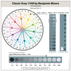
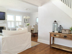
    i love bm classic grey, it has a slightly higher lrv then intense white. If you have a sunny house, it looks almost white. this is in my dining room (but is a match by sherwin williams)


  • 5 years ago

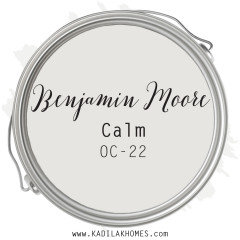
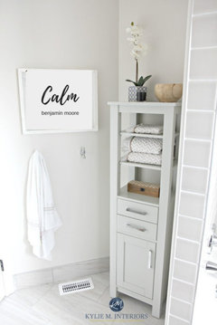
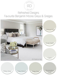
    use BM Calm. It's exactly what you want.


    I just painted my living room with it.


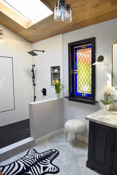
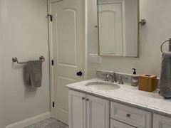
    here it is in a bathroom


    on the walls here w/warmer wood elements


    Eider White


  • PRO
    5 years ago

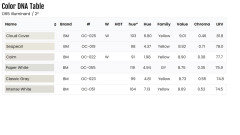
    does anyone know how Seapearl compares?


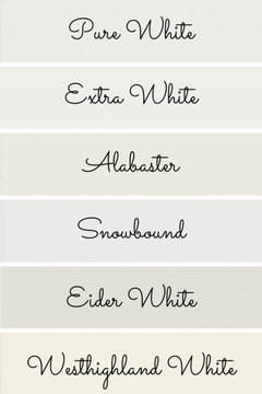
    Here are all the colors mentioned in order from lightest to darkest.


  • 5 years ago

    Hmm ill check out calm again but it looked purpleish to me on the strip. classic gray and intense white are very similar in lightness. both are nice. intense white is better tone for my space but slightly darker than i wanted. thanks everyone.

  • 5 years ago

    Calm looks pretty good in those pics.

  • PRO
    5 years ago

    ill check out calm again but it looked purpleish to me on the strip.


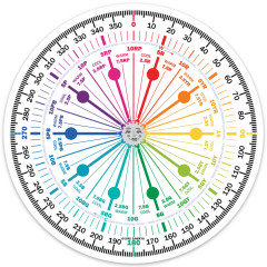
    If you plot all the colors either by hue angle or hue family, you'll see that It's the closest to the Yellow-Red hue family. Near neutral, low chroma colors from this hue family range can shift purple in certain lighting.


    Hue angles and Hue Family don't always align because they're two different color models. Both are illustrated on The Color Strategist Color Wheel. Choose one to use, angle or family, and stay in that lane. Don't toggle back and forth.


    Nikki LA thanked Lori A. Sawaya
  • 5 years ago

    Nikki, I can assure you it's not purple!

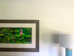
    taken w/myiPhone, it's a horrible pic, but lets you see how it looks next to the white of the lamp shade. IRL, it's not yellow toned like this appears. It's more of a gray.


    Nikki LA thanked Beth H. :
  • PRO
    5 years ago

    Nikki, I can assure you it's not purple!


    If she thinks it looks purple, then it looks purple.


    Just because you don't think it looks purple - in context of your house - doesn't mean she's wrong about how she's seeing the chip in her lighting.

  • 5 years ago

    Well i only saw it on the color strip so i think i need to swatch it in my house. im going to try cloud cover and calm tom tomorrow. third trip to the hardware store and painter is preping tomorrow! if not im going to decide between intense white or simply white.

  • 5 years ago

    Beth do you think its gray/neutral enough to go with my tile. see photo above.

  • 5 years ago
    last modified: 5 years ago

    Lori, Wow. what's your problem?

    If she thinks it looks purple, then it looks purple. Just because you don't think it looks purple - in context of your house - doesn't mean she's wrong about how she's seeing the chip in her lighting.

    Please show me where I said she was WRONG. Stop putting words in my mouth

    All I said was, "I can assure you it's not purple". Maybe it does lean purple in certain lighting. (Nikki, if you have Northern or Eastern light through a window, you may get those lavender tones)

    All I meant from my comment, is from my viewpoint that it's not purple.

    No need to snap at my comment.

    store lighting isn't the most reliable.

    I think it's best if she got a Samplesize or a small sample can and tried it herself. see below for ideas on saving money on those costly BM samples.

    Nikki, if you mistook my comment as an attack on your color perception, that was never my intent. From the way the paint looks in my home (which obviously means nothing to lori) I think it would work with your marble tile. (if you have northern exposure, or use very cool light bulbs, you may want to skip this one and go for a warmer gray)

    The light coming in my window tends to makes things a bit more blue, but this Calm doesn't look blue at all. (and if it was indeed purple toned, it would make it worse). I actually had a color called Silver Half Dollar on the wall and the light made that color very blue/gray.

    Now this looks purple! On my wall w/my lighting, it looked blue. more blue than gray.


    That's why I painted over it w/Calm. I wanted more of a silver gray color.

    I think Calm is pretty neutral. It's more of a grayish white on my wall.

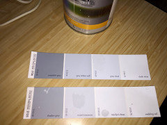
    Calm is at the top on these chips. I can see why you think it looked a little purple! (but I can assure you it's really not! go ahead lori, scold me again )


    Oxford White would be the perfect white for your trim if using Calm.

    BTW, I also have Simply White painted on the other walls. only a hallway seperates the two walls . one is Simply white and the other is Calm. If you didint' know they were diff colors, you wouldn't even notice. That's how close Calm is to white.

    I have marble in my bathroom and went with Gray Cloud. It looks nice w/the whites and the grays, but it leans a little cooler toned than Calm would.

    Is this too cool for you? (Gray Cloud on the wall, bright white trim. Carrara Marble. same as your hex)


    Do you get any natural light through a window? which direction?

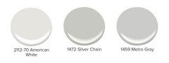
    This is the first time I've seen American White. it appears to have a slight gray tone it. Silver Chain is supposed to a very Neutral Gray, neither blue or yellow. American White might be worth getting a sample.


    Here's Calm on this favorite gray example.


    BTW, if you go to HD and get the Behr samples ($3) they will color match the BM colors. It won't be EXACT, but it will be close enough to give you an idea if they will work. and if you like it, you can actually use their paint. I've gotten quite a few samples of BM w/the cheaper samples. It works for me. But I'm sure someone else will prob tell me I'm wrong about that and should never recommend another paint company.

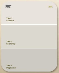
    I've also used Dolphin Fin (apparently I'm drawn to the purple undertones. I used this one on a wall w/western exposure. it appeared as the perfect neutral gray. neither cool or warm. )


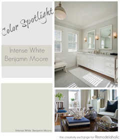
    Here's the Intense White. To me, and on your wall, it appears a bit green/yellow. I don't care for this one. I agree on your wall it's a bit dark looking.


    I mentioned Eider White earlier. it's a SW color


    compared to other whites, it has more of a gray tone to it.


  • PRO
    5 years ago

    All I said was, "I can assure you it's not purple".


    Agreed. That is all you said.


    All I meant from my comment, is from my viewpoint that it's not purple.


    The from your viewpoint context was missing.


    I saw that as an issue and said something. Or, I guess that was "my problem".

  • 5 years ago

    Thank you Beth! i was not offended!

    Lori, thank you also for your details.

  • 5 years ago

    I just want to say that i find this site so helpful.

  • 5 years ago

    Beth i get pretty good light. a double window but eastern exposure.

  • 5 years ago

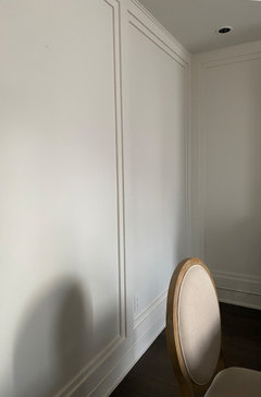
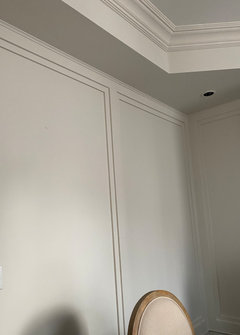
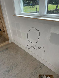
    Beth i think calm is perfect. its in between the warmth of intense white and coolness of paper white but much lighter which is what i wanted. paper white and white wisp were too blue. cloud cover was too yellow. what do you think. i moved my tile out but you can see.

  • 5 years ago


  • 5 years ago


  • 5 years ago

    I think it just looks like a soft dove gray/offwhite. i dont see the purple that i did in the store.

  • 5 years ago

    And i just realized that maybe i like a purple undertone too because i picked thunder for my bedroom which is a warm gray but does have a purple undertone haha

  • 5 years ago
    last modified: 5 years ago

    lol. well I'm glad you like it. prime over those others and paint under the window with it so you can how it looks by itself.


    And Lori, it's your delivery. try being less, hmm, how do I put this without be offensive. I can't.

    Yes, it is a problem.

  • PRO
    5 years ago

    @Beth H. : Disappointing. I expected you'd realize my comment was based on how you worded your point and that you could have been more clear and done a better job making it.


  • 5 years ago
    last modified: 5 years ago

    Lori, Hello pot? meet kettle. This continual scolding from you is juvenile.

    you could have been more clear and done a better job making it.

    This is about the OP, not you and how you reacted to my comment about the color. I don't care about YOUR reaction to my viewpoint Lori.

    You too could have worded your reponse to my comment in a less pious manner, no? I expected a better response from you. Yet even in your last comment, you still can't resist one final jab. But I'm the disappointing one? I find your smug reprimands rather trite.

    The important thing is, Nikki apparently understood me quite well, took no offense to my pointing out it wasn't purple, and ended up liking it in her room.

    So it's all good.

  • 5 years ago

    Beth what do you think of it on the wall? looks good right?

  • PRO
    5 years ago

    You too could have worded your reponse to my comment in a less pious manner, no?


    I'm not responsible for what you choose to assume and read into comments.

  • 5 years ago

    I must agree. i have spent many many hours trying to figure a colorr with very light gray.

    i have bought about 10 samples of blues, greens qnd whites. first of all, most colors lean towards green. i guess it is the solution to getting a more true shade. as for blues, every blue i have put on wall, turns purple sonwhere or sometime during the day. forget it-

    id like gray, but i have determined that the hue needs to be darker- or or, i think in technical terms, it is the lrv. i do not like yellows. i have been blessed with tiles for my kitchen and large foyer that are seamist, grey, and white. not what i would have chosen, but not what i want to take upon redoing. so, i am just putting all the whites so far that i have tried again, on posterboard, and will decide on one. mind you i have samples from behr, sw and bm. yes yes, i am very neurotic on paint. for one reason, its very expensive

    to paint all rooms, so i really do not want to redo in a year b4cause i hate it; furthermore,

    i dont want to rush. i have tead a comment qbout intense white, bm, and i have to agree that it is the best very light grey that does not turn purple. i think it is because our home has lots of windows, and lots of sun so it could be very misleading.i am only going tontry one more paint called moderna white- either behr or sw. also my son has been set on heron white - aither bm or sw - so i may try that. so far i have sampled white dove- way too yellow; chantilly lace- pretty white but really white so my tiles are not quite that white, consequently, they look dirty. Alabaster, atrium like but have to figure its undertone.

    china white - i think more off-white; seapearl, i thought looked a little yellow, but im waiting

    that. white ice, a very very lite green. i also like winter white. my favs are winter ejite and intense white. so so, if you have any suggestions for a white color please comment and inwill do same.😀

  • 4 years ago

    Hi Nikki, would you mind posting a picture of your updated & painted wall? I also have a NE master bathroom and I am contemplating between BM Intense White and Calm. Thanks

  • 4 years ago


  • 4 years ago

    A F, I really love Calm. It was perfect for me. I’m doing another bath and this time I’m looking at Dove Wing but trying to find something a touch grayer.

  • 4 years ago

    Thank you so much! It looks perfect with your tile. My tile is white but has Grey-blue and brown/gold veins so I am not sure how it will affect it.

  • 4 years ago
    last modified: 4 years ago
    Thank you so much. Have you tried paper white? i believe that is still a warmish gray but with a more blueish undertone.