Software
Houzz Logo Print
salonva

Picking paint for powder room-----(and more) please?

4 years ago

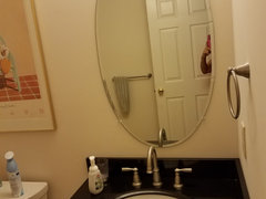
Working on more-than- a tweak to my powder room.

Flooring completed, new countertop, faucet, hardware, etc.

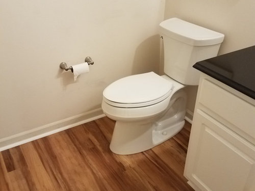
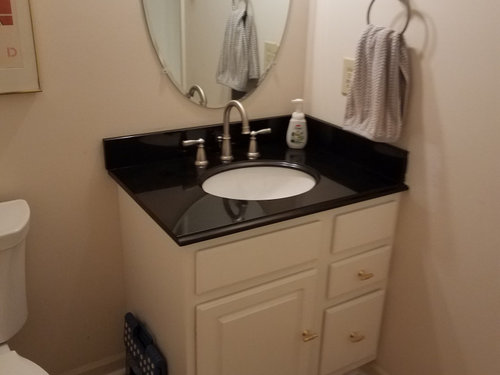
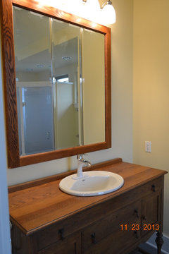
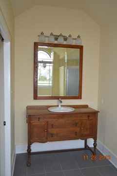
Here it is so far. This is what it looks like today-


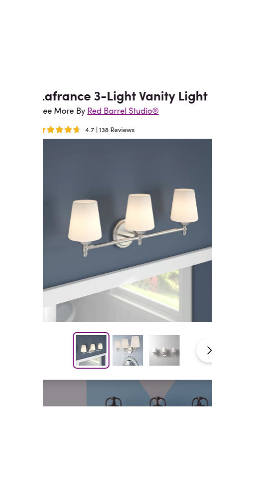
The new light fixture is this, and will be installed soon. (so currently, there is one bulb hanging--so yes, it's not the best lighting currently).


Trying to decide on a paint color. I had thought of SW Sea Salt, and do like it, but thought I would toss it out to you for suggestions. (part of me is thinking about a blue gray, even a rich deep one..but I don't know if it will be too dark with the black vanity top and who knows).


1-So I need inspiration and fresh eyes-question one is what color do you think for the walls?


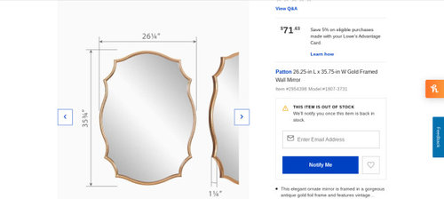
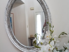
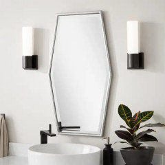
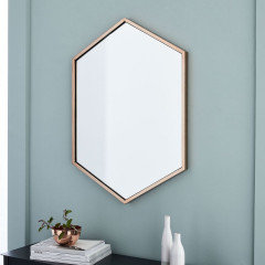
2-I think keeping the existing mirror, or would something else be better.......? I had originally thought about this one, which is currently out of stock- but would it be good?


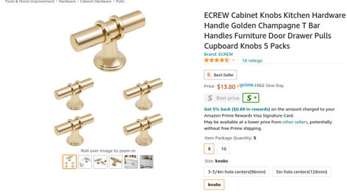
3-Very minor point, but I saw this hardware and thought it would be great. It's fine, but I wonder if I should just stick with a simple brushed nickel or black knob instead. I like gold a lot, but other than adding a gold mirror, is the gold sort of out of place?

The faucet is Moen Banbury brushed nickel.

You can see, I am all over the place.


My main question is the wall color but feel free to comment on my other questions.

Comments (33)

  • PRO
    4 years ago

    Duplicate post please delete

  • 4 years ago

    @Patricia Colwell Consulting- I do not see where this is duplicated...

  • 4 years ago

    It’s looking great! I like how the countertop looks in there.

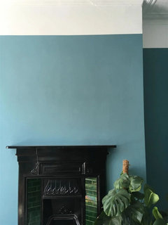
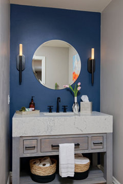
    I’m getting the impression you want to keep it more light and calm, but when you said blue/gray, my first thought was Farrow & Ball Stone Blue. It’s so rich and looks amazing with black. Scroll through the user-submitted gallery; lots of great pictures:

    https://www.farrow-ball.com/en-us/paint-colours/stone-blue


    But it’s definitely a strong and saturated color, maybe more dramatic than you’re wanting, especially in a smaller room with no natural light.

    I think your idea of Sea Salt would look beautiful in there! It’s lovely and fresh.

    salonva thanked Jilly
  • 4 years ago

    I suggest a rich blue or green, such as Behr Coney Island or Benjamin Moore Mill Springs Blue.

    salonva thanked rockyroad33
  • 4 years ago

    Yes to sea salt, it's divine, light and you'll love it.

    salonva thanked Yayagal
  • 4 years ago

    Interesting, I did like that Behr Coney Island... I am going to consider that one, but maybe I should just stick with the Sea Salt which all along has been calling me.


    Can I ask what do you think of my other questions? Does the gold/brass cabinet hardware provide some interest in a nice way or is it just not making sense?


    Part of why I thought about replacing the mirror was for stylish interest and that it brings in gold or brass----but maybe I shouldn't bother?


  • 4 years ago

    The gold shaped mirror is interesting, but your current one is fine. You can use gold framing on your art for the other walls to bring in the gold. Try a sample of Sea Salt to see what you think in your room. A lot depends on your lighting. You may want a more saturated color, or it may be fine. A powder room is a good place to go more bold, but the color should relate in some way to colors you have in adjacent living areas.

    salonva thanked calidesign
  • 4 years ago

    Sea salt is a great colour, too.

    Since the light fixture and faucets are brushed nickel, i don't think I'd recommend gold for the mirror and pulls.

    salonva thanked rockyroad33
  • 4 years ago

    I appreciate all the input. I am going to digest it all for a bit and am inclined to go with sea salt. The light fixture got hung so now there is proper light and I will look at it in there. and get a better take on color.


    The mirror needs to be moved down a bit as the light overlaps it . When we paint, probably in a week or two he can shift the mirror. It will work out fine, but somehow the light looks heavier than I envisioned.

    I will reserve judgement, but I am disappointed at the moment. The other changes I made in the house I have loved- this one not so much.

  • 4 years ago

    Salon, do you think you’d prefer using all brass in there? I just wondered since you posted the mirror and handles in brass. I know you just got the light in silver, but it seems like you’re wanting more of a change? If so, could you return it or paint it, and change out the other silver elements for brass? If I’m off the mark, ignore me. :D

    It is going to look much different after paint, I think you’ll love the color.

    salonva thanked Jilly
  • 4 years ago

    Jinx, you are not at all out of line. I do love gold/brass, but somehow since the faucet is nickel I thought I would go that route.

    Honestly what looks off to be is the light. It really looks different from the stock photo. The stock photo has a more delicate look to it and in the room, in real life, it looks rather big. I will take a picture. (obviously the mirror can be shifted down) but now I am re-thinking if the light is just too big. Of course, it is past the return window but if it is definitely wrong, I can suck it up. I am just now very uncertain about judging size of what would be right.


    I do agree paint will definitely enhance the room and it's still a world nicer than what was...

  • 4 years ago

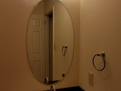
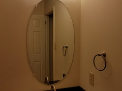
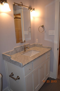
    I tried to get picture of the light- here are a few. Also, the framed poster has gold frame fwiw.


    So the mirror is 22 wide by 39 high.

    The vanity is 31 inches wide, and the light is 24 inches wide.

    If I lower this mirror, it will work. The gold mirror I was considering is 36 inches high (24 wide).

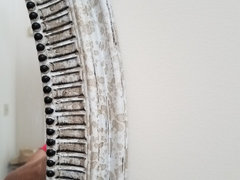
    I do actually have another mirror in my entry way, which is white with gold splatter dots, which is

    25 wide by 33 high.


    As I lay this all out (thank you if you still have patience for me and can focus) I think that if I use this mirror in the powder room, it all might work really nicely ... I am heading out for the day so will probably have to check in later or tomorrow but I will try to see if this works.

    Then you all can help me figure out what to put where that mirror was in the entry way.

    HA. talk about project creep.

    Of course, if you think the light is just too big regardless of mirror, feel free to share that .

    I am just too close to it and need other sets of eyes.

    Bless you all -each and every one


  • 4 years ago

    Oh, I like that mirror! I think you should try it and see what you think.

    I honestly don’t think the light is too big, but I’m only going by photos, of course. I know you’re wanting to get this room right … I want you to love it!

    I hope others will chime in, I’m more of a visual person and not so great with measurements and such.

    Maybe dumb question: did you try the light with the lights pointing down? I’m just wondering if it could be raised a bit more, lights down. Or does that throw lighting, etc, off? This is why I hope a more bathroom technical person than me will weigh in! :D

    You’ll get it right. You have great taste, it’s going to look wonderful. :)

    salonva thanked Jilly
  • 4 years ago


    Re the light facing up or down, I know it's "supposed" to be better lighting pointing down but I just always prefer them pointing up. Also fwiw, if they were facing down I think the light would be overlapping even more. I need to think a bit more on this but I am thinking the splatter mirror really will work.

    The light that WAS there, was a narrow bar ( hollywood lights but mini sized) so I never thought that the mirror was possibly just too high.

    I will try to get to this today- but wanted to say your sweet, kind, and encouraging words are just so wonderful to read, Jinx. Thank you.

  • 4 years ago

    Thank you! :)

    I think the new color will make such a huge difference in how you’re seeing things. Go get the paint, Woman! :D

  • 4 years ago
    last modified: 4 years ago

    These are just my preferences and experience over the years. It appears your bathroom is windowless. I have a windowless guest bathroom. I would not want a dark saturated color in that space or it will feel like a cave. I would recommend a pale, light bright color. My current color I've used in 3 houses is Sherwin Williams Sensitive Tint, a pale lavender. I also like S-W Jersey Cream, a pale yellow. Below are photos of our master and guest bathrooms. Good luck.

    Our new house in country · More Info


    New house in country · More Info


    New house in country · More Info


  • 4 years ago

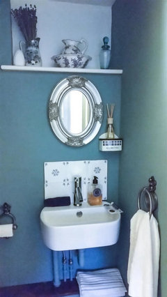
    Here is a mirror I just love at my vanity space. I believe at Home Depot and very inexpensive. It has an antiqued silvered wood frame and can be hung vertically or horizontally.


    Our Craftsman influenced house in the country · More Info


    salonva thanked alwaysdesigning
  • 4 years ago

    Your new light looks good with your faucet. I think it just looks off since the mirror underneath is too delicate to use between the light and the black countertop. Try your wider framed silver mirror in there - it may be perfect. Otherwise, any type of wider framed mirror should work. The framing around a mirror will give you the heft needed.

    salonva thanked calidesign
  • 4 years ago

    Thank you for the encouragement; I think you are on to something @calidesign that the current mirror is just too delicate in scale. I really think my other mirror will work well.

    I do think that other one that @alwaysdesigning recommended would be very nice as well. (Just not certain about dimensions but it has more heft to it which is a good thing). I am inclined of course to repurpose what I already have if possible.

    I also think it's probably a good idea to stick with a lighter color since there is no window in there.

    Probably Sea Salt but of course, looking a few other similar ones. (Rainwashed, Tradewind, ).

    Really pretty similar.


  • 4 years ago
    last modified: 4 years ago

    I used SW Sea Salt in my Florida hall bath. No window. Looks great.

    I like your other ideas too.

    SW Sea Salt is a trued and true for many reasons.

    salonva thanked eld6161
  • 4 years ago

    Pros say a 1/2 bath is one place you can be dramatic. I would go bold with cerulean blue. Nice floors btw. Looks good so far.

    salonva thanked territheresa
  • 4 years ago

    Thanks for all the feedback. That light really provides a lot of light so I could go deep and dramatic wall color. As much as I adore blue, the cerulean seems too bold for me I think. (but it is a gorgeous color).

    I am going to try to focus on my paint deck today . I have only heard how wonderful Sea Salt is and I am inclined to not overthink this ( well, then again, it's me, so I will still overthink it but maybe less).


    It's funny re the light. I read reviews and they were all positive- but one person did say the angle of the photo made it appear different from how it looks straight on. I think that's what I am seeing. I am going to keep it and see after painting and mirror change I think it will be fine,. but if not, I will deal with it later. :)

  • PRO
    4 years ago

    For powder rooms this is my rule of thumb - GO WILD! This is the one room where you can go a little crazy and/or dramatic since it is usually a small and very defined space.


  • PRO
    4 years ago

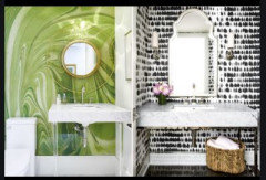
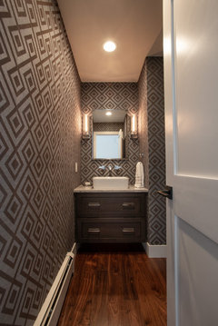
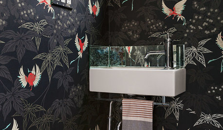
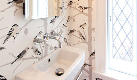
    Powder rooms are typically a place you can have some fun in. Below we have included just a few of our powder room designs to show you what we mean. Please note the paint, wallpaper, hardware, mirrors, and lighting.

    Cherry Hills Residence: Powder Room · More Info


    Golden Renovation: Powder Room · More Info


    Evergreen Renovation: Powder Room · More Info


  • 4 years ago

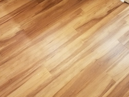
    I don't know if you read but the room has white vanity, black vanity top, and the "hickory" lvp with no window. Those are fixed items.


    I appreciate the additional suggestions. I am probably going to get the paint today or tomorrow, and although I am torn between a nice deep dramatic color and a nice light color, I am pretty sure the nice light color will win.


  • 4 years ago

    @tartanmeup you find the best hardware! I was hoping you'd chime in.


    I am really pleased with the flooring, and the vanity top.

    I do think the other mirror will be perfect.... I am going to get the paint this weekend.


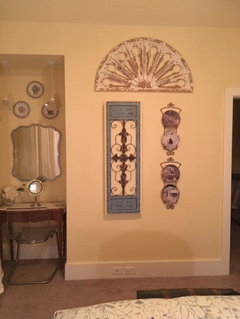
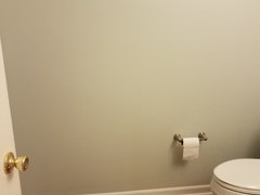
    The wall that you see when you enter the room ( to the left of the toilet) is totally blank so yes there is room for art or anything on the wall . Agree some black touches will help balance it all.


    I am moving forward and agree the hardware is a small piece. I do agree black hardware would probably work best. I have been looking for something to call my name. (but again, it's an easy thing to change out). I love the black and gold ones you shared but they are too big.


  • 4 years ago
    last modified: 4 years ago

    I love the black and gold ones you shared but they are too big.

    The hardware pics are screen captures of close up pictures so probably misleading in terms of sizes. Don't recall any of the knobs being oversized. If there are any particular knobs that tickle your fancy, be happy to retrieve the link so you can double-check sizes. ETA: the more I think of it, the more I think gold or white with a touch of black would be my choice rather than black with a touch of gold.


    Good luck with the painting! Hope you'll post pics when done. :)

    salonva thanked tartanmeup
  • salonva thanked freedomplace1
  • 4 years ago
    last modified: 4 years ago

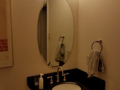
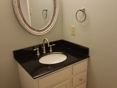
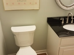
    I wanted to update with the finished ( yes, will put some more "art" or posters on the wall ) room.

    It was painted on Saturday and I am so happy with it. I did use SW Sea Salt. I was worrying a bit that it might be too pale and toyed with using Comfort Gray ( which I do think would have looked great as well) which is the next color on the color strip with Sea Salt.....but ultimately decide to go with Sea Salt.

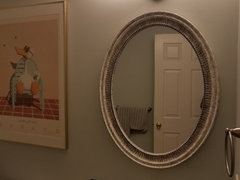
    I definitely is not pale; I am not sure how it shows in the photos and on various monitors but it's great. The mirror also worked out perfectly IMO of course.


    above it does look pretty washed out.- not capturing the color well. There is plenty of contrast.


    II don't think it's capturing the color but trust me in real life it's definitely got depth ( more than I expected but in a good way).

    Anyway- I am one happy camper and thank you for all the advice shared so graciously here.

  • 4 years ago

    Yay! So happy for you. The colour looks great on my screen. I think the oval mirror fits perfectly, btw.

    salonva thanked tartanmeup
  • 4 years ago

    I agree with tartan! It looks wonderful! So glad you like the color, it’s very lovely and calm. :)

    salonva thanked Jilly
  • 4 years ago

    The color is great. I would look for art that has deeper green colors, like foliage or landscapes.

    salonva thanked calidesign