


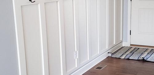
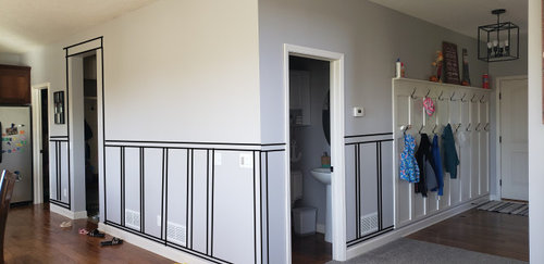
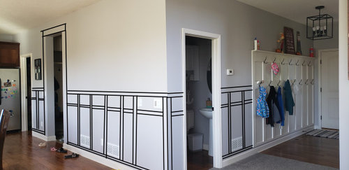
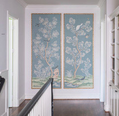
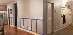
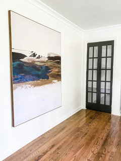
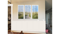
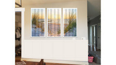
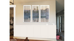
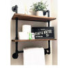
Does Board and Batten work here??
Kaitlyn Larson
2 years ago
last modified: 2 years ago


Featured Answer
Sort by:Oldest
Comments (40)
 PRO
PRODominique Michelle Vidal
2 years ago
Kaitlyn Larson
2 years agoRelated Professionals
Chicago Furniture & Accessories · Vail Furniture & Accessories · Egypt Lake-Leto Lighting · Modesto Lighting · Keansburg Architects & Building Designers · Piedmont Kitchen & Bathroom Designers · Hawthorne Furniture & Accessories · Bloomington General Contractors · Saginaw General Contractors · Whitney Cabinets & Cabinetry · Bellwood Cabinets & Cabinetry · Buffalo Kitchen & Bathroom Designers · Henderson Kitchen & Bathroom Designers · Lakeside Kitchen & Bathroom Remodelers · Cave Spring Kitchen & Bathroom Remodelers PRO
PRODiana Bier Interiors, LLC
2 years agoKaitlyn Larson
2 years ago
decoenthusiaste
2 years ago
littlebug zone 5 Missouri
2 years agolast modified: 2 years agoKaitlyn Larson
2 years ago
calidesign
2 years ago- PRO
Diana Bier Interiors, LLC
2 years ago Kaitlyn Larson
2 years agolast modified: 2 years ago
Brown Dog
2 years agoericalynn523
2 years ago PRO
PROBeverlyFLADeziner
2 years agoHU-187528210
2 years agojohn3582
2 years agoKaitlyn Larson
2 years ago PRO
PROLisa Caudill Designs
2 years agoKaitlyn Larson
2 years agoKaitlyn Larson
2 years ago- PRO
Lisa Caudill Designs
2 years ago - PRO
Lisa Caudill Designs
2 years ago Kaitlyn Larson
2 years ago- PRO
Diana Bier Interiors, LLC
2 years ago Kaitlyn Larson
2 years ago- PRO
Diana Bier Interiors, LLC
2 years ago Kaitlyn Larson
2 years agolast modified: 2 years agoKaitlyn Larson
2 years agoKaitlyn Larson
2 years agoericalynn523
2 years agopernice4
2 years agoKaitlyn Larson
2 years agocalidesign
2 years agolast modified: 2 years agoKaitlyn Larson
2 years agoKaitlyn Larson
2 years agoshirlpp
2 years agocalidesign
2 years agocupofkindnessgw
last yearKaitlyn Larson
last yearlast modified: last year


Related Stories
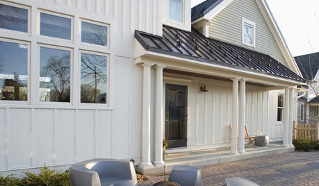
REMODELING GUIDESRenovation Detail: Board and Batten Siding
Classic board and batten siding adds timeless appeal to traditional homes, modern structures and every style in between
Full Story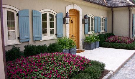
WINDOWSBoard and Batten Shutters Offer Pretty Protection
If you're looking for a traditional window dressing that's decorative and practical, board and batten shutters are flat-out appealing
Full Story
INSIDE HOUZZHow Much Does a Remodel Cost, and How Long Does It Take?
The 2016 Houzz & Home survey asked 120,000 Houzzers about their renovation projects. Here’s what they said
Full Story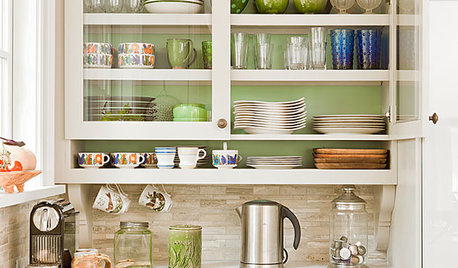
KITCHEN CABINETSChoosing New Cabinets? Here’s What to Know Before You Shop
Get the scoop on kitchen and bathroom cabinet materials and construction methods to understand your options
Full Story
HOUSEKEEPINGIt’s Time to Clean Your Gutters — Here’s How
Follow these steps to care for your gutters so they can continue to protect your house
Full Story
LIFERelocating? Here’s How to Make Moving In a Breeze
Moving guide, Part 2: Helpful tips for unpacking, organizing and setting up your new home
Full Story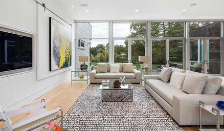
HOME TECHLove Your TV but Not the Way It Looks? Here’s How to Hide It
See the clever new ways designers are concealing that big, blank TV screen
Full Story
MOVINGRelocating? Here’s How to Make the Big Move Better
Moving guide, Part 1: How to organize your stuff and your life for an easier household move
Full Story
ANTIQUESInherited an Antique? Here’s How to Work It Into Your Home
Find out how to make that beloved vintage piece fit in with your decor
Full Story
LANDSCAPE DESIGNHere’s How to Get That Great Steel Planter Look
Learn more about how resilient and beautifully rusty Cor-Ten steel can find a home in your garden, and how much it costs
Full Story

Kaitlyn LarsonOriginal Author