Software
Houzz Logo Print
champsgary

Paint Help please!!! Looking for warm neutral.

4 years ago
last modified: 4 years ago
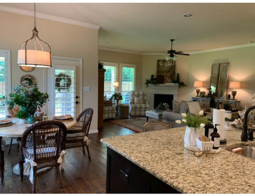
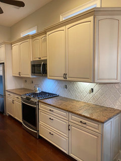
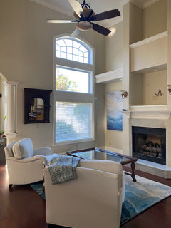
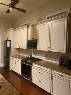
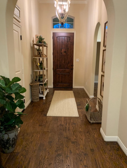
We recently moved into our home. The paint is currently a creamy yellow that leads to a peachy color in the evening, including the ceilings. I believe the builder/prior owner used PPG Almond Cream on the walls and ceilings. I know brightening the ceiling paint will make a huge difference. I am looking for advice for a wall color throughout. I lean to the warm neutral tones, less towards the gray. I would really appreciate you input.

Suggestions for Wall Color and Trim Color would be appreciated!!!


Comments (66)

  • 4 years ago

    Yes BM Simply white. It was their color of the year I think

  • 4 years ago

    Might’ve been SW pure white?

  • 4 years ago

    We did all of our white ceilings and trim SW Pure White and it is the perfect white. I was hoping to avoid any undertones you sometimes get with whites (yellow, blue, pink) and Pure White delivered. A friend painted the exterior of her house a white that has yellow undertones, and she hates it. Because of her experience, we even painted our exterior siding Pure White!


    We did our walls SW Agreeable Gray. It does pull gray, but in such a neutral way. If that makes sense. It's a color you just don't "notice" is on the walls, and that's how I like it.

  • 4 years ago

    Yes we have Pure white on the ceilings, accessible beige on the walls.

  • PRO
    4 years ago
    last modified: 4 years ago
    Check colors in living room in Sharrah Stevens


  • 4 years ago

    I remember I listened to what Beth H recommended years ago

  • 4 years ago

    Find a color wheel on line and review the different whites; there are blue whites, gray whites, yellow or creamy whites, etc. See what appeals to you and try these favorites out in your rooms. We all have our favorite whites and our favorite brands...Benjamin Moore and Sherwin Williams are the brands most often mentioned here. Finding the prefect white for you will take time.

  • 4 years ago
    last modified: 4 years ago

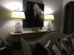
    the light in your living room upper walls looks greenish-- which tells me that it's reflecting off all the greenery in your yard. the previous owners may have chosen a peachy undertone to balance that.

    just something to consider, when looking at samples. be sure to test them out in that living room.

  • 4 years ago

    Benjamin Moore Pale Oak for walls, Benjamin Moore White Dove (semi-gloss) for trim, Benjamin Moore White Dove (flat) for ceilings. The Pale Oak looks beautiful in different lights. It does not turn "pinkish" or "peachy". We have lots of greenery in our yard. The White Dove looks great with the Pale Oak. Stay away from "Ceiling White" for ceiling.

  • 4 years ago

    Pale oak can give off a bit of green undertone so keep that in mind. Love white white ceilings they help reflect light. Also make sure to change out your light bulbs to led Daylight it is transforming!

    What is your trim color now?
    Do you just want to change out wall color?

  • 4 years ago

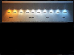
    Sorry but no to daylight bulbs. the ones common at hardware stores labeled as "daylight" tend to be 5000k, which are bluish and cold. But yes to trying bulbs that are whiter, such as 3500-4000k. These are brighter while not being too cold.

  • 4 years ago

    I have changed out to GE daylight 1600 lumens..no blue at all! I hate that would never want blue and cold…..they are true neutral light..love them!

  • 4 years ago

    3500-5000 is neutral…..5000 is great for lamps, overhead pot lighting and kitchen……still neutral…for bedrooms you can lower to around 3500 without it being too warm…every Lightbulb brand is a bit different I found that the GE has the best daylight overall.

  • 4 years ago

    I think your current wall color is warm and gorgeous. It looks like the perfect backdrop.

  • 4 years ago

    I don't care about color charts or sample photos viewed online. I'm talking about how light feels in real life. Every time I walk into a home lit with 5000k bulbs, it looks and feels awful to me. sorry. feel free to decorate with it if you want, it's your house!

  • 4 years ago

    That is my home with the daylight bulbs..not a sample photo online….it is in real life…feels amazing and uplifting it also makes it much easier to decide on wall colors because it is true color not changed or distorted from yellow warm lighting…So many clients have switched and can’t believe how true the colors in their home are…in this posters case the warmer walls would most likely be fine if the lighting was more neutral…if you live in Seattle this type of lighting would be amazing! My daughter lives in Seattle and lighting can change your mood when it is mostly cloudy and raining a big portion of the year. You seem a bit cranky maybe your lighting would lift your mood! 🤗😉☺️🌞

  • 4 years ago

    Haha, Julie. Good one!

  • 4 years ago

    😉☺️

  • 4 years ago

    I got fantastic advice from a great color consultant who we used for our home almost ten years ago: Paint the ceiling the same color as the walls but cut the pigment by 50%. The ceiling and walls end up looking the same color, you don't need a different bright white that could then throw off your wall colors. It is perfection.


    We recently moved and I used Farrow and Ball neutrals. They have a limited pallet, which I find helps to not have to sift through a gazillion choices. We used white tie in our living areas - it is creamy and beautiful. We thought it would be too yellow but risked it and once our furniture was in place it looked stunning. Our bedroom is dimnity, a red based neutral. Absolute heaven but might be too pink-ish for your desire. We used satin slipper in the guest room / office. It reads too cool and grey, not a fan.

  • 4 years ago
    last modified: 4 years ago

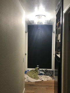
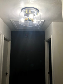
    I just put in these 'Daylight' 60W LED bulbs in my new ceiling fixture (i'm painting the hallway at the moment) and they say 5000K. Man oh man is it bright! LAX could use this as a spare landing strip.


    I'm switching to 3500-4000 bulbs.


    SGary Try using the Base White straight from the can for the ceiling (have the paint guy top it off w/a few more squirts of white). Or, try the Simply White. I'm repainting these walls w/Simply White w/Behr paint. I just had them color match the ben moore color. I like Behr paint better.

  • 4 years ago

    You need lower lumens..the lumens are the strength of the light..the K is the color of the light…the lumens are what you compare to your wattage…so if that light needs 40 watt..you need 450 lumens..60 watts is 800 lumens..75 watts is 1100 lumens.

  • 4 years ago
    last modified: 4 years ago

    yes, it's an 800 lumens. I could go down to a 40 watt, but that's a little dim. it says it's a 5000K (on this 60W bulb) . I'd like a 60 watt with a 3500 or 4000 temp.

  • 4 years ago
    last modified: 4 years ago

    I bought such pretty 3,000K temperature bulbs but they are way too many lumens equivalent to 150 - 200 watts. The 60 watt bulbs in my bedroom are just not bright enough. I am going to look for 100 watts bulbs with a temperature of 3,000K for two of my 4 small lamps in my bedroom. Lumens is the brightness. Temperature is the color of the bulb like Home Interiors With Ease's picture shown. I learned all this when I was buying lights for my kitchen and changing bulbs to make my new tiles look pretty. Editing this since I tried the 3,000K bulbs downstairs in the family room and not only are they too bright, they are making my white shades more yellow than the incandescent bulbs so they must be lesss than 2,700K temperature unless the brighter lumens is enhancing the yellow. I like a little warm but not so yellow so I am returning these bulbs.

  • 4 years ago

    What direction is the room facing? Most people don't take that into account when choosing a paint color. My LR faces north so I needed a warm white so it didn't feel like so sanitary. I choose SW Creamy. https://www.benjaminmoore.com/en-us/color-overview/color-palettes/color-by-direction/east-facing-room-paint-colors

  • 4 years ago

    I love the light fixture over your dining area!

    Pale Oak and White Dove are a great combo that someone suggested earlier! I have also had great success for a light and bright feel with Sea Pearl and Oxford White combo. Both Benjamin Moore.

  • 4 years ago

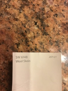
    I had a similar problem…yellow and peach undertones which felt dated. I originally wanted grey but after consulting a color expert, I understood how my hardscapes such as a cherry hardwood floor combined with off white glazed cabinets and similar granite as you, would compete with it. I went with SW Wool Skein! It truly is amazing!

  • 4 years ago

    I also like SW pure white (Semi gloss for trim and flat for ceilings). After way too many paint samples, reading of blogs etc, settled on BM classic gray for the walls and love it. It’s not really gray, more taupe but very light and subtle. It warms up nicely at night with lamps (not so much the can lights). Blogs have talked about lavender undertones and I see none of that (I am super sensitive to color and undertone). It looks beautiful in every room regardless of location, sun exposure etc. when we first tried it it looked dark compared to the primer. Once on, it’s just perfect. Not dark at all but offers just enough contrast with the trim. I love it.

  • 4 years ago

    Ppg Millet from builder worked great as a warm neutral for us. Was used on walls and ceilings. I ended up putting other colors in some rooms dark blue, dark red and pale green and the Millet on the ceiling looked great with all of them.

  • 4 years ago

    On the lumens you can go much lower than your normal lightbulb…and use higher K for a neutral light.

  • PRO
    4 years ago

    Suggestion: Once you've found the neutral colour you like, buy a sample size container of the paint and paint a large cardbord (available in dollar stores). Give it 2 coats of paint to ensure a good covering. You can then walk around the room(s) and see what the colour will look like in different areas and lights.

  • 4 years ago

    lisedv, that is a good idea but the former wall color will reflect off the board not letting you see the real color. So in addition to walking around the room with the board, you need to also put it on a wall that a chair or curtain can go in front and no see any of the former wall. Do this in a few places in the room so you can see what the real color is in your room situation.

  • 4 years ago

    A good beige neutral is Accessible beige by Sherwin Williams. Looks great with a crisp white trim.

  • 4 years ago

    Although you said not gray, look at Worldly Gray and Mega Griege by Sherwin


    MG is the darker wall color in the first photo. WG is behind the french doir in the fireplace photo. i use the bright white LEDs, but in the fireplace photo you can see the more yellow light with those same two colors.

  • 4 years ago

    There is no way anyone can tell you which color to use in your space, since natural light varies depending on your exposure and what region of the country you live in. I have lived in almost every region of the USA and overseas and colors I adored in one house looked strikingly different in another. A color that reads beige in one setting can look pinkish in another location depending on the tints in the paint and lighting. Your best bet is to pull a few samples you like( look for warm colors, light colors without a red tint added to avoid a pinkish tone) and test the samples on your walls. Observe the colors during various times of the day too see how they look. A tip to bear in mind, is that you should pick a shade lighter than you your choice ,since the walls reflect off each other, and always appear a shade darker. If want your ceilings the same color, you may want to dilute with white, as one commentator suggested, as it will read darker. White ceilings will brighten the space.

  • 4 years ago

    I am loving Sherwin Williams Greek Villa.

  • 4 years ago

    BM Shoreline is a soft, warm, light gray, great with white trim.

  • 4 years ago

    I love all the input so this is just to help you and not take away from all the comments, but after having personally struggled with paint to the point I had the painter repaint - each floor - twice - I can tell you that there are ways to get yourself crazed about paint. Painfully crazed. I personally can’t take the idea of stressing about how every color appears in every room due to sun exposure and certainly not due to lighting intensity. You should like your paint in all rooms and all times of the day. If a paint has peach undertones you will see it in every room, it will simply look more intense in a room with brighter light. Pay careful attention and don’t let your mind correct for what you actually see. I had really wanted

  • 4 years ago

    Oops, posted that too soon - I had really wanted to like certain colors so told myself I liked them and cooperated with blogs etc. I the end, I think there are a million ways to go. Find the spots that get the most and least light and try the samples there. And I wish you luck. I hated this part. The first time we painted inside all these things didn’t exist except for going to the paint store and getting a sample. I brought some home, picked a color, and liked it for years. There is so much out there to make you second guess yourself. It’s painful!

  • 4 years ago

    With your darker floors I would go lighter on the walls, trim. i just moved into a house with dark floors, we repainted walls BM Crisp Linen and trim BM Simply White. we did BM Ceiling White on Ceiling. i prefer a light, brighter home and this combo really made a difference. i brought in my color with area rugs and art.

  • 4 years ago

    Kautry, There is a Sherwin Williams Crisp Linen my friend used on the walls in her house. I just looked it up and there is also a Benjamin Moore Crisp Linen by the same name. We would love pictures.

    https://www.benjaminmoore.com/en-us/color-overview/find-your-color/color/csp-305/crisp-linen?color=CSP-305


  • 4 years ago


    We just had new floors installed, new baseboards are not yet installed.

  • 4 years ago

    I also prefer BM over Sherwin Williams paint, i think Aura-though expensive-is easier to work with.

  • 4 years ago

    Thank you Kautry! I love the color. I used the Benjamin Moore Viewer to compare with BM Linen White and it looks like BM Crisp Linen is more neutral with less yellow. I may get a sample. I also prefer Benjamin Moore Paint over Sherwin Williams Paint.

  • 4 years ago

    Kautry, can you tell me what your floors are? I love them so much.


  • 4 years ago

    Our open floor plan main floor is all BM White Dove, which is a perfect off-white that still contrasts with true white trim (BM Chantilly Lace). All the hallways are BM Ballet White, which gives just a touch more contrast but is still bright and light.

  • 4 years ago

    Thank you Brittany.

  • 4 years ago

    We recently painted all but 2 bedrooms in our house BM Wind's Breath. I think it is a light warm greige. We used White Dove trim. Works great in north,south and east facing rooms. We love it. I am going to paint the 2 bedrooms BM Balboa Mist.

  • 4 years ago

    patrcia48, can you please post pictures. Sounds pretty.

  • 4 years ago

    susanlynn2012 the floors are Triumph by Mannington, engineered hardwood. the planks are hickory, white oak and maple-a compromise to make everyone happy! i do love them too

Sponsored
Buckeye Basements, Inc.
Average rating: 5 out of 5 stars40 Reviews
Central Ohio's Basement Finishing ExpertsBest Of Houzz '13-'21