Software
Houzz Logo Print
maggie_tri

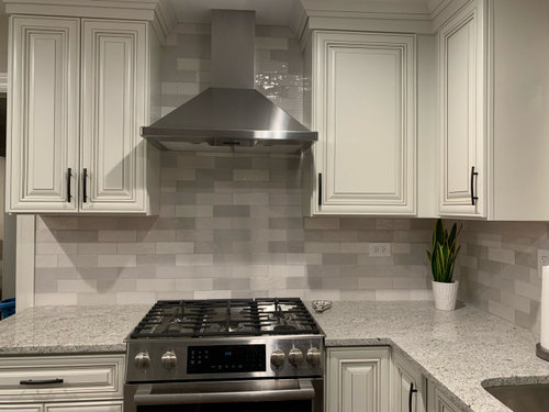
don’t like newly installed backsplash- any way to lighten?

4 years ago
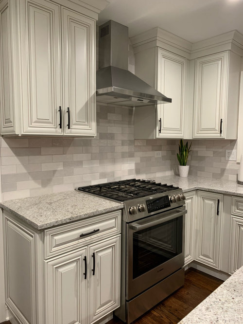
We previously had white subway tile with these cabinets in our last home. We wanted to go with a subtle patterned look after seeing bedrosian tile inspiration pictures on Pinterest. The bedrosian tile was sold out so we went with this ceramic tile from Spain. It looks best when under cabinet lighting is on, but I can’t help but feel it would look better if it was toned down in color. Does anyone have any thoughts?

Comments (44)

  • 4 years ago

    Starting to regret going with this tile and wishing I would have stuck to the plain white subway tile :/

  • 4 years ago

    This looks great! Plain white would have been too stark of a contrast to your warm cabinets and counter!

    Maggie T thanked wicketdog123
  • 4 years ago

    Don’t mean to contradict, but they look really nice! Maybe putting white grout on it, but I have no idea if that is realistic on top of existing grout. Perhaps someone can advise. Otherwise I can’t imagine anything other than starting from scratch.

    Maggie T thanked Therese N
  • 4 years ago

    I think it’s ok. What’s a little ‘off’ (at least on my screen) is that some of the tiles look pinkish, and it makes your warm cabinets look a little yellow. And together it’s not great (again, on my screen). Overall I think it’s ok and you’ll get stuff in the kitchen and you won’t notice so much hopefully.

    Maggie T thanked Jennifer Svensson
  • 4 years ago

    Love the tile. i would hate white.

    Maggie T thanked nycbluedevil_gw
  • PRO
    4 years ago

    A solid color would work better with your countertop. But if you can’t change it then stack some wood, interesting cutting boards up against it to interrupt the visual. Add a colorful pot and plant and see how it looks with those accessories.

  • 4 years ago

    I think it's fine, even with the countertop, because that is pretty much a consistent speckle.

    Maggie T thanked palimpsest
  • 4 years ago

    I like the repeating of neutral color counters with same neutrals, in another form/ of tiles. It's not a mismatch that I can tell. I like it.

    Maggie T thanked everdebz
  • 4 years ago
    last modified: 4 years ago

    It looks pink to me too and doesn’t blend with the cabinets. Or the countertops.

  • 4 years ago

    Hi Maggie, could you actually tell me what color your cabinets are?

  • 4 years ago

    I would have chosen a single color tile, but I think this looks fine. Maybe you are just used to the white tile you had previously and will take a little time to readjust.

    Maggie T thanked flopsycat1
  • 4 years ago

    If your lighting uses led bulbs you could swap them out for a higher Kelvin rating to take away some of the yellow. Go to 4000K is you have a warmer bulb. https://www.mydimmerswitch.com/how-tos/kelvin-temperature-led/

    Maggie T thanked dan1888
  • 4 years ago

    Every monitor is slightly different, but I think it looks good on mine. If it looks best with the under counter lights on, keep them on. Small price to make you happy.

    Maggie T thanked RedRyder
  • 4 years ago

    They look great on my monitor!

    Maggie T thanked Carrie B
  • 4 years ago

    This is really beautiful, and your installation looks amazing!
    (I’m kinda jealous-crying over mine, same tile different color)

    Maggie T thanked Red Robin
  • PRO
    4 years ago

    This is cute Christmas deco but shows how cutting boards can decorate up a backsplash!

    Maggie T thanked Flo Mangan
  • 4 years ago

    Looks wonderful on my screen.

    Maggie T thanked drumleewest
  • 4 years ago
    last modified: 4 years ago

    It looks great on my monitor. Would you mind sharing what cabinets, counter, and tile you used?

    Maggie T thanked HU-402831377
  • 4 years ago

    Im thinking its more about the two different patterns that are bothering you more maybe


  • 4 years ago

    Don’t do anything until you have improved your lighting. 4000 kelvin minimum. It could make all the difference. Seriously.

    Maggie T thanked Bari Castle
  • 4 years ago

    On my screen, it looks great, and Im pretty picky.

    Maggie T thanked Mrs. S
  • 4 years ago

    It looks beautiful!

    Maggie T thanked bearbev
  • 4 years ago

    I think (suspect) what is bothering you is the juxtaposition of the two different patterns--speckled granite and the alternating colors in the backsplash. I don't know what you can do about it however other than rip out the entire backsplash and go with something that is all one color.

  • 4 years ago

    I really like it!

  • 4 years ago

    On my screen it looks great too. Not pink at all. I echo everyone’s comment on change the lighting

  • PRO
    4 years ago

    I think it looks fine! You may be overthinking this.

    Maggie T thanked Sabrina Alfin Interiors
  • 4 years ago

    Looks good to me. Perhaps you just have to get used to the change.

    Maggie T thanked oreet
  • PRO
    4 years ago

    Get light underneath of cabinets.

    Maggie T thanked Celery. Visualization, Rendering images
  • 4 years ago

    I like it.

  • PRO
    4 years ago
    last modified: 4 years ago

    Agreed! look at installing under cabinet lighting and adding additional interest with accessories.

    Maggie T thanked The Best Dressed House
  • 4 years ago

    I like the suggestion of keeping the under cabinet lights on. I’m assuming they’re LED. I keep mine on full whenever I’m home. Your kitchen look really pretty, just needs kitchen accessories.

    Maggie T thanked Anne Duke
  • 4 years ago

    Love it. It is subtle. Elegant. Wouldn’t change a thing. Colors are perfect on my monitor, but that said, you can make some amazing changes with bulb swaps.

    Maggie T thanked MizLizzie
  • 4 years ago
    last modified: 4 years ago

    What matters the most is your feelings. And, I get why you are disappointed. This BS pairs better with a solid counter.

    That said, on my monitor, all the colors blend: backsplash, counter and cabinet color.

    You are not used to looking at pattern, but you will get used to it.

    Sidee story: Many of us here have made the “backsplash error.” I had mine ripped out the following day. It was clear that it clashed horribly. It took 6 more months to find something suitable.

    Only you can decide if you can live with this backsplash or not. All the positive feedback should make you feel somewhat better.

    I agree to add some wood elements. Always a good idea to go 4000k lighting.

    Live with for it for at least a month. If you go Into the kitchen every day and feel sad and disappointed, then change it.

    Come here to for advice for a replacement.

    Maggie T thanked eld6161
  • 4 years ago

    Just another one of my periodic curmudgeonly observations.


    Not all that long ago, in the scheme of things, maybe 12 years or so, everybody was all over active granite Plus Jeffrey Court et. al. ceramic + glass + metal accent mosaic Plus border tiles and accents over the sink or range. Some of those kitchens had the same level of activity as the inside of a Greek Orthodox Church.


    Now relatively subtle gradations of grey in a uniform size format + grey speckled granite is "Too Much". Not just in this particular thread...and surely the Entire population of GW has not been replaced in that time.

  • 4 years ago

    Looks fine. First world problem!

    Maggie T thanked whistle_b
  • 4 years ago

    It is one of the better ones I've seen. Over time you will really love it. If after a month and you walk in your kitchen and aren't saying "OMG what was I thinking!" ......you're good.

    Maggie T thanked Steve8690
  • 4 years ago

    Thank you all for the feedback and reassurance! With your help I realized that the lighting and lack of decor was drawing my eye to the tiles under the hood- which appeared darker and too busy. After a month of second guessing my tile choice I’m really glad I posted here..

    I’m going to take your suggestions about changing to a higher kelvin rating for lighting and things already look better with trying some countertop decor and keeping under cabinet lights on. thanks for taking the time to offer your input!

    For those that asked:
    Cabinets: off white/Arlington oatmeal
    Tile: ZELLIGE PEARL OPAL POLISHED CERAMIC TILE
    Granite: andino white

  • 4 years ago

    I actually think it looks pretty nice. It is all soft and blends well.

  • 4 years ago

    It looks good, compared to many of the “I don’t like my backsplash” post I’ve seen. In hindsight you may have used a quieter counter with the splash…but it’s in, and at least the colors coordinate well!

  • 4 years ago

    I think the tile is beautiful and the whole kitchen, too. I wouldn’t change a thing.

  • 4 years ago

    I think it looks wonderful. congratulations on your lovely kitchen!

  • 4 years ago

    I would like to add that I love the color of the cabinets with the black hardware. Elegant and timeless. I also love there isn't a gigantic grout gap. Really adds to the sophistication. Very nice.

  • 4 years ago

    Love your countertops. What are they?