Software
Houzz Logo Print
webuser_684371897

Why does my paint color look so different?

4 years ago
last modified: 4 years ago
Im struggling to find a paint color for a small bedroom with one small west window.

The colors dont look like the swatches once i sample on the wall. i look at it only in natural light because the ceilingnlight is awful. ive primed the area around the sample white.

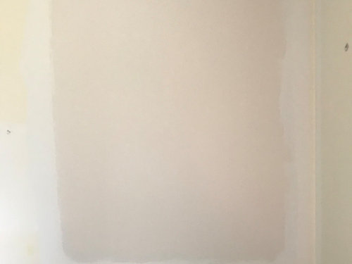
My latest attemp is SW Origami White, which ends up looking almost mauve. how do i get a color that actually looks like how Origami white should?


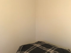
Actual morning:


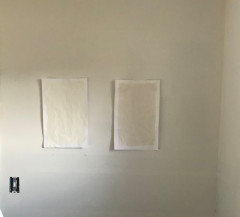
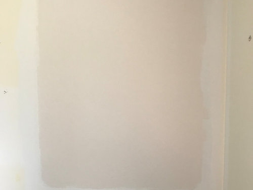
Actual afternoon:


Onlime sample:


Inspiration:


Comments (27)

  • 4 years ago

    I've been completely geeking out trying to find the perfect truest gray, so I've learned a lot about paint colors, specifically RGB levels. Your Origami White is RGB: 232 228 220. This means it has more red (232) than green or blue, which gives it that mauve tone. Try to find one with less red.

    Indecisiveness thanked LH On the Move
  • PRO
    4 years ago

    I would try egret white.

    Indecisiveness thanked BaumHaus Design-Build, LLC
  • 4 years ago

    Try Benjamin Moore seapearl!

    Indecisiveness thanked stellarceline
  • 4 years ago

    What color is the trim? That can affect the color too.

    Indecisiveness thanked ykindschi
  • 4 years ago

    I think the corner of the labeled picture above the green wall looks pretty much like you've got on your wall. Definitely pinky

    Indecisiveness thanked palimpsest
  • 4 years ago

    Thanks for the feedback.

    Id like to keep the color with an LRV of 76 or greater, in the off white category.


    I will start looking at the color distribution.

    The white around the sample is dry wall primer.


    @palimpsest Do you mean that you think them color on my wall looks like the online swatch color?


  • 4 years ago

    I don't think the online flat sample looks like it but the photo of it in the room does, on my computer.

  • PRO
    4 years ago

    IMO you do not test colors on a wall but on poster board and also the walls need to be primed withwhite primer before painting any new light color. Also colors on a monitor are pretty useless for choosing colors. I also would suggest the center light be changed to have LEDs 4000 bulbs since you need good lighting for overall in a bedroom for cleaning if nothing else. BTW wall color in a bedroom is usually decided from the bedding so maybe share that before buying anymore paint.

  • 4 years ago

    The white you can see around the sample color is primer white.

    I agree the light needs yo be replaced, , i am currently only evaluating colors in natural daylight as the fixture makes everytging yellow.

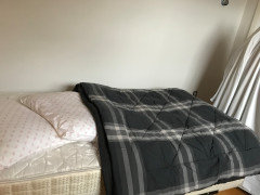
    The bedding is gray/black plaid:


    Its for my 14yo stepsons room, he said he wanted white walls

  • 4 years ago
    last modified: 4 years ago
    Are you using SW paint samples or having HD or L match them? If so, the matching never works...only asking because SW has been out of samples for a long time...you have to buy a quart. I have Origami White in my upstairs and it's nothing but a soft white (with a hint of the lightest gray sometimes)...zero mauve on any wall.

  • 4 years ago
    last modified: 4 years ago

    Actually there is confusion here between color rendering and color temperature. Incandescent bulbs will generally have color rendering very close to 100 despite being in the 2800 vicinity temperature wise, and fluorescents at 3000-4000 have pretty bad color rendering at 60.

    LEDs are 80-95, but not a 100. A 4000 LED bulb could have really mediocre color rendering if it's only 80, the temperature has nothing to do with it.

  • 4 years ago

    My guess is that this is a relatively small sample that you painted and you are looking in a corner where it is shadowed and looking at it in the context of a very yellow room.


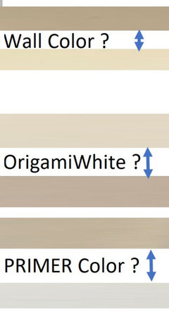
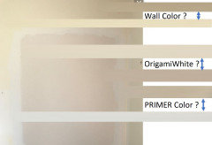
    Please look at this picture and tell if you walk into your bedroom and see a dark green gray yellow or a clearer creamier yellow? My guess it is probably lighter/cleaner than either of the choices below, but much closer to the light color than the dark color.


    Same with the Primer.


    So you can expect the same result from Origami White.


    You need to look at wall color with the colors that will be in the room - not next to colors that are going away.


    You need to look at the sample in all areas of your room and mainly around eye level. It is good to know what the corners will do, but when the entire room is painted our brains actually compensate for lighting differences, so corners often don't look as different as your sample does, where it was exclusively painted in a floor level corner.


    Prime your walls or get a large white poster board (3'x4') and make an 8 1/2 x 11 sample of your paint color on another piece of poster board or on watercolor paper (my preference is water color paper, but both work - so will a pizza box lid or other cardboard. Paint a coat of primer and two generous coats of paint on your sample board. Then place it in the middle of the big white poster board and look at it again. Origami White is not prone to pink or purple undertones. It is pretty neutral, but all neutrals will shift colors based on the colors around them.


    Again, the human brain perceives colors based on everything in your visual field. Your brain compares all of the colors and you see sometimes see something that really isn't there at all.


  • 4 years ago

    looks like only one of two photos posted above. . .


    Indecisiveness thanked Jennifer Hogan
  • 4 years ago

    A small bedroom with one window would probably benefit by being painted a whiter white. I don’t think Origami White is white enough to help bounce light around the room. Keep the bedding on the light side. Add one or two table lamps and change the ceiling fixture to one which provides better light. Add a bit of an accent color in art and/or window treatments or an accent pillow or two.

    Indecisiveness thanked felizlady
  • 4 years ago

    Go to Maria Killam’s website to see the best way to pick whites.

    Indecisiveness thanked joycedjay
  • 4 years ago
    last modified: 4 years ago
    The samples in previous pictures are rougly 2’by 3’.

    I primed the entire room with white primer. Then i painted new samples on 11”x17” paper.

    The two samples of SW Marshmallow and Origami White. These are on different walls in the same room, with afternoon light, only nautural light.


  • 4 years ago

    I see your dilemma clearly now. Thank you for helping us help you. We cannot change the color of the light coming into your room. and you have two walls getting very different lighting.


    The lighter the paint the more reflection and the more the color of the light is intensified. So colors on the one wall will wash out and on the other wall will go very warm, unless you fix the lighting. A light filtering shade and good interior lighting will solve the dilemma.


    The other option is to choose a color that looks good with both cool and warm light and doesn't change as dramatically. Drop your LRV down to the mid 60s and choose a matte finish. (Gloss reflects more light).


    Blue green grays are my favorites for rooms where lighting is this dramatic. The cool walls go bluer and the warm walls to greener, but both are lovely. The first color I would look at would be SW Comfort Gray.


    If you are set on picking a more neutral color I would start with testing these:

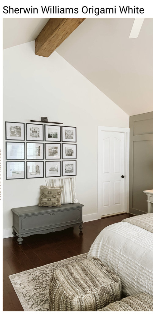
    (Origami White is shown for comparison purposes)


    Indecisiveness thanked Jennifer Hogan
  • 4 years ago

    I am not sure you can fight the nature of how paint colors are going to interact with the sun coming from different directions, and win. I am sitting in a room painted a complex full-spectrum grey and one corner of the room blends so closely into the white ceiling that if I squint I lose the the boundary and the other corner is high contrast. You would have to use a different white paint color on each wall for it to look the same.

    Indecisiveness thanked palimpsest
  • 4 years ago

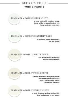
    From someone who has ordered almost every white from samplize.com, I would recommend looking at Chantilly lace. If that is too stark, one of my favorite whites is Simply white. Whites are the hardest!

    (179) Pinterest · More Info


    Indecisiveness thanked kulrn
  • 4 years ago
    last modified: 4 years ago

    I feel your pain! We just built a house and I'm not happy with some of the colors I picked, so I am testing new colors to repaint. All my cabinets, trim and doors are BM Chantilly Lace and I'm happy with that white color. For walls I want an off white with a hint of beige, but everything seems to read very yellow in this house! I do not want yellow! So far the best option seems to be SW Snowbound, but I have to do some more testing and tweak some light bulbs too.

    Indecisiveness thanked chispa
  • 4 years ago

    Thank you all for the detailed input.

    I have Simply White in another room. I wanted a white that was slightly less white, if that makes sense.


    My next guess is Snowbound i think.


    Im ok if the color doesnt look the exact same on every wall, just as long as what it looks like on different walls ”goes” overall.


    Ive been getting the samples at Lowes, they offer a colors theough SW and HGTV. I realize that the colors arent quite the same as pure SW, but its what I have availabe to me..

  • 4 years ago

    Greek villa, Alabaster, White dove? Snowbound may lean a bit pink/purple also according to this video. Snowbound

  • 4 years ago

    The videos are good, but don't rule out a color based on someone else's perception of the color. Long time ago I needed to find a beige/tan that looked good in most of my house and with the salmon-y marble tiles in the 2-story foyer. For the longest time I avoided testing SW Kilim Beige because all the reviews said it had a fleshy undertone. Finally tested it and it was perfect for that house and looked like a nice neutral beige. No fleshy undertones to be seen anywhere.

  • 4 years ago

    Here is another video on Snowbound! https://www.youtube.com/watch?v=EFMYYYsogJI

  • 4 years ago

    @chispa - It was pink undertoned tile that sent me down this journey of learning about color and undertones. It was during the builders beige and white trend and I cannot tell you how many color experts told me that my only option was to rip out my flooring. Then I found an artist who picked a violet undertoned taupe and it looked wonderful in my home.


    Pictures look grayer than the color was - it was a true taupe, but came off as very neutral.


  • 4 years ago

    Well, i had enough of looking at samples and went with Snowbound. Its not exactlt what i wanted, but Im going with it.