Software
Houzz Logo Print
theotherjaye

Blue upper cabinets too weird?

4 years ago
last modified: 4 years ago

In the kitchen of our new house, I am planning to do the kitchen in blue and white. Wherever I see this combination, the lowers are almost always blue, and the uppers are white. Since we’re planning the backsplash to be navy subway tile in a herringbone gradually transitioning to white as it approaches the ceiling. I’m thinking that it would look better to have the blue cabinets against the white tiles and the white ones against the blue. And yes, I know I could just reverse the backsplash and accomplish the same thing, but to some extent, I feel like blue lowers and white uppers has been done to death, much as I like the combination. Also, I feel like the dark tile lower down will not show filth as easily - we had white subway tile in our last house, and it looked great, but had to be kept spotless. If it matters, ceilings are 9’, floor is maple, countertops are soapstone.

Comments (33)

  • 4 years ago

    Are you planning navy blue cabinets? Light blue? Federal blue? That might make a difference in advice given.

  • 4 years ago
    last modified: 4 years ago

    Perhaps the reason one can't find dark blue uppers against white lowers is the imbalance of overwhelming weight they would bring. Pale blue uppers are another matter.


  • 4 years ago

    Probably not navy - the tile is definitely navy, and we don’t want monochrome. I guess the closest color to what I’m thinking of would be french blue? It’s a medium blue that I’m picking up from the rug that will be in the living room - darker than sky, but lighter than royal, somewhere in that range.

  • 4 years ago
    last modified: 4 years ago

    If you really felt confident in your choice, you would not have posted here! So if a bunch of people here tell you not to do blue uppers you are going to follow their personal opinions?

    You seem to have a detailed reason why you want to do it, so why the hesitation?

    My vote is no blue cabinets at all, but that is my personal taste and it doesn't mean that your blue upper cabinets and design scheme won't look good.

    Pay someone to do some scaled color renderings for you with all your materials, so you can get a better idea of how it will all look together.

  • 4 years ago

    Find someone to do a mock up for you. Then you can see if it works for you.


    Right now, to me, it's seems that any blue on top will make it look to heavy.

  • 4 years ago
    last modified: 4 years ago

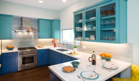
    Is this something like you were considering.


    HGTV Showhouse Showdown · More Info


    Contemporary Blue Kitchen with Chevron Tiled Splashback · More Info


  • 4 years ago

    I don't have good advice, because I have a personal hangup about darker colors above lighter colors. Just can't handle it. But if it's a medium tone, what about using it for uppers and lowers?

  • 4 years ago

    I kinda like the idea of the cabinets transitioning into the tile of the same color and then the tile transitioning to the same color for the uppers: Navy/navy --> white/white

  • 4 years ago
    last modified: 4 years ago

    That combo could be fine, as @njmomma showed. However, not with a navy backsplash. Notice in those pics, the backsplashes are white…which reduces the ”heaviness” everyone is talking about.

    Rule of thumb…the backsplash should be the last element chosen. That is, get the cabs, counters and appliances installed first. When you see how all of that plays together, you’ll be better able to choose the right backsplash. Too many folks have committed to a backsplash early in the process, only to find that it’s all wrong in the end.

  • 4 years ago

    My concern is it will be too many elements competing with one another.

  • 4 years ago
    last modified: 4 years ago

    What I’m thinking is very much in line with what @njmomma posted.

    @palimpsest, I like that idea too, just having a hard time visualizing it.

    @chispa, I’m fairly sure what were going to do, but want to see if anyone has an idea I like better. Our last kitchen was grey, black and lime green, so I’m pretty comfortable working with color

  • 4 years ago

    The blue should go on the bottom because of the visual weight of the color -- it will look grounded on the bottom but top-heavy and unbalanced on the top. The pics posted above demonstrate this. If you do all the cabinets the same color that's a different story, but if two-toned do the darker on the bottom.

  • 4 years ago

    I don't think the idea of it is too weird, it's a matter of striking the right balance. You need a good rendering of what it could look like to help you make choices.

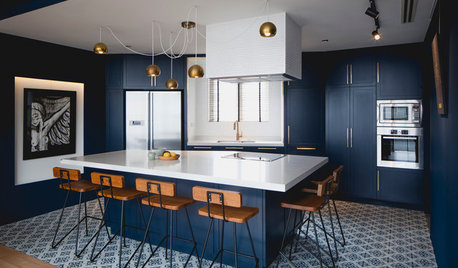
    Deep Blue Kitchen Larchmont Manor · More Info


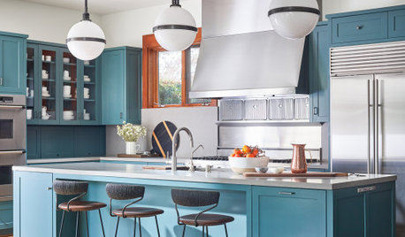
    Kitchen for a Queen · More Info


  • 4 years ago

    @bearbev - Thanks for posting those - the second one is pretty much the shade of blue I’m thinking, although I’d skip the glaze. Thr first one is a little dark, but otherwise quite resembles mine. They both look great! My baking center and peninsula are separated from one another by a bump in for a cloet on the other side that occupies one inside corner of our u-shaped kitchen. The first picture has me thinking I could do the perimeter cabinets in white, and the baking center/peninsula cabinets in blue. Hmmm…

  • 4 years ago

    Theotherjaye - yes I thought 2nd photo I posted was the blue you described. Use caution choosing the white for that blue I think it needs to be warm and not cool or stark.

    theotherjaye thanked bearbev
  • 4 years ago

    Some visualizations. Best I could do for an ombre tile effect from navy to white.


  • 4 years ago

    Thanks, @bearbev - I am hoping to get the paint the white of the tile with ~20% pigment in it - the white tile is almost cream, so I think I’m going in the right direction.

  • 4 years ago


  • 4 years ago

    @cawaps - that’s one hell of a tile job!

  • 4 years ago

    @cawaps

    Wow! your pretty awesome to mock that up for @theotherjaye

  • 4 years ago

    In cawaps' mock-ups (pretty great ombre viz), I like the all-white cabinets the most, and dark blue lowers and white uppers next. Note though that the counters in the mock-ups are light and not soapstone countertops so darker countertops may have a different effect.

  • 4 years ago
    last modified: 4 years ago

    I’m not sure having the blue cabinets near the white tiles will have a greater/nicer impact, so also suggest blue lowers so as to provide better balance, which is important.

    Given how busy the backsplash will be, have you thought about cabinets being all the same color, for a less broken up feel? Can’t find your tile description, but hope photo helps. Imagine this kitchen with two different cabinetry colors; might be busy, .


  • 4 years ago

    I love jackowskib's first photo above. Blocks, not stripes!

  • 4 years ago

    I always thought that if I were remodeling our kitchen and putting white cabinets anywhere, it wouldn't be on the bottom, due to sometimes wet/damp dogs, kids wearing their shoes inside, spills, etc., that the white lowers would be a real challenge to keep clean.

  • 4 years ago

    I prefer the all white or the all blue cabinets so the backsplash becomes the star. With the mix of blue/white cabinets, as I suspected, the cabinets are competing with that fabulous backsplash idea.

  • 4 years ago

    that the white lowers would be a real challenge to keep clean.

    I don't have kids but two dogs and I'm not the neatest cook and I have no problem keeping the white lowers clean. In fact it's easier since I can see when something is making them dirty.

  • 4 years ago

    I also like either all blue or all white, and if I do two colors it will be ”blocks not stripes” (what a great way to put it, @mcarroll16!) I am in awe of those of you who are so proficient with modeling software - I’m teaching myself Sketchup, but it’s (embarrassingly, as I worked in software development until I retired) rather slow going.


    I can’t imagine white cabinets being all that difficult to keep clean, actually. Our last kitchen had light grey lowers, and that wasn’t a problem.

  • 4 years ago

    Also if you go with the blue, my personal preference would be a dark blue like cawaps showed in the second set of pictures. I can't wait to see your kitchen finished with that fabulous backsplash. Bravo for doing something different and interesting.

  • 4 years ago

    I am concerned that you are going to have way too much going on in your kitchen--tile gradient colors, both blue and white cabinets, and soapstone counters.


    Are you planning to get a veined or more solid soapstone? I just installed soapstone that I chose specifically for its lovely veining. Visually it is the main attraction of the kitchen and doesn't need or want any competition. After getting a gazillion backsplash samples including lots of colors with varying intensities in the blues and greens and grays, I ended up choosing a plain white (cabinets are unstained maple).

  • 4 years ago
    last modified: 4 years ago

    Just wanted to suggest that Mercury Mosaics https://mercurymosaics.com/blogs/shop-by-kitchens Kitchen Gallery might be fun for you to peruse, to see how others have designed kitchens using dramatic tile.


  • 4 years ago

    ^^ Oh, that teal hex is fabulous! Is that your kitchen?

  • 4 years ago
    last modified: 4 years ago

    @porkchop_z5b_MI, no, but thanks, I will edit my post to make it clear, lol.

    Mercury's tile photos are amazing so I thought it might provide inspo about balancing a wowser backsplash

  • 4 years ago

    @barncatz That hex tile is gorgeous!


    @julieste our soapstone is nearly solid black


    Some great suggestions here - off to noodle…

Sponsored
Kuhns Contracting, Inc.
Average rating: 5 out of 5 stars26 Reviews
Central Ohio's Trusted Home Remodeler Specializing in Kitchens & Baths