Software
Houzz Logo Print
km51571

tile backsplash ideas / color palette

4 years ago
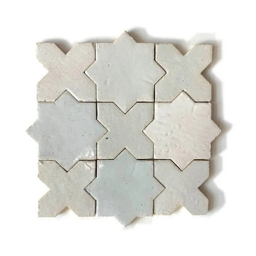
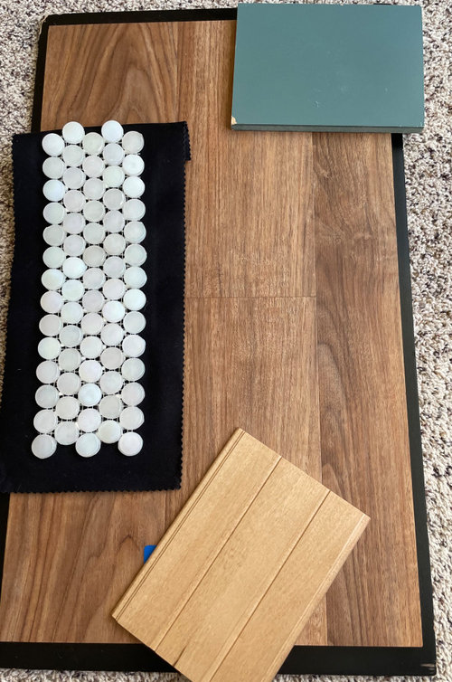
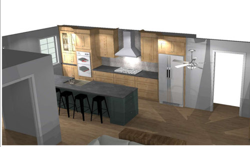
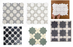
Thoughts on this color palette and option for tile backsplash. The big wood sample is the floors, small wood sample is maple honeywood and will be perimeter cabinets in shaker style. The green/blue pieces is Rocky River by SW and will be the island. As of now, I was thinking of honed absolute black granite for counters. This penny tile is iridescent white glass. Do you think that is too much for the backsplash? was hoping to go all the way to the ceiling (8ft ceilings) behind the vent hood. My other thought was the star cross tile, a subway layed in herringbone, or hex shaped tile. Last thought--should counters be the same on island and perimeter or do something lighter on the island?


Comments (21)

  • 4 years ago

    I love the Rocky River on the island!


    However, I'm not a fan of the penny tile. It looks like a very cold white and fights with your Rocky River and wood tones.


    While I love the star and cross tile, I'm not sure the colors are just right- but it could be my monitor. I do think you are on the right track with that, however. I feel your best bet would be a light teal that works with the island.


    Good luck, it will be lovely!


    Nicole

  • 4 years ago

    fitting sheets of penny tile is tricky... often, from a distance the squares show. Something to keep in mind. ... as with all tile, double check to make certain it is all from the same dye lot.

  • 4 years ago

    Is that an island or a peninsula. If it’s a peninsula, it will look have more continuity if it’s the same as your other base cabinets.

  • 4 years ago

    wow I LOVE everything except the penny tile. I have never seen the star cross tile and I think that would look awesome as the backsplash. Please post pictures!

  • 4 years ago

    If you want small mosaic tile, I wound pick something other than penny round. We had it in the place we purchased and it just felt like a wall of grout. Hard to clean, not particularly pleasant to look at. There are tons of mosaic shapes to consider and I like the star and cross. On aesthetic side, consider the brick material in the photo. Even painted, the brick will appear very heavy and substantial and could overpower the cabs and counters. Depends on what you want to achieve looks wise

  • PRO
    4 years ago

    I would not use penny rounds in this kitchen.


  • 4 years ago

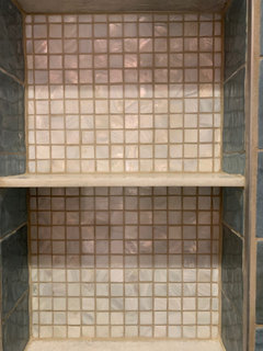
    How thick are those penny rounds? If they’re very thin, they’re very difficult to place. I used a similar tile for shower ceiling and niche but I went with square to make it a bit easier for the tiler, but I know it was tricky especially grouting. I like the star and cross a lot, but I think a lighter countertop would work better with your colors.

  • 4 years ago

    I love the wood with the teal and that star and cross tile is beautiful! No on the irridescent penny rounds for reasons mentioned.

    Just a thought, but have you considered going with the teal paint on the perimeter cabinets and then the island in wood instead?

    I love matte black counters, but I have heard that the honed absolute black in particular is notorious for showing oil and fingerprint smudges. I think I would actually go with light counters to relate better with the backsplash, and since the teal and wood are somewhat dark I think a light counter would contrast nicely.

  • 4 years ago
    last modified: 4 years ago

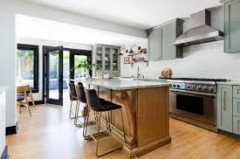
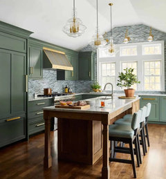
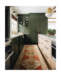
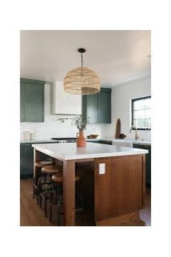
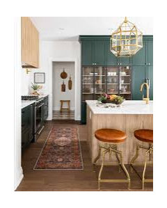
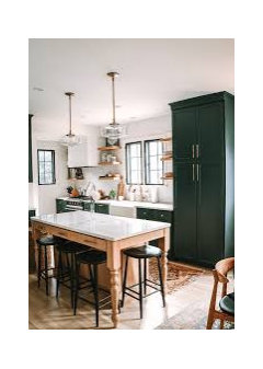
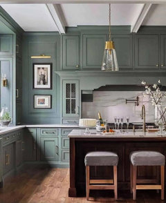
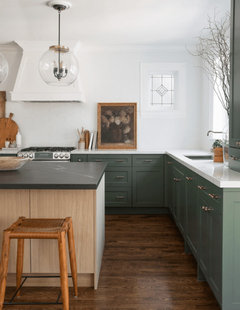
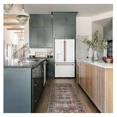
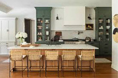
    Here are a whole bunch of kitchens that have the green perimeter cabinets with wood on the island and wood floor. I noticed almost everyone I saw used the lighter countertops on both the perimeter and wood island . Except those last two or three kitchens did a white perimeter and black island or else vice versa.


    The way you have it planned with the wood perimeter and green island will look great too! I just may have seen it done the opposite way more. I guess the thinking is that with the wood floor, it feels a little more balanced with the wood to green ratio??

    Actually it may be smart to do the wood on the perimeter because that way if you got sick of the green and wanted to change colors it would be less to paint if just an island. Or peninsula I should say...🥰

  • 4 years ago

    Usually the backsplash is the last choice, after the cabinets, floors, countertop and most of all, lighting. Without having all the elements together, it’s really hard to make a good choice. Plus you’re looking at it horizontally and it gets installed vertically.
    Keep collecting samples but wait until your kitchen is there to put the tiles up against.

    I love, love, the colors,and wood together!

  • PRO
    4 years ago

    I am in love with the start cross tile!!! And believe the penny tile, while being quite pretty, will be too busy especially if you run it right to the ceiling. I think the island would look best with a lighter counter that compliments whatever tile you decide, but will also look nice in a black granite. Hope that helps!

  • PRO
    4 years ago

    Star/Cross tiles come in lots of variations to choose from.

  • 4 years ago

    I like the star cross for backsplash. However, I agree that you should wait until everything is installed.

    I prefer the counter to all be same since you have the island different than parameters.

  • 4 years ago

    Star and cross tone on tone, matching grout to make it subtle. Lovely. Ditto on the green cabs, wood island swap though I am far from a pro.

  • 4 years ago

    @nicoletouk after sitting with it a while --I agree it seems a harsher/modern look than I was going for. Used copper penny tile as an accent band in my last kitchen with subway tile. But I'm definitely leaning towards the star/cross tile now.


  • 4 years ago

    @rebunky --we definitely considered doing the main cabinets in the teal and wood for the island and then decided we'd keep it more neutral on the perimeter just in case we grew tired of the color in a few years--I want to be bold but it scares me lol. Also, fell in love with a kitchen that had soapstone counters but hubby doesn't want the maintenance with the oiling of them so that's the inspiration for the dark counters. My inclination would be light as well but was trying to step out of my comfort zone.


  • 4 years ago

    @RedRyder yes--definitely going to get some samples of the backsplash tile but trying to make some decisions, or narrow the field, a little earlier with supply chain issues

  • 4 years ago

    @kj s --yes! exactly what I was thinking for that star/cross tile, hoping to find one that is a creamy white and do light grout as well. In my last kitchen we had light grout and cream subway tile so I know I'll be fine with cleaning.


    @eld6161 so many times I've seen the counters differ on the island/perimeter so I thought ZI should consider it. However, then it's more decisions! Which goes where--light on perimeter or light on island. Don't want the room to feel too heavy.