Software
Houzz Logo Print
donna_horowitz81

Triangular accent behind rangetop?

4 years ago
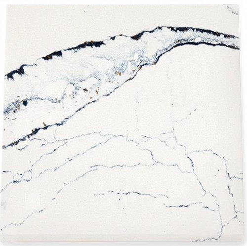
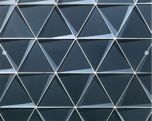
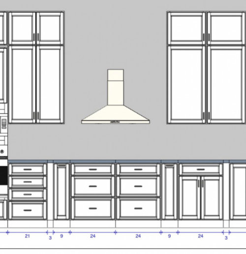
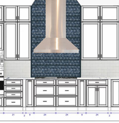
Cabinets will be ivory with a navy island. Countertops likely to be Cambria Portrush. Primary backsplash tile will be a white or off-white subway tile. Debating an accent behind the 48" rangetop (topped by a 54" stainless steel hood where chimney extends to the 11'4" ceiling). These glass tiles really float my boat, so was wondering about an unusual frame behind the rangetop -- a triangle with a dark blue pencil border. Kitchen opens to a family room that will be decorated in mid-centry modern with blue accents. Thoughts?


Comments (20)

  • 4 years ago

    Dark tiles will really close in the space without lots of added lighting. Lots of added directed lighting.

    Donna Horowitz thanked User
  • 4 years ago
    last modified: 4 years ago

    FWIW I have darkish blue tiles in my kitchen and they are dramatic and not dark or depressing.

    I have plenty of light - canned lights, task light as well as lights that illuminate my coved copper ceiling.

    My kitchen is also open to my living area which is somewhat open to my office/den area and since I decorated it all at the same time all of my design and color choices complement each other. It is not matching but there is definitely blue that runs through all of choices in some way.


    Even the interiors of my kitchen cabinets are a teal blue which complements the tile.

    Donna Horowitz thanked Helen
  • 4 years ago
    last modified: 4 years ago

    No feature behind range since 2004. Also, it would be too much going on to have that dramatic counter and those tiles. One has to go, whichever one you like less.

    Donna Horowitz thanked M Miller
  • 4 years ago
    last modified: 4 years ago

    I used a feature behind my range and white subway everywhere else in my last house. The feature tile went all the way down to the counter. No boxy outline. I see it in a lot of high-end homes now.

    I like your idea.

    Donna Horowitz thanked anna_682
  • 4 years ago

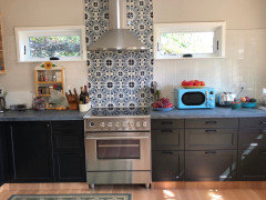
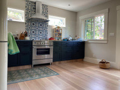
    I have dark-ish blue tiles for my backsplash and love them. They pull out the blue in my Namibian Blue marble countertop. Mine go all the way to the ceiling behind the hood.


    Agree that those accents aren't used much anymore. I think three different tiles on the backsplash plus two different cabinet colors is probably too much. If you like the blue, go for it!

    Donna Horowitz thanked latifolia
  • 4 years ago

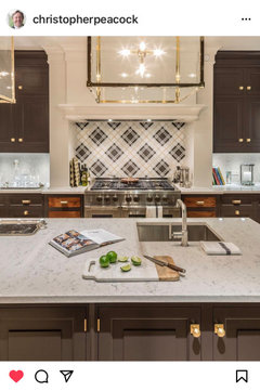
    This was posted last year. I think it’s stunning but maybe because every other detail is just right?


    Donna Horowitz thanked Marie J.
  • 4 years ago

    @Marie J. This is obviously the work of a very talented designer using high end finishes which though not obvious subtly are absorbed by the viewer.


    I remodeled with the help of a great designer and working with her and discussing options and how she made choices gave me a bit of insight into how "great" rooms come together. I don't have that ability to do a room to that level but I have gotten some ability to analyze why a great room like this works. Even if it isn't someone's taste, it still reflects great and interesting design. It doesn't safely "match" but the various design elements complement each other in terms of variation in size, shape, texture and color. The brown tones of the wood are echoed in the use of some brown tile in the tile accent. The deliberate use of a shiny gold hardware element brings a necessary bit of sparkle and light. The counters are subtle but still reflect the tones around them - and so on - I am sure that other elements also reflect that kind of use of color, texture, dimension etc.

  • 4 years ago

    Working with a designer is definitely an option that I'm considering, especially since I'm doing a multi-room renovation and want everything to play well together. All of the input has been very helpful, thanks everyone! I'm now leaning towards using the blue glass triangles not as a framed accent but behind the range and hood.

  • 4 years ago

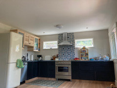
    Last year, I chose to use a Pratt and Larson mosaic tile for the backsplash behind the range and hood in my ADU kitchen, and I love it.

    Donna Horowitz thanked chinacatpeekin
  • PRO
    4 years ago

    I would just like to revisit your decision to combine ivory cabinets with counters that are so very white. Are you sure about that decision?

  • 4 years ago

    Chinacat, that's gorgeous and exactly the direction I'm leaning.


    Beverly, I'm not committed to the off-white cabinets. I'm more attached to the countertop, so could switch to white cabinets if that works better. That said, Portrush doesn't strike me as a bright white -- some pictures I've seen make it look almost creamy. I definitely need to see a slab in person to get a better idea of that.

  • 4 years ago

    While I am not personally a fan of the accent behind the range, I can see it he appeal of the full wall section look (rather than a bordered rectangle). I can also see why you love the tile - gorgeous! I would rethink doing a triangle as I don’t think that would play well with the hood. I would also consider going without the pencil tile unless you can get it in matching tile - too much of a visual distraction.

    Donna Horowitz thanked abcdlatham
  • 4 years ago

    I think a great designer that you work well with is critical for achieving the best result both functionally and aesthetically. i did a full gut remodel and wouid never have been able to do it on my own. it wouldn’t have been as functional and the aesthetic resuot wouod have been too safe as well as not flowing as well as possible.


    The expense was worth it especially since many of the items were the same or less than I would have paid on my own because of the significantly lower prices for to the trade discounts.

    Donna Horowitz thanked Helen
  • 4 years ago

    Same here Helen, I did a major remodel of my primary bedroom suite, and the designer was outstanding from a design and function perspective. I didn't feel good, however, about the fee structure, so am considering negotiating a different one for this second project.

  • 4 years ago
    last modified: 4 years ago

    Donna, were you thinking of something like this? I love the triangle tile and the color. Only having a small framed area under the hood would not be my choice.

    Of course, you would have everything matching better colorwise. I also wasn’t sure on the subway size. Your designer’s rendering of the hood didn’t look big enough, but mine seems too big. Haha! Sorry, getting things to scale it is not one of my strong suits. But at least it gives you somewhat of an idea.


    Donna Horowitz thanked rebunky
  • 4 years ago

    Rebunky, that is *exactly* what I'm thinking now! Thank you. And yes, the range isn't shown to scale on the diagram, your rendering is much closer to reality.


    What are all y'all's opinion on how high to take the blue tile -- to the top of the cabinets, or all the way to my 11'4" ceiling (another 22" above the 114" tops of the cabinets)?

  • 4 years ago

    Love it. Take it all the way up (but SKETCH it before you commit). I assume your hood will be higher than it's shown in your drawing. Might want it wider as well...

    Donna Horowitz thanked Fori
  • 4 years ago
    last modified: 4 years ago

    The hood will start at 38", and the chimney will go to the ceiling (11'4"). There will be just under 21" from the tops of the cabinets to the ceilings. My only concern with the tile behind the hood extending to the ceiling is that it may look a little too trendy -- but on this site, I've seen pictures of people doing that going back 10 years, albeit mostly with cabinets that extend to the ceiling as well. The only 2 other options that I can envision are stopping at the bottom of the hood or stopping at the tops of the uppers -- but I'm afraid those will look too choppy. I think it's to the ceiling -- any other thoughts?

  • 4 years ago

    Rebunky, how did you do that mock-up?