Software
Houzz Logo Print
destiny_c

Satin sheen for room with little light?

4 years ago

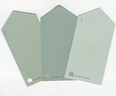
Refreshing my entryway, dining room and living room but having a moment of confusion as to what sheen I should use. I finally settled on Behr’s Intercoastal Gray after so many samples.

Now my only issue is whether to go with an eggshell or satin finish. The dining room gets an abundance of eastern light, but our south facing living room not as much because of our neighbors 3 story home overshadowing what we could get.

On the wall swatches, I can see that reflection, and my home has the original walls from 1917. So there are bumps and such. I think it’s been said that satin will accentuate flaws, but not sure if the lack of light might counteract that and we might skate by and make it a bit brighter room.

Should I go all satin? All eggshell? Dining eggshell and living satin?

Comments (15)

  • 4 years ago

    You don't want satin on the walls. Stick with eggshell.


  • 4 years ago

    Flat works well with imperfections or the dreaded textured walls.

  • 4 years ago

    agree with @Anne Duke the duller the better... velvet

    Work on the lighting. not just one fixture, ambient light will make the room more appealing.


    Window treatments will also change the look/lighting of the room, Dining rooms need fabric.

    Acoustics are important to any dining experience. Fabrics absorb the clatter & chatter.

  • 4 years ago

    Flat is too hard to clean. I would choose eggshell. Satin will show every imperfection.

  • 4 years ago

    Why are you using a grey in a 1917 house?

  • 4 years ago

    Honestly prefer a blue with a hint of grey, which is why I leaned toward Intercoastal grey. It gives such a beautiful silvery blue that I had been searching for. It doesn’t go too much either way and brings out the color of my warmer toned furniture.

  • 4 years ago

    I used eggshell in my dining room several years ago and was very unhappy with the results. I would stick with matte. Easier to clean than flat.

  • PRO
    4 years ago
    last modified: 4 years ago

    Behr’s Intercoastal Gray

    BEHR's sheen range is all over the place. So a lot depends on the specified grade.

    On average, BEHR runs shinier compared to SW and Ben Moore. For example, a BEHR "eggshell" could be on par with another brand's "satin". A darker color in their "satin" looks like another brand's semi, etc.

    Their newish Dynasty in flat/matte is a good value. They have a range of high-hide colors and you can clean it.

    I recommend ordering 8 oz samples in Dynasty flat/matte and eggshell from the HD website so you can make an informed decision about gloss level and color.

  • 4 years ago
    last modified: 4 years ago

    I have read countless articles and posts on sheens of paint. Definitely matte for walls as it will not accentuate any wall flaws. A few years ago, my husband and I painted the entire inside of our home: matte on all walls and ceilings; satin on moldings and doors. The prep work is the key! We fixed all nail pops, cracks, sanded and primed areas, washed and rinsed all ceilings, walls, doors and moldings. Used Home Depot’s: Behr Ultra Stain Blocker Paint and Primer. I love the Behr paint!! Easy to apply, no odor, no issues. It washes easy too!! We even received a 10% military discount from Home Depot, as I am a retired US Air Force Captain. Best of luck in your paint journey.


  • 4 years ago

    In the past I have been really OCD about my paint and paint colors, often mixing my own blends to get precisely what I want, testing different brands, different colors, different lines in different brands. It is part of my DNA, I need things to be right. This personality trait has served me well with my work, which requires great attention to detail and great precision, but I have had to learn to accept good enough in many other areas of my life so that I am not crippled by the decision making process.


    I think paint makes a difference, but how much does it really impact the total aesthetic of a home? Does anyone know if you used Behr Ultra or BM Regal Select? @kculbers home looks beautiful and more importantly, she obviously is proud of the paint job they did and it brings her joy. As long as you feel good about the end result, nothing else matters.


    The norm is to use flat on the ceilings and matte or eggshell on the walls and satin or semi gloss on the trim.


    If you think about homes that you have gone to that were not your own and where you didn't participate in the painting of the home, do you remember or did you notice anything about their walls or ceiling or trim. Do you know what colors the walls are or if they are painted or wallpapered? I tend to notice imperfections in a paint job and when colors are off, but I have years of experience and study behind me, and I only notice when something is really off. When the ceiling paint is slopped onto the wall or when gloss paint was used and the patch work on the wall was awful. I didn't notice that my brother's home had eggshell on the ceilings until I went their to specifically help them with picking colors for their new kitchen. His home was built by the Amish and his ceilings have no flaws. The drywall was done beautifully and 25 years after being built there are no tape marks or cracks or anything that draws your eye.


    I have specified paint colors and brands for people and their painter went to wherever he buys paint and had them color match the paint and painted the room. The people were happy with the results, I didn't notice a difference until I saw the can of paint. It was close enough to what I specified that unless you had my sample taped to the wall you couldn't tell the difference.


    I painted my guest bedroom with a BM Regal Select color matched to SW Silvermist (Using BM throughout so that all of my gloss levels/finishes are consistent - probably overly OCD). A friend came to my home and was tickled pink that I used the same color in my guest bedroom as I specified for her guest bedroom. Her Guest bedroom is SW Comfort Gray.


    Left is Comfort Gray, middle is Silvermist. When you are in two different homes with different finishes and flooring the two are both mid toned blue green grays.


    It is similar to going shopping and finding a shirt you just know will go perfectly with the new pants you have at home and bringing it home to find out the two colors are both corals, but one is way more pink than the other or they are both off whites, but one looks really yellow compared to the other. Our minds just register the general color and only when looked at side by side do we notice the more subtle differences.


    Enjoy the journey, but don't get too hung up on the things that no one else will ever notice.


  • PRO
    4 years ago

    I like matte always for walls and in both those spaces for sure . As for gray in a 1917 house why would that matter . I would use the best quailty paint you can afford since the washability is better with better paint.

  • 4 years ago

    Behr Day Spa is a very fresh white with a hint of blue gray... try a sample, you might like it.

  • 4 years ago

    More gloss doesn't even really help with room brightness anyway. Matte is the most forgiving with flawed walls.

    If you want the space to feel brighter, use a light color. Mirrors might help, but only if there's natural light nearby that it can bounce.

  • 4 years ago

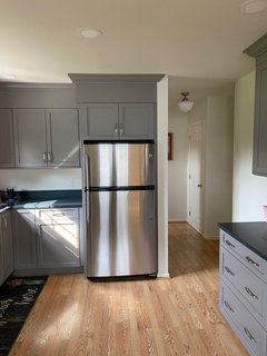
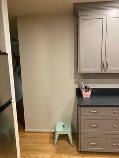
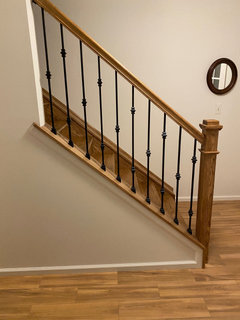
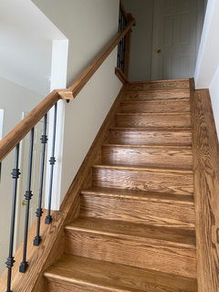
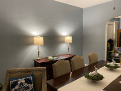
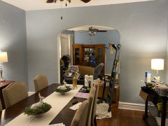
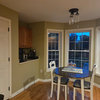
    I ended up going with Behr’s Marquee paint line in eggshell and the intercoastal gray color is coming out beautifully. I’ve gotten most of the dining room painted and this is the color I wanted for many years. A happy compromise of gray with a dash of blue. Please excuse the mess, I still have a ways to go. Next on the to do list will be crown molding.