Software
Houzz Logo Print
sandy_kaplan53

backsplash design to complement countertops

4 years ago
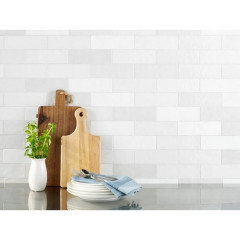
I am installing cambria quartz brittanica gold countertops to complement my cherrywood cabinets and brighten up my kitchen.
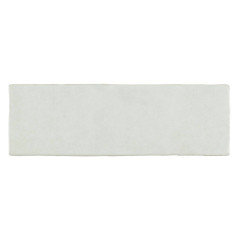
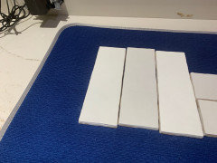
I am using pearl opal 8” x 2 1/2” tiles which I purchased from floor and decor. The tiles vary - they are ehite but have teeny gray sand dots and some tile have a tinge of a pale gray. The background of the counters is white but a suggestion of taupe so the backsplash tiles go better than a pure white.
My question- do I do a herringbone or subway design. The area where the hood and the cooktop meet is the biggest area.
Help!
Thanks,
Sandy

subway
herringbone

Comments (37)

  • 4 years ago
    last modified: 4 years ago
    sigh. a picture is worth a thousand words.

    why not just wait until everything is installed, come back w/pictures, and THEN decide on a tile, color and layout?

    doing it now is a big mistake, but, since you've already gotten the tiles, just wait. after the countertops are in, set them up against the backsplash and take some pictures. then come back here with them.

    You trying to describe colors of everything makes our advice a guessing game.

    we can't see the cabs, the tiles, the flooring, your layout, your lighting or your countertops and how they relate to the room.

    layout of the tiles at this venture is irrelevent until everything else is in. Sorry to be blunt, but it's the truth.

    You can look at a lot of pics of herringbone backsplashes to decide if it's for you, but until we can see the actual kitchen in question, it's a shot in the dark. I assume you want realistic opinions, yes?

  • 4 years ago
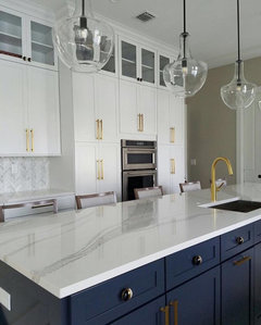
    Herringbone pattern

  • 4 years ago
    I love it too! It looks so lovely

  • 4 years ago
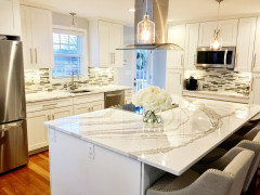
    Thanks for all your comments.
    Beth, I will follow your suggestions. Thanks.
    Sandy

  • 4 years ago
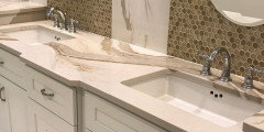
    I am new to Houzz so I don’t know how to post the pics which are in my photos app.

  • 4 years ago
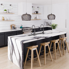
    Sandy, you could post them in the comments if you like. Click on the photo icon, select the photo, wait for it to load. (You can submit
    More than one if you like). Then hit Post

  • 4 years ago
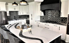
    Thanks.

  • 4 years ago
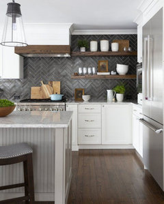
    I will wait for the counter installation (Thurs) and then post the pics.
    Sandy

  • 4 years ago
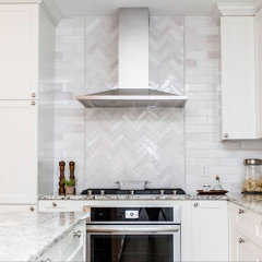
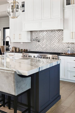
    herringbone gives a richer look... but we need to see pics of the kitchen first, it's hard to say without seeing the details

  • 4 years ago

    Thanks G G.
    I will post pics after the counter is installed.
    Sandy

  • 4 years ago

    I really am computer challenges. I took pics of the kitchen with the newly installed counters. They are in my photos. I forwarded them on to Houzz. The pics went to my ideas. I can’t get them to go to comments. Plse help.
    Sandy

  • 4 years ago

    Sandy you still have them in your photos. Write a comment and go to your photos. It is tge square box to the right of your camera. Mark them and upload them here

  • 4 years ago

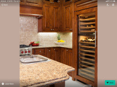
    Are these your pictures

  • 4 years ago
    last modified: 4 years ago

    Sandy, when you write a comment, before you hit the Submit button, click on the "Photo"button/icon under the comment box. In my view, that button looks like a camera and says Photo. Those icons disappear on submitted comments, they're only visible under empty or unsubmitted comment boxes.

    Have your cursor on a new line.

    When you click the Photo icon, a page showing all your file photos should open up. These are photos on your phone - not photos you've uploaded to your Houzz ideas.

    Click on a photo, choose Done or Select and you should be returned to this Houzz page and the photo should upload to your comment box. Wait until it is done loading - it looks kind of grayed-out until the loading is complete. You will see it. If you want to load another photo, move your cursor to a new line, choose Photo, choose the photo you want from your files, wait for it to display correctly.

    When all photos are in your comment box, click on the big Submit button.

  • 4 years ago

    Sandy this is what shows on my iPad when I click on comment. Click on the photo icon to tge right of the camera

  • 4 years ago
    last modified: 4 years ago

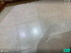
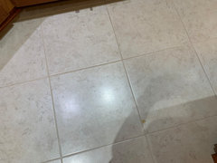
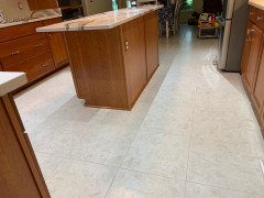
    sandy, is this your tile floor? it's the only pic of your kitchen I see under your ideas

    Sandy's Ideas · More Info


    are you on a desk computer?

    just drag the photo to your desktop, click the photo icon here in the comments, upload photo, wait for it to load, hit submit.


    You don't forward them to Houzz. just come here to the comments, click the little photo icon, and load your photo. you can do it from your ipad or phone too.

  • 4 years ago

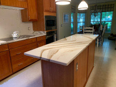
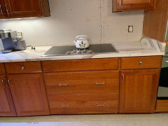
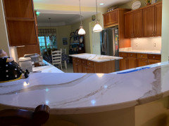
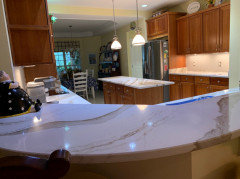
    These represent the counters and the floor.

  • 4 years ago

    Thanks to all of you for all the instructions. I finally got it.
    Beth, that was a pic of my floor.
    Looking forward to your responses.
    Thanks again,
    Sandy

  • 4 years ago

    The tile is being late d Sat. So I need help ASAP.
    Thx
    Sandy

  • 4 years ago
    last modified: 4 years ago

    And do you have a picture of your tiles you could post?

    Floor is staying as is, correct?

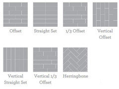
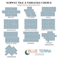
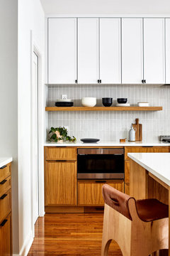
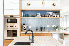
    here are some layout options. since your countertop is a little on the modern side, you could go w/more of a modern layout. like the stacked tile. Vertical offset or straight set.

    I wouldn't do a standard subway layout.


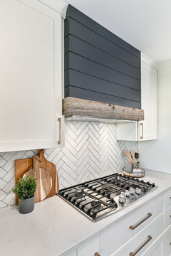
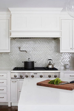
    herringbone is also a good choice


    90 degree herringbone


    vertical stack straight set and vertical stacked offset. I like any of these too


    One other thing. Are you painting the walls? I don't think that yellow tone is the best choice w/your cabinets or countertop


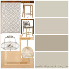
    Consider doing one of these colors shown on the right.


    (The jute or woven ratten pendant is nice for the color and texture next to your kitchen. think about doing a dining light like this)

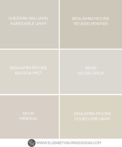
    Some other paint colors that may look better w/countertop/flooring and cabs


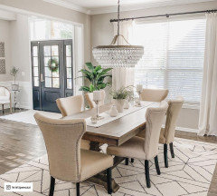
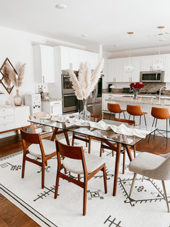
    I also have to mention the more country looking dining furniture, fabric, chairs, window treatment, and the dining room light. None of it meshes well with the kitchen elements. You have two diff styles

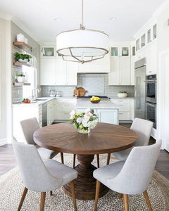
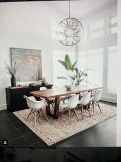
    either of these style tables and chairs, and rug (colors) would look better w/your kitchen


    this reddish table and soft white chairs would also look nice w/your cabinets


  • 4 years ago
    last modified: 4 years ago

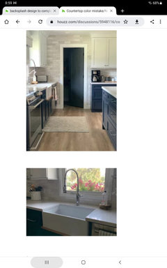
    @Sandy Kaplan, are these your tiles? 2/12 x 8 Zellige Pearl Opal from Floor and Decor?


    Here is that tile in a Houzzer's kitchen: https://www.houzz.com/discussions/5948116/countertop-color-mistake-need-backsplash-ideas


  • 4 years ago

    Beth, thanks for all your suggestions. The flooring remains the same. Here’s a pic of the tiles.
    Thx,
    Sandy

  • 4 years ago

    I think herringbone might be too busy for your kitchen. There is too much color and the herringbone pattern can make it look to dizzying. I would go for a straight set.

  • 4 years ago

    To Barncatz,
    Yes, that is the tile from floor and decor.

  • 4 years ago

    I would do a horizontal stacked installation. In Beth’s first chart it’s a straight set. Herringbone is too busy for your lovely countertops. Let them be the star and keep the backsplash simple with matching grout.

  • 4 years ago

    Thanks, Red Ryder.

  • 4 years ago

    I can’t do the vertical offset. From under the cabinet to the counter is 17” and the tiles are 8” long.
    That leaves herringbone and horizontal offset.
    Also the pics make the background of the quartz cream. It’s actually white w/ a subtle tinge of gray. The tiles for the backsplash match.

    Sleepless night. I need more input. Thx
    Sandy

  • 4 years ago

    Why can’t you do horizontal stacked? Your tile setter will know how to work with the size you chose. Off set is okay too but ask the pro before you cross off that option. Your countertop is super modern and lovely and a stacked backsplash matches it well.
    Smaller cuts can be used in corners to handle the size issues. Maybe @ Beth H will chime in to help. She’s a pro at this stuff.

  • 4 years ago

    What about doing a horizontal offset? Or back to herringbone?

    Sandy

  • 4 years ago

    Red Ryder,
    I just saw your comment after I sent my last note.
    Again, thanks for taking the time to give me your opinion.
    Much appreciated.

    Sandy

  • 4 years ago

    Sandy, a low tech way to visualize different tile layouts is to cut pieces of paper the size of your tile and tape them on the wall different ways. I think I would go for a stacked horizontal layout.

  • 4 years ago

    Thanks for your input and suggestion.

  • 4 years ago
    last modified: 4 years ago

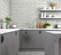
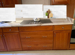
    Here's your tile w/your kitchen. to me, this tile appears a little cooler tone, while your cabs, countertop have more warmth. make sure your lighting in this kitchen is at least 4000K, or it's going to look even more yellow.


    here's your tile,,


    and the bedrosians Cloe tile. almost identical (except yours is wider)


    as for the pattern layout, your countertop is not busy looking. don't forget , you will have items on your countertop. I really like decorating w/wood butcher blocks, trays w/small plants or kitchen items, just to add some interest.


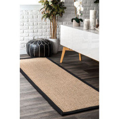
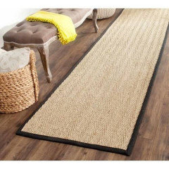
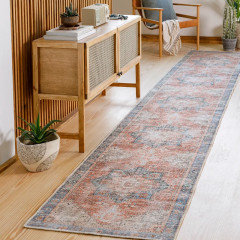
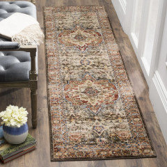
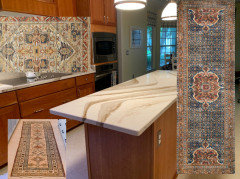
    I also like a runner in that aisle by the stove top.


    keep the colors in the same range as your cabinets and coordinating tones, and you'll be fine.

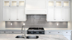
    here are two other Brittanica countertops w/a busy pattern backsplash. these are way busier compared to doing yours in a herringbone.


    I'm not suggesting this one, but look at how busy it is and still looks fine w/this countertop.


    this mosaic is way busier than a herringbone. does this look terrible?


    picket design


    varied color arabesque


    busier countertop than what you have and this pattern looks fine.


    Why not take a few tiles, tape them to a piece of cardboard or tape them to the wall in the herringbone layout? see how it looks.


    YOu could also do the 90 degree herringbone.

    or, try the double herringbone


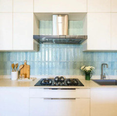
    if you did a horizontal stack, it would resemble this look


  • 4 years ago

    Beth, thanks for all the time you’ve taken on my project. I have made note of the lighting and also painting the walls.
    Re the backsplash - the tiles range from pure white to very light gray to medium to dark. The tilers started the herringbone and all I saw was gray. I eliminated the dark gray and mixed up all the other shades. The herringbone turned out to be a problem so, sadly, I opted for subway. Not happy but, hopefully, it will work out better.
    Thanks again, Sandy

  • 4 years ago
    last modified: 4 years ago

    ok, no prob. try one of the other layouts. if you like the stacked, try that. or try the 1/3 brick layout. (if you google image search "subway tile layouts for backsplash" you'll find some interesting options)

    and don't forget a runner!

    even a sisal and black edge would look nice (if you don't like those prints I posted


    check out all of these too

    https://www.wayfair.com/Sand-and-Stable™--Middleton-Striped-Handmade-Flatweave-JuteCotton-BeigeBlack-Area-Rug-X118147846-L167-K~W007036735.html

  • 4 years ago

    Thanks again, Beth
    Appreciative,
    Sandy