Software
Houzz Logo Print
kelli_ga

How to visually separate living and dining rooms?

4 years ago
last modified: 4 years ago
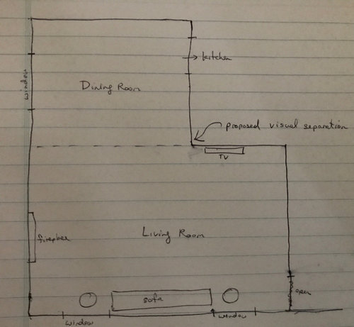
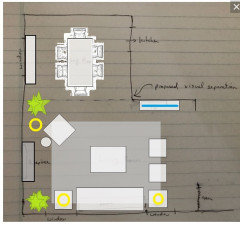
We have a small L shaped living and dining area. The furniture arrangement has already been decided. It is depicted in the rough diagram below. From the sofa, we look into the dining room, which is fine. But it bugs me that it feels like a continuous L, and not 2 separate rectangles.

We don’t want to close off the dining room - I just want it to feel like a separate grander space. It is about 11x11 with 8’ ceilings. It has a nice big window in there that is visible from the living room.

What are some ways to make it feel like a special, separate room? Coffered ceiling? Arched entry? Wainscoting? Wallpaper? (not a fan, but open to it)

Most of the house trim will be white. The house is dark, so most walls need to be light or near white colors. I will definitely beef up the crown moulding throughout the house. The house style is like a modern cabin in the woods (no logs). I’m not sure arches would work as the rest of the architecture uses straight lines. Maybe some other interesting profile though.

I change up the decor and colors on the dining table every month or so. We are looking for versatile architectural and finish enhancements that will work with any table decor.


Comments (22)

  • 4 years ago

    A wall would be a good start. With large french doors in it, so that you could open them and create a connected space when you want. Or, keep them closed, and have a non loud TV spot for kids to do homework.

    kelli_ga thanked Crepe Myrtle
  • PRO
    4 years ago

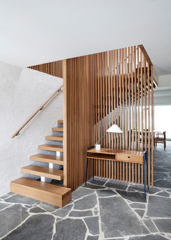
    What about putting up a decorative screen on either side of the boundary between the two rooms? If you put up slatted panels, that could create a little drama. Here's an example that separates the living room from the dining area:


    MacDougal Manor · More Info


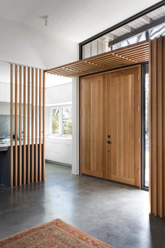
    Here are other built-in examples:

    Project | Coastal Beach House · More Info


    River Road · More Info


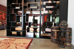
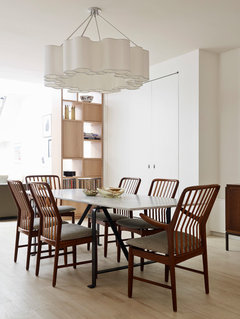
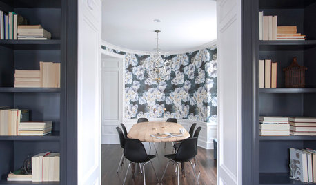
    Or, you could simply use a couple of open bookshelves on either side to act as room dividers:


    m.a.p. interiors · More Info


    Chelsea Dining Room · More Info


    Hope this is helpful!

    kelli_ga thanked Sabrina Alfin Interiors
  • 4 years ago
    last modified: 4 years ago

    Thank you both, those ideas sound beautiful! I do want to keep the space open and be able to move through it freely. So a divider should be as small as possible, no more than 1 foot on either side, if that.

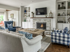
    I’m thinking more about visually separating the ceiling, because that is where I see the L shape. Maybe something that feels like a cased opening, but less drywall, like a beam with columns on either side. And some kind of ceiling treatment and wall treatment inside the space to differentiate it from the living room.

    I saw this pic today that I thought was interesting, but it’s not quite right for my house. I could do a square opening, but I don’t want it to look skimpy. Maybe I could do some faux columns and trim them out. I’m not really in a hurry.

  • 4 years ago
    last modified: 4 years ago

    After a little more thought, I am thinking about putting a 5-6” inch square column in each corner, with a ceiling beam separating the 2 entry columns. (I need to run a TV wire up there anyway.) I can trim out the columns to make them as fancy as I want. Maybe a diagonal beam support on each side of the entry. It’s not really my thing but it would work for the house. Then maybe wallpaper with a light neutral grasscloth running horizontally (no vertical seams). Hopefully that won’t be terribly hard to apply since the room is small with windows and a door to interrupt the wallpaper.

    The only thing about the grasscloth is will it conflict with the red variegated fireplace brick in the adjacent room, and would it fit with this house style? (House style is like a contemporary cabin in the woods.) I have the option of whitewashing the brick, but it really doesn’t need any treatment as is and it currently matches the exterior fireplace brick and the 2’ brick skirt on the house exterior. I grew up with grasscloth and it is the only wallpaper I’ve actually liked so far.

    I would still want a separate treatment for the ceiling, not sure what yet. The perimeter will be 6” of painted moulding consisting of existing 2-3” crown and more underneath. I suppose I could do a deeper more dramatic crown in that room? And/or more dramatic baseboards? The current ceiling has an unpainted stippled texture that I may be able to slightly sand and transition to knock-down. I’d rather do something different on the other side of the faux beam.

    A rug is a good idea. I have a big one in the living room which carries the line through. That might be sufficient.

    This project is at least a year out. After I get the basics of this room done, I may post pics and ask for more help. I already have decor I like, and that will help determine some of the final finishes. My vision is to frame the dining room as a ”jewel box” that I can peek into.

    For those of you that watch Hallmark movies, do you remember the house in the move ”It was always you”? I am in love with that house and I cannot find pics of it anywhere. Everything interior and exterior was shades of subtle green to khaki to buttery yellow with gorgeous white trim. I’ve read that it was filmed in Victoria, British Columbia.

  • 4 years ago

    Do you want to always sit in the living room and look into the dining room. IMO that TV is in the wrong spot.

    kelli_ga thanked shirlpp
  • 4 years ago

    Yes and yes. The living area was hard to design. The wall at the bottom of the diagram is the only good place to put a sofa. Anyplace else feels cramped. I tried different combinations with chair/ottoman and sofa and I considered buying a sectional. This arrangement is the best one. There is a chair and sofa table in that nook with the TV and it looks cohesive and intentional now.


    The TV will be on a wall mount so it will be able to rotate a bit.


    The dining table is beautiful to look at. I always keep it decorated. It’s a fun hobby.

  • 4 years ago

    What size is your living room?

  • 4 years ago
    last modified: 4 years ago

    About 13’ x 18’, maybe slightly smaller.


    Interior walls are 10’ and 7.5’, which is why they don’t take a sofa well. I really hate sitting in that niche. I feel like the room is closing in on me. That’s why I like the sofa on the long wall.


    The dining room opening is 10.5’. There is really no place to float the sofa. Even if I got a sectional, it would have to be long enough to lay down on.

  • 4 years ago

    Based on what you said about the style of your house, I don't think you should do anything too elaborate in the dining room. I haven't seen the movie you referred to, but sometimes all of our ideas don't fit into one house. :-)


    Does this look like what you're envisioning for the divider between the two rooms?


    The Country House · More Info


  • 4 years ago

    The suggested dividers will give you the separation you're looking for - better than a coffered ceiling, in my opinion. You could also use wallpaper. A rug is a great idea.


    You need to be realistic about your space: 11' by 11', with 8' ceilings is not a grand volume. A coffered ceiling and extensive crown moldings will lower it even further. Same with bulky pillars. Look for something slender that will not eat up the space you have.


    How large is your dining table? How many do you want to seat? Table decor is fun, and a good way to mark the seasons.

    kelli_ga thanked latifolia
  • 4 years ago

    Sort of, but I’d like to avoid the drywall at the ceiling and just make a wood faux beam. I think the design of the column and beam and crown could be a little more cohesive.

  • 4 years ago

    Do you have any pics? That would help so much.

  • 4 years ago

    I’ll have to do pics later. This place is a construction zone. This project is at least a year out. I have 3 or more huge projects to finish by myself before I can do pics.


    It’s just that I look at this space everyday, and if I ask for input now, I might be able to avoid rework later.

  • 4 years ago
    last modified: 4 years ago

    Hi latifolia, the table is 3x5’. There are two chairs on each side. There is one more that could be on one end if needed. It is in the bedroom now.

    I love table decor! I’ve accumulated quite a collection.

    I have heard coffered ceiling is better with higher ceilings. Maybe the beam will be enough. Although I could do any design with wood up there, or even smooth it out and change up the paint color, or do stained wood…

    I don’t know, I just have issues with no line being there.

    Maybe a bold paint color on the columns and crown? Time to find more inspiration pics.

    Even a drywalled opening is starting to look good now.

  • 4 years ago

    I’m leaning toward a combination of white pillars and wainscoting and beams (separating rooms) for the entire living area with maybe neutral shades of green, khaki and cream paint colors on the drywall sections. It all has to work together. I’ll have to come up with a master plan for trim and paint colors. I want a lot of white, but having color interspersed between white woodwork will make the space brighter, I think.


    I keep looking at the house in that movie on dvd, and I love it more each time I look at it.


    In the interim, I think I’ll throw some cheap white paint on the walls to see if it changes the illusion of space and natural light.

  • PRO
    4 years ago

    Here is an expanded layout of your furnishings for the two rooms.


    kelli_ga thanked BeverlyFLADeziner
  • 4 years ago
    last modified: 4 years ago

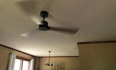
    This is what I see right now. My eye always goes up from the TV (under lower right side of pic.)

    I cropped off the bottom because there is a bunch of stuff I am storing in the area right now.


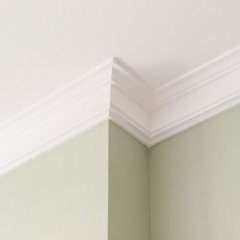
    It could be that the line of crown moulding is messing with my head. I want to beef that up and paint it white. (I will beef it up by adding trim under it but it won’t add depth.) The wall color will also be much lighter.

    Here is a sample of what I think the crown moulding will look like when I’m finished:


    I love the metal wall sculpture. It won’t be leaving anytime soon. The light fixture was one of my first purchases, and I got the fan to go with it. Sort of an ”industrial farmhouse” look because it worked with the brick of the fireplace. So all hardware and fixtures and art are staying for now. I can play with paint and see if that changes how I feel about that corner.

    The furnishings and floor don’t annoy me. Just the ceiling and that outside corner and the closed-in 7’ wall that has the TV on it.

    What you don’t see is the entry into the living room. It is tiny. I need to keep a thruway open in that space (lower right corner of diagram). (Beverly, I just noticed you removed a wall. That is staying. there is a staircase behind it. The opening to the living room is a 34” wide opening at the bottom right of the diagram. However… that wall runs parallel to the joists, I think. So it may be just that it needs a support post at the base of the staircase. Maybe I could once again consider opening up that staircase wall, and keeping the post in place. I didn’t want to install a new beam to support the upper level, but that wall may not have support beams. This is similar to how the open staircase would look, but one post would go to the ceiling and the other would be normal height and up one tread. All 13 steps would likely show. I still would need some open space in front of that wall. I don’t need much furniture - dogs love open rug space.)

    I’ll revisit this after the room is cleared and some temporary paint is up.

  • 4 years ago
    last modified: 4 years ago

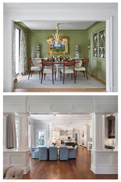
    I found a couple of inspiration photos with the look I think I want. Just need to decide how far to project the columns into the room.

    Here are the original photos:


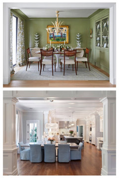
    Here are cropped versions of the photos that have only the columns (or casings) showing:


    The top one is a cased opening. I’d like a bigger presence, more like two columns and a beam, no drywall. The columns would be nudged up against the existing walls. On one wall I can use part of the wall to create the illusion of the column from the living room, but if I do that, it would be narrower in the dining room. Maybe it should be symmetrical?

    The top picture has more of the feel I am going for. I probably will do a lighter wall color, but it does look pretty in that pic.

  • 4 years ago

    Can you inquire how big those rooms are? My guess is they are larger than 11 x 11, with ceilings higher than 8'. Before you put a lot of effort and expense into your renovations, here's an idea. Get some used moving boxes and mock up something the size you envision. You could even paint them white. Glue them up with double stick tape. That will give you a sense of scale.

    kelli_ga thanked latifolia
  • 4 years ago

    We can't help with how far to project the columns into the room - since we can't see your spaces.

    kelli_ga thanked shirlpp
  • 4 years ago

    Right, I’m going to have to play with proportion when I am ready to do the project. I’ll have a lot of scrap wood to play with after I remodel the kitchen and take the old built-in cabinets out.


    8” projections on each side would give me about a 9’ opening, about the size of my old garage door. But more importantly is how it would look from the relatively shallow living room. I think the projections would need to be at least 5.5”. But they could be something like 5.5 x 11.5 too, to make them seem beefier without taking up extra space in the opening. (They would not be solid wood - I’ll build an underlying structure for the faux beam and columns like I did for the fireplace mantel surround in my previous home.)


    I don’t have a problem with a 6’8” or 7’ high (or higher) opening below an 8’ ceiling. I may do a repeat of the design for small openings in the living room and a hall cased opening, so I might be able to get it to look like an architectural feature.


    At least I have a tentative design to think about as I sit on my computer staring at this opening for far too many hours a day.


    Thank you everyone for your help!