Software
Houzz Logo Print
txguy

cove and reverse cove ceilings for modern design style

4 years ago
last modified: 4 years ago
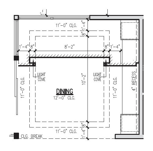
My design team has conflicting views on this topic, so I figured I'd solicit opinions here.

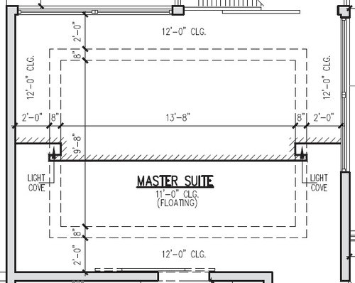
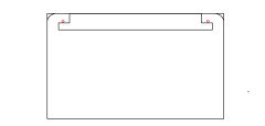
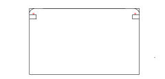
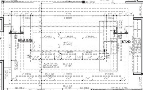
I am building a fairly modern home that overall follows a pretty minimalistic design style, and we are trying to decide on ceiling treatments for bedrooms, the dining room, and the great room. One side is in favor of decorative elements such as coves and reverse coves with the applicable lighting. The other is in favor of plain ceilings, arguing that cove-based designs are dated. I like both looks, and have never been exposed to either for a prolonged period of time, so I'm not sure which I would prefer long-term. I've excerpted some of the proposed treatments below.

What are your thoughts?


Comments (27)

  • PRO
    4 years ago

    IMO simple is always better and you need to post pics of the actual ideas you are thinking of .

  • 4 years ago

    @Patricia Colwell Consulting Unfortunately there are no renderings, so all I have to work from is what's shown on the plans.

  • 4 years ago

    So it is like a reverse tray ceiling for the master.

    I wouldn't like that at all and would be asking myself why they didn't just make the ceilings 12 ft for the whole room!

    It also is a look that makes me think that it wasn't planned well and they had to lower ceilings to run hvac, electrical and/or plumbing.

    We built this past year in a warm climate and I like high ceilings. No regrets with having 12 ft ceilings in most of the house.

    What does it do to the positioning of your window/slider headers when you lower the inside part of the ceiling? Do you place them based on the 11ft or 12ft height?

  • 4 years ago

    @chispa Do you not like the current design from a functional or aesthetic point of view (or both)?

    The ceiling wasn't lowered for mechanicals -- it is solely a design element.

    The window headers are at 10', and no one has mentioned changing this if we go to a flat 12' ceiling.

  • 4 years ago

    I guess I just prefer my ceilings to be flat/simple!


    I know the lowering was a planned design element for you project, but it always makes me thing that it was bad planning and they had to raise/lower a certain part during the build to fit the mechanicals that weren't planned for.


    The headers at 10 should look good. We used 10 ft tall sliders with 12 ft ceilings so that was the header height that dictated other design decisions.

  • 4 years ago

    @chispa Although just an opinion, sharing your ceiling preference is appreciated. I can't fault you for thinking the ceiling was adjusted to accommodate mechanicals...there have been some such oversights where we've needed to adjust things (e.g., I lost the 12' ceilings in my exercise room) but this isn't one of them. Thanks for your feedback about the 10' headers looking good with 12' ceilings.

  • 4 years ago

    I like coved ceilings when they're lighted. IMO it's a lovely way to have general illumination. So much more attractive than ceiling cans. We rented a house for a vacation week that had that treatment in the living room and have wanted to recreate it at home ever since. Maybe it's dated, maybe it isn't - I wouldn't be the best judge of that, plus I don't know that I would care. Are you truly indifferent about both options? If you prefer one over the other, just do it. Your designer isn't going to live in your house, you are.

  • PRO
    4 years ago

    I think 12' ceilings are 2' to high always not to mention the extra cost of heating and cooling a spce that serves no purpose .

  • 4 years ago

    @kandrewspa Yes, the coves would have lights, and I agree it is a nice way to light a room, especially when you don't need focused task lighting. I see pros and cons to both options, and I suspect I will end up with a mix, since there is no need for continuity between some of the spaces. Noted that the designer won't be living there, and no one has said I "have to" do it their way. I think they are all looking out for my long-term best interest; they just have different opinions of what that is. They're all happy to move forward with whatever I ultimately decide on. And since I haven't lived with many of the features that will be in my new house, I look to the design team to advise me on these things.

  • 4 years ago
    last modified: 4 years ago
    I think the master bedroom ceiling would work better if it was much closer to the walls. Not 24", more like 10-12".

  • 4 years ago

    @palimpsest Interesting thought...that may make the design look less "busy" and blend in with the room better.

  • 4 years ago

    That way the master will look like a flat ceiling with recessed cove lighting all around it rather than a ceiling dropped in the middle. And as it is a separate room, most people will not be able to tell the difference between 11 feet and 12 feet.

  • 4 years ago

    @palimpsest The more I think about this suggestion, the more I like it...thanks!

  • PRO
    4 years ago

    It might help you to see photos of these.

  • 4 years ago

    I like palimpsest's suggestion. I've never had a house with either, but a beach house I stay in every year has coved ceilings similar to your DR drawing. I always like it and think it look nice, but also always wonder how dirty and dusty it is up there.

    That's all the thoughts I have ;)

  • 4 years ago

    @Jeffrey R. Grenz, General Contractor I've seen pics, but it is hard (for me) to understand what these will be like long-term.


    @justcallmepool I think my favorite of all of the rooms is the dining room. And yes, I'm sure it is very dusty!

  • 4 years ago

    It's your house, so if you love the treatment, get it. The shown plan makes sense for the dining room. Will you also have a light hanging from the ceiling, or sconces on the wall? I've only seen this done in a restaurant and it was used as mood lighting to create a cozy atmosphere. But I use my dining room table for big projects sometimes and wood want significant light. Just a thought. For the bedroom, the plan would put more light on the walls. Do you want that or do you want light to be centered over the bed, like the light will be centered over the table in the dining room? Maybe you have things around the bedroom perimeter that you want to highlight…I don't know. For the great room it would make sense to highlight art or objects around the perimeter, but I wonder how that reflects off shiny things like windows. Is there glare? I've never seen that configuration, the reverse-cove, in reality.


    The other thing is that I'm not sure this is minimalist anymore. Not that I care about that. You say it is "modern", and an expert should weigh in here, but "modern" refers to "mid-century modern" so of course it will look dated. Just like Greek columns technically make a house look "dated". Or are you like me and mix up the terms modern and contemporary? I think cove ceilings are "modern" looking as in MCM. But I also say again, it's YOUR house. Are you going to furnish it in MCM? 

    Now if what you are really going for is just more interesting ceilings and this is the only kind you know, that's a different story. There are lots out there, especially for such high ceilings. Choice would partly depend on room shape and what you want to emphasize. https://www.archwaysandceilings.com/collections/ceiling-kits

  • 4 years ago

    "follows a pretty minimalistic design style"

    Not totally sold that these blend with that style. Certainly not in the Kitchen/Great Room because of the complicated visuals (see below), but the Master and Dining are cleaner with only a 12" elevation change and simple layout. The general image in my head of a more "minimalistic" design would be a simple reveal along the wall/ceiling joint (there is a deep 4" one along the back wall of Dining), broad, flowing ceilings across multiple spaces, and a "baseless" wall/floor joint with a reveal or flush base.

    Backing up a bit, I would want to understand more of the house so these ceilings weren't designed in a bubble. How do the ceilings in the adjacent spaces transition to these? What type of HVAC supply registers/return grilles and where will they be in the ceiling? What type and how many recessed lights will break up the ceiling or interfere with the coves? Are all the windows at the same height/distance from floor, and do the door heads/doorway openings align with anything horizontally? How does cabinetry relate? Are the coves defining a floor space that does not relate to furniture?

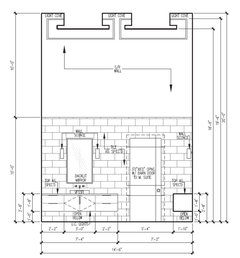
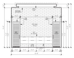
    - Master/Dining: In general seem to work in these rooms. In the Dining the 4" wall wash might be interrupted by the 2 cabinet towers of which height is unknown.

    - Kitchen/Great Room: There's a whole lotta sheet going on here. The coves do not relate to the island (good luck with island task lighting) and contradict the floor space below what the aisle is defining. You have a 9'-6" cabinet soffit with 10' window headers and 11' or other unknown various doorway soffit heights/"ceiling breaks." There is a 30" cove elevation change of which you will see inside of the lowered cove (as opposed to more hidden like in the Master/Dining). You have a finish pattern of 1x6 T&G wood outlining the lowered smooth drywall. You have patterned "blocks" of 4" recessed lighting at the lowest cove sections. However, all of this is happening 19' to 22'-6" above the floor, so a lot of what it is trying to accomplish is going to get lost at human scale down at 6'. Still, that's a lot of visual noise for minimalistic design!

    Here is a section, sketched to scale of your space. Notice the differing heights of absolutely everything, the proportion of the entire space, the ceiling finish selections, and how high up this cove ceiling is.


  • 4 years ago

    @kl23 The dining room will have a hanging fixture as well, so I am pretty confident there will be plenty of light...plus I don't intend to use this space for other than dining or maybe playing the occasional board game. The master has a fan with light plus 4 can lights. so I think that should be more than adequate. I don't yet know what will be on 1 of the walls, but if it is something that needs specific accent lighting, we'd add that in later. In the greatroom, those ceilings are so high I can't imagine they will meaningfully illuminate anything but I could be wrong. I think they're more to "look cool" than anything else, and perhaps provide some basic ambiance lighting.


    I'm playing fast and loose with modern and contemporary, both of which seem to be used very differently by seemingly informed people. As for the minimalist label, as you alluded, it is OK if it isn't "true" minimalist as long as I like it and like the look. And I haven't even started thinking of furnishings yet.


    That link has lots of interesting ideas for ceiling designs. I'm going to study it more and see what other options may appeal to me.

  • 4 years ago

    @3onthetree Thank you for your detailed comments and taking the time to do the diagrams. Your post is thought provoking and I'd like to take some time to think before replying.

  • 4 years ago

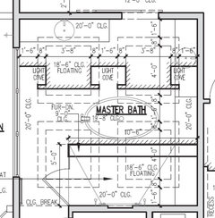
    @3onthetree I think I've been convinced that the elaborate design in the great room (and also the master bath, which I've included here) is not in line with my overall preference for simplicity and minimalism. I know those are fuzzy terms and people can draw their personal lines in different places. I do like the look, but I don't think I will be happy with it long-term.

    The diagrams you provided illustrate well how busy that design really is. Thank you for making them and for presenting them in a way that is so clear. In addition, there are clerestory windows at the same level as the reverse coves, which further complicates the look. The reverse coves would also be visible from the outside through those windows, which probably isn't the nicest look. I've included an excerpt showing this.

    One thing I noticed in your diagrams is that the opening to the dining room is shown at 11' right next to the 10' sliders. Although the dining room ceiling height is 11', I am 99% sure the plan is to have tne opening be 10', continue for the width of the column at the right edge of the slider, and then go up to 11'. This should improve that aspect of the look. Just to the right of the dining room, the ceiling comes down to 10', so I think that will provide a clean integrated look overall, at least as far as those design elements.

    I do think that the bedroom and dining room designs are fundamentally sound and add interest to those rooms in a way that I think I will appreciate, and I also think that they offer functional lighting. I do think it is worth exploring the idea of making the "border" of the room a bit smaller, and I would also consider replicating the design in the dining room in the bedroom. I like both looks, but I think the dining room look is cleaner. I also really like your idea of a reveal like in the dining room. To address your concern there, the towers you see are wine coolers and they're 84" tall. I've included that elevation so you can see what is planned.

    Could you elaborate a bit more about what you had in mind when you said "broad, flowing ceilings across multiple spaces"? As for the walls, I am currently planning to do flush baseboards with reglet, which I think is in line with your recommendation.

    I like your approach of trying to look at the house hollistically. While I'm not comfortable posting the full plans here (I think that would violate the intent of my agreement with my architect) I am happy to share other excerpts that would be helpful or answer specific questions. I will also reach out to you via DM.

    As for how ceilings in adjacent spaces transition to these, primarily via fur downs. All of the openings "out" of the great room except for the main entrance foyer are 10' openings that in some cases change ceiling height on the other side of the passageway. The foyer is 14'8" and matches the height of the porch, and this all transitions to the great room via fur down. The foyer and porch will be wood cladding, as will the rear patio, so the current ceiling design that keeps the continuity of that wood is nice, but not essential IMHO.

    The HVAC is not planned to that level of detail yet, but I am hoping to use the stainless linear style as opposed to more traditionally shaped vents.

    The lighting in the great room is currently all linear LEDs, but if I change the ceiling design that may change. The master has 4 can lights on the lowered part of the ceiling and a fan with light centered on the cove.

    In the areas we're looking at, the windows all have headers at 10', with the door openings also at 10'. Those elements don't really align with anything else horizontally, although I suspect the cabinet height of 9'6" was selected so they don't look weird in the places where there are cabinets near a door opening. This applies somewhat to the main kitchen cabinets (where the stove is) which are flanked with 10' openings on each side. An arguably more problematic area is on the lower wall, where there are cabinets right up to the wall where the ceiling break occurs. I can see an argument for having the cabinets at 10' to match, or to be slightly below, as currently drawn. Thoughts?

    None of the coves are defining floor space. They are in the "logical" geometric center of the rooms (I say logical because, for example, in the dining room the cove is centered on the room ignoring the cabinets and counter on the right).

    I had to chuckle at your characterization of the great room and kitchen...and can't say you're wrong. I do think the plan of using 2 pendants for the island would work, but of course that may all change if I revise the ceiling. I don't know exactly what you mean by "The coves...contradict the floor space below what the aisle is defining." I think you're observing that the natural walkways in the room are not in sync with the cove design? All of your other points about that ceiling design are very valid and got me to think about this space much more critically.

    Thank you again for your detailed analysis and thoughts. Hopefully this additional info will facilitate further discussion.


  • 4 years ago

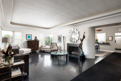
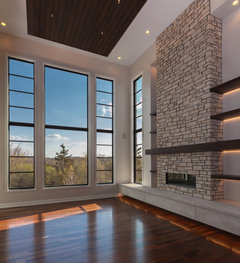
    I would make every ceiling you want indirect lighting on a variation of these. Just a single band dropped around the perimeter or a single recessed cove around the perimeter. and I would cove the inside corners to soften the lighting. You can get these as a preformed material.


    https://www.moderncurvedsolutions.com/

  • 4 years ago

    This is what cove lighting looked like in the 1930s when it was developed:

  • 4 years ago

    We have both those versions but trimmed in wood so seeing corners are not an issue. It looks fine trimmed in wood. And I love using the hidden lighting on its own for ambiance. Good luck!

  • 4 years ago

    @palimpsest Thanks for the pics. The historical perspective is especially interesting. I'm not sure how I feel about rounded corners for my situation.

  • 4 years ago

    @Wendy Good feedback, thanks! And I really like your rooms -- very sharp look with the wood.