

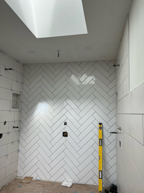
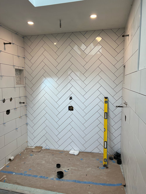
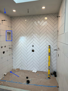
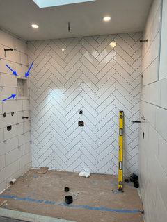
dye lot/tile variation issue. how bad does it look?
3 years ago
Featured Answer
Sort by:Oldest
Comments (17)
 PRO3 years ago
 3 years ago
Related Professionals
Natchez Kitchen & Bathroom Designers · Clarksburg Kitchen & Bathroom Designers · Waterbury Kitchen & Bathroom Designers · Detroit Kitchen & Bathroom Designers · Kalamazoo Kitchen & Bathroom Designers · Sierra Vista Kitchen & Bathroom Designers · Orlando Bathroom Remodelers · Pine Bluff Tile and Stone Contractors · Cape Coral Tile and Stone Contractors · Hays Tile and Stone Contractors · Jamestown Tile and Stone Contractors · Saint Cloud Interior Designers & Decorators · Cape Girardeau Architects & Building Designers · Birmingham Kitchen & Bathroom Designers · Murrieta Kitchen & Bathroom Designers 3 years ago
 3 years ago
- 3 years ago
- 3 years ago
- 3 years agolast modified: 3 years ago
- 3 years ago
- 3 years ago
 3 years ago
- 3 years ago
- 3 years ago
 3 years ago
 3 years agolast modified: 3 years ago
- 3 years ago
- 3 years ago
Related Stories

INSIDE HOUZZHow Much Does a Remodel Cost, and How Long Does It Take?
The 2016 Houzz & Home survey asked 120,000 Houzzers about their renovation projects. Here’s what they said
Full Story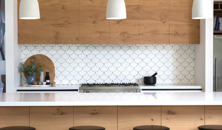
TILELet’s Talk Tile: An Alphabetical Guide to Tile Terminology
Get set for a tile project with this handy glossary of shapes, materials, finishes and more
Full Story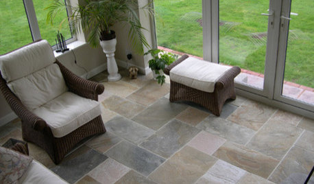
REMODELING GUIDESYour Floor: How to Find Right Stone Tile
Get the Pros and Cons of Slate, Travertine, Sandstone, Marble and Granite
Full Story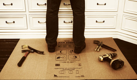
BATHROOM DESIGNOut With the Old Tile: 8 Steps to Prep for Demolition
This isn't a light DIY project: You'll need heavy-duty tools and plenty of protection for your home and yourself
Full Story
REMODELING GUIDESBathroom Workbook: How Much Does a Bathroom Remodel Cost?
Learn what features to expect for $3,000 to $100,000-plus, to help you plan your bathroom remodel
Full Story
EVENTSLook What Tile Can Do Now: 9 Versatile New Finishes
See exciting new stoneware looks from Italy’s big ceramic tile and bath show
Full Story
WORKING WITH PROSHow Much Does It Cost to Hire an Interior Designer?
Interior designers may charge hourly rates, flat fees, cost-plus or a combination. Here’s what that means for you
Full Story
TILEIs It Over for Subway Tile?
Should we ditch the ubiquitous rows of rectangles for a rival, or is subway tile a classic that’s here to stay?
Full Story
TILE10 Reasons to Consider 4-by-4-Inch Tile
Designers are embracing the once common but recently overlooked square tile in kitchens and bathrooms
Full Story
REMODELING GUIDES7 Bad Things Your Home May Be Hiding
What you don't know about your home could cost you during a remodel. Here's what to plan for
Full Story





chispa