Software
Houzz Logo Print
xxnonamexx

Paint choice opinions before I go for it?

3 years ago
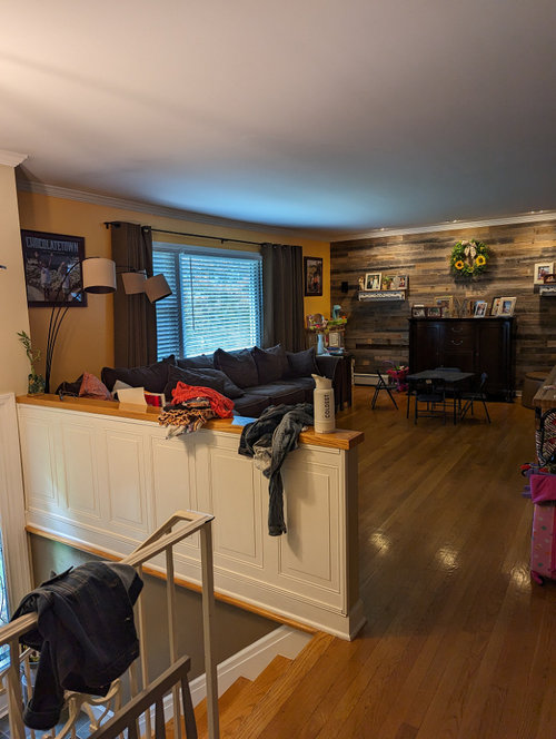
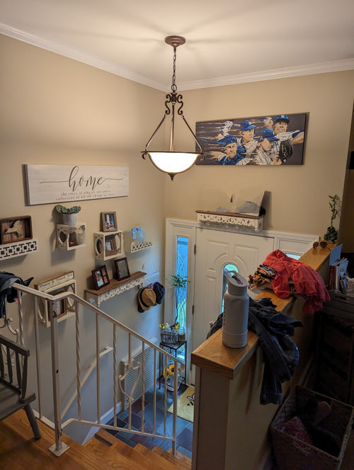
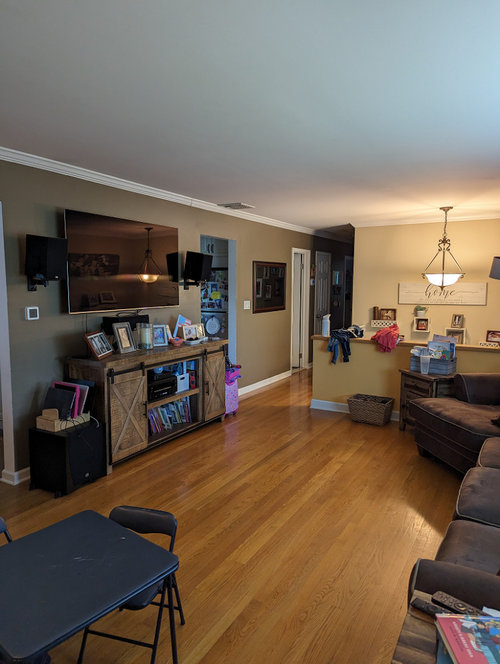
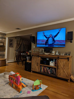
I recieved recommendations on paint choice for my living room just checking if this will look good with the current decor, floor. I am getting quotes to paint making sure I have good color choice.


Comments (97)

  • 3 years ago
    last modified: 3 years ago

    Wow to the Azure Tide blue! It really transforms that space into something special.

  • 3 years ago

    That room will be cave-like with that dark blue color.

  • PRO
    3 years ago

    It is common for people to think darker colored walls make dark rooms. Not true. It is lack of proper lighting that makes for dark spaces. It looks like this is movie/family room so a color like this really suits the space. It’s a choice but one many enjoy making. Just remember to get proper “primer”. SW has P01-06 to use as primer depending on your color choice. This color probably needs PO5 or 06. Well worth a look. With TV on wall it will also help reduce the TV black hole view when the TV isn’t on.

  • 3 years ago

    Hi Flo! Pretty suggestion. OP hasn’t clarified if they were intentionally going for a blue with Gray Timber Wolf or if they were actually aiming for gray. @xxnonamexx can you elaborate on what your goals are for the space, colors or neutrals?

  • 3 years ago

    @texmax13 the crown moulding ceiling baseboard will be painted white again.

  • 3 years ago

    Originally we were leaving towards the gray scale and my wife was thinking a blue. This idea makes things to rethink about

  • 3 years ago

    So this was should be blue as well?

  • PRO
    3 years ago

    Yes. Your woods will pop with Azure Walls. Floor and wood wall and wood TV console. Blue plays well with woods.

  • 3 years ago
    last modified: 3 years ago

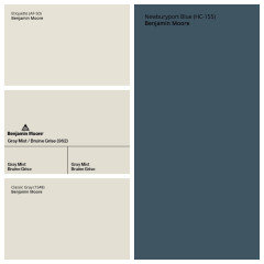
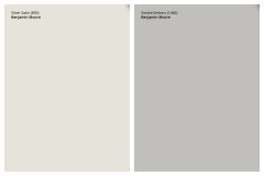
    If you’re going to go with a blue, take a look at Newburyport Blue. I like it with any of these 3 colors for your entry. As far as whites go, I’d get chips for Ben Moore Steam, Cloud White and Mountain Peak White (they look different online than they do in person).


  • 3 years ago

    now the electrician replaced a fixture with a high hat and stated should paint it lighter. The blue would look awesome but my wife thinks we should brighten it up which is why she wanted the grey but i think the grey might be too silver. I will have to recheck the samples.

  • 3 years ago

    @xxnonamexx are you thinking one color all over now or still want different colors for the entry and living space?

  • 3 years ago

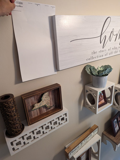
    i think the satin silver in entry way stays since its only a few walls and will make it nice and bright since that light is used the most to light the living room. Its the living,hallway walls so its not too dark and not beige/brown but gray tint.

  • PRO
    3 years ago

    Can I assume the new “high hat” is some form of LED? The level of LED is also important and LEDs have different levels of warmth or coolness too all of which effect the perception of your paint colors. Why not use the Satin Silver everywhere if you like it? A couple floor lamps would be very important too. Ceiling can lights are the least effective in lighting rooms. Better layered lighting is the way to go.

  • 3 years ago

    I’m not a pro, but what I think you’re being told is that different lighting will change how the same paint looks in different rooms. You may not need two colors.

    The blue accent wall Flo suggested will look different in your space than in the picture she posted. GET SOME POSTER-BOARD AND BRUSHES. You really need to sample these colors on poster board in your own house.

    And if you look at a painted poster board on a colored wall, your eyes may not register the color properly. Hence the suggestion to prime the wall first. This is a huge change for your house. Take the time to do sample boards and look at them at different times of the day.

  • 3 years ago

    If you dont like or want dark blue, thats fine, but what about a light or mid blue or blue gray. I think the space is crying out for COLOR and blue/blue-gray is a good choice - blue is complementary to gold/gold-brown (eg wood tones) and you do have blues in some of your decor. I think gray + beige + browns + dingy whites is too blah. Color helps brighten up spaces which may not have a lot of natural light. I see you have some blue samples in your earlier post - have you tested out any of them on a larger scale? Large panels at least 4 x 4 or bigger that can be moved around is a good iea. You need to do that before ruling in or out anything. I would also make the entire space the same color for greater cohesiveness.

  • 3 years ago
    last modified: 3 years ago

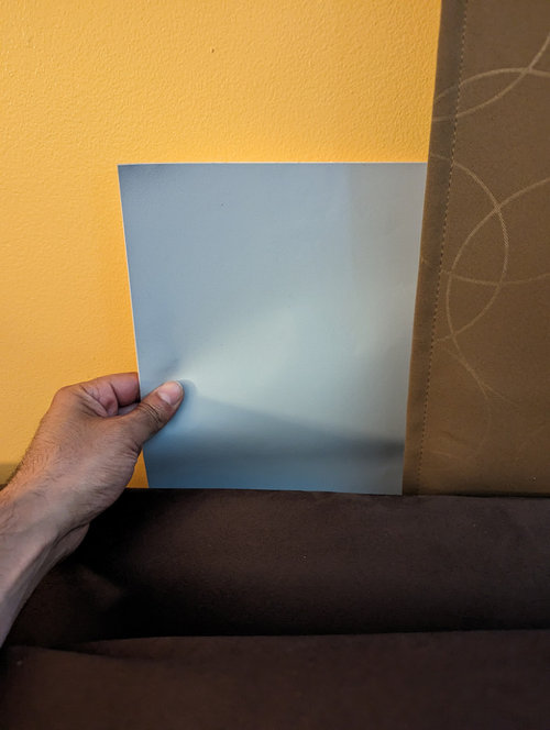
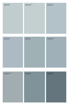
    Since people aren’t giving suggestions of actual color names, here are some blues ranging from light to mid to deep (but lighter than my previously suggested Newburyport Blue) that should look ok with Silver Satin and hopefully have less potential to look purple than Gray Timber Wolf.

    In my opinion, light blues can be tricky because they can easily end up looking like baby nursery blue; so if you see something you like please at least get a sampilize sheet before committing.

    I would’t completely rule out the thought of a mid, deep or even dark blue. The color you currently have in the hallway is pretty deep and you haven’t mentioned it being an issue.


  • 3 years ago

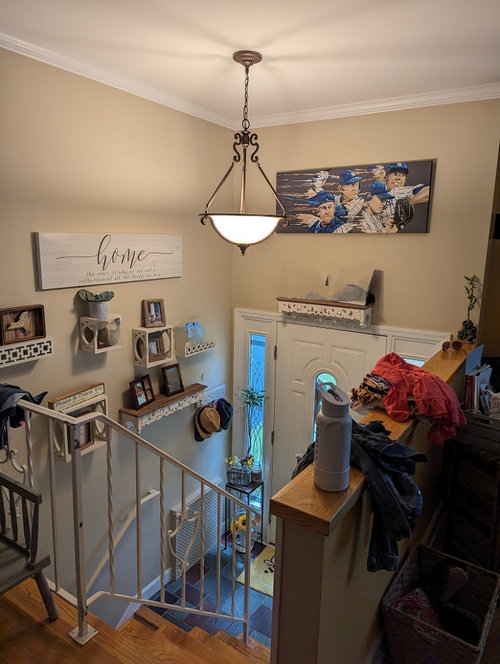
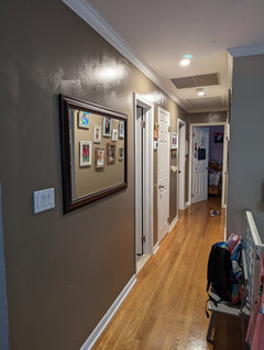
    Heres the new hallway lights the new paint will be matte finish not glossy (covid painting error) yes I can imagine this looking nice with blue but wife liking grey so I'm thinking grey with blue tint not baby blue light but not grey thunderstorm grey. I have to check the ones suggested to see what she thinks. Cape May Cobblestone and Nimbus are interesting. if blue the Azure tide is nice.


  • 3 years ago
    last modified: 3 years ago

    The suggestions I made are more blue/gray than blue. Let me know if you want some brighter suggestions. I’ve been sticking with Ben Moore because those were the colors you were originally asking about, is that the brand you plan to stick with?

  • 3 years ago

    Also, do you happen to know what colors you currently have painted in there?

  • 3 years ago
    last modified: 3 years ago

    Thank you, that’s helpful. Good news is every color that has been suggested except for newburyport blue, azure tide and britannia blue are all lighter than taupe fedora; so that may ease your mind a bit.

    That being said, I have a color in a 10x10 bedroom in my home very similar to britannia blue and I have never felt it was too dark, so I wouldn’t automatically rule them out without at least picking up a paint chip to see in your space :)

  • 3 years ago
    last modified: 3 years ago

    One week until painter comes and still unexpected my wife is looking pelican gray. It appear it has more blue. We have the color wheels and are going to see if we can find a good grey that will work.

  • PRO
    3 years ago

    BM Pelican Gray has an LRV of 58 so not very reflective and it is in the Blue Hue family but with the Chroma probably will appear more gray. If you want lighter color in gray I can find one for you. Get sample to see if it works with your wood reclaimed wall and flooring.

  • 3 years ago

    @xxnonamexx are you and your wife wanting a blue or a gray?

  • PRO
    3 years ago

    Before finalizing the paint choice for your living room, it's essential to test sample swatches on the walls and see how they blend with the existing decor and floor. This step ensures you make a well-informed decision, creating a harmonious and aesthetically pleasing space.

  • 3 years ago

    @texmax13 grey family and on the lighter side

  • 3 years ago
    last modified: 3 years ago

    @xxnonamexx what are your thoughts on nimbus? same hue family as silver satin, less potential for it to look blue than pelican and lighter than cape may.

  • 3 years ago
    last modified: 3 years ago

    It appears we have decides onBM smoke embers throughout the rooms entry, living, hallway.

  • 3 years ago
    last modified: 3 years ago

    Ok, happy you found something you both like. Smoke Embers is a little darker and less chromatic than Nimbus, but should still go fine with Silver Satin because they’re all in the same hue family. Will you post pictures once the painting is done?


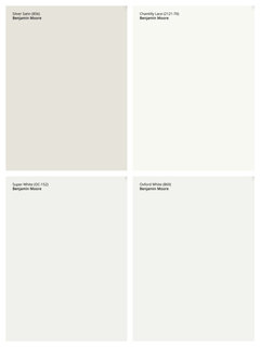
    The following whites would work for your trim, doors and ceiling. They are light enough contrast with Silver Satin. You could also check out Steam and Snowfall White. Do you know what White you have on the trim in the rest of the house?


    A good rule of thumb for sheen is Flat/Matte or Eggshell for the walls, Flat for the ceiling and either Satin or Semi-Gloss for the trim/doors.

  • 3 years ago

    Pictures don't do justice but might look a tad darker then smoke embers. they look so similar. What do you mean by chromatic? The trim we curently have is the regular trim white. I didn't think about looking into a different white for trim, ceiling, doors. We also are thinking what everyone recommended by 1 solid color throughout and no satin silver in entry but one color for all.

  • 3 years ago

    One color throughout can definately work, but I would suggest something in between the two colors you’re considering. Not quite as light as Silver Satin but not quite as dark as Smoke Embers, Collingwood might be right on the money. Same hue as Smoke Embers but a little lighter. Chroma is how colorful something is, less chroma=more gray :)

    To keep things easy, I would stick to the same trim color you have throughout the rest of your home.


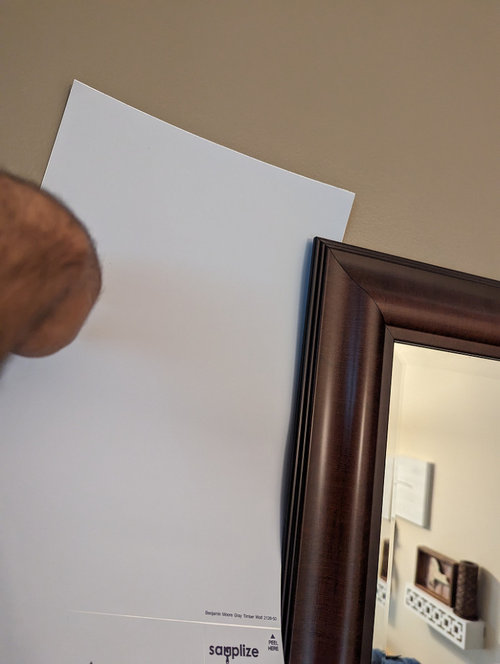
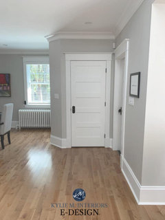
    here is a photo of Collingwood:


  • 3 years ago

    I am going to check this sample out.

  • 3 years ago

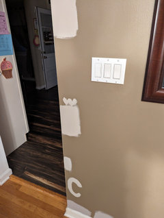
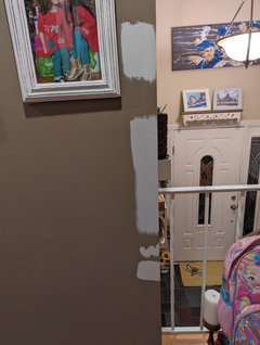
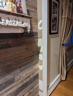
    BM Revere Pewter at my friends

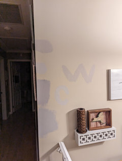
    and where you see the W this is the same paint on my wall samples

    C is Collingwood


  • 3 years ago

    @xxnonamexx I think either color can work. Collingwood is a little lighter and a little more neutral (gray). Which looks better to your eye?

  • 3 years ago

    I have a friend who painted his main floor Collingwood a few years ago and now he is considering painting the entire house white. There are thousands of whites but I understand that designers prefer Cloud White (?) is that Benjamin Moore or Behr?

  • PRO
    3 years ago

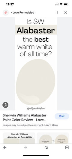
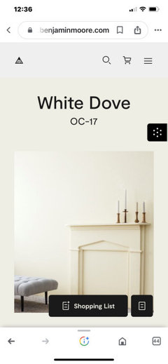
    Ok you can’t assess any color with painting splotches on your existing walls. If you want lighter walls, go with a warm white. No grays. Your woods have warm tones, your floors are warm so I highly recommend SW Alabaster or BM White Dove (OC-17 specifically).

  • 3 years ago

    Good luck @Flo Mangan I gave up trying to steer them away from gray and am now just trying to help them find one that might work :)

  • PRO
    3 years ago

    Hope burnith eternal texmax13.
    Grays are so depressing.

  • 3 years ago

    I don’t find them depressing, I just don’t think it’s the right choice with all of their other fixed elements.

  • PRO
    3 years ago

    Well, how about grays are “yesterday”! But all personal choices.

  • 3 years ago
    last modified: 3 years ago

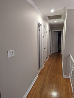
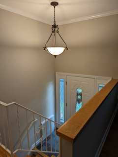
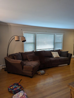
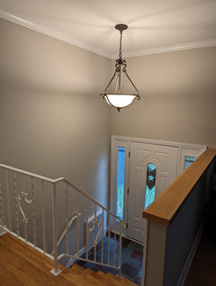
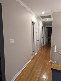
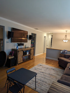
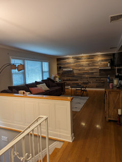
    Collington won and is now on the walls it is absolutely beautiful and now looking for a valance to replace the curtains. I will post photos when it goes back together.

  • 3 years ago

    @xxnonamexx so happy you found something you love!

  • PRO
    3 years ago

    Great! Look forward to seeing pictures.

  • 3 years ago

    Can’t wait to see the pictures!

  • 3 years ago

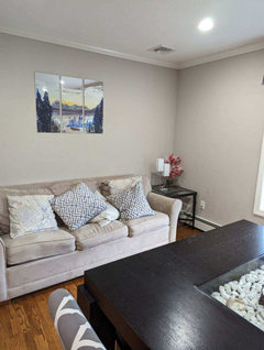
    Here are some photos. Next step is my wife doesnt want to put the brown curtains and just put a valance for the picture window. In the winter probably put longer curtains to cover the window to avoid drafts.


  • 3 years ago

    It looks so clean now thinking of what to do with the photos I had on the walls and mirror want to change it up. The curtains as well need to change it up.


  • 3 years ago

    It looks great. I had a couple of rooms refreshed recently and felt the same as you - ambivalent about what to put up on the newly painted walls. Changing the color made a big difference.

  • 3 years ago

    @RedRyder now the debate is putting the photos of the kids on the walls if we do the same boxes or go with floating shelves going up the steps then the hallway wall we had photos on the walls. Then the picture window changing up the curtains so alot to think about lol

  • 3 years ago

    It’s beautiful! Love the Collington!

  • 3 years ago

    This is the definition of “cascade designing”. I get it….😊