Software
Houzz Logo Print
jfmc81

Adding a Porch Roof - Column Spacing Problems

3 years ago
Hello,


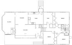
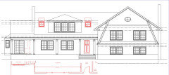
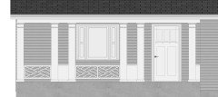
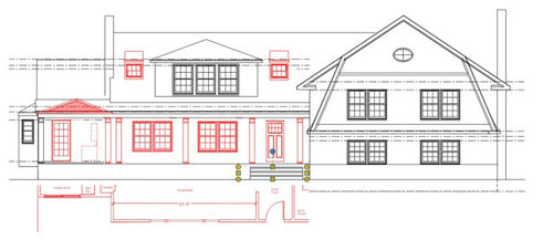
We're trying to give a facelift to an old 1950's split level, and part of this work will be covering an existing front concrete porch with a roof. Our living room faces the porch and has the typical 50's split-level picture window flanked by two double-hung windows in our living room--we also wanted to reconfigure this window as part of this renovation. Our architect had given us an initial elevation, including the porch layout, which we spent over an hour tweaking with him. Ultimately, the only solution we found to maintain even column spacing along the porch length and avoid conflicts with windows and doors required us to relocate an entry closet in order to move the front entry door. We are now realizing (after marking things out at the house) that the proposed locations for the new windows are significantly off-center (in an unappealing way) relative to the living room from the interior side, and the architect's proposed location for a new family room door onto the porch (replacing an existing slider) conflicts with the location of an existing wet bar. We would have compromised and spent the money on the entry reconfiguration to make the columns work, but feel that the other two issues now make even this not viable as a solution.


The attached pdf Bluebeam markup is all we could come up with (our markups and a snippet of the interior floor plan are in red). We will review with the architect, but we would love some independent perspective from you folks as to how on- or off- track we are, and what may look wrong. From this site, we've learned that the spacing need not be maintained at the entry door, so we've utilized that option. We've also noticed from pictures on Houzz that where there is a distinct element in the porch roof, this can be utilized to break the column spacing, so we added a short gable at the deeper (left) end of the porch, and a double column at one side to maintain an even spacing with the other "bays" in front of the living room. Still the door there is not centered under the gable, but we were thinking we could offset this with a piece of furniture or a sconce.


Even some rough rules on spacing and when it can be irregular/when it should not be, etc. would be extremely helpful.


Thanks for reading.


Comments (13)

  • PRO
    3 years ago

    Having everything perfectly lined up is only important in a 2d drawing. In reality the columns are 6-8 feet in front of the windows so you will never be able to tell if the spacing is slightly different. What you have is fine as illustrated but skip the gable far left, that is drawing to much attention to a secondary door. Posting a plan and current photos may get you more options.

  • PRO
    3 years ago

    Why all the grids in the windows on a 50's house ? I need to see the actual house to know what you are planning. So post those pics here in a comment DO NOT start another post.

  • 3 years ago

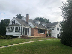
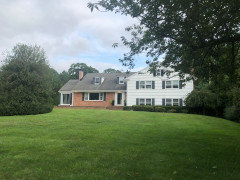
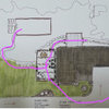
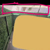
    Thank you to everyone for your responses. I've attached photos of the house and the first floor plan of the existing layout, as requested. I've also taken another shot at column spacing that eliminates a column and the gable off the left side, per Hallett & Co and PPF suggestions. Not sure if this looks OK, but it locates the living room windows where we are good with them.


    As for the grids on the proposed windows, we are open to suggestions. They were added by the architect on the first draft elevations, as we like them, but are not married to them.


    Again, thanks for everyone's input.


  • PRO
    3 years ago

    I think that version is much cleaner.

    jfmc81 thanked HALLETT & Co.
  • 3 years ago

    Yes to the suggested change, above. Play around with your fenestration. Try the look of 4/1, 6/1, 2/2. What I am not fond of is how, on the gambrel side, the size of the second floor panes is larger than those in the lower level. The little dormers also have smaller panes, and the bay has vertical panes. See??

  • 3 years ago

    Thank you Hallett& Co, and ptreckel. It sounds like the second versions is a start to a viable solution to the column issue.


    ptreckel, as for the fenestration, I will continue to discuss with the architect, as I see what you are saying. On the gambrel side, the lower windows now sit on the existing foundation wall, with sills less than 30" above grade. If I want to make them more vertical/"taller" (which I agree would look better), I would have to extend them lower, cutting the block wall to accommodate (the header cannot be raised). I was trying to avoid this and just lose it with some landscaping, but sounds like I should explore it further. The upper windows on the gambrel side have been made taller in the new design, but currently are the same size (see photos in my last post). Should I consider keeping them the same (shorter) dimension?


    The little dormer windows left and right of the upper dormer at plan left in red (not sure what these would be called, eyebrow dormers? transom dormers without a window below?) were my addition, mainly a placeholder to discuss further with the architect, not married to the deisgn shown. The one on the left is at a walk-in closet, the one at the right is the upper landing of the stairs to that level, both of which could use some natural light. I thought something like these would help get that light without extending the main dormer, or adding skylights on the street-facing elevation. Bad idea? Is there something else I should consider?


    Thanks again!

  • 3 years ago

    PPF, I think you have solved the problem of the posts with the retention of the picture window! Love the new fenestration plan, too. Jfmc81, what do you think?????

    jfmc81 thanked ptreckel
  • 3 years ago

    Apologies for the delayed date response, but as soon as I saw PPF's post, it was clear that his suggestions are dead on--so now I've been reeling for two days, trying to make the shift of the second floor dormer work with the proposed second floor plan. Not sure it will work, but it's clear that the composition of the front elevation looks 100% better than the initial design.

  • PRO
    3 years ago

    Wondering about a railing, and how adding some solids between some columns might look.


  • 3 years ago

    I like the new one you posted above. Much better than the original. I like grids in some windows, but, not in your 50's house. They didnt have them, so they look out of place now.

  • 3 years ago
    last modified: 3 years ago

    Its a Dutch Colonial Revival. Eliminate the far right column and the muntins in the bottom sash of the windows

  • PRO
    2 years ago

    @jfmc81


    Updates?