Software
Houzz Logo Print
denise_boyce1

Is this rug too colorful?

2 years ago
last modified: 2 years ago

*EDIT*

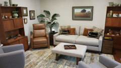
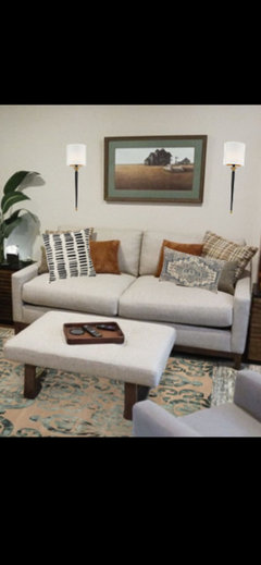
I took the suggestions about adding black and found this rug. I really love it, need you guys to chime in please.

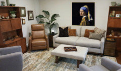
I'm looking for some bigger art too.
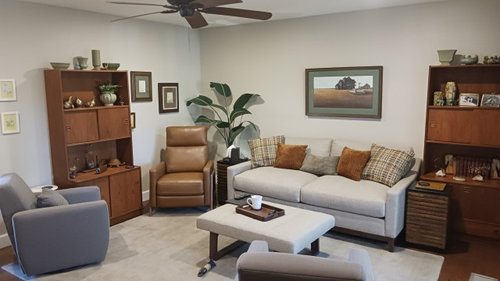
(I know the chairs look blue gray in the photo but they are really a sage grayish green.)


I saw this rug and thought it was beautiful, all the colors in my room. Brought it home and now I'm wondering if it's too overwhelming? I've had the solid rug for so long I'm just bored with the blandness of the wall, couch and rug being the same tone. What do you think? Should I return it? Do you have a better suggestion what might work?


Thanks

Resized_20231024_145320.jpeg
Resized_20231018_085352.jpeg
karastan black.png

Comments (27)

  • 2 years ago
    last modified: 2 years ago
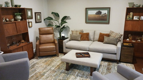
    I think if you used darker pillows on the sofa and a bigger tray on the ottoman the colorful rug would work very well. Try transferring your camel-brown pillows to the gray chairs after you've tried darker fabrics on the sofa.

    denise boyce thanked mytwo cents
  • 2 years ago

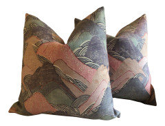
    Just some examples of colors I would bring onto the sofa and chairs


  • 2 years ago


  • 2 years ago

    I think the new rug looks very nice, and wouldn’t change a thing! Nicely done!

    denise boyce thanked bearbev
  • 2 years ago
    last modified: 2 years ago
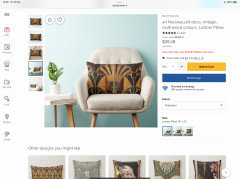
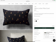
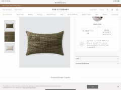
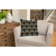
    (I also think you could bring some small touches of blues into the room for color, especially some blue pottery, but also some pillow patterns


    I'm not suggesting ALL these pillows at once -- just saying layering in a few darker shades here and there and a touch of blue will create depth

    denise boyce thanked mytwo cents
  • 2 years ago
    last modified: 2 years ago

    I like the new rug.

    The art above the sofa might look better with the rug if the mat was changed from green to ivory or white.

    The two small art works to the left of the hutch might look better if the frames were changed from white to wood or something else that coordinates with the other wall frames.

    Edit - a different cocktail table/ottoman or using a larger tray on your ottoman as suggested by @mytwo cents would have a big impact.

    denise boyce thanked Design Fan (NE z7a)
  • 2 years ago

    Haha. See discussion on neutrals.

    I don’t think if that rug as colorful. I see it as a pattern of neutrals. It makes the room much more interesting than the solid rug, so I much preferred it to the solid no matter what you else you swap around.

    If it were my room, I’d go for even more interest and less “ safe” by introducing some small amount of another color that’s completely different from your beige/ cream/ brown// green. Because the room still looks a bit careful, trying to be sure nothing’s too fun, while overall I still like it a lot because of how you have some good textures, contrasts and repetition.

    One if the best ways to do this is with art , something that you truly like, is even generally in your colors, but, being art, can go off the rails a bit with extra colors or an unusual theme. Something really interesting to look at and not to motel- worthy.

    Or books, but only if you read and ones you love. Or some pottery or plant pots in a different color. The color (s) should be one you love ( well, hard to control that with REAL books, not ordering a set if “ blue books online. Although since I had a large collection, I was amazed at how many of the actual bindings “ went” with much decor, and I could organize/curate if I wanted to) and is ok to be at home with your other colors in some ways—so fine to say, fluorescent pink isn’t the one, but maybe purple , red, some types of orange.

    I wouldn’t go out and try to quickly buy discount throw pillows or ceramics, but just be thinking, if you see something that you really love, it can and should be a bit unmatched. Again, art is often the solution because it has “ permission “ to include a range of colors that work together intentionally.
    denise boyce thanked marmiegard_z7b
  • 2 years ago

    I'd rather use cheap pillows from Target than what gets called ''árt'' from the crank out the blobs splotch vendors or in posts from this site.


    Of course put anything into your house you love and if you want to read a book don't hide it. And don't rule out flourescent pink.


    denise boyce thanked mytwo cents
  • 2 years ago
    last modified: 2 years ago

    That rug is far from "too colorful", and works well in your room.

    The mat on the artwork above the sofa is perfect.

    I agree with choosing a couple of pillows, or a perhaps a throw, that brings something other than gray/beige/cream. The room is very well coordinated now, and the golden tan pillows are good - but you just need a bit more contrast to perk it up a notch. How about dark blue to flow with the blue-ish gray of the chairs, or a green that flows with the matting on the picture (I can't really see the rug colors well enough to tell if there is blue or green in it.)

    denise boyce thanked raee_gw zone 5b-6a Ohio
  • 2 years ago

    The new rug is nice. Try adding a black pillow or two on your sofa, and see if you like the rug better than. Could be two solid black pillows, or you could even mix it up - and use a solid black and a black patterned pillow, such as a stripe, etc.


    I just scribbled here on this visual - but hopefully it gives you the general idea.


    denise boyce thanked freedomplace1
  • PRO
    2 years ago

    I would try darker blue pillows on the sofa to pull the blues out of the rugs and tie the room together. Overall, I love the rug though!

    denise boyce thanked Sophia Van Zyl
  • 2 years ago

    I like the suggestions of adding black and larger artwork. The starker contrasts adds dimension to the room.


    denise boyce thanked ffpalms
  • 2 years ago

    This would be a bold and beautiful change.


  • 2 years ago
    last modified: 2 years ago

    The new rug is perfect and some of the suggestions about larger art are right on. It’s a very nice room!

    denise boyce thanked Olychick
  • PRO
    2 years ago

    Perfect rug now .

    denise boyce thanked Patricia Colwell Consulting
  • 2 years ago

    What do you guys think about this new find?

  • 2 years ago
    last modified: 2 years ago

    I like that black rug, too, but would get a sample before ordering a big one.

    It does have a bit of a faded look to it, which may or may not matter. This is a good pic of it (in good lighting) in a reviewer’s room:


    ETA: Just making sure I have the right one, it is this one?

    https://incrediblerugsanddecor.com/products/karastan-estate-somersby-black-area-rug

    denise boyce thanked Jilly
  • 2 years ago

    ohhhh it looks way more faded our doesn't it? hmmm Thank you Jilly!

  • 2 years ago

    I do like the black rug - I have one that is similar in colors (not so much in pattern) that I used on my kitchen floor. It is a flat weave, all wool, so cleaned beautifully.

    I don't mind that it appears slightly faded - that's a softer look

    You just need that larger artwork - with a black or very dark color frame- for it all to be pulled together nicely. Perhaps you could also find a less bulky & smaller end table to replace the one that is in front of the bookcase (on the right) so that area doesn't seem so crowded.

    denise boyce thanked raee_gw zone 5b-6a Ohio
  • 2 years ago

    I don't know where you live, but maybe the original pick for the summer and the black for the winter.

  • 2 years ago

    Do you like the art ? There are really no rules about how big art has to be over a sofa, etc.... But if you want bigger, you can use a larger mat and larger frame. Or even better - flank the art with some wall sconces. You could use plug in sconces; but there is also a way to adapt hardwire sconces so that you don’t need to have the electric setup.


    denise boyce thanked freedomplace1
  • 2 years ago

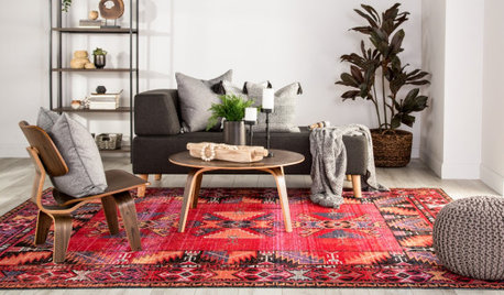
    I like both of your rug choices. I just used another rug above to show a different look. I love this rug. Every picture i see shows a pink cast - at least on my phone. And I actually like the pink! But all the descriptions say that the rug is camel and grey. Pretty much sold out at Rugs Direct, but here it is on eBay - and also available from Bed Bath & Beyond, Armand Flooring and maybe some other vendors have it, too.


    denise boyce thanked freedomplace1
  • denise boyce thanked freedomplace1
  • 2 years ago
    last modified: 2 years ago

    Just a thought, but I would find an area rug that has the same accent colors in it as the matt of the picture over the couch or even an area rug that is predominantly that color. I think you need some accent colors in the room and the first rug you displayed just kind of blends in with the rest of the room decor. You could also add accent pillows on the sofa the same color as the matt or even get a nice throw in that shade. I would also consider painting the shelving you have in the room a nice sage or the color of the matt. Would look really nice.

    denise boyce thanked Cara Fidler
  • 2 years ago

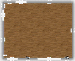
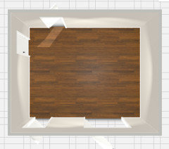
    I am surprised nobody mentioned furniture placement. you should not put evething alone the wall. Also cabinets need they own areas not to be mixed with seating area. if you will provide room size and layout it will be easier to figure it out.

    denise boyce thanked sofikbr
  • 2 years ago

    sofikbr I struggle with the furniture placement. It's a small room with too many entries or closets.

    This placement was done by a salesperson that sold me the couch. The bookcases are vintage Scandinavian teak 35" wide I've had since the early 70's and the black walnut end tables are vintage also. Both sentimental to me.

    The door at the top of the room is the entry from the front living room. Counter clockwise is a closet, entry into the laundry, then a set of french doors to the backyard. The left wall has the companion teak console 41" wide with a TV on top. I'd love it someone could come up with a better alternative. Thanks for your input.