Software
Houzz Logo Print
webuser_793581748

furniture placement dilemma

2 years ago
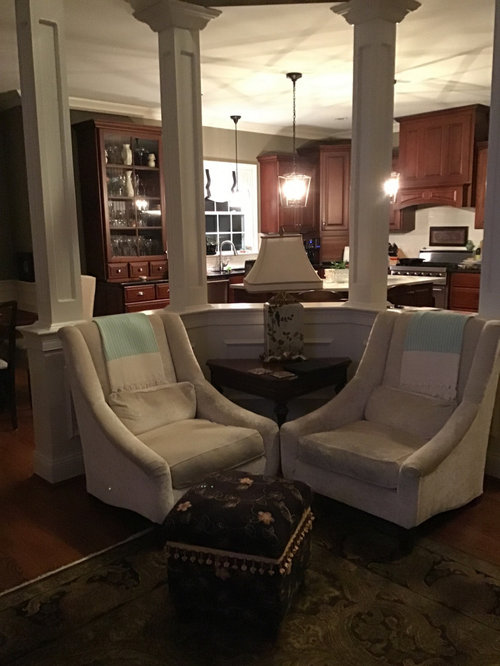
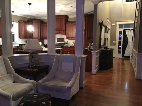
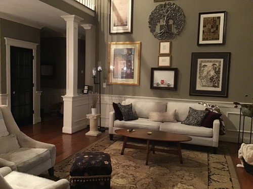
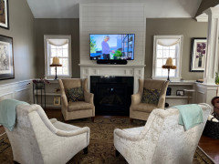
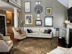
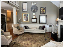
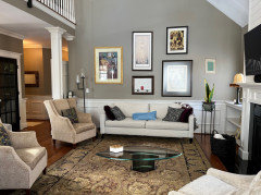
My living room is small, has only one solid wall and a small three sided pony wall that needs to have seating in front of it. I like my low slug upholstered chairs but would like to replace so seats are higher from the ground. Also we like to extend our legs as with a recliner or ottoman but the space is too small.
Any suggestions appreciated.

Comments (32)

  • 2 years ago

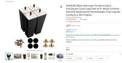
    You can buy chair legs to lift the chair up. It depends on how handy you are to be able to isntall new legs. What do you see on the bottom of the chairs? Does it look like a place for short legs?

  • 2 years ago

    There are short legs on the chairs. I think lifting them higher would bring the overall height too far above the pony wall.

  • PRO
    2 years ago

    Replacement chair legs on Amazon

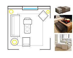
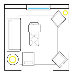
    Try this arrangement instead.


  • 2 years ago

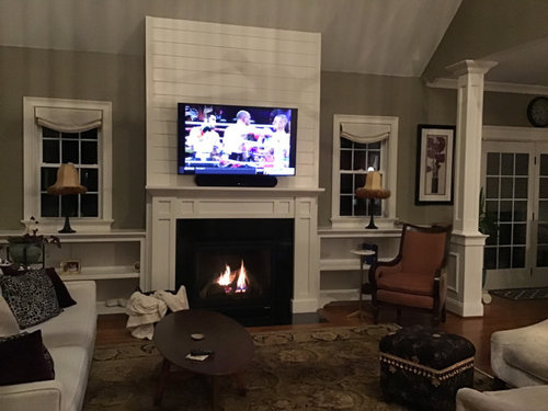
    Thank you. I have actually placed a chair near the sofa as pictured and it does work. I would like two upholstered chairs positioned to view the fireplace and tv. Would placing only one chair at the pony wall seem off balance? Can I fill the space in some way? It may be difficult to see in the pic but now there is a triangular table between the two chairs. They fit perfectly. Maybe that is why I am having difficulty picturing anything else there.

  • 2 years ago

    Sort of but we sit comfortably. We have short legs🤣🤣🤣

  • 2 years ago

    I would listen to Beverly. Time for a change... the chairs are too big to be placed together like that.

  • 2 years ago

    When I placed a chair near the sofa, it was closer than in the diagram and on an angle. The size of the room seemed to dictate that. It was too crowded otherwise. I tried moving the sofa down but it is then not centered below the artwork. Moving the artwork is too difficult.

  • 2 years ago

    But what do I do with that space?

  • 2 years ago

    Not all spaces need to be filled. How many people sit in the room and watch TV or gather there on a regular basis?

  • 2 years ago

    On a daily basis there are only two but I’d like to have seating for six on occasion.

    It just seems way off balance with the space empty. I’ll move furniture around to try it out.

  • 2 years ago
    last modified: 2 years ago

    Do that and take some pictures tomorrow. There are professional designers on here that will give an opinion whether or not you are right about balance. You need more comfort for two than you are giving yourself.

  • 2 years ago

    I will do that. Thanks for your help.

  • PRO
    2 years ago
    last modified: 2 years ago

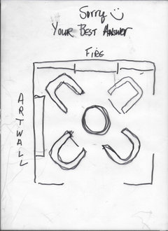
    The true answer is a console on the art wall.

    a round cocktail table, and four comfy chairs.

    You clearly favor sitting in the squashed together chairs.

    The sofa police will not bang on your door.


  • 2 years ago
    last modified: 2 years ago

    I love your art wall. Very bold and very well done!

    I also love Jan’s idea. Go sofa-free! Since it is a room for two, you will both have a great chair for TV watching. When you do have more than two, you can bring in chairs from the dining room!

  • 2 years ago

    The backs of the chairs don't have to be parallel to the pony wall. Just separate and angle them out a bit more.

  • 2 years ago

    Thanks for the suggestion chispa. I have tried that in the past and it didn’t really work.

  • 2 years ago

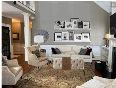
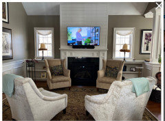
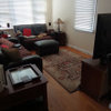
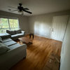
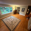
    I’ve moved furniture in from another room just to try out placement. Please comment on photos below.

  • 2 years ago

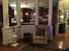
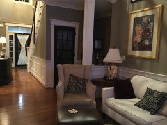
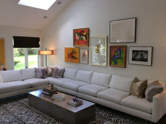
    Today’s Picture #1 places chairs as Jan suggested and would allow a console on the left wall.

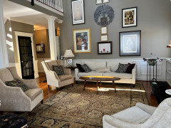
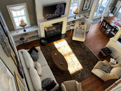
    #2,3, &4 show a version of BeverlyFLADeziner’s suggestion but with additional seating. If I could find a sleek, not ugly recliner, I would welcome two where the gold/white dotted chairs are placed.

    I am replacing all all pieces in this room so I welcome and appreciate all suggestions.

  • PRO
    2 years ago
    last modified: 2 years ago

    Move the sofa to the right so you can actually get the chair in the boundaries of the room. I realize it will not work with your gallery, but the gallery placement needs tending to anyway. Why would you place small items at the top of the wall where no one can see them?????

  • 2 years ago

    I suggest that you go to the LeeIndustries.com website and look at their chairs. Every style of chair has clear measurements. You can sort through the chairs that appeal to you and, comparing their dimensions to yours, check for back height, seat height, interior width, exterior width, thickness of arms, etc. This is what I would do if I were you and wanted to make sure that the height of your chair backs didn’t exceed the height of the pony wall, and the seat cushion is slightly higher than yours. Also, density of your seat cushion, currently, might be something you look into and enhance. With time, cushions compress. You could get more height from your seat if the cushion is re-wrapped. You want a recliner? They have them, but…I suggest an ottoman. And one that could be shared by your two matching chairs, if possible. On wheels, so it could also serve as additional seating, as required. Options. That is what I am suggesting. You have gotten excellent advice from the PROs here, above.

  • PRO
    2 years ago
    last modified: 2 years ago

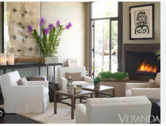
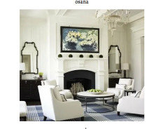
    FIRST? Love this concept.......( no shock there )


    if all the chairs were same and you had the round cocktail

    Note..... the scale and the height of your sofa is very pretty, not as congested feeling as the very tall back you seem to favor in chairs?

    Here below:

    Take one chair away. Bring the one in lower left a little forward _ you are clinging to corners. Bring back the coffee table.

    But see again the disparity..and how the sofa looks lighter, sleeker, less bulky? It's the back : )


    When small rooms have very high ceilings ? You need a bit of caution. They don't feel bigger, they most always feel smaller.

    If I may, and no hurry?

    Feel free to remove the ship lap on fire at any time! Out of context with all else in the house , trim, and flavor. Sort of sneakers with pearls and a black cocktail dress, : )

    You've not been in the house long? I ask as the paint is not what was in the former home? All your fabrics are very warm - I'm guessing the walls were as well.

    A warm white could be lovely here.

  • 2 years ago

    BeverlyFLADeziner Thank you for your suggestions. I understand your comment about the smaller pieces up top. The answer is they fit but I now see where else they could have gone. Perhaps the small pieces have meaning I’d rather not discuss.)😜 The tree of life sculpture is strategically placed to camouflage an air exchange vent so it’s placement is crucial. I built around that.

    Jan Moyer I totally agree about the shiplap. It was there when we moved in and the only thing I didn’t like from the beginning. Also correct about the furniture being from our last house. The paint color however didn’t photograph well. It is a warm, dusky green. It actually coordinates well with the area rug.

    I plan to replace the furniture and would like to paint but the paint may need to wait. The walls flow into the dining area, kitchen, halls, foyer and upstairs to the loft.

    And you are right I do like high back chairs. I like variety.

    The chair at lower left is really not clinging to the corner; the pic is deceiving. I’ll post another view below. This placement requires something else perhaps something on the center wall, not sure what else?

    Thanks so much for all input!

  • PRO
    2 years ago

    So you think placing the metal piece over the exchange vent makes it look better? Well, we differ on that. It just draws more attention to it IMO.

  • PRO
    2 years ago
    last modified: 2 years ago

    I'm going to agree with Bev F on this-

    Life is lived, and art is viewed much closer to floor than the ceiling.

    You are calling attention to the air exchange. I'd lower everything, and call a local to you gallery ! They can probably charge you by the hour and give you an arrangement, using MORE width, less demanding of a perfect center to the whole composition.

    The ceiling here? Vaults to 18 feet.


    Interior Design Work · More Info


    Interior Design Work · More Info


  • 2 years ago

    If you use framed art to cover the vent you could put half inch bumpers on it to keep it off the wall. You really do need to balance out the room. Don't let the vent dictate the design.


  • 2 years ago

    Interesting. I like Paul F.’s idea about using bumpers with art in front of the vent and Jan Moyer’s suggestion “more width, less demanding of a perfect center.” Has anyone used bumpers as recommended? Does it really allow for circulation?

  • PRO
    2 years ago
    last modified: 2 years ago

    I will bet if you run that idea past any decent HVAC guy? You get a hard no. It's there for a reason. What's your climate?

    Your gallery is not well done, and YES, I am sure you spent days with hubby and a level.

    Get someone from a gallery to the house. Or an interior designer with a good eye.

    I'd redo it in an hour, but my arms won't fit thru the Mac, but it would not take me more than that.

  • 2 years ago

    That is my concern. I’m in the northeast. And yes, the gallery was a project. I SO hate the vent but get what you are saying. I can get help with the arrangement but rehanging everything will be the biggest challenge.

  • PRO
    2 years ago

    Not for anyone who hangs HUNDREDS every year

  • 2 years ago
    last modified: 2 years ago

    My idea for that vent is absolutely no worse or different than this current trend with forced air heat vents. Instead of the air being blasted or sucked in dead center it just is rerouted to the perimeter. I don’t believe you’d hear a hard no.


  • 2 years ago

    Good to know, thanks