Software
Houzz Logo Print
rossn1

Seeking Feedback on Living Room Lighting Layout

2 years ago
last modified: 2 years ago
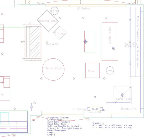
Could use some feedback on 2 proposed lighting layouts from lighting pros.

Preferred feel is that the lighting is warm, comforting, layered, and less 'consistent' Kmart lighting. I prefer a little dimness when transitoining between different areas. Maybe a little moody.

Currently on 8 different dimmers, keypad controlled. Ceiling slopes from 9' to 11'.

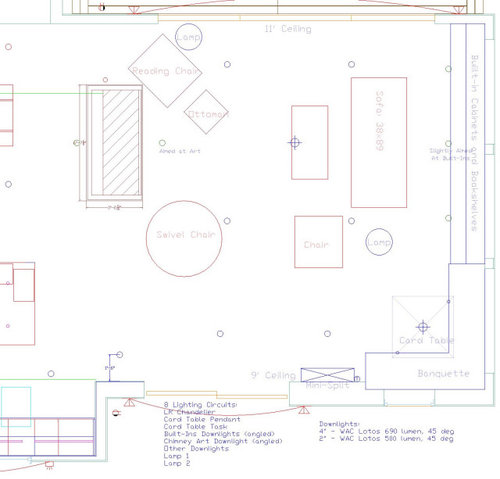
I like the space and separation of layout 1's downlights, but am conderned about more hard shadows from heads of folks in chairs and inconsistent lighting on the chimney. On layout 2, curious if I need a 3rd light on the north (11') side.

Best placement of lights relative to 'swivel chair' and 'chair'? I'm trying to avoid placement right over heads.

Welcome any feedback, keeping in mind the desired feel.

Layout 1:


Layout 2:


Comments (5)

  • 2 years ago

    Bump. Maybe this is a dud...

  • 2 years ago

    Couple comments which are more questions:

    - I believe all are the 4" lumenaires except for (2) 2" over card table.

    - Is the opening on the 11' wall a sliding door, windows, or open to another room?

    - Why is the reading chair lodged into the kink between the FP and wall?

    - A floor receptacle at the couch and some wall receptables are shown sporadically. How to plug in the reading chair lamp?

    - Is the mini-split cartridge up high? Why is there a light highlighting that wall then?

    - Is the FP massing the focal point, is it electric (more a visual piece than wood burning), or is the art on the FP more the focal point? Or is the drawing indicating the FP faces the Kitchen?

    - What is the need for the 2" tasks only at two corners of the card table? Is your pendant chosen and will it, in combination with the built-in seating, take focus away from the Living area? Conflict with the size/type of lamp next to couch?

    - The chandelier looks centered on the FP and 11' opening, but not the windows over the bookcases. Will the bookcases and windows coverings further accentuate how the chandelier is not aligned with them (as well as the 3 recessed)?

    - Is the swivel chair covered?

    - Is the Living lighting designed in relationship to the Kitchen/circulation lighting given the openness of plan?

    - Given all the questions above, the lighting is apparently being designed for this exact layout and furniture. Is there a need for more of a flexible layout, either with this furniture, or different? Or that the roof structure may not allow exact placement as indicated?

  • 2 years ago
    last modified: 2 years ago
    3onthetree - thanks for your questions; I'll try to answer them here...

    - I believe all are the 4" lumenaires except for (2) 2" over card table.

    Yes, that's correct. On the remainder of the adjacent open area (kitchen, dining, foyer), the same fixtures are used, with 2" (WAC R2ERAR) being used on counter/table surfaces and 4" (WAC R4ERAR) being used on 9' high areas.

    - Is the opening on the 11' wall a sliding door, windows, or open to another room?

    That opening connects to the Kitchen and dining spaces, which are one contiguous area, abutted by the foyer (split level type thing). What you see peeking through there is the E end of the dining table near the chimney and the E end of the island on the S side.

    - Why is the reading chair lodged into the kink between the FP and wall?

    Really, because we wanted a reading chair in the space, with enough individual seats opposed and after a lot of cad variations and mock-up it's what practically worked out. That space passes through to the dining space. It's not really an area that needs to be walked through, per se... but long story short, my wife and I were in debate as to if it should be left open or closed off, and she won and was right.... light and seeing out the N patio doors from the other space would have been lost. Looking closer at the drawing, that chair may not sit quite so close to the chimney, but give/take 6-9". It's the only piece in the room that we don't have yet, and so might have made it a little larger just to fill the space.

    - A floor receptacle at the couch and some wall receptables are shown sporadically. How to plug in the reading chair lamp?

    Yeah, I currently have the cad layer turned off for electrical, but didn't turn off the layer with the exterior half-hot soffit holiday light receptacles. There will be about 10 receptacles in that room.

    - Is the mini-split cartridge up high? Why is there a light highlighting that wall then?

    Good question. The head on the wall is probably around 8-1/2' to the top of it, at about 9'-3' ceiling. I do want to get light on that wall because a) it may have some sort of photos, decoration on the wall b) getting light on walls has a real impact on the ambient light in the room, esp given all the glass in this room. I did push it out to about 33" off the wall, based on a test with a sample light. It will show up and have some light on it with a little shadow, but tried to position at a distance so as to not have it highlight the wall unit.

    - Is the FP massing the focal point, is it electric (more a visual piece than wood burning), or is the art on the FP more the focal point? Or is the drawing indicating the FP faces the Kitchen?

    The fire place is an odd situation... old masonry structure that had been converted to double sided by the owner decades ago, when they did an addition E of the chimney. We are converting it to a gas insert, and there is no double sided gas insert on the market, so we elected to have the FP point to the LR, and a mason closed up the W side.

    Artwise... not quite sure what we will hang yet... I have some large framed prints that may go there for now. Something on each side of the chimney. There really isn't much wall/display space post remodel, so this is one place to have something on display.

    - What is the need for the 2" tasks only at two corners of the card table? Is your pendant chosen and will it, in combination with the built-in seating, take focus away from the Living area? Conflict with the size/type of lamp next to couch?

    The pendant isn't chosen yet, and will probably not be something overriding.. It's physically far enough away that we are comfortable with it not competing. The thought on the area is that this is an area which will either be used for cards/games/etc at some times, and other times a working space (kids homework, paperwork, etc). So, we wanted to provide two layers of light - pendant with some ambiance and softer area lighting as well as some task lighting. My guess is the task lighting will only be used 10% of the time, but come in handy.

    - The chandelier looks centered on the FP and 11' opening, but not the windows over the bookcases. Will the bookcases and windows coverings further accentuate how the chandelier is not aligned with them (as well as the 3 recessed)?

    The built-ins are not going in at time of initial construction (budget), and we are still working out what they will be. There is a strip of windows across that wall, which start about 7', so they will go to some level below that, with the top being 12-14" deep, and most of the space in these being to display objects more than books per se. Likely will have to put some lighting in those, too. Base cabinets deeper for storage of blankets, audio equip, sub, games, etc).

    The chandelier is centered about the fireplace (and north facing Patio doors, which contrary to the drawing is a 4-panel setup with the two center panels parting), as the furniture layout is built about it as well. S 'patio door' is a 2-panel wide opening door that pockets into the wall. I had not thought about the bookcase centering (well... I don't recall if I thought about it, as it was some time ago), but just checked and the fixture is only 1" off center of the book case. Good question, but let me know if you have a recommendation.

    - Is the swivel chair covered?

    Yes, it's this R&B chair... I think my wife picked some golden microfiber. The fireplace opening is much narrower than the structure, so there is sufficient space according to the insert mfg.

    - Is the Living lighting designed in relationship to the Kitchen/circulation lighting given the openness of plan?

    In general, yes. However, we are not intending to have equally uniform lighting everywhere... there may be some dimness before moving into another area for some transitions.

    - Given all the questions above, the lighting is apparently being designed for this exact layout and furniture. Is there a need for more of a flexible layout, either with this furniture, or different? Or that the roof structure may not allow exact placement as indicated?

    Yes, that is correct. Furniture is already in the garage, and we would rather design around the current than 10 years down the road. There may be some minor tweaks to the center lights, based on framing, but not by much. Most of those perimeter lights I've already verified with the laser.

    At this point, I'm mostly trying to figure out if 3 lights are genuinely needed on the N side, due to ceiling height, and loss of light out the doors, as well as the placement of the lights relative to the chairs on the S side of the LR layout. I did a little testing in the original proposed location (behind the swivel chair), and wasn't entirely happy with the shadowing, and also don't want to position the lights in a location where it will lead to odd face shadowing. Similarly, want to ensure that the fixture in the center of the LR seating area kind of holds its own area to some degree without being overly washed out by the recessed lights.


    Here is a look at the overall space from the other end, though I don't have one handy from the LR end.


  • PRO
    2 years ago

    Too much reading for most of the responders. Lamps can be moved pot lights not so much I like the por light layout now fill in with table lamps , floor lamps where you still need layers of light. I do not like moody lighting in most spaces that is up to you I use LEDs 4000K everywhere then have the overheads in my LR on dimmers. I like a nice bright space usually . I do not like the look of incancsent buls do the lowest I go for LED is 3500K the color of the bulb is up to you but the layered lighting is always the way to go .

  • 2 years ago

    When you have lighting issues where you have to zero in on 1 or 2 fixture placements, that is usually emblematic of larger issues. Some aspects of this design I probably would have done differently. The big tell is your panaramic looking across the house into the new addition. A linear, very open space seems to be in purgatory between seamlessly flowing with the old but holding back at the same time. And it would be better to always show ceiling changes in plane, as that has a huge effect on lighting and demarcating floor spaces.

    Now looking at old threads, a strange place is the NW corner next to the fireplace and why I thought something was wrong there. Really, with that hodgepodge ceiling that should be closed off as part of the FP design (whether flush, notched, shelves,etc). The Living seating area appears to need to be larger based on the Kitchen/Dining size, which leads the reading chair to be in the NE corner. And the built-in nook reduced (linear instead of 'L').

    The FP should have 2 accent lights. Question if a tv will be here or a required hearth extension.

    It seems there is too much emphasis on technicality of the lights (move furniture 6" here, 9" there) when the ceiling plane lighting, in this design, should be more of a general ambient focus because you have layered lighting. Highlighting short width walls flanking the South door lends a disproportionate feel of what is the focus. The (2) lights over the card table is unnecessary. In general, for this design, artistic and aesthetic influence should be prioritized over lumen throws and footcandle readings.