Software
Houzz Logo Print
salonva

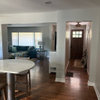
I'd say these colors are pretty pretty close

2 years ago
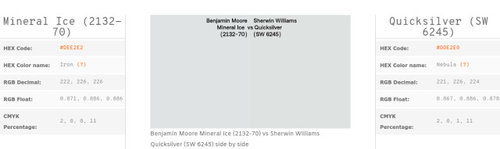
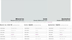
So I am playing around with paint colors and came up with a potential BM color. I have a SW paint deck so I wanted to see if there was a good equivalent to Mineral Ice (BM).

I searched for SW equivalent and came up with Quicksilver. They are not identical , but they are really close.

Again, I 'm not sure this is my color, but I was really surprised at how close these 2 are. All the others I played with, while similar, once next to each other they were clearly so different.

Just had to share.


Comments (31)

  • 2 years ago

    These elderly eyes of mine see the BM color as just a tad cooler than the SW, which reads slightly warmer than BM. Of course, that could be due to my computer....

    salonva thanked roxanna
  • 2 years ago

    Mineral Ice is slightly cooler on my computer. I pick up more green on the right.

    salonva thanked palimpsest
  • 2 years ago

    oh I agree that the SW is greener and not 100% the same but I was impressed with how they are indeed quite similar.

    And yes, the computer screen is another factor for sure. At least I can search out the BM sample because I do think I like that one better.

    Just sayin, if anyone has a suggestion for a similar color with a tad more blue, I'm all ears.

  • 2 years ago

    Interesting how different monitors give different results! On mine, Quicksilver is noticeably more saturated than Mineral Ice.

    salonva thanked Ida Claire
  • 2 years ago

    if anyone has a suggestion for a similar color with a tad more blue, I'm all ears.


    You can usually find that on the mfr site; they have de facto "strips" like the little card stock paint strips you get at the hardware store, showing increasingly less intense and more intense versions.


    Given how many colors are in each line, I'd be surprised if there aren't dupes.

    salonva thanked mtnrdredux_gw
  • 2 years ago

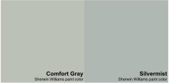
    I had a client come to my house after I had just painted my spare room. When she saw the room she exclaimed "I love it - you picked the same color as you picked for my bedroom!"


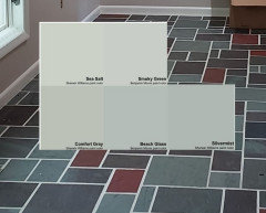
    I picked Comfort Gray for her bedroom and Silvermist for my spare room.


    salonva thanked Jennifer Hogan
  • 2 years ago

    Jennifer, thanks for your insight. What color is your paint and can you describe how it actually looks (i.e., how you perceive it) on your walls?

    salonva thanked Bunny
  • 2 years ago
    last modified: 2 years ago

    Comfort Gray is the color that the previous owners painted in my daughter's living room. I was shocked to find out what the color was. It's the most perfect chameleon of graybluegreen at least in her house. I did think of that for my bathroom and haven't ruled it out, but think I should be going several levels softer/lighter.

    But yes, I can see the difference above. Silvermist is much deeper and more gray gray.

    Always appreciate everyone's insight.


  • 2 years ago

    The two colors you picked are different and it is noticeable when they are side by side, but honestly, if your neighbor painted their home in Mineral Ice and you painted your home in Quicksilver no one would think you used different colors.


    salonva thanked Jennifer Hogan
  • 2 years ago
    last modified: 2 years ago

    Salonva, if you like Comfort Gray, perhaps sample a 75% or 50% formulation. I found a SW color that was the perfect combo for my living areas, but it was too dark. I sampled it at 75% or 50% (I think it was 50%), and it worked.

    Jennifer can probably weigh in whether this is a good strategy in general.

  • 2 years ago

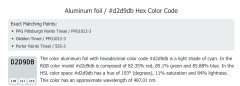
    Aluminum foil appears to be very close but a tad more blue...


    salonva thanked Annie Deighnaugh
  • 2 years ago
    last modified: 2 years ago

    Adding white is not always the best way to get a lighter version, believe it or not.

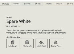
    Here is the "strip" i suggested you look at. One shade lighter than Comfort Gray, 6205 is Sea Salt, 6204.


    And one shade lighter than Sea Salt is Spare White, 6203


    salonva thanked mtnrdredux_gw
  • 2 years ago

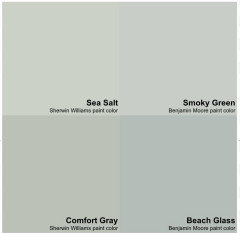
    If you love Comfort Gray the lighter version is Sea Salt.


    I love Comfort Gray and Sea Salt, but with my color palette I needed just a bit more blue.


    (Smoky Green is the same color as Quiet Moments - BM likes to have different names for the exact same color)


    I wanted the walls of the spare room to match the flooring of the foyer that you can see when you stand in the hallway between the two rooms.


    I tried Beach Glass first, but when the light shined through the window I got a baby blue wall and that bothered me, so I picked something with just a tad less less saturation and tad darker.


  • 2 years ago

    Annie- What manufacturer is that Itried looking for paint color aluminum foil and came up empty. I tried d2d9db and came to a technical page but no manufactuers?

  • 2 years ago

    I have absolutely no issues with lightening and darkening paint colors as long as you are using the same base and as long as the color doesn't include white colorant. The white colorant can throw things off and not enough colorant in a more transparent base causes coverage issues.


    Another method I have often employed is buying a sample of the color I like but find too dark and having a sample can of just white base.


    I use a medicine syringe and mix my own color and paint several sheets with the colors.

    I like to use watercolor paper for my swatches. Doesn't warp and relatively inexpensive (30 sheets for <$14.)

    https://www.amazon.com/gp/product/B004M59O4C/ref=ppx_yo_dt_b_search_asin_image?ie=UTF8&th=1


    I generally create the swatches using:


    4 cc color

    3 cc color 1 cc white

    2 cc color 2 cc white

    1 cc color 3 cc white


    Then I take the one I like best and have the store color match the sample.


  • 2 years ago

    Back to the original question, there are some websites that provide good color matching and color comparison tools.


    To find the best match in SW for Benjamin Moore Mineral Ice I would use Easy RGB

    https://www.easyrgb.com/en/compare.php#inputFORM


    The triangle with the E is the Delta E value - how different are the two colors.


    Icicle is almost identical with a difference of 0.3

    Anything under 1 is hard for someone to identify as a differnt color unless they are right beside each other.


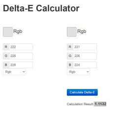
    Using a delta e calculator I checked Mineral Ice and Quick Silver rgb values - the difference is 1.11

    https://colormine.org/delta-e-calculator


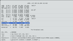
    In the Easy RGB site you can also get the LCH (Light Chroma Hue) values for the colors.

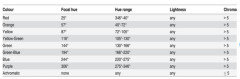
    Light - how light or dark the color is

    Chroma - how gray vs saturated the color is

    Hue - where the color lands on the color wheel


    Right click on the color on the page shown above and you get this screen (I highlighted where you find LCH).


    The LCH for Mineral Ice is

    L=87.9 C=1.4 H=220


    The LCH for Icicle is

    L=88.0 C=1.6 H=211


    The LCH for QuickSilver is

    L=89.9 C=2.2 H=173


    they are approximately the same level of light - no one will notice 1 or 2 points difference.

    Chroma - is a bit more pronounced. 1 point can feel more colorful when we are working with numbers under 10 Once you get over 10 you are working with color vs neutral and a small change in chroma is less impactful.

    These three colors are all within the Green Blue Hue range, but will feel more blue because we interpret gray as blue and these are very close to gray.


    Quicksilver is much closer to green and has more chroma, making it feel more green, less gray than Mineral Ice which is grayer and is much closer to blue.


    salonva thanked Jennifer Hogan
  • 2 years ago

    Looking at the coloretica site that lets you compare 2, 3 or 4 colors


    https://coloretica.com/compare-three-colors/benjamin-moore-mineral-ice-2132-70-vs-sherwin-williams-icicle-sw6238-vs-sherwin-williams-quicksilver-sw6245/


    gives us this information on the three blue gray colors we looked at below


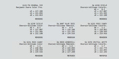
    RGB Values are not the same for each paint color on each website:


    coloretica RGB values

    Mineral Ice 220,223,223

    Icicle 218,223,224

    Quicksilver 220,225,224


    EasyRGB RGB values

    Mineral Ice 217,221,222

    Icicle 217,222,222

    Quicksilver 222,227,226


    BM Website Mineral Ice web part source code shows Hex Code DDE1E1

    Mineral Ice 221,225,225


    SW website Color Detail

    Icicle 219,223,224

    Quicksilver 221,226,224


    Makes it hard to provide color information confidently when two colors are very close.

    I have my own spreadsheets that scraped the colors from the BM Website and SW Website, but I am planning a retirement business helping people pick colors.


    For a single home I wouldn't go to that much trouble.


    salonva thanked Jennifer Hogan
  • 2 years ago

    wondering if anyone is sorry I found this post

    salonva thanked Jennifer Hogan
  • 2 years ago

    salonva, it lists it on the attached photo: PIttsburgh Paints or Glidden both call it Tinsel. But any of the paint companies have the formula for other paint companies so anyone should be able to mix it for you.

    salonva thanked Annie Deighnaugh
  • 2 years ago

    Jennifer - I think that what you are posting is really interesting. I have zero eye for colour and I hire people to pick paint colours for me.

    salonva thanked blfenton
  • 2 years ago

    Jennifer's right because I learned the hard way. Before I painted all but one room I ordered an 8x10 sample of paint for each and for held it up in different parts of the room with different lighting. Makes a big difference.

    I have no idea which room the paint is for, but both are cool colors. Is that what you want? I was drawn to warm before I even knew there was a difference. Warm colors make me feel safe, even though I was never in harm. lol

    salonva thanked Oakley
  • 2 years ago

    Following

  • 2 years ago

    Jennifer, I absolutely appreciate your input. It's often overwhelming to me but I do get something from what you've shared. For the record with my SW deck I did like Icicle.

    Oakley, I do like warm colors but blue is my BFF color. I am not a gray fan but I like grayed blues. For my bathroom I am looking for a less intense color.

    Re Sea Salt, yup that is what I chose for my powder room and I do like it. For my bathroom though I think I want less intensity.

  • PRO
    2 years ago
    last modified: 2 years ago

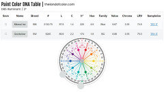
    In the same color space used to make and manage paint colors by every manufacturer (because it's a color space that models color appearance perceived by normal human eyeballs) they're a good distance away from each other.

    Mineral Ice and Quicksilver factually and actually aren't that close - they are markedly different colors. Same Chroma but different hue families and Mineral Ice is darker.

    Factually in terms of their objective LCH/HVC notations.

    Actually in terms of when you look at 'em, they're noticeably different.


    salonva thanked Lori A. Sawaya
  • 2 years ago

    Wait...am I reading things right? Someone actually named a paint color ALUMINUM FOIL!?!? ROFLMAO!!!

    salonva thanked porkchop_z5b_MI
  • 2 years ago

    I wonder if it shows best in a high-gloss finish. JK

    salonva thanked blfenton
  • 2 years ago

    I picked a color for a bathroom at our old house by sitting down in the Sherwin Williams store with twelve color strips of white to beige to tan with pencil and paper, ranking their different values numerically. i found three colors I liked, got three samples and chose the only one that looked great in the room. That process took about two hours in the store but was a LOT easier than taking two or three sample pots home at a time, then going back to the store for different ones but not quite knowing why they weren’t working. With the bathroom I knew the undertones I wanted to avoid and that helped tremendously.

    salonva thanked Kswl
  • 2 years ago
    last modified: 2 years ago

    If it's a grayed blue you want, my favorite is Ben Moore


    But if that's too dark, they suggest the lighter shade Silver Cloud


    salonva thanked Annie Deighnaugh
  • 2 years ago

    You are all so helpful.

    I feel like the princess and the pea or Goldilocks.


  • 2 years ago

    @salonva , are you familiar with the concept of a whole home color palette?


    I think that one of the reasons I fell in love with my home was the purple, red and green slate entry. I have always loved purple, red and teal. Most of my art has various shades of purple, red and teal. Most of my clothing is purple, red and blue greens/teals, summer clothing includes some lime, coral, fuchsia and brighter teals.


    I picked a neutral that complements the slate floor, the pink brick wall and all the art and décor that I own that are purple, red and teal. I picked a white that works well with my neutral and I am picking wall colors for bedrooms, bathrooms, kitchen, dining room . . . that are various shades of the purple, red and green found in the slate flooring.


    I often get inspiration when helping others from a piece of art or bedding or clothing that they love.


    For most homes the color palette ends up being 3 main colors plus the neutral and white. I may end up with some colors being used in lighter and darker shades of the same color.


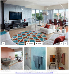
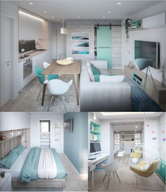
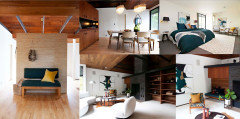
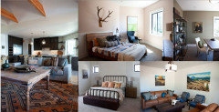
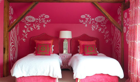
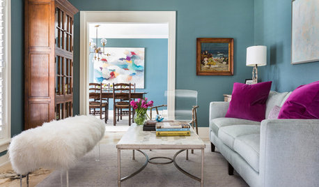
    One of my favorite examples is how this designer went from teal living room to a purple bedroom by using both colors in the dining room.


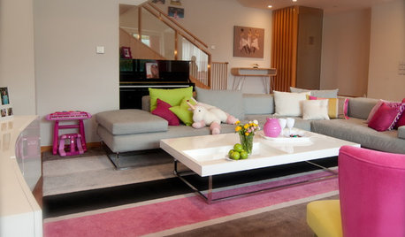
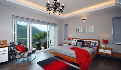
    Here are a few other examples. The last two were not shared as examples of a whole home color palatte, but I put together because they do show how the same colors are used in various amounts in different rooms, but make everything feel cohesive.


    salonva thanked Jennifer Hogan