Software
Houzz Logo Print
fmistretta

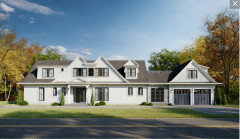
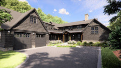
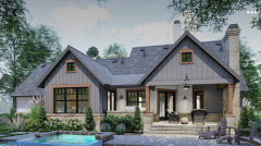
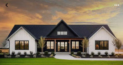
Which Color Theme do you prefer? A or B?

2 years ago
last modified: 2 years ago
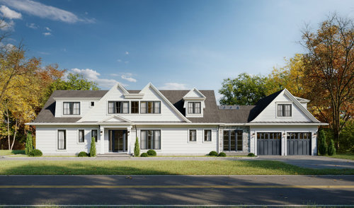
Windows are charcoal but what siding and color theme do you prefer? A or B?

A - White or offwhite with T&G 1x8 or 1x10 siding OR

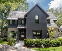
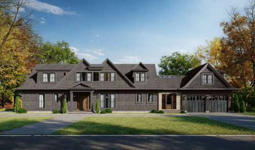
B - Dark charcoal or dark taupe/olive cedar shingles?

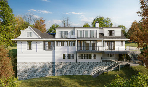
Backside of the house is on a river in Connecticut - see rendering for option A.

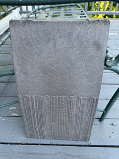
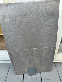
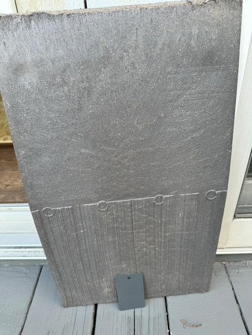
And here is roof and the window color together (window is Graphite color by Loewen) ---roof is Silvered Cedar by Enviroshake out of Canada; windows and roof already purchased.

I would appreciate any specific paint colors recommendations -- even a white or off white you think would be a good fit (in BM, SW or PPG) for painting the siding and trim. Or even an example photo or two.

I think siding and trim should be the same color to make it more modern/streamlined and less traditional. Client says she prefers tongue and groove siding (in the white rendering) vs shingles (in the charcoal rendering) as she doesn’t want it to look too cottage-y but T&G siding OR pre-stained shingles is still an option. She wants house to “pop” be prominent and not recede.

I must say that I am concered about the white house with black windows being already passe (these are charcoal windows) --seems like all spec homes in this town in last 5 years has this color theme -- and this is not supposed to be a farmouse-style! Opinions very appreciated!


Comments (47)

  • 2 years ago

    I don't see any images.

  • 2 years ago

    uploaded now

  • 2 years ago

    For me a darker vetsion is more striking. I might keep the siding slightly lighter than the roof.

  • 2 years ago

    Both look good. I think I like the darker version better.


  • PRO
    2 years ago

    I like white/off-white.

  • 2 years ago

    A…unless you want a more rustic country ranch look…the white is so beautiful!

  • 2 years ago

    Definitely A for me. Just gives the house more ”life.”

  • 2 years ago

    A - Crisp, works well with stonework in the back.

    Beautiful home!

  • 2 years ago
    last modified: 2 years ago
    I don't think I have ever seen conjoined gables. It kind of gives me the chills. Blame Rorschach and the ink blots.


    I like opton A.

  • PRO
    2 years ago
    last modified: 2 years ago
    What will the stone be if you select the dark color scheme?

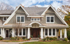
    Love the stain color on this shingle-style home. Lots of depth to that color.


  • PRO
    2 years ago

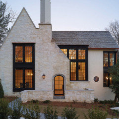
    Before deciding on a color, I'd rethink the architecture.


    Use white windows with a light, but not white body.


    Where is RES when he is needed?


    fmistretta thanked PPF.
  • 2 years ago

    the darker version


  • 2 years ago

    A

  • 2 years ago

    A.

    B - looks spooky.

  • 2 years ago

    A.

  • 2 years ago

    A.

    B gives me prison camp vibes.


  • 2 years ago
    last modified: 2 years ago
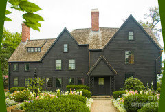
    This is interesting. I wonder if where you live/grew up in the U.S. has a bit to do with your preference. To me, the dark house is way too dark, even unwelcoming, and even though it's a lovely design it fades into the background of trees but I live in Florida. Those of you who live in more northern areas might find it a very comforting choice. It reminds me of the real "House of Seven Gables" in Salem, Massachusetts (photo below) so this is a welcome color scheme for a home in that part of the country.


    I actually like PPF's suggestion but changing out the windows is probably not in consideration. Could you keep the trim/fascia white and change the house color to a gray or taupe like shown in PPF's photo? Perhaps a tone to tie in with the stone foundation seen in the back elevation. I think the dark windows would enhance the facade.

    It's an amazingly beautiful house!

  • 2 years ago

    Strong preference for B. Having the roof and siding a similar color works better for this house. The darker color also hides the McDonald's / eyebrow shape of the double M windows in the front. I think dark is a warm and welcoming color.

  • 2 years ago
    last modified: 2 years ago

    Definitely B with a WHOLE LOT of colorful landscaping added.

  • 2 years ago

    Maybe it's a regional thing, liking lighter colors in a hot climate to reflect the heat but I like the white. Dark trim can be ok but that magpie modern farmhouse look of stark white and black is too trendy now. Coordinate a light tone with the stone. A pearly light blue grey would work with those grey stones.

    fmistretta thanked kathleen MK
  • PRO
    2 years ago
    last modified: 2 years ago

    I am in the rethink group this is a convouluted design and honestly not good.

  • 2 years ago

    I 100% agree that black windows with a stark white house is passe now, but the client purchased the charcoal windows 18 months ago to avoid a huge window price hike (when she THOUGHT she wanted the dark charcoal house), but that trend has also passed too....now we need to work with a color that compliments the charcoal windows. :-( In this area of high-priced Connecticut homes, white is always 1st choice for house color. Also since it is only 1-1/2 stories in the front, I didn't want to go with a color that receeds--I want the house to have as much presence from the street/looks as tall as possible. I've always thought that light-medium greys, blue-greys, cedar wood tones, tans, beiges are really boring (neither here nor there) --- and I definitely think trim color should match house color - a much more transitional / modern/ clean look --- so given all this what do y'all think we should do? What color?

  • 2 years ago

    Also we have flexibility on thin stone color; I'd rather pick the house color then the foundation stone color.

  • 2 years ago

    @jayapple21, good example. I used to live in MA and always found The House of Seven Gables to be too dark and slightly creepy looking.

    I vote for neither color. There are so many colors between white and dark brown that would look beautiful and unique on this house.

  • 2 years ago
    last modified: 2 years ago

    The issues is the charcoal windows ... your client has definitely placed themselves in a "design corner" with less options.

    BM Nantucket Gray is a great exterior color, but not sure about pairing it with charcoal, so you would have to test at the site.

  • 2 years ago

    Can the roof color be changed or was that ordered already?

    fmistretta thanked chispa
  • 2 years ago

    Black window frames have been around since the 19th century it is a classic look..maybe pair it with a greige grey or light tan..so beautiful…I also love the the white!

    fmistretta thanked Home Interiors With Ease
  • 2 years ago

    The roof was ordered already too! it’s this roof color….similar color to the windows. Silvered cedar by Enviroshake

  • 2 years ago
    last modified: 2 years ago

    All, here is the roof and the window color together (window is Graphite color by Loewen) and roof is Silvered Cedar by Enviroshake out of Canada. I would appreciate any specific paint colors -- even a white or off white you think would be a good fit (in BM, SW or PPG) for painting the siding and trim. I think siding and trim should be the same color to make it more modern/streamlined and less traditional. Client says she prefers tongue and groove siding (in the white rendering) vs shingles (in the charcoal rendering) as she doesn’t want it to look too cottage-y but T&G siding OR pre-stained shingles is still an option. She wants house to “pop” be prominent and not recede. Opinions very appreciated!


  • 2 years ago
    last modified: 2 years ago

    With that roof color and window color your choices are quite limited, for me it would be either white for contrast OR a similar paint color that complements roof and windows for a monochromatic look.


    For whites I would start with these:


    BM Classic Gray

    Bridle Path · More Info


    SW Drift of Mist

    Maple Avenue · More Info


    SW Snowbound

    Edloe · More Info


    SW Moderne White

    Modern Farmhouse Color Blocking · More Info


    Also test SW Pure White.

  • 2 years ago

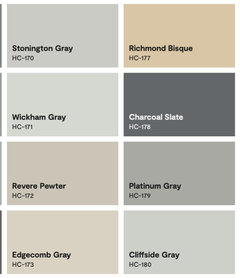
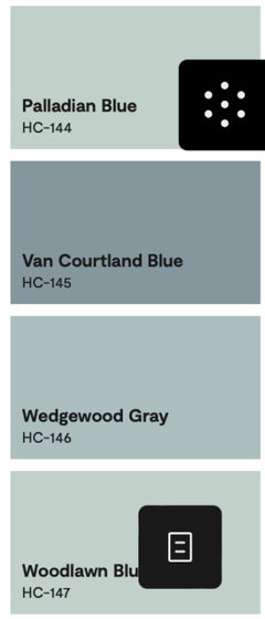
    These are BM colors Historical colors which might be very appropriate for Connecticut. The Charcoal Slate is similar to the new roof tiles and window frames. Perhaps the lightest colors on these charts in the gray and blue tones (like Wickham Gray, Edgecomb Gray or Woodlawn Blue) would appeal to your homeowner depending upon how they work with the roof and tile colors. I'd actually like some white trim as shown in the background between the colors on these charts but that's a personal choice.


  • 2 years ago

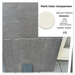
    A sophisticated neutral or Alabaster White


    fmistretta thanked Home Interiors With Ease
  • 2 years ago
    last modified: 2 years ago

    I think the darker version is more in keeping with the Shingle Style /Arts and Crafts roofline on the front, but either is nice.

    fmistretta thanked palimpsest
  • 2 years ago

    The dark looks like it should be operating as a woodsy retreat. The light looks like a striking house, unibrow or not.;)

    fmistretta thanked acm
  • 2 years ago

    A

    fmistretta thanked Emily
  • 2 years ago

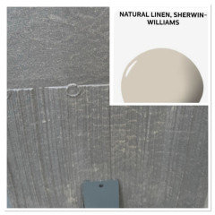
    I like A, perhaps consider SW Snowbound and Shoji White.

    fmistretta thanked bearbev
  • 2 years ago

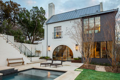
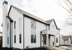
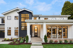
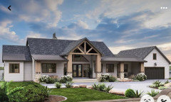
    If it’s in Connecticut, white wins. Can you add some wood elements to warm up the facade? Wood columns, a wood garage and a wood front door might do the trick. Some ideas.
    Each of these houses are more interesting with wood and more than just white.

  • 2 years ago

    Adding some black?

  • PRO
    2 years ago

    I like the darker one better. It stands out very well against the general background. If I had to choose, I would choose it.

  • 2 years ago

    Neither. Never ever like black and white. Sooo BORING. I have not been able to embrace the darkening of our neighborhoods that is so popular. I like color in my world.

  • PRO
    2 years ago

    Since you're stuck with the dark windows, the dark siding is much nicer looking.

    I absolutely despise the white house/black window look. It's all over my area of Long Island, NY too.

  • 2 years ago

    Diana, aaagh….I know, I agree I really hate the white house black windows overused trend…. But in this setting, and this house I dont see very dark charcoal which is another ”Dwell” trend that is waning again, and dark colors make an already short 1 1/2 story house in the front,, look smaller which is not desired

  • PRO
    2 years ago

    I prefer the white color scheme.

  • 2 years ago
    last modified: 2 years ago

    Neither. To avoid a farmhouse look or a somber feel, perhaps an ivory or cream, with muted stones on breezway and garage, could work in creating a house that might feel less stark than the two choices.


  • PRO
    2 years ago

    White is always classic.

Sponsored
Hope Restoration & General Contracting
Average rating: 4.7 out of 5 stars35 Reviews
Columbus Design-Build, Kitchen & Bath Remodeling, Historic Renovations