Software
Houzz Logo Print
sheila

Should I paint these walls a dark color to show off the landscaping?

2 years ago
last modified: 2 years ago

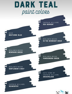
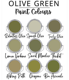
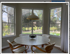
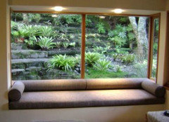
I am thinking of painting these walls a dark teal or olive to make the backyard more of a focal point. The shades and curtains need to stay white because they are new and replacement would be too expensive. I would welcome any thoughts about painting details, specific colors to test, etc. The windows face west, but don't get bright afternoon sun due to lots of trees.

Comments (74)

  • PRO
    2 years ago

    If you are trying to spend Money putting in taller (lower) casement windows in the bay would look great. I think your white trim is fine.

    Sheila Rowan thanked HALLETT & Co.
  • 2 years ago

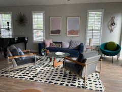
    HALLETT & Co. I don't have to try to spend money, it just comes naturally. But I like your idea of taller windows, especially since I never open them, they could each be a single pane of glass (getting rid of the line across the middle). It will depend on the $ whether I do it. The living room has mainly pink and blue accents, thus I will try to add some pink and blue in the garden to tie them together. I'm in zone 9b, so I'm thinking plumbago and hibiscus; any suggestions about this would be appreciated.

    o09np

  • PRO
    2 years ago

    It was Jan who pointed it out and now I can’t unsee it, the double hung windows are just clunky looking in the bay.

    Sheila Rowan thanked HALLETT & Co.
  • PRO
    2 years ago
    last modified: 2 years ago

    It's Florida...... and hurricane proof means a bit more Kaching. I don't think the baseboards are an issue, ( paint ) seeing sky definitely helps!

    A pool without a Lanai enclosure is foolhardy in Florida. No doubt the screen dims /diffuses the clarity and brightness of an exposure. Is what it is: )

    Sheila Rowan thanked JAN MOYER
  • 2 years ago

    HALLETT & Co. Now I can't unsee single pane windows for my breakfast room - just hope the price won't be too sky high. JAN MOYER I can think of two approaches to the screen room: 1. Put bright colored flowers inside it at the periphery to stop the eye there or 2. keep it very clean and monotone and put bright flowers outside to draw the eye through it to the long view (not sure if this would work because the land slopes down too abruptly).

  • last year
    last modified: last year
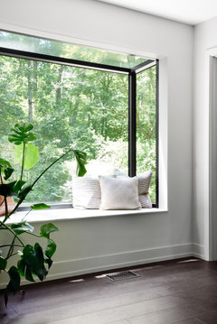
    SW Retreat is neither a dark teal or olive.


    https://plan-home.com/color/retreat-sw-6207


    My feeling, given your comment around not getting a lot of afternoon sun due to the trees, could be risking a cave like feel given the large open concept and may just distract vs enhancing. Actually the first place my eyes went to in your pictures was outside. Other suggestions you received are better options.

    Sheila Rowan thanked Maureen
  • PRO
    last year

    The screen room just needs lusher landscaping Inside and out. It will recede when it’s not the view.

    Sheila Rowan thanked HALLETT & Co.
  • PRO
    last year
    last modified: last year
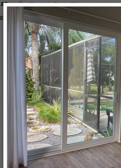
    Aurrrggggh... You know what I wish?

    The ANGLED bay to never ever have existed. It is virtually pointless, was decades ago and still is. Corner beads....DRYWALL...trim

    It could have been a slider with fixed casement TALL.


    It splits the windows, adds trim and drywall. It disrupts.

    It is just as EAST to square the damn thing off. Spare the clipped corners!

    As to landscape decor out side? FURTHER from the windows

    Take your eye OUT TO THE TREE LINE: ) think bigger and more impact, versus pots/pots . Or mass the pots and the color.

    Sheila Rowan thanked JAN MOYER
  • PRO
    last year

    I'm going to disagree about light colors inside. Light colors advance, dark colors recede. If you want to emphasize the landscaping, I think dark colors would be better. Light colors stop your eye, but a dark green blends into the landscape. We did that outside by using a dark green color for our fence. It makes the backyard seem so much bigger than a white fence. JMHO.

    Sheila Rowan thanked Diana Bier Interiors, LLC
  • last year

    Beautiful views already; I don’t see the issue...


    You could paint the walls darker. That could possibly work.


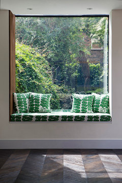
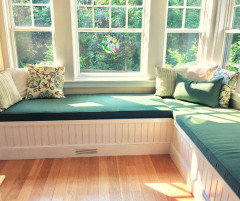
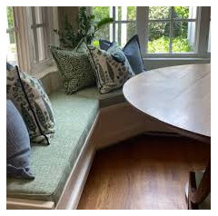
    Or you could take advantage of the charm of the bay. imo, it could use a window seat. You can bring the color in on the seat/ connecting indoors/outdoors. And or maybe paint the trim.


    Or - as suggested above - you could get a bulldozer. :)

    Sheila Rowan thanked freedomplace1
  • last year
    last modified: last year
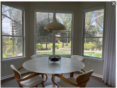
    Thanks everyone, so many good ideas! I think I will get an estimate to replace the breakfast nook windows with single pane glass and more streamlined windowsills. This house was built during the Tuscan trend, so it has literally dozens of "features" that I would like to change, and I don't want to spend all my money on just the bulldozer option. While I'm waiting for the estimate, I can paint the breakfast room deep green, maybe the Rock Bottom color that julaney showed in her post. I will post a pic when it's done. It's a small room, so it would be easy to return to its original color if the deep green doesn't improve it.

  • last year
    last modified: last year
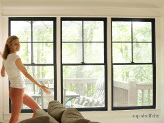
    Still thinking ideas and to also try....

    Paint all the windows and sliders in a soft green for the trim. It's a trending look that might work to draw the eye to all the glass and view. Unify the whole wrap around window wall and other elements like the Plantation shutter windows..

    Bring in green decor and fabrics as suggested. Some tall indoor plants.

    Sheila Rowan thanked tracefloyd
  • last year
    last modified: last year
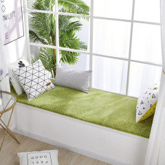
    tracefloyd, I do like the color combo you suggested, but the window frames and slider are vinyl, so they would be difficult to paint. Maybe the way to unify everything would be to paint it all white, as rockybird suggested?

  • PRO
    last year

    You can't paint your way into bigger, taller, closer to ground windows.

    Get the window guy first. You're ahead of yourself. I'd paint NOTHING yet.

    Sheila Rowan thanked JAN MOYER
  • last year

    I still like a botanical wallpaper for the bay.

    You have a wall of glass...slightly larger windows in the breakfast nook seems moot. I'm not a pro but will it improve the space that signifigantly for a few more inces of glass there?

    Instead of changing the bay windows, I like the casement idea for over the slider...that would have a huge impact to have an upper window.

    Sheila Rowan thanked tracefloyd
  • PRO
    last year

    Sorry, this isn’t a house that has trim as a feature. The windows only have sills and all the rest of the trim is minimal. Fun trim colors work great on houses that have real decorative trim, which is not this house. I agree with Jan the current trim and wall color is not the problem.

    Sheila Rowan thanked HALLETT & Co.
  • PRO
    last year
    last modified: last year
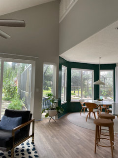
    I see the ground. I see the earth'

    lalalalla Come out, come out, whatever you're doing! : )


    Now...............why is 3/4 of my pool lopped off as I sit here? Mmmmmm?


    There ya go

    Sheila Rowan thanked JAN MOYER
  • last year

    OP, just do a Google search for windows with dark trim, colored trim, etc. You could narrow it down to ”thin trimmed” windows, if you like - although your window and door trim is really not overly minimalistic.


    Also do searches for rooms that are adjacent to outdoor spaces with walls done in colors you are considering.


    There are really no ”problems“ in your current spaces, imo. You have beautiful views, and they are very evident. There are mimimally invasive things you can do to enhance, if you choose to.

    Sheila Rowan thanked freedomplace1
  • last year
    last modified: last year
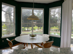
    I just read some of the other comments. I see you mention the windows are vinyl and not as feasible to paint the trim. Yes, you can paint it all white if you like, as @rockybird suggested. That would take away any wall color distraction.


    Definitely try that.


    Just to note: There are many people who actually like bay windows and they are considered to be a property asset. Also, not everyone wants to be in their kitchen/breakfast room and sitting right on top of their swimming pool.


    ETA:

    https://bellbroshvac.com/blog/does-a-bay-window-add-value-to-a-home-the-advantages-and-disadvantages/#:~:text=Bay%20windows%20add%20value%20to,are%20energy%20efficient%20and%20affordable.

    Sheila Rowan thanked freedomplace1
  • last year

    So here is the breakfast nook with a first coat of Behr's Rainforest. Yea or nay? It will cost about $3000 to replace the windows with three single panes of glass (getting rid of the cross in the center window and the horizontal lines in the two side windows) . I'm still waiting on an estimate to put a window above the sliding door in the LR.


  • PRO
    last year
    last modified: last year
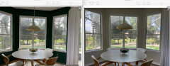
    I'm a side by side sort

    The breakfast bump look larger ( no surprise, deep colors do that as the walls recede.......

    Pool water looks cleaner

    If you're happy ? You're happy!?


    this might make me nuts.....but I loathe "accent" walls. I might go all the way , but can't see the WHOLE space in one shot. Sort of has no ending point,vault meets wall...meet........


    Sheila Rowan thanked JAN MOYER
  • last year
    last modified: last year
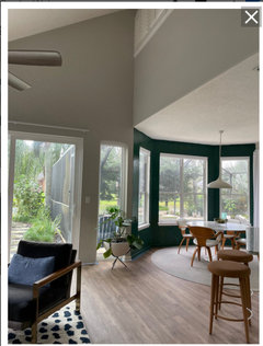
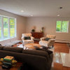
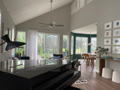
    JAN MOYER here is the whole space. I could paint the entire breakfast room, so then it wouldn't be an accent wall. But I'm thinking I'd like to paint the rear LR wall (with the triangle) as well. The LR wall on the far left faces south, so it could even be green also. I'm waiting to see how things look after dark...


  • last year
    last modified: last year
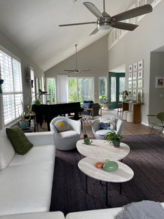
    This space is much, much bigger than you've let on. With these new pics, I'm not so sure about the accent wall for the bay windows now. Or any accent wall.

    Sheila Rowan thanked tracefloyd
  • last year

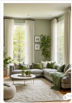
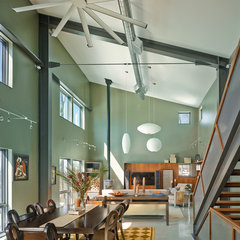
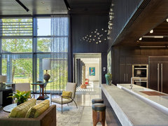
    You have buckets of light pouring into your lovely home. Could you paint it all that beautiful green color? Be brave you have the right instinct.


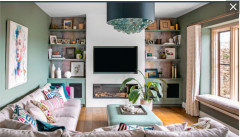
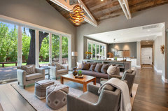
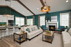
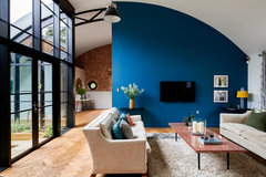
    like this

    Autumn Hill Lane · More Info


    Contemporary Virginia Beach Home | Lantern on Linkhorn Bay · More Info


    Alamo, CA. Farmhouse. Full Service Design Firm. Open concept living and dining r · More Info


    2019 Parade of Homes · More Info


    maybe an accent wall could work... I just think you could do all walls a fun color


    Domingo Road Great Room Project · More Info


    Frillinghurst Mill · More Info


    Sheila Rowan thanked Boxerpal
  • last year
    last modified: last year
    I love the green in Autumn Hill Lane^^. All the walls as shown.

    Sheila Rowan thanked tracefloyd
  • last year
    last modified: last year

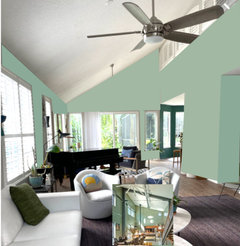
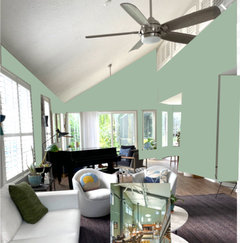
    Quick mockup using color select on the Autumn Hill photo for the paint. Keep the bay windows the current green. I love it.


    Sheila Rowan thanked tracefloyd
  • last year

    tracefloyd, I like that color, it's the same as my kitchen backsplash. And the Rainforest green looks nice at night, it's lively compared to the light walls I have now, they look drab by comparison.

  • last year

    Oh I am so excited about this green. I can't wait to see it all done.

    : )

    Sheila Rowan thanked Boxerpal
  • last year

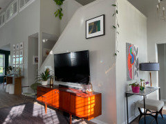
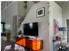
    I'm really liking the Rainforest color with tracefloyd's lighter green. This tv and entry wall is across from the cream sofa in my LR; should I paint it Rainforest to help hide the tv?


  • PRO
    last year

    Look, I am DEFINITELY the wrong person to ask . Why? well, it isn't because I don't like" fun" or pizzzzzazzz..

    What I loathe is disjointed things, overwrought concepts. You have angles, changes in ceiling heights. No casings and no ending points. You will chop up, that which is already choppy.

    Pick a wall color that can go everywhere. Get bigger windows if you like. Use rugs, and art, even the lowly accent pillow to pull in the outdoors.

    But painting Two, three, four whatever colors, in a space like this? Nope.... sorry.

    Accent walls have a place....once in a very blue moon. Usually? They scream amateur. There. I said it lol Mea Culpa included: )

    Less....... can be a LOT more.

    Sheila Rowan thanked JAN MOYER
  • last year
    last modified: last year
    More and more of this space is revealed....Wow. And now a TV mounted on a big angled box! This new view of the room makes a big difference. Again.

    Everything would look more polished without accent walls. Okay no accent walls. I agree there is too much going on and one color will tie all the shapes together. So many shapes and angles.

    What other surprises await us as more photos are dropped one by one?


    Sheila Rowan thanked tracefloyd
  • PRO
    last year

    We have here the problem of a design dilemma originally posted with just a smidge of the entire space revealed. On seeing the big picture, I would agree that an accent wall just around the bay window would be a mistake. I also would not recommend the mint green color; it does nothing for the space. A soft white would be a good choice considering everything else going on. I'd paint the whole space BM White Dove.

    Sheila Rowan thanked Diana Bier Interiors, LLC
  • last year

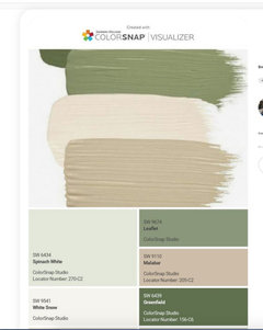
    Sorry, everyone, I didn't intend to trick people with a gradual reveal of my house, I was just focused on the view out the back windows. But if I repaint the whole thing, I'd like to add at least a little color; Diana Bier, I worry that White Dove wouldn't have enough contrast with the curtains/shades that need to remain white, and since the shutters area a little more yellow than the curtains, it would be impossible to match everything. Maybe a very pale green or pale aqua? Or if a neutral is better, how about SW Oatmilk? Tracefloyd, thank you for the great mockups, and no, I don't think there are any more surprises to come!

  • PRO
    last year
    last modified: last year
    What I see is a boho gal. ? I am all for color - in this case? NOT on the walls.

    The boho gal saves every plant indoors, not meriting a save. She trails vines.....wants a "thing" on every wall.

    That gal may be KEEPING her eye from the thing she wants which is to send it outside, To let the outside in....

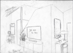
    Go to black and white for a moment,,,,,,,and look at what I REMOVED........I purposely added no color: )

    An indoor plant? Must look like one that is thriving. .....and sad to say, they look best in VERY limited number, or the space begins to resemble a teen girl dorm, ( sorry ) or you will get a lot of the hippy dippy . Fine if you LOVE , but it will stop your eye cold.

    Basically? Take as much "choppy, busy, visual clutter, AS YOU CAN

    from inside.


    SOME GONZO..... ? scroll back and forth


    What's my answer?

    Not what you want or expect.

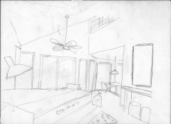
    Paint all the walls and trim the SAME WHITE. Vary only the sheen between wall and trim. It isn't deserving of the highlight.

    Get your COLOR in art.....in even a rug. Think bolder art, and framed, bigger, and fewer small pieces.

    Put a lush tropical view on t he smart tv

    Add more TEXTURE that feels tropical. Maybe change that fan ?

    I adjusted those windows, and the round dining table needs no rug beneath it.

    Sheila Rowan thanked JAN MOYER
  • last year
    No worries...It happens a LOT.

    If your shutters have a yellow undertone, don't go green. Green and cream is going bye-bye decor-wise.

    Something to go with the shutters. Do you recall who the maker is and what the color is called for the shutters? Paint companies make it easier to coordinate.

    With your shutters, go for creamy walls --and a bright white ceiling will tie in your white drapes, too.


    Sheila Rowan thanked tracefloyd
  • PRO
    last year
    "Green and cream is going bye-bye decor-wise." Whaaaatttt? Who makes these "rules"??????

    Sheila Rowan thanked Diana Bier Interiors, LLC
  • last year

    JAN MOYER you are right again. I admit it, my style used to be more boho and I have been evolving to a more modern, streamlined style (but still have a way to go). Your great little sketches make that abundantly clear. Tracefloyd, I got a sample of White Dove, and it is a little more yellow than my shutters, which are old and have no identifying label, so I think I could use it on all the surfaces. And thank you Diana Bier, I love my green and cream kitchen countertops. Tomorrow I will be repainting the dining nook and starting to get quotes on painting the LR.

  • PRO
    last year
    last modified: last year
    Every now and then, one interior designer will call on another, and the response is often something like this:

    WTH!!! are ya' calling me for, you're a DESIGNER!! Or have I lost my mind?

    Answer? True , but this is MY OWN kitchen, bedroom, whatever that may be and I am totally stuck!

    There's a reason for that. The longer you stare at the same thing, the harder it is to really see it. It becomes a never changing landscape. It's one of the reasons people get designers. Fresh eyes. ..Someone who hasn't been looking at that room, that house, for the last decade or more will see what the owner of that space doesn't, or no longer sees in the same manner as when it was newer. She may immediately notice the very obstacles in the path of exactly what you want..... or the vacuum that needs to be filled. ......or whatever the subtle je ne sais quoi ...blah blah may be: )

    Sheila Rowan thanked JAN MOYER
  • PRO
    last year
    Ps...... I think a scoop of vanilla ice cream alongside or atop the scoop pf peppermint chocolate chip? Jeesh.... looks perfectly great to ME LOL

    Sheila Rowan thanked JAN MOYER
  • last year
    last modified: last year
    Hah! Sounds delicious! I found the article from Homes & Gardens about Ivory (Magnolia) being dated but it doesn't mention green. II may have imagined that part because I have grown to dislike the combo.

    Yellow-toned ivories, especially on trim, moldings, and cabinets, can feel outdated,' explains Mary Jones, principal designer and founder of Arpieka.

    Instead of yellow whites that lean towards magnolia, fresher whites with more subtle warmth are the way forward for 2025, much like Sherwin-Williams' Pure White which was used in this bedroom.

    'If it’s been a while since your last update, refreshing with more modern neutrals like Simply White by Benjamin Moore or Pure White by Sherwin Williams can make a big difference,' continues Mary. 'I like to match the wall color with trim for a cohesive, fresh look. Matte finishes are also trending for walls, though clients often prefer satin finishes for trim...

    https://www.homesandgardens.com/interior-design/colors-dating-your-home

    I don't like these ivory drapes with the green. It feels dated.


    Sheila Rowan thanked tracefloyd
  • PRO
    last year
    What's dated to me are comments by "designers" who are trying to sound important, but just wind up sounding ignorant. It's all about context, and designers who proclaim the newest trends without considering context are just full of themselves.

    Sheila Rowan thanked Diana Bier Interiors, LLC
  • last year

    Maybe this sounds goofy, and I am not a designer, but what about a very pale peachy pink for my neutral walls and ceiling? I think it would make the green outdoors really pop!

  • PRO
    last year

    There's a lot more wrong in that room than ivory curtain panels? Like it's just rather .....mmmmmm..... ugly?

    A thing is dated when YOU are no longer in love with it.

    ...what makes me crazy? The Instagram darling of the moment, followed courtesy of a barrage of weekly images of whatever! Do this or, LOOK what I did??

    You wonder why half the world looks like it was done by only two designers? My GAWD!

    AS TO GREEN? It's a color with a feeling, a mood. It depends the mood you want. Moody, woodsy, tropical, citrus fresh. It's also seasonal...wintry cozy, summery cool as a breeze.

    Do What You LIke. Your mood! It's no different magenta and baby blush and while both are pink? They are hardly the same.: )

    Call that my green blanket opinion...the what, why, where, how.....of any color.


    Sheila Rowan thanked JAN MOYER
  • PRO
    last year

    Opinion of one? Put a white on the walls......put the PINK, the GREEN in art, in pillows. Put the green on the floor! What color is grass and fauna???

    As I said....opinion of one. : )


    Sheila Rowan thanked JAN MOYER
  • PRO
    last year

    "A thing is dated when YOU are no longer in love with it."


    Jan, that's the best definition of dated I've ever seen. That needs to go in your book.

    Sheila Rowan thanked Diana Bier Interiors, LLC
  • last year
    last modified: last year

    A thing is dated when YOU are no longer in love with it.

    True dat, I am no longer in love with it. We had green walls and ivory trim up for so long I got tired of it.

  • last year
    last modified: last year

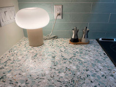
    I still love my green and ivory countertops, Emerald Coast by Vitrazzo.


  • last year
    last modified: last year

    I would never get tired of that green tile and countertop. Ever.

    Sheila Rowan thanked tracefloyd
  • last year

    The green paint in breakfast nook ties in with the kitchen. If you still like it, leave it. It highlights your landscaping; and you can absolutely use paint colors to delineate spaces.

    Sheila Rowan thanked freedomplace1
  • PRO
    last year

    Very cool, Sheila!

    Sheila Rowan thanked Diana Bier Interiors, LLC