Software
Houzz Logo Print
yz00

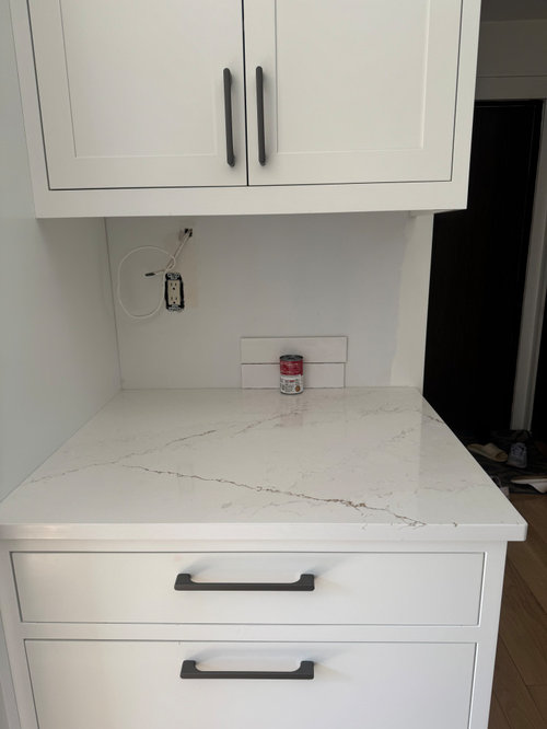
Trying to pick a backsplash tile out of two options

last year
last modified: last year
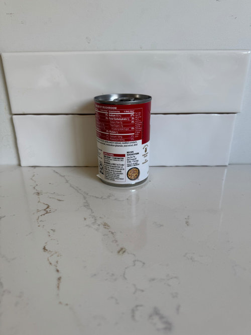
Hello, everyone,

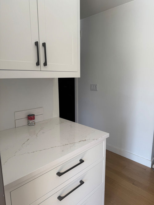
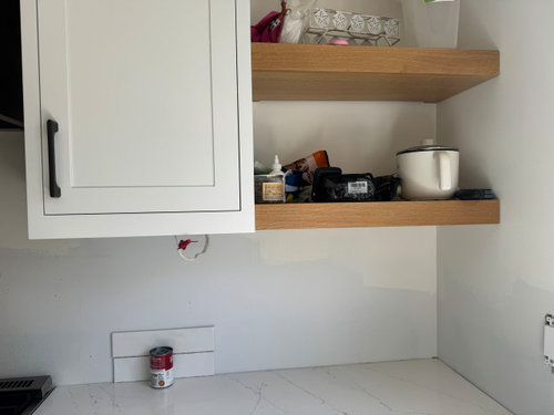
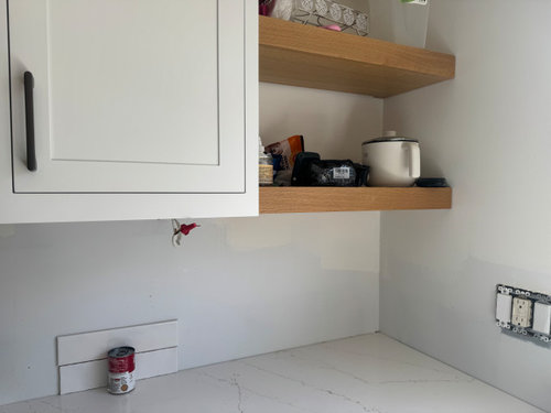
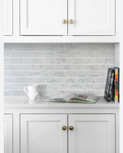
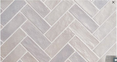
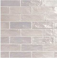
It has been a while for me trying to decide a backsplash color between two options. Really want to get some opinions here. The top tile is a little warmer than the bottom one which offers a closer look to the cabinet and countertop under most lighting. Under some circumstances, they look almost the same. The top one feels almost identical to the top cabinet color and close to the countertop also under some lighting. But it feels a little bit dingy sometime. The bottom one is a little bit too cold compared to the cabinet and countertop under some lighting. So, I am confused now how to pick between these two colors.

Should a backsplash tile color be as close as possible to the cabinet or countertop, or they should have enough difference?

Thank you for any input!


Comments (15)

  • PRO
    last year

    Hi there!

    Deciding between two very similar tiles can definitely be tricky, especially when lighting conditions make them appear slightly different throughout the day. Here are a few tips to help you pick:

    Consider Lighting & Mood

    • If your space gets a lot of natural light, a backsplash that’s exactly the same color as the cabinets can sometimes look “flat” or washed out. A subtle contrast (even if it’s just a half-shade cooler or warmer) often adds depth and visual interest.
    • Warmer tones tend to create a cozy, inviting vibe, while cooler tones can feel crisp and modern. Think about which atmosphere you want to emphasize.

    Check Samples in Different Lighting

    • It sounds like you’ve already noticed how the tiles change under various conditions. Keep both samples up for at least a full day through morning, afternoon, and evening lighting to see which tile consistently complements your cabinets and countertops.

    Aim for Harmony, Not Necessarily a Perfect Match

    • A backsplash shouldn’t blend in so much that everything looks monotone, but it also shouldn’t compete so strongly that it distracts from the overall design. If the top one feels “dingy” in certain lights, that may be a sign it’s too close to the cabinet color. On the other hand, if the bottom one seems “too cold,” you might lose some of the warmth you love about your cabinets/counters.
    • Generally, a slight contrast in tone or texture keeps the space visually interesting.

    Bring in Your Personal Style

    • If you want a very clean, continuous look, choosing a tile close to the cabinetry or countertop can achieve that. If you prefer a bit more dimension, opt for a tile that’s in the same family (warm or cool) but at least a shade lighter or darker.


    Ultimately, trust your gut and consider which tile makes you happiest in your space’s natural light. You won’t go wrong by choosing the one that feels slightly different in tone yet still coordinates with your cabinets and counters. Good luck with your decision!

    yz00 thanked ANH Design Studio: Custom Cabinets & Countertops
  • last year

    It would be helpful to see pics of your cabinets too. And, what does your floor and wall color look like?

    yz00 thanked Kendrah
  • last year

    @ANH Design Studio: Custom Cabinets & Countertops Thank you so much for all of the inputs. It is very helpful. I forgot to mention that our ceiling is only 8 feet. I do want to make the space simple, clean and look larger, also make ceiling look taller. But I do know normally a designer will like contrast between elements in a room. It seems they don't like things look so close to each other. I don't want everything feel so plain either. If this is your house, what do you want to pick?

  • last year

    Kendrah's comment above is correct - without seeing the cabinets/floors/walls - I don't know how anyone can really provide an opinion re: which of the two above tiles would work best. Maybe the answer will actually be - neither. It all depends upon the rest of the space.

    yz00 thanked dani_m08
  • last year

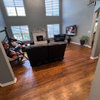
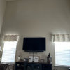
    @Kendrah @dani_m08 I updated the pictures showing the cabinets and wall. This is an opposite side of the kitchen to the first picture.

  • PRO
    last year

    If colors change in different light fix the lighting so it is close to daylight I like LED 4000K for kitchens for sure

    yz00 thanked Patricia Colwell Consulting
  • PRO
    last year

    @yz00 With 8-foot ceilings, I’d go for the warmer tile (the one that closely matches your cabinet and countertop). It will make the space feel unified and visually extend your cabinets upward, helping the kitchen appear larger and the ceiling seem taller. You can always add subtle contrast with decorative accents or hardware (like your black ones) so it’s not too plain. But overall, a close match in tone keeps things bright, cohesive, and timeless.

    Hope this helps! I’d love to see how it turns out.

    yz00 thanked ANH Design Studio: Custom Cabinets & Countertops
  • PRO
    last year

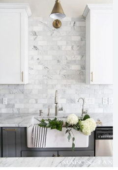
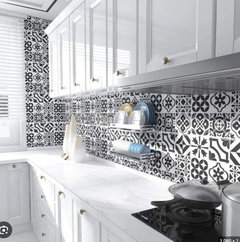
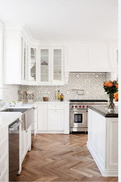
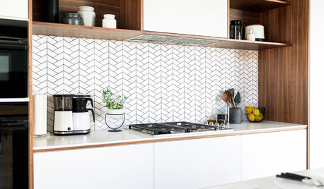
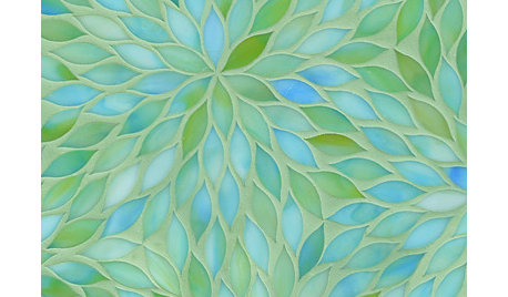
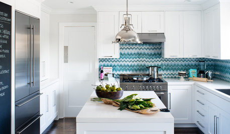
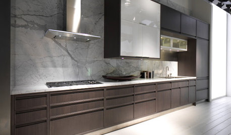
    Are the walls staying white? If so then neither. Way to plain for me - add a little something.


    It's a backsplash. Ne need to play it safe. Find something you love.

    yz00 thanked Debbi Washburn
  • last year

    @Debbi Washburn I understand what you are saying. I was considering another one which is called white, but it is a creamy white which adds a little bit color to it. But I was not sure with that one and tried to find an easier way to do by staying with the true white.


    Regarding the pictures you posted, I noticed one thing. Almost all of them have high ceilings which we don't have. Could that be a concern to add more color to the backsplash?

  • last year

    @Patricia Colwell Consulting I think we do have 4000k right now. But they still have two different feelings between day time and night. During night time, the bottom one is not as bright and cool as day time.

  • PRO
    last year

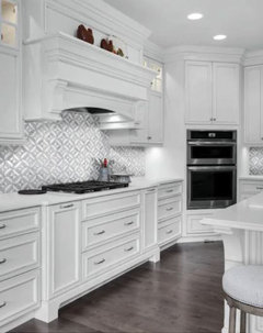
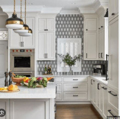
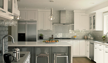
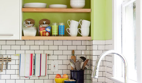
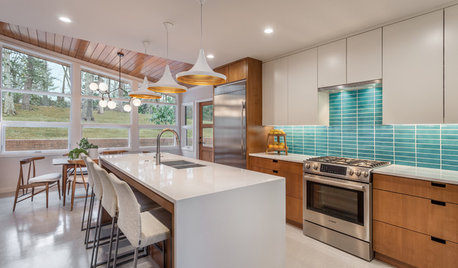
    The first 2 pictures I posted don't show the ceiling height at all. That wouldn't make a difference to me. You need to do what you love, but don't miss out on a great design element because you are "stuck" or cautious. Sometimes design is just a bit of nerve.

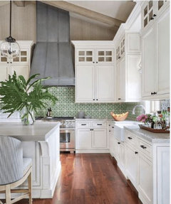
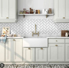
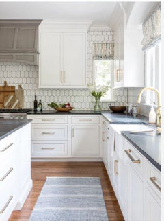
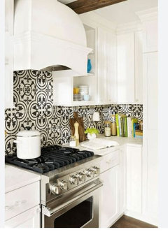
    Here are some more - these all look to be on 8 ft ceilings.


    You don't need to get a super bold pattern or bright color. Sometimes even just a white tile with a shape or a contrasting grout could work.

    I like a little more oomph! LOL

    yz00 thanked Debbi Washburn
  • last year
    yz00 thanked elcieg
  • last year

    I like the top choice too!
    I think matching the countertop is the right move.

    Do you want to do something with more color to it? Or do you want to stick with white…?

    yz00 thanked littlemissdena
  • last year

    Thanks for the added pics. I’d go with the top one. And I don’t find it boring or safe. There are plenty of aesthetically pleasing moments in your design - a touch of wood, bold hardware, and the wonderful look of inset cabimets with slender shaker doors and classy flat drawers. You need not make the backsplash the star of the show. Your kitchen is harmonious and pleasing already.

    yz00 thanked Kendrah