

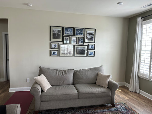
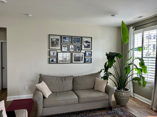
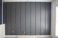
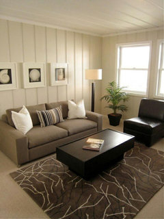
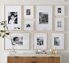
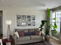
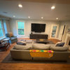
Living room wall design suggestion
last year
last modified: last year
Featured Answer
Sort by:Oldest
Comments (22)
Related Professionals
Valdosta Interior Designers & Decorators · Chillicothe Interior Designers & Decorators · Rockford Interior Designers & Decorators · Bangor Interior Designers & Decorators · Beaumont Architects & Building Designers · Fort Dodge Architects & Building Designers · Youngstown Architects & Building Designers · Providence Architects & Building Designers · Ontario Architects & Building Designers · El Dorado Kitchen & Bathroom Designers · Harrisonburg Kitchen & Bathroom Designers · Albert Lea Kitchen & Bathroom Designers · Erie Kitchen & Bathroom Designers · Denver Kitchen & Bathroom Designers · Twin Falls Kitchen & Bathroom Designers last yearlast modified: last year
- last year
- last year
- last year
- last year
 last yearlast modified: last year
- last year
- last year
- last year
- last year
- last year
- last year




Related Stories
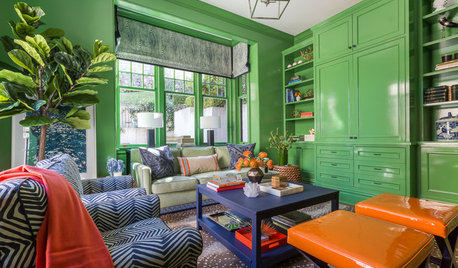
LIVING ROOMSRoom of the Day: Green Walls Raise the Energy in This Living Room
A vibrant paint color takes a pale yellow space to an upbeat place
Full Story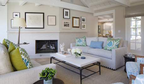
DECORATING GUIDESRoom of the Day: A Living Room Designed for Conversation
A calm color scheme and an open seating area create a welcoming space made for daily living and entertaining
Full Story
HOUZZ TV LIVETour a London Designer’s Living Room and Get Custom Storage Tips
In this video, designer Samantha Watkins McRae talks about the benefits of adding custom-designed cabinets to your home
Full Story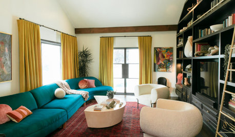
HOUZZ TV LIVETour a Designer’s Bold and Colorful Living Room and Guest Bath
In this video, an L.A. designer highlights the colors, materials and furnishings in her modern Spanish-style home
Full Story
HOUZZ TV LIVEPeek Inside a Designer’s Eclectic Dining Room and Powder Room
In this video, Jules Duffy talks about converting a garage into a dining space and creating a powder room ‘experience’
Full Story
DECORATING GUIDES13 Ways to Upsize a Small Living Room Without Moving a Wall
A design pro shows how to use light, colour, layers and focal points to make a compact room look and feel more expansive
Full Story
LIVING ROOMSSan Francisco Living Room Designed to Wow Guests
A designer renovates a traditional space with contemporary flair for homeowners who frequently host events
Full Story
TRENDING NOWDesign Ideas From Spring 2020’s Top Living Rooms
See how built-in firewood storage, accent walls and vaulted ceilings create inspiring spaces in the most popular photos
Full Story
MORE ROOMSDesigns for Living: Every Room Tells a Story
8 Rooms, 8 Little Stories. What Tale Does Your Interior Tell?
Full Story
LIGHTINGSmart Ways to Work Wall Lights Into Your Living Room
Mood-setting sconces cast light where it’s wanted while keeping horizontal surfaces clear
Full Story

simplynatural